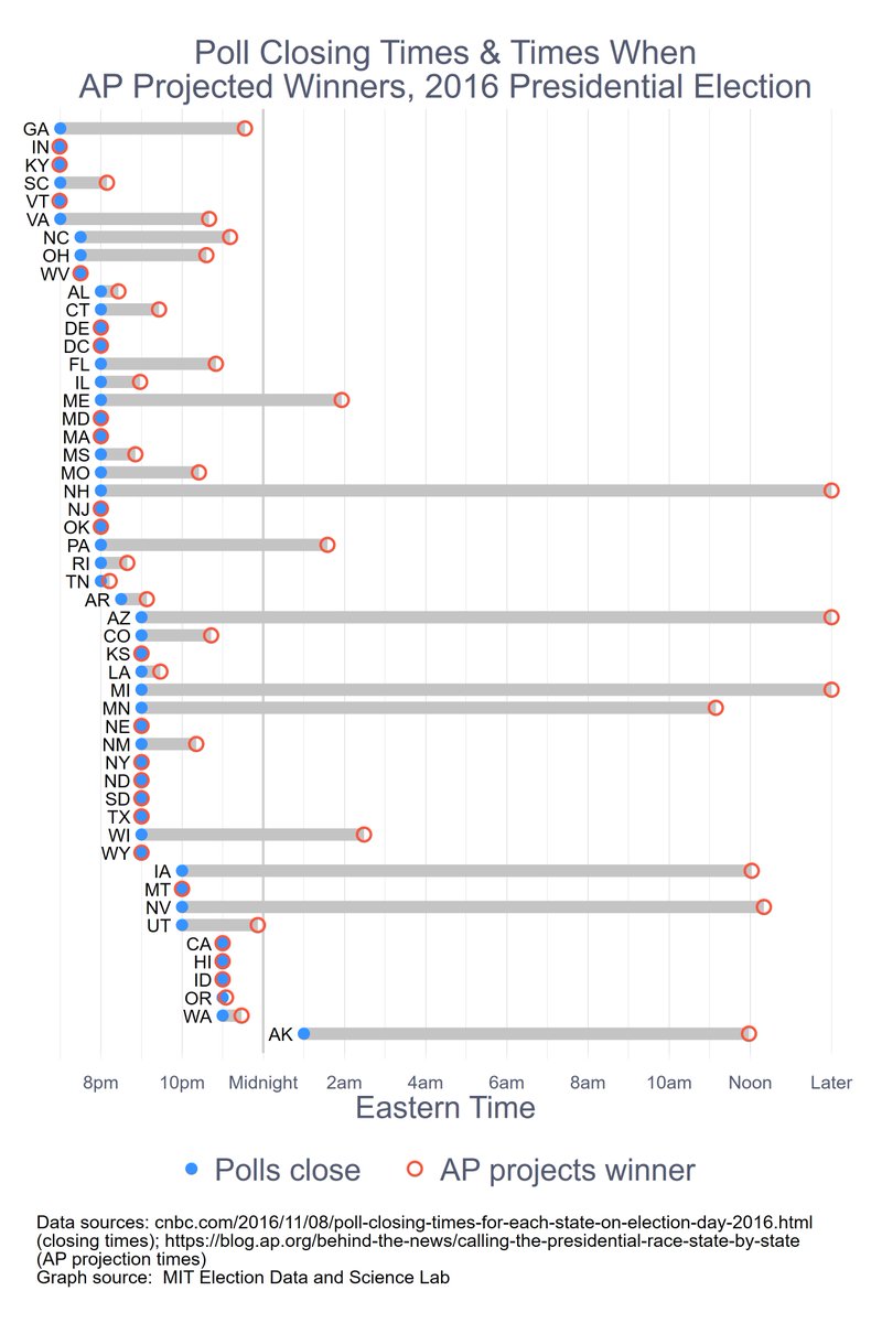
Spent the weekend looking at AP "call" times from 2016. Here are three graphs. (I hope the thread stays together.) The first simply shows when the polls closed and when the AP declared a state for a candidate.
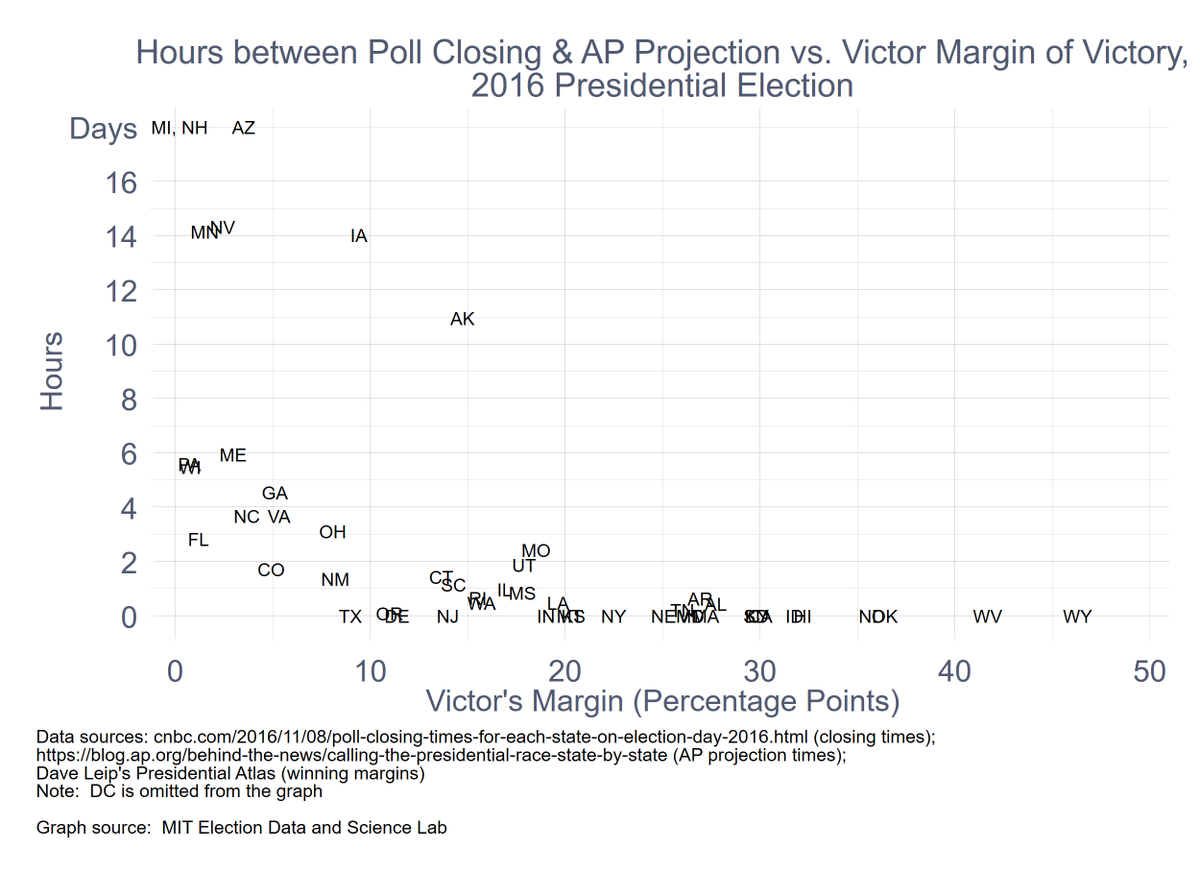
The second graph is a scatterplot that shows the time (in hours) it took to declare a state (y-axis) against the ultimate margin of victory by the winning candidate. Intuitive result overall, but still significant variability.
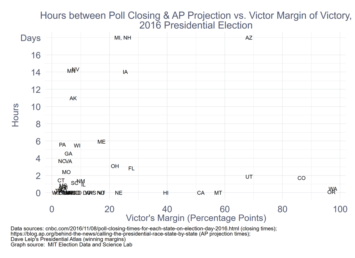
The third graph is a scatterplot that shows the time (in hours) it took to declare a state (y-axis) against the % of ballots cast by mail. Counter-intuitive result: the more mail ballots, the faster the call (with lots of variability).

 Read on Twitter


