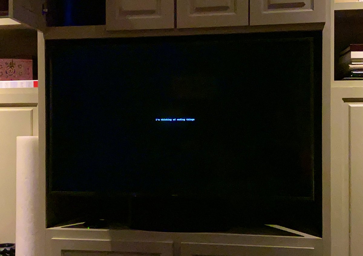
After finishing the movie I went back to the start for this photo. The end titles made me even angrier. But there’s a spoiler in them and you should watch the movie because it’s fascinating.
These titles are inaccessible. By setting them at such a tiny size, one might be making a narrative point (possible mild spoiler) but at the cost of saying fuck you to anyone who wants to read them.
Design isn’t just aesthetics. Architects can design glorious buildings, but because of the ADA and other standards, people can actually use them.
Titles are meant to be read.
Titles are meant to be read.
I’m not calling for title font size rules. Just thoughtfulness. These titles reflect a choice, and it wasn’t inclusive.
Also, none of this is criticism of the movie sandwiched between its infuriating titles, which I’m very happy exists. You should see it.

 Read on Twitter


