A theme running through my recent thinking is that layout on the web is in a mediocre phase which is counterintuitive to the recent advances in layout technology (eg CSS Grid).
Layouts should be getting more ambitious, but the opposite is true. https://twitter.com/jordanmoore/status/1287363028984496128?s=20">https://twitter.com/jordanmoo...
Layouts should be getting more ambitious, but the opposite is true. https://twitter.com/jordanmoore/status/1287363028984496128?s=20">https://twitter.com/jordanmoo...
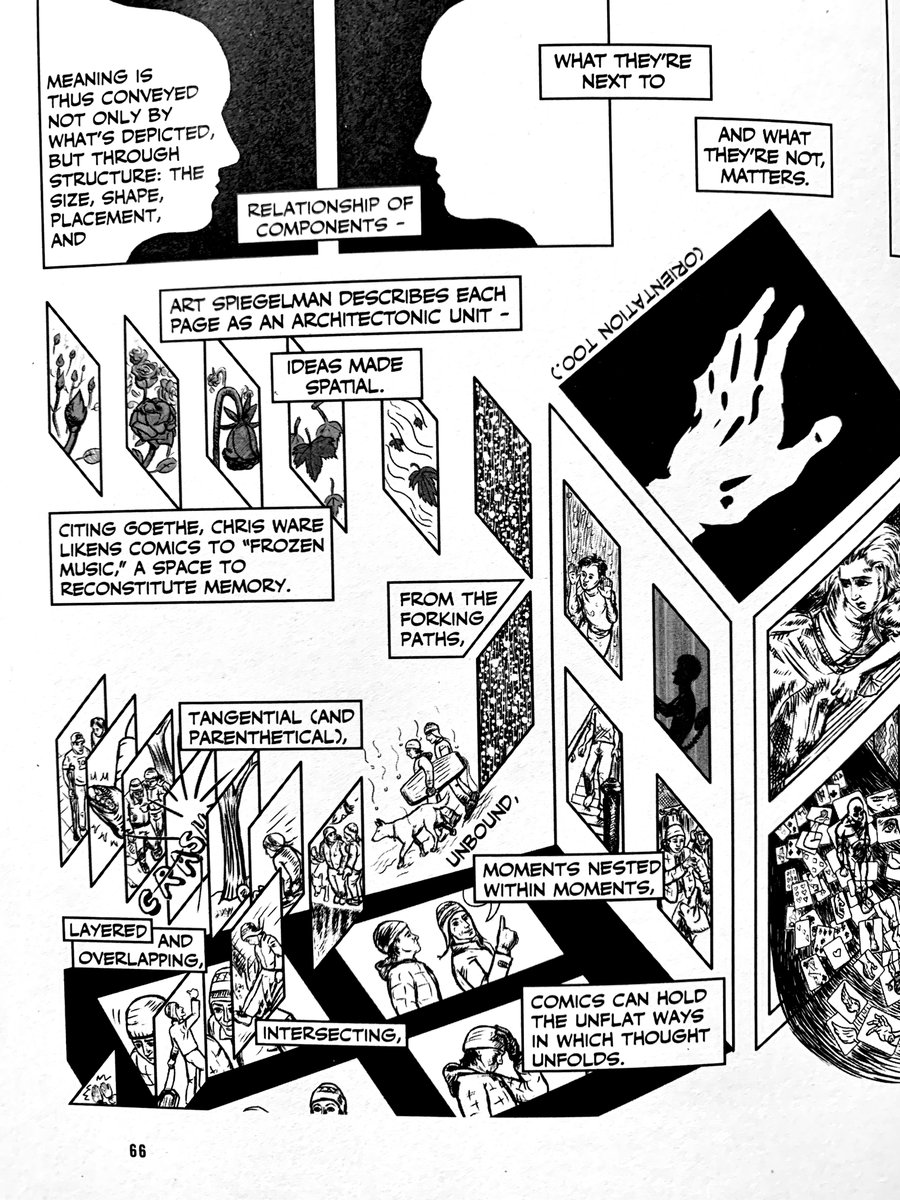
Why make ambitious layouts? For starters, layout can be so much more than simply placing blocks on a page in a top to bottom hierarchy of information.
Like comics, web layout has the potential to be a vessel for information flow, storytelling as an interplay between images, text, position, and connection, and recollection.
Forgettable web experiences flash in and out of a user& #39;s own direct, conscious experience.
The real opportunity is that the web has the potential to be a cultural pillar alongside art, music, and film — to create experiences that live on long after the tab is closed.
The real opportunity is that the web has the potential to be a cultural pillar alongside art, music, and film — to create experiences that live on long after the tab is closed.
Why is there an absence of ambitious layouts? For me, the blame rests mostly at the feet of the web community& #39;s tendency to follow dogmatic instruction.
"You must design and build mobile-first" — why? And completely overlook the bigger picture and potential of a larger canvas?
"You must design and build mobile-first" — why? And completely overlook the bigger picture and potential of a larger canvas?
Why build in layout limitations from the beginning? I would much prefer to design from all directions and possibilities instead.
Responsive designers lean too heavily on the single column as a crutch for scaling down layouts from multiple columns.
Responsive designers lean too heavily on the single column as a crutch for scaling down layouts from multiple columns.
There is a tendency to play it safe knowing that the layout will adapt to a multitude of canvases. Layout is always first to be compromised. https://twitter.com/jordanmoore/status/1255451847336382465?s=20">https://twitter.com/jordanmoo...
We& #39;ve witnessed greater ambition nearly a decade ago in mobile design.
Few designers today want to go anywhere near horizontal layouts even though left to right side-scrolling as a pattern in gaming predates vertical web page scrolling as a pattern. https://twitter.com/jordanmoore/status/1296943809910190082?s=20">https://twitter.com/jordanmoo...
Few designers today want to go anywhere near horizontal layouts even though left to right side-scrolling as a pattern in gaming predates vertical web page scrolling as a pattern. https://twitter.com/jordanmoore/status/1296943809910190082?s=20">https://twitter.com/jordanmoo...
Browser technology and CSS doesn& #39;t help when starts to break down when you try to move along the x-axis. We need more people to question the page paradigm like Masonry did during the last bright spark of web layout. https://twitter.com/jordanmoore/status/1258759176081354753">https://twitter.com/jordanmoo...
The only way to influence web specifications and their glacial pace is to hack it as demonstrated by Masonry, images for rounded corners, sIFR, Cufon, the <picture> element etc. https://twitter.com/jordanmoore/status/1280877661879971847">https://twitter.com/jordanmoo...
Layout is undergoing a simplification process and being bundled into conversations around the systemisation of design. When you systemise type, colour, interface elements, and layouts, you& #39;ve essentially given automation the tools to bring in an era of No Design alongside No Code
On one hand, I& #39;m a fan of lowering the barrier to entry of design if it& #39;s at the cost of rent-seeking designers and agencies, and for the benefit of the people that they have been robbing (businesses people who, with better tools, could have designed and built their own websites)
On the other hand, there is a need for more intricate design in more complex and nuanced scenarios — where a need for deeper design exists.
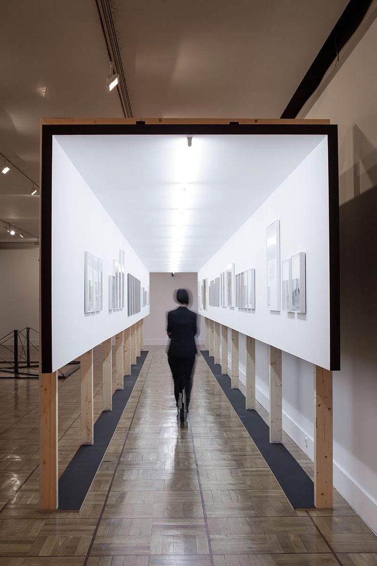
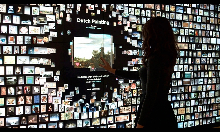
Exhibition design achieves a lot of what comics do in 3-dimensional space - narrative storytelling through layouts designed with purpose.
Exhibition design achieves a lot of what comics do in 3-dimensional space - narrative storytelling through layouts designed with purpose.
You tend to leave these spaces retaining more information than you would if you had read the exhibit info top to bottom in a single column article on the web. They& #39;re remarkable AND memorable.
I would go as far as to say exhibition design is to UX what science fiction is to tech
I would go as far as to say exhibition design is to UX what science fiction is to tech

 Read on Twitter


