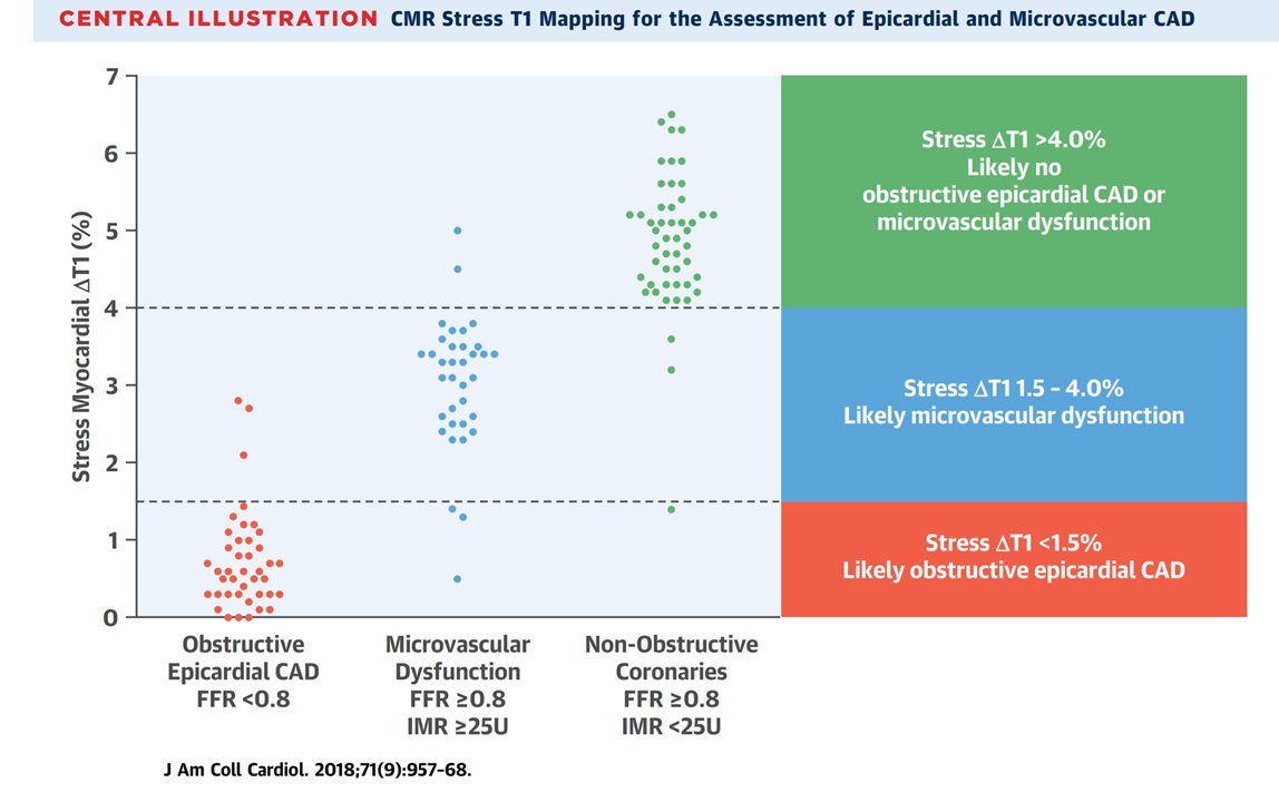
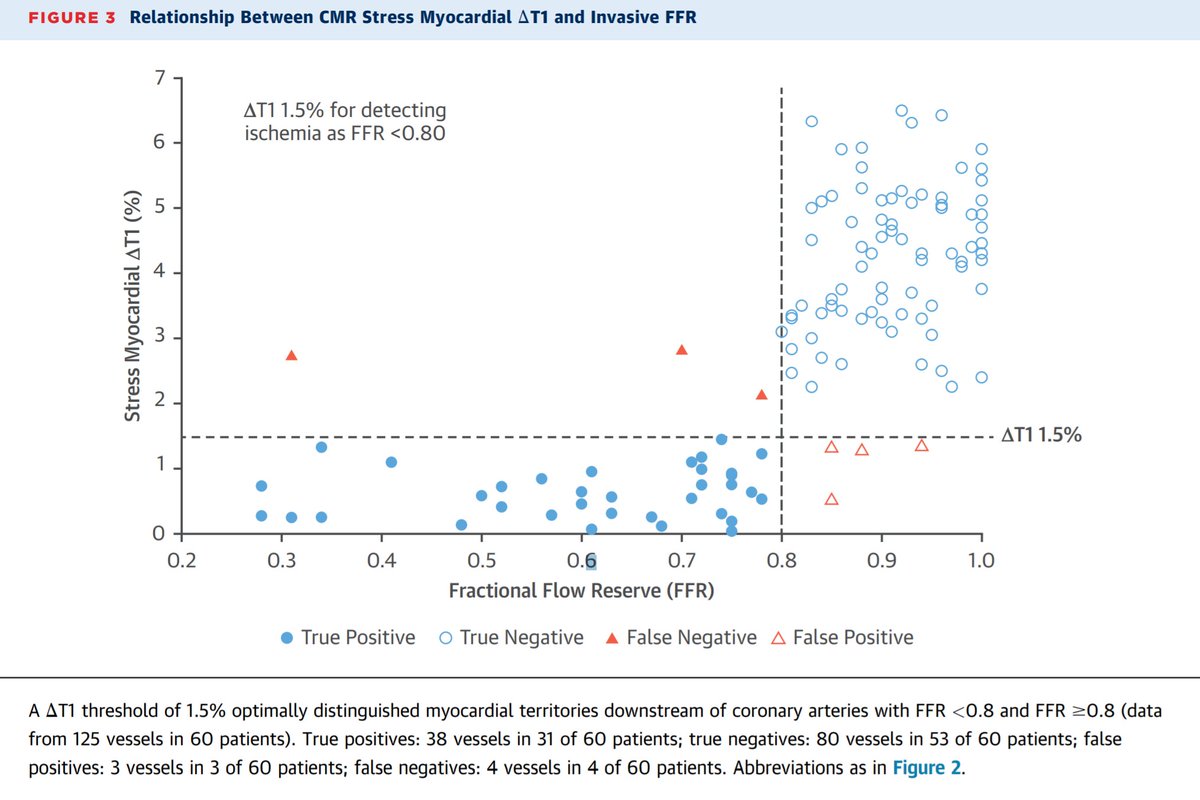
I do remember @drgrahamcole showing me this award-winning graph, a few years ago.
Unfortunately, I knew the same amount about MRI then as I do now. But also twice as much and half as much, if you get my meaning.
So I couldn& #39;t see what he was giggling about.
So I couldn& #39;t see what he was giggling about.
I beamed happily at the ROC curves.
"This black thing is very good at doing whatever it is that it is supposed to do.
You should get one of these on your scanner, mate!"
"This black thing is very good at doing whatever it is that it is supposed to do.
You should get one of these on your scanner, mate!"
This is the "Enron Bite".
Francis Industries markets a computer program (license fee only $9,995 per month) to generate such plots, by starting with real datasets, and then just deleting the points it doesn& #39;t like.
Source: https://www.internationaljournalofcardiology.com/action/showPdf?pii=S0167-5273%2811%2902178-4">https://www.internationaljournalofcardiology.com/action/sh...
Unfortunately, our program never really caught on.
(1) It leaves characteristic Enron Bite marks where the data points have been removed.
(1) It leaves characteristic Enron Bite marks where the data points have been removed.
and
(2) I think the price-tag sometimes causes attempts at do-it-yourself.
(2) I think the price-tag sometimes causes attempts at do-it-yourself.
It was a 3 year deliberation process, and a seriously significant amount of work and heartache for Oxford and the Authors.
Much more difficult to unpublish a paper than to publish it.
Which is a terrible shame.
Much more difficult to unpublish a paper than to publish it.
Which is a terrible shame.
That is why we have Twitter.
So we can know in 3 minutes instead of 3 years.
So we can know in 3 minutes instead of 3 years.
Congrats again to Oxford and the Authors for sorting this out through the painfully slow process forced upon them.
And remember you are not the only ones who have faced an uphill struggle to correct the record:
And remember you are not the only ones who have faced an uphill struggle to correct the record:
Hat tip for story to Joseph Selvanayagam https://twitter.com/josephselvacmr/status/1302180626901028869?s=20">https://twitter.com/josephsel...
And I believe the first person to point out the extreme implausibility of the data, when it was presented liver at a conference, was Martin Ugander.
He apparently got in big trouble for his impolite comments.
They shoulda just listened to him, eh? https://twitter.com/mugander/status/1302143741369618432?s=20">https://twitter.com/mugander/...
He apparently got in big trouble for his impolite comments.
They shoulda just listened to him, eh? https://twitter.com/mugander/status/1302143741369618432?s=20">https://twitter.com/mugander/...

 Read on Twitter


