Here we go. Here’s my How I Colour Manga Panels thread. A very looong, in depth look at my process and some things that go into it! Buckle up.
here’s your disclaimer: this is not The way to colour panels!! it is just the way /I/ do it and what /I/ like!
This tutorial will be divided into ultimately two parts, the theory and the practical. I’ll explain the process and then I’ll apply it to an actual colouring!
This tutorial will be divided into ultimately two parts, the theory and the practical. I’ll explain the process and then I’ll apply it to an actual colouring!
well obviously.
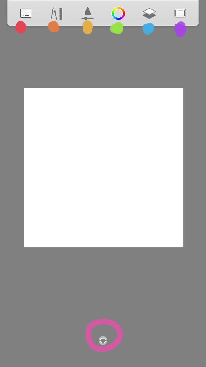
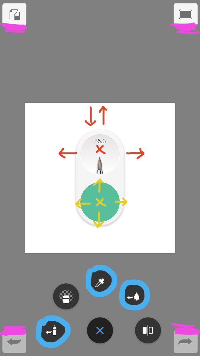
note that:
-autodesk is the simplest in terms of layout
-if you are using medibang you should make an account first else you won’t have access to a lot of good brushes.
note that:
-autodesk is the simplest in terms of layout
-if you are using medibang you should make an account first else you won’t have access to a lot of good brushes.
Examples of colour schemes. These are base colours, highlights and shading will vary. I tend to use complimentary colours the most.
1. Monochromatic
2. A Mix of Analogous and Complimentary
3. Complimentary
4. Complimentary
1. Monochromatic
2. A Mix of Analogous and Complimentary
3. Complimentary
4. Complimentary
SHADING lord knows we all need help here. I tried to cover as much as I could as clearly as I could here. The examples of the two types of shading, the first is Cell/Hard shading and the second is Soft/Blended shading. The light source is indicated by the lil sun in the corner
That’s it for theory I believe. If you have any questions on it quote this tweet with them and I’ll do my best to explain!
onto the actual colouring part now
onto the actual colouring part now
Your manga panel! It’s best to get one with clear lines, as hq as you can. Medibang has a feature called Lineart Extraction where they get rid of the white space for you, Autodesk Does Not. To start:
-Add a layer under your panel layer
-Set panel layer to multiply +
-Add a layer under your panel layer
-Set panel layer to multiply +
by clicking it! You see the Blending bit? Yeah click that shit, click Multiply, and it’ll be like lineart extraction! You colour on layers /under/ panel layer.
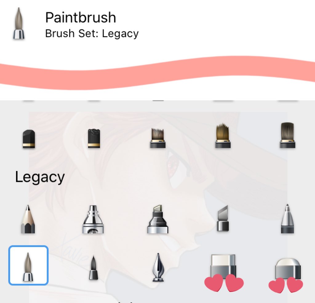
These are the brushes I use. Paintbrush for base colours, Watercolour and mostly Pencil for blending! Also these two erasers
Starting with the base, remember not to use highly saturated colours. This is the Hard shading version, I mix the shading types.
Top right: Areas to be shaded
Bottom Left: Areas to be highlighted (purple = depending on light source)
How I picked my shading colours +
Top right: Areas to be shaded
Bottom Left: Areas to be highlighted (purple = depending on light source)
How I picked my shading colours +
Always a few tones darker than the base colour, so that it doesn’t look out of place. This adheres more on the realistic side as other colours such as pink and blue can be used to shade/highlight! It gives off different moods, as the pink is warmer and the blue is more dramatic.
Here I add the softer shading. Midtones are used here, to link two colours so they blend smoothly (which is why there are three colours for shading rather than one.)
Left: Contours for shading
Top right: Highlights
The easiest way to get the hang of this is a makeup tutorial.
Left: Contours for shading
Top right: Highlights
The easiest way to get the hang of this is a makeup tutorial.
Once you do the skin everything else is a rinse and repeat.
Clothes - white is never! never white. it’s usually really light versions of colours, and I’m going for a warm feel so I picked a pinkish white. The shading isn’t too severe and it’s mostly blended with the base.
Clothes - white is never! never white. it’s usually really light versions of colours, and I’m going for a warm feel so I picked a pinkish white. The shading isn’t too severe and it’s mostly blended with the base.
More white areas, the teeth and corneas.
The eyes are covered by his hat so it’s a little darker, but sticking with the light colours.
The teeth, I stay on the grayer side of colours especially for the shading.
The eyes are covered by his hat so it’s a little darker, but sticking with the light colours.
The teeth, I stay on the grayer side of colours especially for the shading.
The eyes, my absolute favorite part.
Base - whatever colour you want the eyes to be.
Shade - around pupil and mostly the top of the iris; shadow cast by the upper eye lid.
Midtone - to make it Pop, add life, this is the most saturated colour I use
Highlight - however you feel!
Base - whatever colour you want the eyes to be.
Shade - around pupil and mostly the top of the iris; shadow cast by the upper eye lid.
Midtone - to make it Pop, add life, this is the most saturated colour I use
Highlight - however you feel!
^^ minor mistake there, the colour of the midtone changes bc i could never make up my mind
The blended version (using the Pencil brush) is even sexier ugh I love this, it was definitely my favorite part of this. The colours are the same but it looks different bc of the brushes.
The blended version (using the Pencil brush) is even sexier ugh I love this, it was definitely my favorite part of this. The colours are the same but it looks different bc of the brushes.
the way I colour hair changes so much  https://abs.twimg.com/emoji/v2/... draggable="false" alt="😭" title="Laut schreiendes Gesicht" aria-label="Emoji: Laut schreiendes Gesicht"> but like I said, rinse and repeat. the shading is placed on strands that are covered by other locks of hair, the highlights go on these dominant locks of hair. it’s hard shading so i used the Paintbrush only
filling in other details, keeping with the warm reddish-brown colour scheme, as the hat isn’t something i want to stand out or take attention away from the center of the colouring
Changing the lineart colour! I usually do this last bc I want it to match my colour scheme. To do this:
-New Layer /over/ panel layer
-Set layer blending mode to Screen
-Colour over the black lines to change it’s colour!
*This will affect any area that isn’t white so be mindful.
-New Layer /over/ panel layer
-Set layer blending mode to Screen
-Colour over the black lines to change it’s colour!
*This will affect any area that isn’t white so be mindful.
+Merge the screen layer with the panel layer !! bada bing bada boom, coloured lineart.
I like leaving the outermost lines black but that’s just a personal preference, you can colour it however you want.
I like leaving the outermost lines black but that’s just a personal preference, you can colour it however you want.
Quick hack for easily making a colour scheme warm/cool:
-New layer over all other layers
-Colour entire layer in blue/orange
-Set layer to Lighten
-Lower opacity to suit (I use about 30-40%)
-New layer over all other layers
-Colour entire layer in blue/orange
-Set layer to Lighten
-Lower opacity to suit (I use about 30-40%)
Finished product! Daiyatwt pls accept my ginger narumiya mei i put my blood sweat and tears into him for days
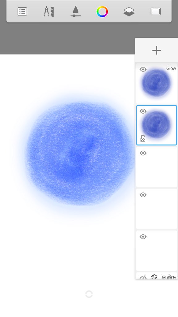
oh extras !! oomf asked about a glow tutorial, i don’t use it often but:
-Lightly Airbrush over the base object using the same colour
-Duplicate layer
-Set Duplicate layer to glow mode of your choice (Soft Glow, Luminosity, Add, Overlay, etc)
OR;
-Airbrush on new layer and+
-Lightly Airbrush over the base object using the same colour
-Duplicate layer
-Set Duplicate layer to glow mode of your choice (Soft Glow, Luminosity, Add, Overlay, etc)
OR;
-Airbrush on new layer and+
set it to a glow mode!
There are glow brushes available but I personally don’t like the effect they create, you could mess around with them though and see what’s up.
There are glow brushes available but I personally don’t like the effect they create, you could mess around with them though and see what’s up.
This concludes this thread! If you have any more questions or stuff please quote this tweet with them and I’ll try my best to help!! I hope this tutorial made things easier for you, may you all enjoy coloring panels ~  https://abs.twimg.com/emoji/v2/... draggable="false" alt="🥳" title="Partying face" aria-label="Emoji: Partying face">

 Read on Twitter


 but like I said, rinse and repeat. the shading is placed on strands that are covered by other locks of hair, the highlights go on these dominant locks of hair. it’s hard shading so i used the Paintbrush only" title="the way I colour hair changes so much https://abs.twimg.com/emoji/v2/... draggable="false" alt="😭" title="Laut schreiendes Gesicht" aria-label="Emoji: Laut schreiendes Gesicht"> but like I said, rinse and repeat. the shading is placed on strands that are covered by other locks of hair, the highlights go on these dominant locks of hair. it’s hard shading so i used the Paintbrush only">
 but like I said, rinse and repeat. the shading is placed on strands that are covered by other locks of hair, the highlights go on these dominant locks of hair. it’s hard shading so i used the Paintbrush only" title="the way I colour hair changes so much https://abs.twimg.com/emoji/v2/... draggable="false" alt="😭" title="Laut schreiendes Gesicht" aria-label="Emoji: Laut schreiendes Gesicht"> but like I said, rinse and repeat. the shading is placed on strands that are covered by other locks of hair, the highlights go on these dominant locks of hair. it’s hard shading so i used the Paintbrush only">


