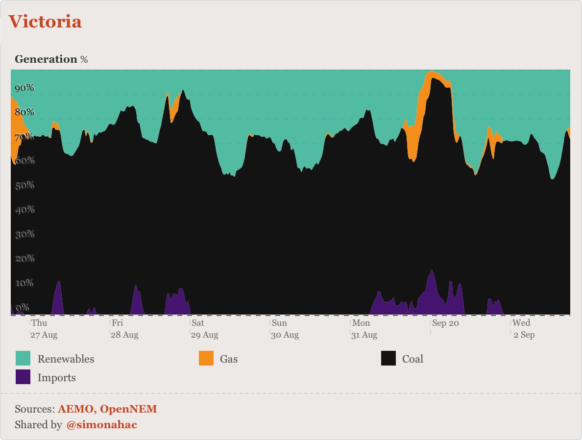
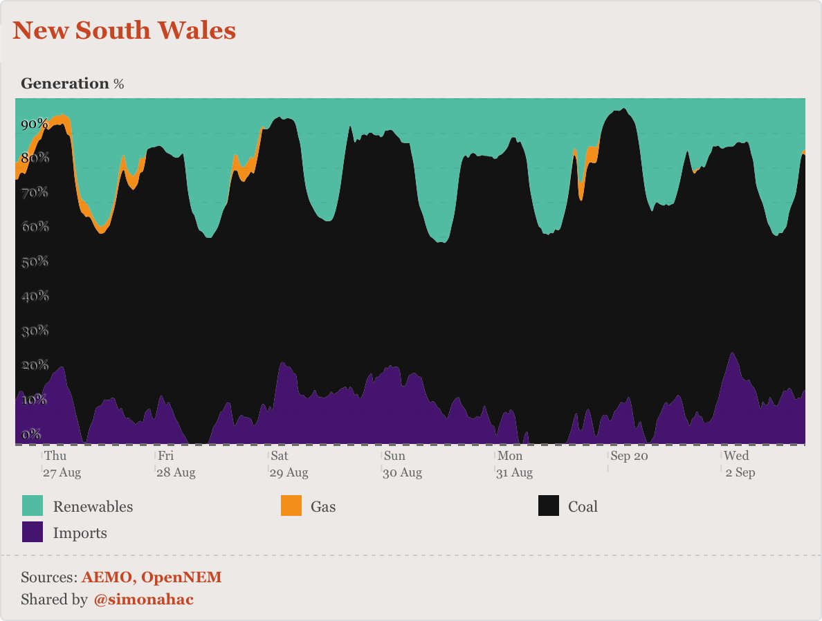
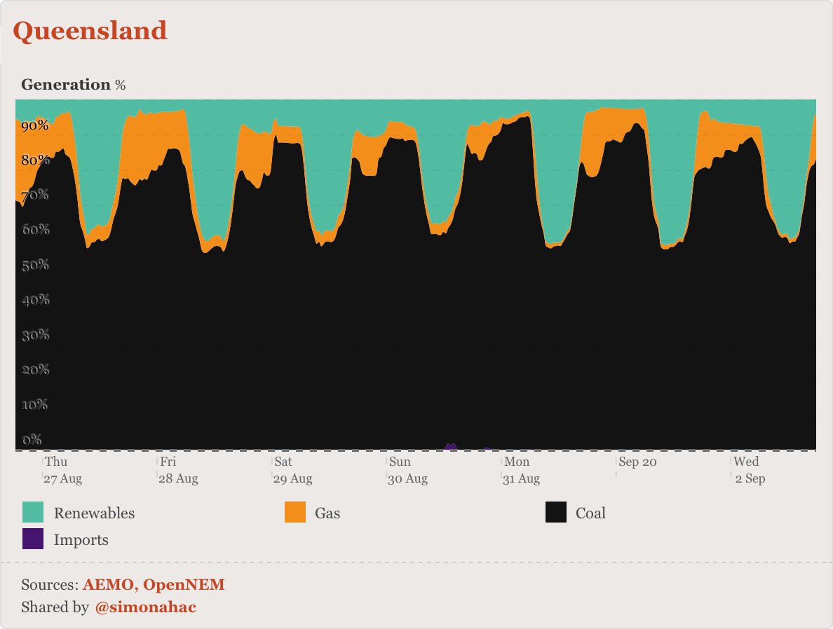
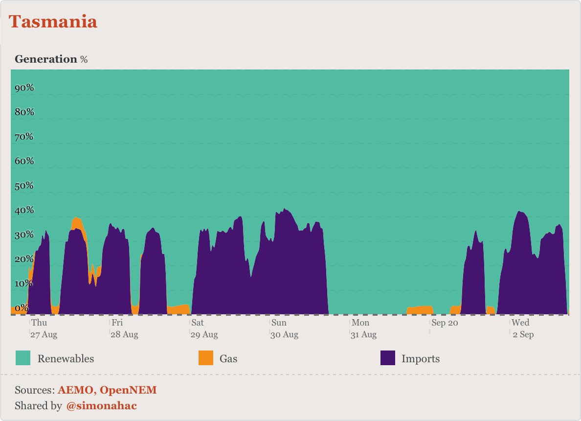
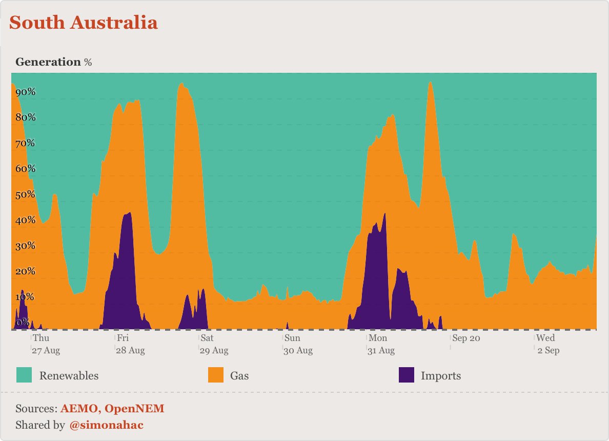
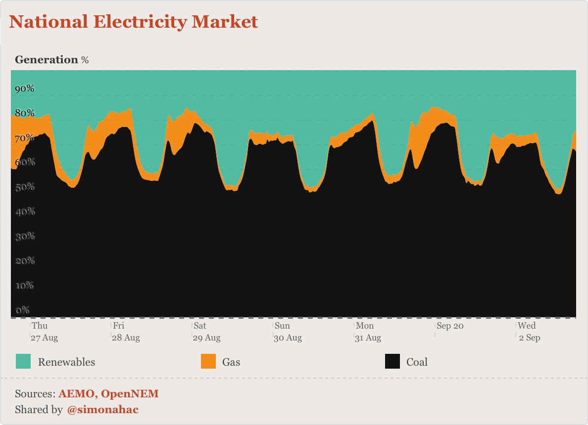
here& #39;s the *proportion* of power in the NEM from coal, renewables and gas over the past week (30 minute intervals).
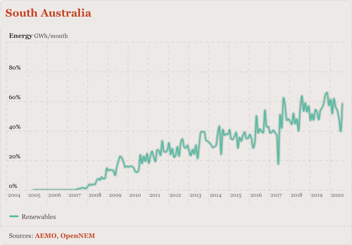
…and south australia.
(nb. by their nature, these specific charts don& #39;t show exports, and denote the proportion of each source during each interval.)
you too can visualise what& #39;s happening in our national electricity network at http://opennem.org.au"> http://opennem.org.au , free, always.
enjoy!
(nb. by their nature, these specific charts don& #39;t show exports, and denote the proportion of each source during each interval.)
you too can visualise what& #39;s happening in our national electricity network at http://opennem.org.au"> http://opennem.org.au , free, always.
enjoy!
ps. WA coming soon — we just need to get hold of rooftop solar data.

 Read on Twitter
 these @OpenNem charts are close to art IMHO…here& #39;s the *proportion* of power in the NEM from coal, renewables and gas over the past week (30 minute intervals)." title="https://abs.twimg.com/emoji/v2/... draggable="false" alt="🤓" title="Nerd-Gesicht" aria-label="Emoji: Nerd-Gesicht"> these @OpenNem charts are close to art IMHO…here& #39;s the *proportion* of power in the NEM from coal, renewables and gas over the past week (30 minute intervals)." class="img-responsive" style="max-width:100%;"/>
