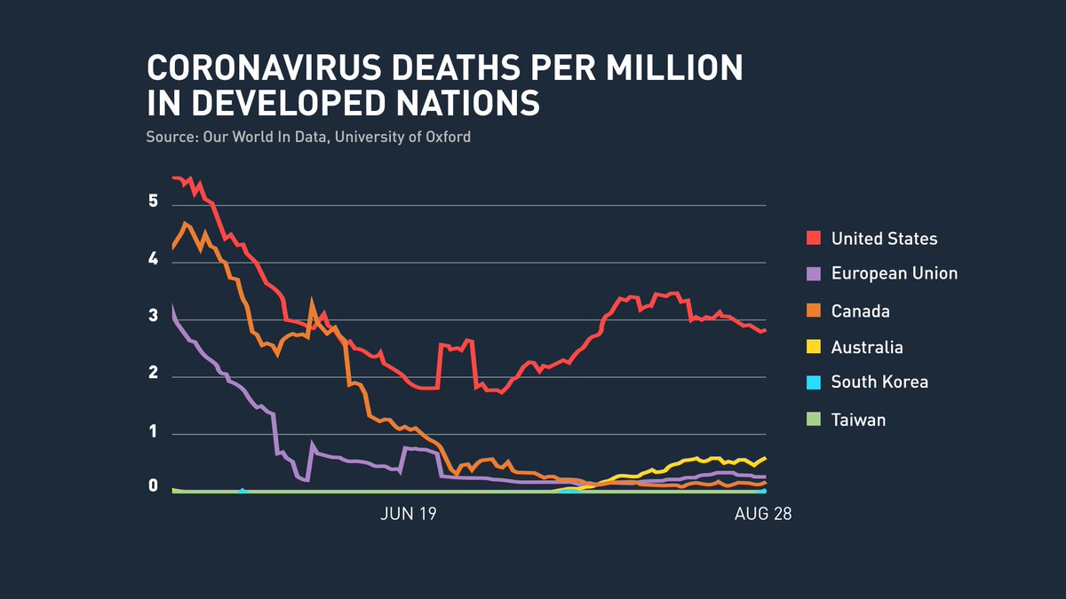
Many of you asked for the chart I showed on the @newshour last night, comparing Covid-19 deaths/per million amongst modern, developed nations. Here it is:
As I said to @JudyWoodruff - these nations don& #39;t have smarter doctors or better medicines than we do, they just launched smarter, more consistent public-health responses. And more of their people are alive today because it. We can do this too. The evidence is right here.
There *are* meaningful differences in these countries: they have distinct health-care systems... their people have different views of their government.. and they will (and are) still going to have outbreaks, but the point is: they took this pandemic seriously.
Next week on @newshour, we& #39;re launching a 5-part series looking more broadly at the U.S. healthcare system (which is full of incredible innovation, but also ugly disparities) and then looking at 3 other nations who achieve universal health care, better outcomes and lower costs.
We visit the United Kingdom (single-payer), Switzerland (all private insurance), and Australia (hybrid of the 2) for comparisons. Their systems are *not* perfect, and none would be 100% transplants into the U.S., but how they achieve what we haven& #39;t been able to so far? TUNE IN!
We are very lucky in this series to have @ashishkjha as a collaborator. He was an invaluable advisor to producer @JasoKane and me. At the tail-end of the series, we& #39;ll talk with Ashish about how these countries *also* handled the pandemic. Starts Monday on the @NewsHour
Here& #39;s some more background on next week& #39;s series, which is called "The Best Health Care? America & the World" https://www.pbs.org/newshour/press-releases/amid-global-pandemic-pbs-newshour-offers-an-in-depth-look-at-health-care-systems-in-europe-australia-and-the-united-states">https://www.pbs.org/newshour/...
*My omission on this chart -- as many of you have asked -- this is DAILY deaths/per million people from these countries.

 Read on Twitter


