Type is an important tool Developers use. A website is 95% typography.
Typography can make or break your website& #39;s aesthetic and readability. What font should I choose? What should be bold? What is tracking?
Here is your go-to guide for High-Caliber Typography https://abs.twimg.com/emoji/v2/... draggable="false" alt="🔥" title="Feuer" aria-label="Emoji: Feuer">
 https://abs.twimg.com/emoji/v2/... draggable="false" alt="🔠" title="Eingabe-Symbol für lateinische Großbuchstaben" aria-label="Emoji: Eingabe-Symbol für lateinische Großbuchstaben">
Thread https://abs.twimg.com/emoji/v2/... draggable="false" alt="🧵" title="Thread" aria-label="Emoji: Thread">
Typography can make or break your website& #39;s aesthetic and readability. What font should I choose? What should be bold? What is tracking?
Here is your go-to guide for High-Caliber Typography
Thread
1/ Choosing the Right Font is critical  https://abs.twimg.com/emoji/v2/... draggable="false" alt="⚠️" title="Warnsignal" aria-label="Emoji: Warnsignal">
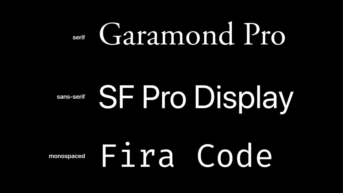
Serif fonts can be more pleasant for long text, while sans-serif can be loud for headlines and callouts
Choose fonts that goes with your brand
For your blog, choose simple font. For a Landing page, choose big, bold font
Serif fonts can be more pleasant for long text, while sans-serif can be loud for headlines and callouts
Choose fonts that goes with your brand
For your blog, choose simple font. For a Landing page, choose big, bold font
2/ Size Matters  https://abs.twimg.com/emoji/v2/... draggable="false" alt="😎" title="Lächelndes Gesicht mit Sonnenbrille" aria-label="Emoji: Lächelndes Gesicht mit Sonnenbrille">
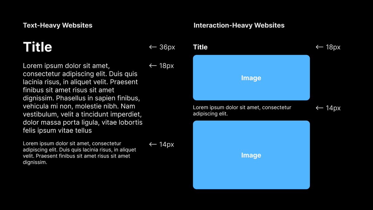
Text-heavy web pages should have larger text sizes. Base text size can be 18px with secondary text being 14px and large text up to 36px
For Interaction-heavy pages, use smaller text, like 14px and 12px, to not interfere with images and graphics.
Text-heavy web pages should have larger text sizes. Base text size can be 18px with secondary text being 14px and large text up to 36px
For Interaction-heavy pages, use smaller text, like 14px and 12px, to not interfere with images and graphics.
3/ Font weights add variety  https://abs.twimg.com/emoji/v2/... draggable="false" alt="🖊" title="Kugelschreiber unten links" aria-label="Emoji: Kugelschreiber unten links">
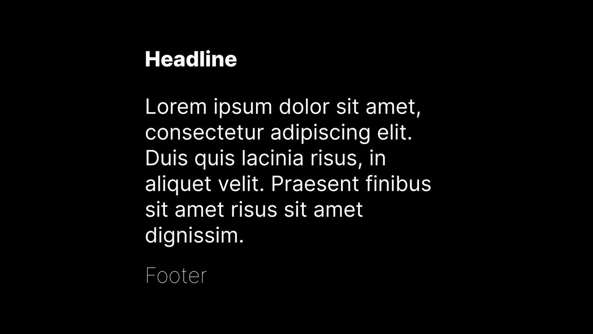
Font weights establishes hierarchy and easily make your website pop
Want something to appear more important? Make it bold. Want something to be easily readable, use a regular weight. Want something to appear smaller? Make it thin.
Font weights establishes hierarchy and easily make your website pop
Want something to appear more important? Make it bold. Want something to be easily readable, use a regular weight. Want something to appear smaller? Make it thin.
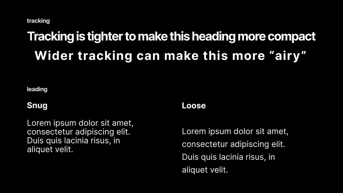
4/ Tracking and Leading allow your to website breathe  https://abs.twimg.com/emoji/v2/... draggable="false" alt="💨" title="Staubwolke" aria-label="Emoji: Staubwolke">
Tracking is the space between the letters of a word, while Leading is the space between each line
Use looser leading smaller text and readability. Tighter tracking for condensing heading length.
Tracking is the space between the letters of a word, while Leading is the space between each line
Use looser leading smaller text and readability. Tighter tracking for condensing heading length.
5/ End
Remember:
1. Choose the right font
2. Make sure your text size is appropriate
3. Use a variety of font weight to make your website pop
4. Use leading and tracking strategically
Remember:
1. Choose the right font
2. Make sure your text size is appropriate
3. Use a variety of font weight to make your website pop
4. Use leading and tracking strategically

 Read on Twitter
 https://abs.twimg.com/emoji/v2/... draggable="false" alt="🔠" title="Eingabe-Symbol für lateinische Großbuchstaben" aria-label="Emoji: Eingabe-Symbol für lateinische Großbuchstaben">Thread https://abs.twimg.com/emoji/v2/... draggable="false" alt="🧵" title="Thread" aria-label="Emoji: Thread">" title="Type is an important tool Developers use. A website is 95% typography.Typography can make or break your website& #39;s aesthetic and readability. What font should I choose? What should be bold? What is tracking?Here is your go-to guide for High-Caliber Typography https://abs.twimg.com/emoji/v2/... draggable="false" alt="🔥" title="Feuer" aria-label="Emoji: Feuer">https://abs.twimg.com/emoji/v2/... draggable="false" alt="🔠" title="Eingabe-Symbol für lateinische Großbuchstaben" aria-label="Emoji: Eingabe-Symbol für lateinische Großbuchstaben">Thread https://abs.twimg.com/emoji/v2/... draggable="false" alt="🧵" title="Thread" aria-label="Emoji: Thread">" class="img-responsive" style="max-width:100%;"/>
 Serif fonts can be more pleasant for long text, while sans-serif can be loud for headlines and calloutsChoose fonts that goes with your brandFor your blog, choose simple font. For a Landing page, choose big, bold font" title="1/ Choosing the Right Font is critical https://abs.twimg.com/emoji/v2/... draggable="false" alt="⚠️" title="Warnsignal" aria-label="Emoji: Warnsignal">Serif fonts can be more pleasant for long text, while sans-serif can be loud for headlines and calloutsChoose fonts that goes with your brandFor your blog, choose simple font. For a Landing page, choose big, bold font" class="img-responsive" style="max-width:100%;"/>
 Text-heavy web pages should have larger text sizes. Base text size can be 18px with secondary text being 14px and large text up to 36pxFor Interaction-heavy pages, use smaller text, like 14px and 12px, to not interfere with images and graphics." title="2/ Size Matters https://abs.twimg.com/emoji/v2/... draggable="false" alt="😎" title="Lächelndes Gesicht mit Sonnenbrille" aria-label="Emoji: Lächelndes Gesicht mit Sonnenbrille">Text-heavy web pages should have larger text sizes. Base text size can be 18px with secondary text being 14px and large text up to 36pxFor Interaction-heavy pages, use smaller text, like 14px and 12px, to not interfere with images and graphics." class="img-responsive" style="max-width:100%;"/>
 Font weights establishes hierarchy and easily make your website popWant something to appear more important? Make it bold. Want something to be easily readable, use a regular weight. Want something to appear smaller? Make it thin." title="3/ Font weights add variety https://abs.twimg.com/emoji/v2/... draggable="false" alt="🖊" title="Kugelschreiber unten links" aria-label="Emoji: Kugelschreiber unten links">Font weights establishes hierarchy and easily make your website popWant something to appear more important? Make it bold. Want something to be easily readable, use a regular weight. Want something to appear smaller? Make it thin." class="img-responsive" style="max-width:100%;"/>
 Tracking is the space between the letters of a word, while Leading is the space between each lineUse looser leading smaller text and readability. Tighter tracking for condensing heading length." title="4/ Tracking and Leading allow your to website breathe https://abs.twimg.com/emoji/v2/... draggable="false" alt="💨" title="Staubwolke" aria-label="Emoji: Staubwolke">Tracking is the space between the letters of a word, while Leading is the space between each lineUse looser leading smaller text and readability. Tighter tracking for condensing heading length." class="img-responsive" style="max-width:100%;"/>


