An attempt to explain one of aspects of how I think of colours and an explanation why I accidentally started loving violets [a short tutorial-thread]:
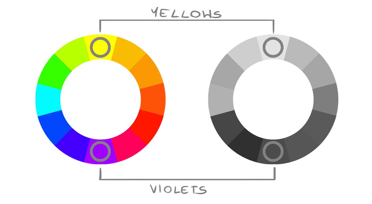
Different hues have different values. While pure fully saturated yellows or cyans are naturally bright - violets, blues or reds are darker.
I used to think that brighter hues are "better ones" because you can have saturated look with small amount of tint.
I used to think that brighter hues are "better ones" because you can have saturated look with small amount of tint.
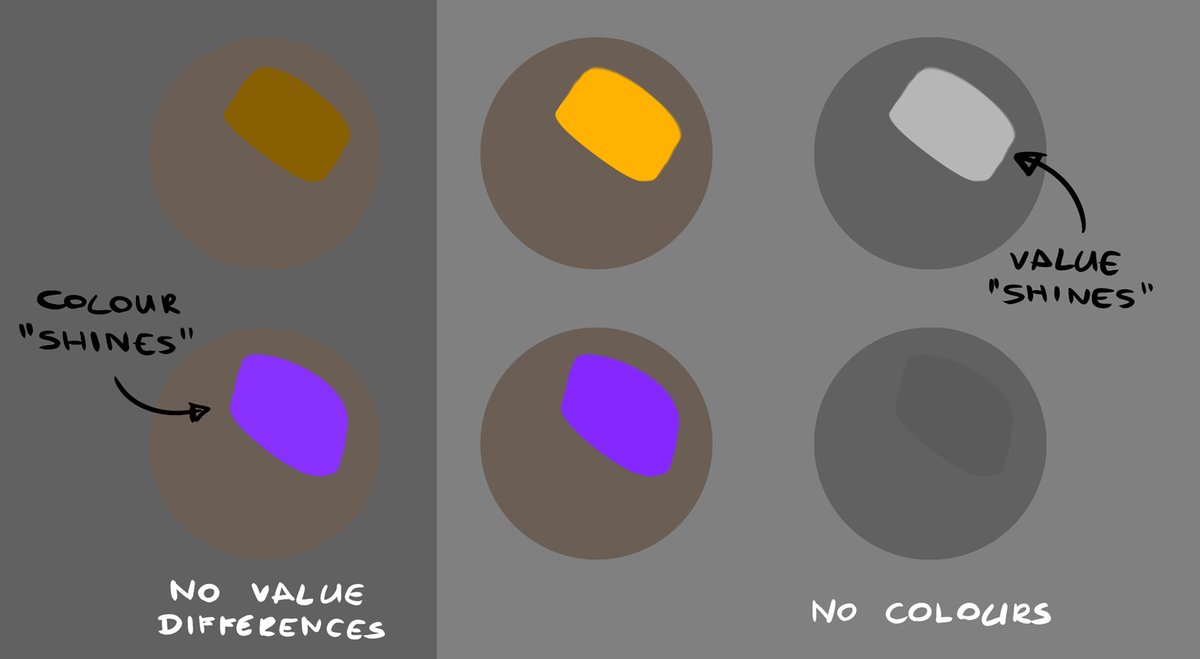
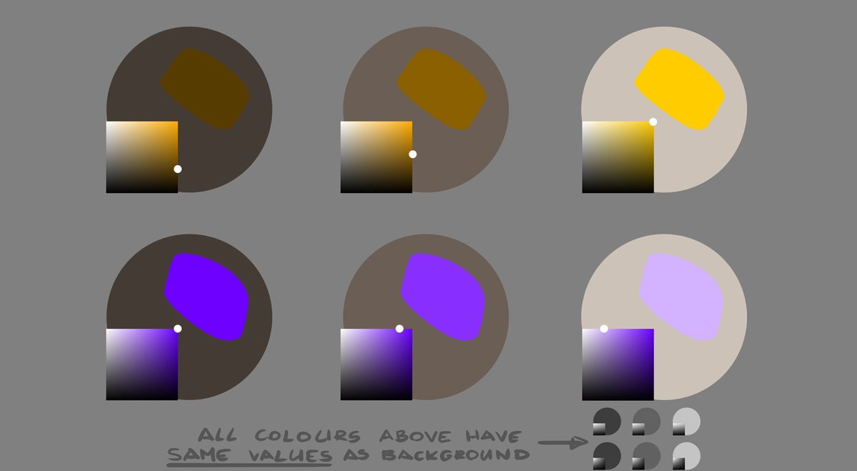
But as saturated yellows stand out with their value against darker backgrounds - violets stand out with their saturation even when value is limited to darker tones - because they don& #39;t need black tint added. Meanwhile yellows need that black as by themselves those are too bright.
So you can cover quite a wide range of values with violets without need to use any black what makes them really amazing. While yellows shows their colours only in bright values - the darker, the more muddy the colour.
That being said, it doesn& #39;t mean I use only saturated colours - in fact it& #39;s quite the opposite (feel free to colorpick my works to see).
It& #39;s a matter if you are the one deciding if you want that one spot saturated or not or if that decisiveness is taken away by hue limitations.
It& #39;s a matter if you are the one deciding if you want that one spot saturated or not or if that decisiveness is taken away by hue limitations.
If you want to check your values in photoshop remember to not use desaturate (it most of all relies on amount of black and doesn& #39;t show accurate values). Just put completely while layer on top of all and set it to "color" blending mode.

 Read on Twitter
![An attempt to explain one of aspects of how I think of colours and an explanation why I accidentally started loving violets [a short tutorial-thread]: An attempt to explain one of aspects of how I think of colours and an explanation why I accidentally started loving violets [a short tutorial-thread]:](https://pbs.twimg.com/media/EgXv93yU4AEbS_4.jpg)


