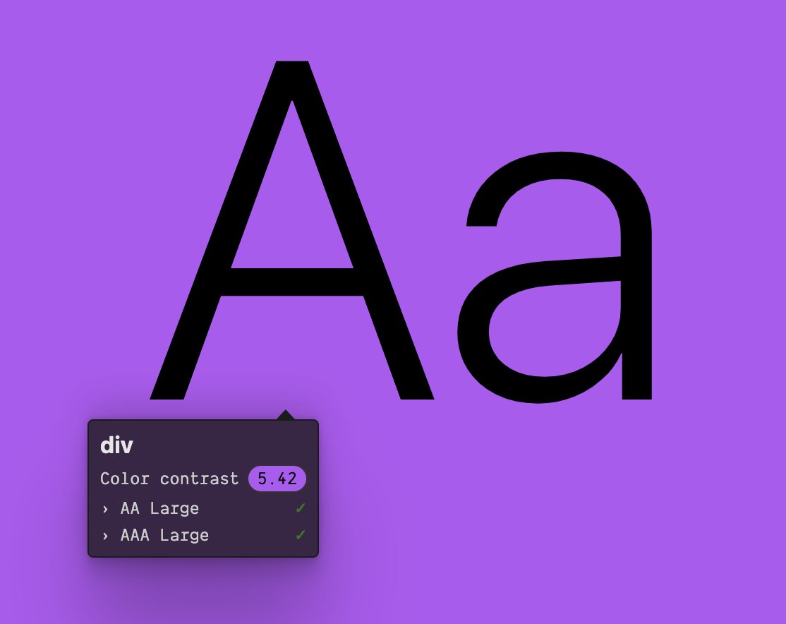
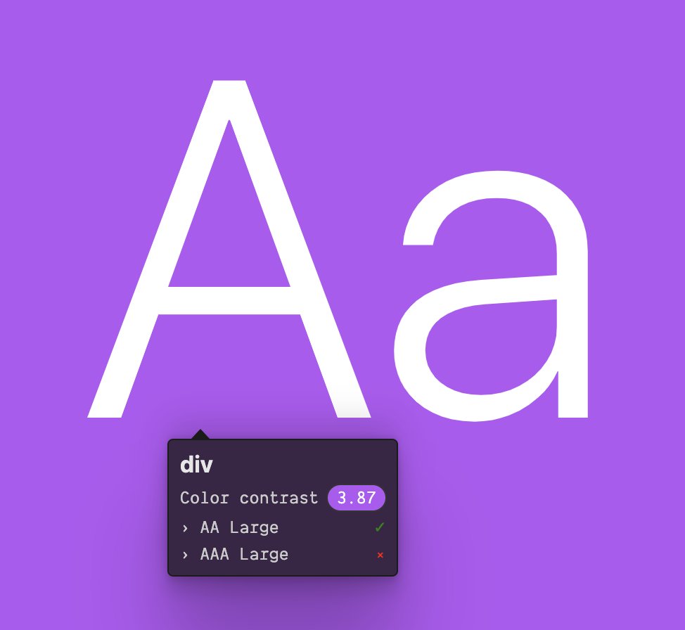
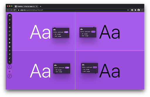
(a mismatch between RGB math and human perception..) I believe the white text "pops" WAY MORE than the black text.. but, the algorithm we use today disagrees..
what do you think?!
explore how a small change to purple can convince the algorithm otherwise
https://codepen.io/argyleink/pen/rNeyzyN">https://codepen.io/argyleink...
what do you think?!
explore how a small change to purple can convince the algorithm otherwise
https://codepen.io/argyleink/pen/rNeyzyN">https://codepen.io/argyleink...
I find this pretty frustrating pretty often..
thanks @mayabenari for this share, a tool that includes luminance information in the comparison and is making (or made) efforts to help these color scenarios https://www.myndex.com/SAPC/ ">https://www.myndex.com/SAPC/&quo...
another killer share from @mayabenari, Editor& #39;s draft that includes updates to the WCAG contrast algorithm #visual-contrast-of-text">https://w3c.github.io/silver/guidelines/ #visual-contrast-of-text">https://w3c.github.io/silver/gu... and a link to the updated algorithm in js https://github.com/Myndex/SAPC/blob/master/JS/SAPCsRGB.js">https://github.com/Myndex/SA...

 Read on Twitter


