Visualize Value Reviewed
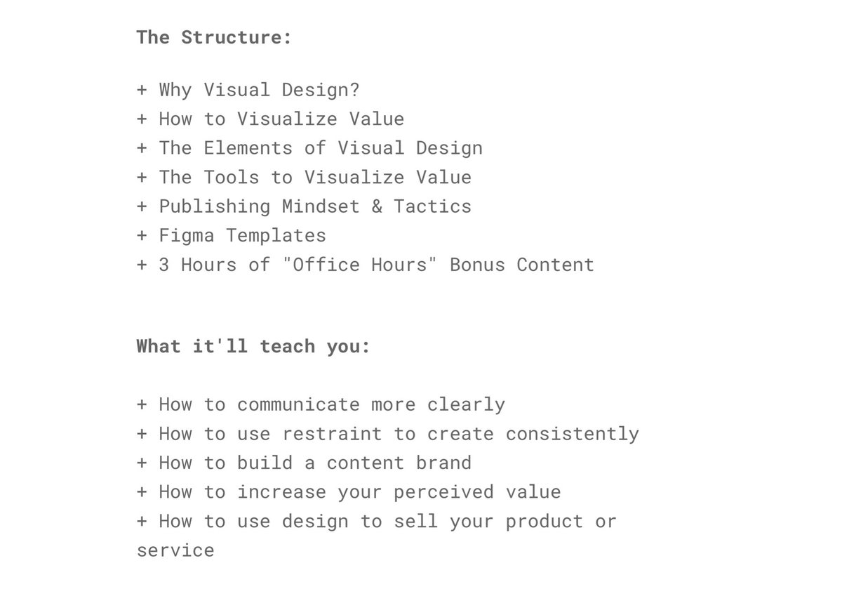
Those of you who’ve been following my newsletter may know that I’ve been taking @jackbutcher’s Visualize Value course
Here are a few concepts that you’ll pick up from taking it.
Those of you who’ve been following my newsletter may know that I’ve been taking @jackbutcher’s Visualize Value course
Here are a few concepts that you’ll pick up from taking it.
Constraints are a great way to force yourself to think creatively with your designs.
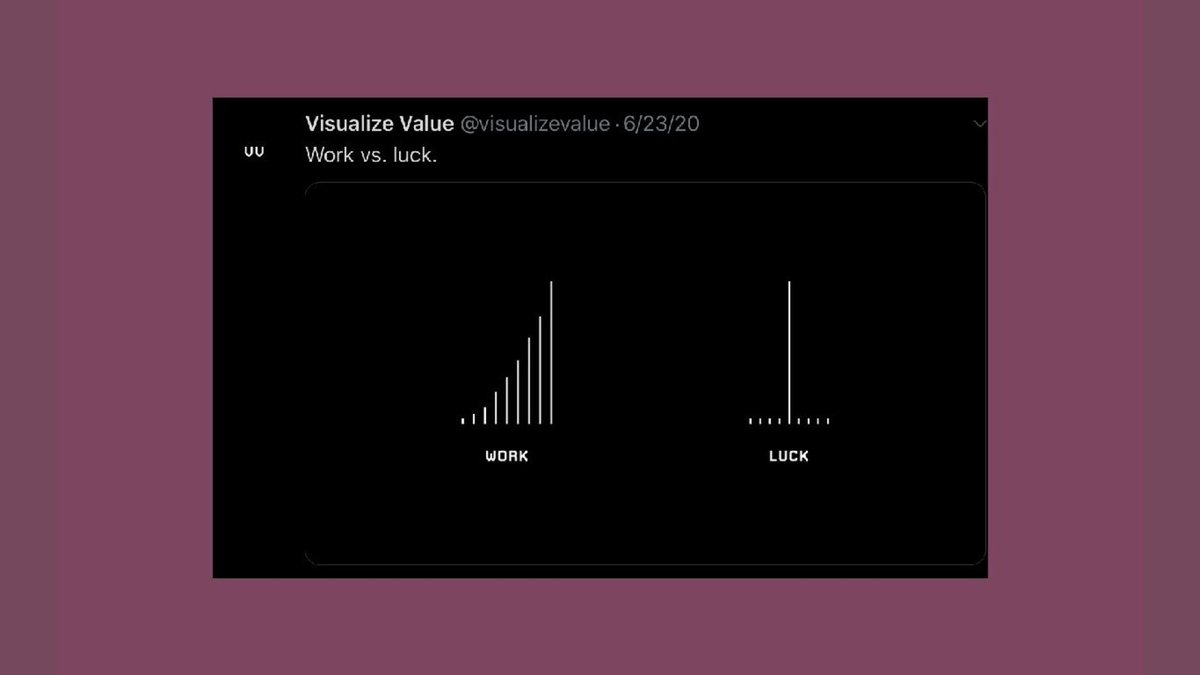
For example, with @visualizevalue, Jack limits himself to geometric forms and a black and white color scheme and a set typeface.
In being limited, he becomes limitless creatively.
For example, with @visualizevalue, Jack limits himself to geometric forms and a black and white color scheme and a set typeface.
In being limited, he becomes limitless creatively.
I’ve seen this in my work too.
I never learned how to use Photoshop to edit pictures.
I used Snapchat because it was free. It had some limited tools but that forced me to think creatively to get around its constraints.
I never learned how to use Photoshop to edit pictures.
I used Snapchat because it was free. It had some limited tools but that forced me to think creatively to get around its constraints.
Visuals are like mental models.
They are a common ground for all of us to quickly grasp a concept.
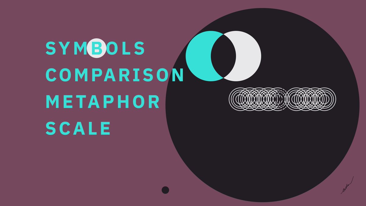
You can illustrate value through:
1. Symbols
2. Comparison
3. Metaphor
4. Scale
They are a common ground for all of us to quickly grasp a concept.
You can illustrate value through:
1. Symbols
2. Comparison
3. Metaphor
4. Scale
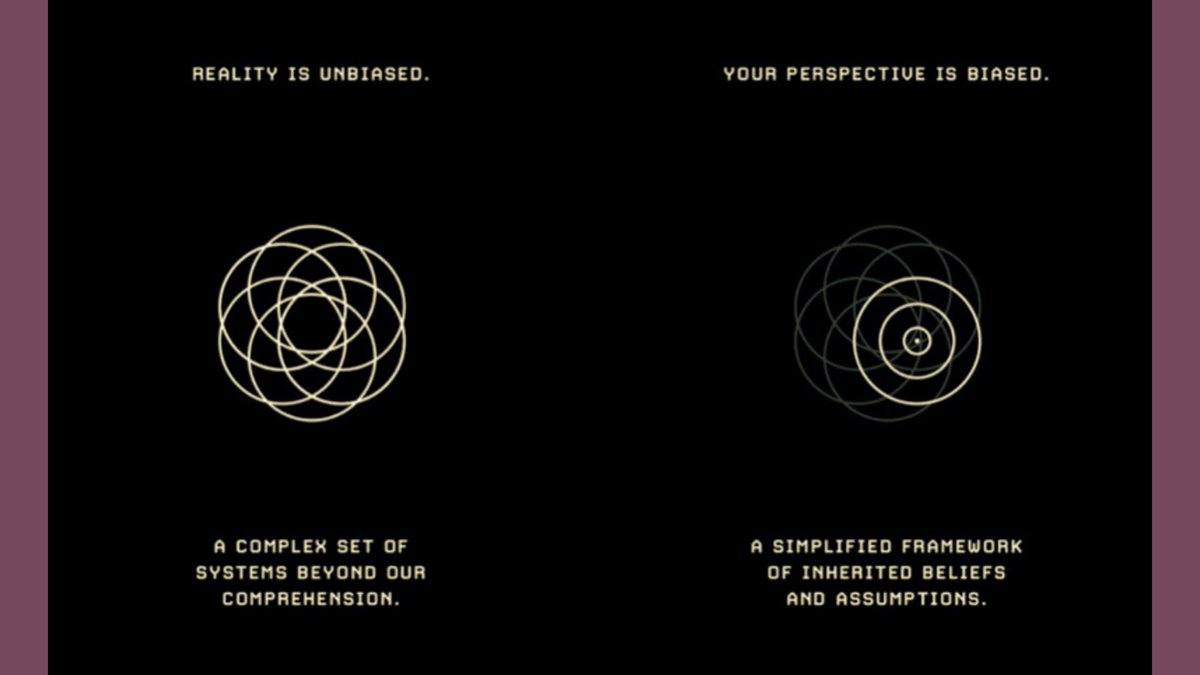
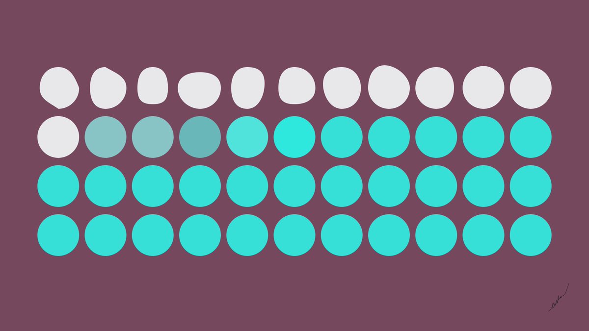
Here& #39;s a great example of how Jack takes a quote and breaks it into a visual.
“Reality is unbiased. A complex set of systems beyond our comprehension. Your perspective is biased. A simplified framework of inherited beliefs and assumptions."
“Reality is unbiased. A complex set of systems beyond our comprehension. Your perspective is biased. A simplified framework of inherited beliefs and assumptions."
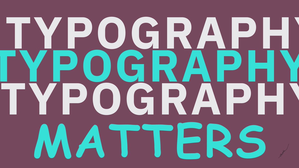
Typography MATTERS.
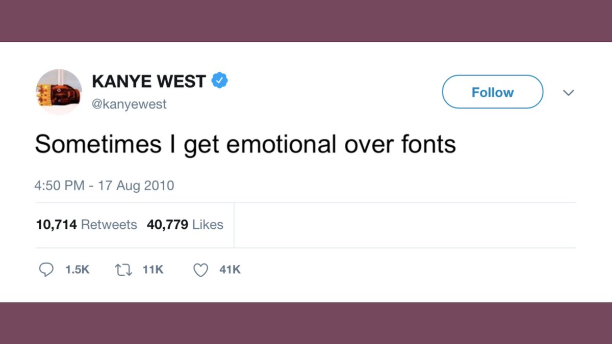
This was crazy to me because I& #39;d always sort of known this intuitively but I didn& #39;t appreciate the differences of typefaces and how I could use them more effectively until I got through Jack& #39;s module on typefaces.
This was crazy to me because I& #39;d always sort of known this intuitively but I didn& #39;t appreciate the differences of typefaces and how I could use them more effectively until I got through Jack& #39;s module on typefaces.
How do you get better?
1. Volume
2. Reps
3. Iterate
Produce more, repeat the process to get more streamlined at what you produce, and focusing on a single idea will pay better dividends over time. You get a visual type of branding associated with your work.
1. Volume
2. Reps
3. Iterate
Produce more, repeat the process to get more streamlined at what you produce, and focusing on a single idea will pay better dividends over time. You get a visual type of branding associated with your work.
These are just some of the surface level concepts that changed how I approached design.
Understanding design is such a useful skill and by getting the basic skills down, you empower yourself to communicate with others in a way that strikes deep.
Understanding design is such a useful skill and by getting the basic skills down, you empower yourself to communicate with others in a way that strikes deep.
This is part of why I get fascinated with the art of things.
It feels like I& #39;m being talked to through a work.
It& #39;s not a written expression where I have to sit and read to understand.
I see, I process, I react.
Therein lies its power.
It feels like I& #39;m being talked to through a work.
It& #39;s not a written expression where I have to sit and read to understand.
I see, I process, I react.
Therein lies its power.
Having an eye for good aesthetic and good design is a skill I think everyone should seek to explore if not dedicate their career around.
There& #39;s a lot to be gained from being able to communicate your ideas, product or research visually.
There& #39;s a lot to be gained from being able to communicate your ideas, product or research visually.
This is part of the reason why I started writing @KnowledgeBoxNL every week.
I want to cultivate taste. https://twitter.com/visakanv/status/921207155910369280">https://twitter.com/visakanv/...
I want to cultivate taste. https://twitter.com/visakanv/status/921207155910369280">https://twitter.com/visakanv/...
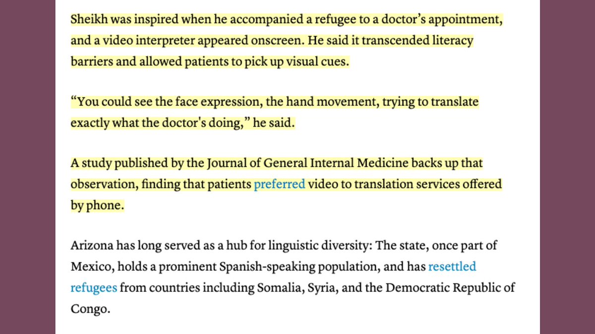
Visual cues are powerful.
Especially in medicine.
Informing patients effectively partly depends on it
https://www.thenewhumanitarian.org/news-feature/2020/07/30/coronavirus-immigrant-refugee-language">https://www.thenewhumanitarian.org/news-feat...
Especially in medicine.
Informing patients effectively partly depends on it
https://www.thenewhumanitarian.org/news-feature/2020/07/30/coronavirus-immigrant-refugee-language">https://www.thenewhumanitarian.org/news-feat...
If you enjoyed reading this...
Here are some related threads https://abs.twimg.com/emoji/v2/... draggable="false" alt="🤗" title="Umarmendes Gesicht" aria-label="Emoji: Umarmendes Gesicht">: https://twitter.com/eashankotha/status/1293935819195953154">https://twitter.com/eashankot...
Here are some related threads
Course Link:
https://shop.visualizevalue.com/products/how-to-visualize-value">https://shop.visualizevalue.com/products/...
https://shop.visualizevalue.com/products/how-to-visualize-value">https://shop.visualizevalue.com/products/...

 Read on Twitter