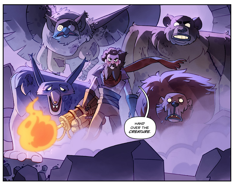
Help please!
I’m fed up with how I color. Could y’all link me to coloring tutorials you find helpful? I’m focusing on cell-shading/non-photo-realistic styles.
I’m also making a thread about my current coloring style—could you please tell me… where I’m going wrong…
I’m fed up with how I color. Could y’all link me to coloring tutorials you find helpful? I’m focusing on cell-shading/non-photo-realistic styles.
I’m also making a thread about my current coloring style—could you please tell me… where I’m going wrong…
People tell me—or they used to tell me—that I’m good with color. The truth is I have never seriously studied color theory and always just went with my gut. Which I’m sure has led me to some bad/befuddling habits. Plz don’t make fun of me lol
The first steps are pretty universal:
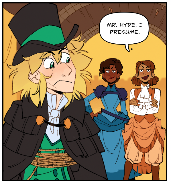
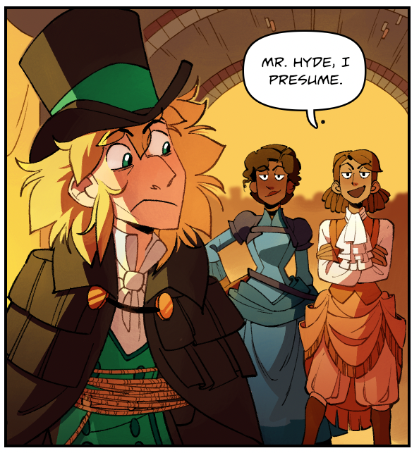
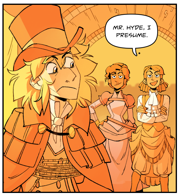
First I start with flat colors. Ugly as sin. I always hate how my pages look at this stage.
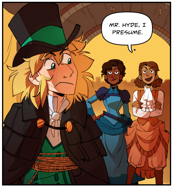
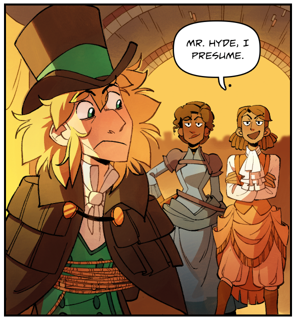
Then I layer on shadows in a MULTIPLY layer. Still pretty ugly.
First I start with flat colors. Ugly as sin. I always hate how my pages look at this stage.
Then I layer on shadows in a MULTIPLY layer. Still pretty ugly.
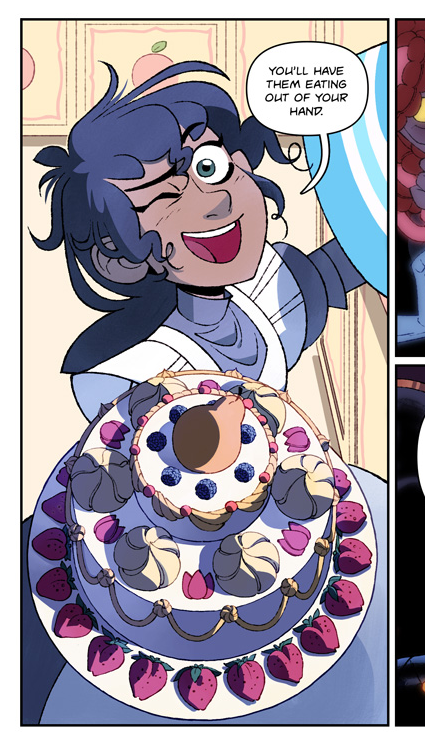
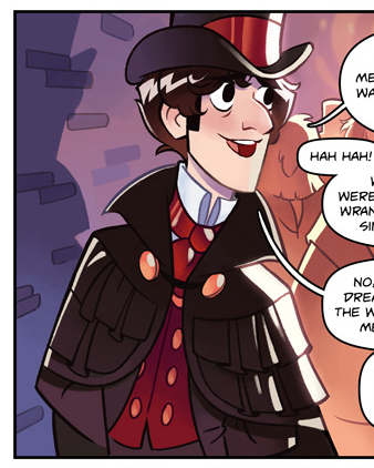
(like, that bright blue of Betsy& #39;s dress and the black of Hyde& #39;s cape feels really out of place in this otherwise very warm environment)
OKAY HERE’S WHERE IT STARTS TO GET WEIRD
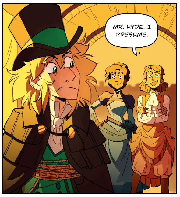
Next I select the OPPOSITE of the shadow layer and fill in the whole area with a bright-ass highlight color on HARD LIGHT. Then I heavily erase with a gradient brush until I get a midtone color that feels “right”
Next I select the OPPOSITE of the shadow layer and fill in the whole area with a bright-ass highlight color on HARD LIGHT. Then I heavily erase with a gradient brush until I get a midtone color that feels “right”
Side note: A common form of cell shading uses 3 layers: shadow, midtone, highlight. I tend to use highlights VERY sparingly because I think having all three tends to look busy and breaks up the shapes too much? Sometimes I do thin rim light highlights on more polished pieces.
WEIRDNESS, PART 2:
I create a second layer set to HARD LIGHT and fill the ENTIRE IMAGE with another highlight color. Then I erase until the final image “feels right”. In practice, this layer usually serves as a bounce light so that the dark shadows don’t feel so flat.
I create a second layer set to HARD LIGHT and fill the ENTIRE IMAGE with another highlight color. Then I erase until the final image “feels right”. In practice, this layer usually serves as a bounce light so that the dark shadows don’t feel so flat.
I suspect my problem has to do with functionally using two highlight layers—either that or the fact that both highlight layers are set to “HARD LIGHT”, a pretty harsh layer setting. I don’t know why I use it—I just don’t know how to do it any other way.
The net effect of this coloring style is that night scenes tend to look much more vibrant than day scenes, which at worst can look downright washed out.
(Granted, the night scenes look TERRIBLE at first—I have to do a lot more work cheating the lighting and adding in convenient new light sources to make the panels “read” at all. The end result is better but I’d kill myself if I had to put that much effort into every page.)
The obvious choice is to drop one of the highlight layers, but I swear to God, whenever I try that the colors look cheap, flat, and digital in a bad way. I see artists who can light daylight scenes and still keep their colors vibrant and I’m like HO. Hence: Tutorials, please!
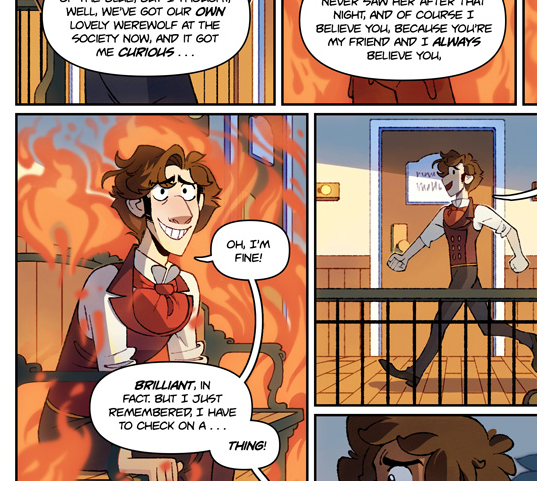
I didn’t color this way until midway through chapter 4 of The Glass Scientists. I used to color with: A) Flat colors B) a BRIGHT AS FUCK rim light C) a gradient bounce light from below.
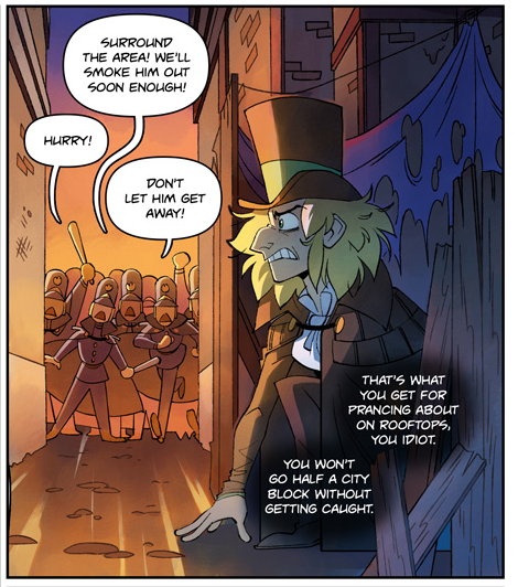
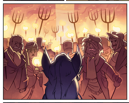
I think a lot of readers prefer this look because it’s much more vibrant, but I switched it because A) it took forever and B) it only looked good in nighttime scenes. I developed it during Chapter 1, which takes place at night with BRIGHT torchlights to justify the rim light
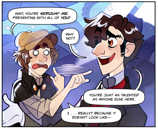
In daylight, the dark colors looked flat and the rim light looked ridiculous. And even during night scenes, characters looked weird if they overlapped at all. This second panel here took SO much extra work to make it look decent.
Plus, with those huge, stark rim lights, I couldn’t really add any cell-shaded shadows (rim lights imply that every other part of the character is in shadow, so adding MORE shadows on top of that looks cluttered). It really limited what I could do.
Plus plus, coloring backgrounds—and making characters read against those backgrounds—was a weekly nightmare. My choice was often between “kinda dull looking colors” and “complete chaos of random shapes and colors that make no coherent sense”.
Despite all that, the old style WAS more vibrant. And it preserved the “base” color much more strongly. As one anonymous commenter pointed out, “How come your colors are so ugly and washed out now?”
(Unfortunately, rude comments like this are sometimes the only way I can tell readers are dissatisfied. I have gotten SOME constructive criticism, but I am not exaggerating when I saw the majority of “critiques” I get on my work sound like something out of Mean Girls.)
“Oh, your colors used to be so nice, what happened?” “Oh, I thought it was because your colorist was bad at their job” (They’re not!!!) “Don’t worry, I LIKE how ugly and washed out your colors are” “I thought you were making a statement about the ugliness and bleakless of life”
What I want to say to ALL these people is “I’m not doing this on purpose! I’m just trying my best!” Or perhaps “trying my best” isn’t the best way to put it. I’m trying to make it look as good as possible given my limited skillsets and time.
Like, Calarts is a GREAT SCHOOL, but we had one (1) Color and Design class in which I learned that red and yellow make orange and also that goache is expensive.
I’m honestly super embarrassed to be posting about this. I’ve been working in animation for seven years, how do I not know how to color good??
Truthfully, I haven’t colored anything in a professional setting since I was an intern. As a TV director and storyboard artist, I literally never deal with color. I have focused instead on boarding and writing.
But when my professional work is locked behind NDAs and the only thing I have to show for my work is my comic…. Yikes
Anyway, TL;DR I want to get better at color. Help please?
Anyway, TL;DR I want to get better at color. Help please?

 Read on Twitter