It& #39;s time for the information no one asked for but that I spent six months analyzing: the definitive ranking of every state license plate.
First, let& #39;s discuss the ideal license plate. Obviously, overall aesthetic and design (font choice, use of space, etc.) are key. It should also have some kind of imagery that would be identifiable as being of its specific state even if the state name were removed.
In cases where I couldn& #39;t decide which of two states should be ranked higher, I put any that were predominantly red, white and blue lower for lack of creativity. License plate history is not considered in this ranking (with a slight exception for Tennessee).
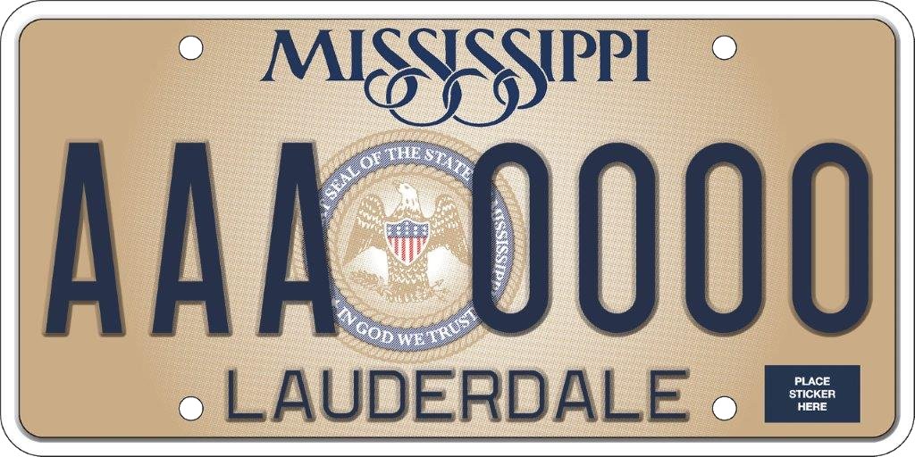
#50: Mississippi. An all around easy choice for last place. The color is terrible, the font is annoying and no one can identify Mississippi by its state seal, which isn’t even centered.
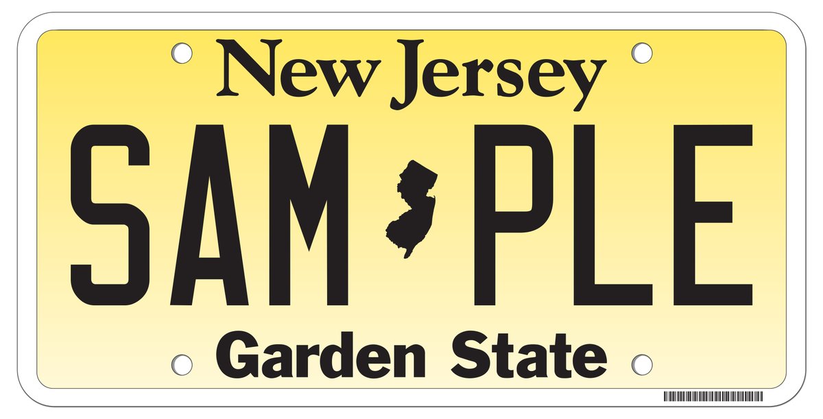
#49: New Jersey. They really went for it with not one but TWO subpar fonts, no interesting imagery and a background in what I instinctively want to call "pee yellow."
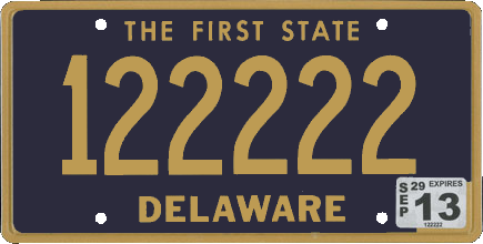
#48: Delaware. They had longer than anyone else to improve on this design and they said “no thanks, we’re good with our first draft.”
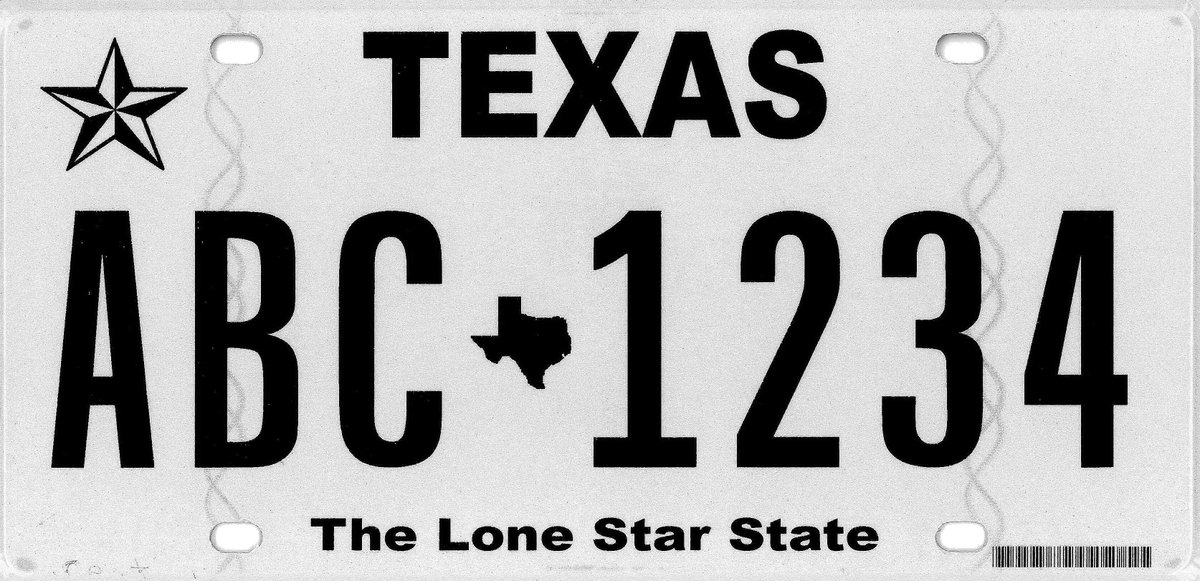
#47: Texas. It only outranks three other states because it’s more boring than ugly and someone thought to add a lone star, which is something, I guess.
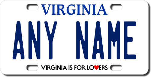
#46: Virginia. It’s boring, and it uses a serif font, which is scientifically hard to read, counterintuitive to the entire purpose of license plates.
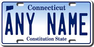
#45: Connecticut. It looks like every state got a license plate template to use as inspiration and Connecticut waited until the day the design was due and just changed the text from “Your State Here” and “Slogan Example” before turning it in.
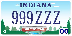
#44: Indiana. Like Indiana itself, this license plate is ugly, boring and I could happily live the rest of my days without ever seeing it again.
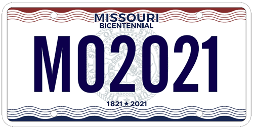
#43: Missouri. Hey Missourians, since you filled out a legal document to get your license plate, here’s a license plate that looks like a legal document. It took us 200 years to develop.
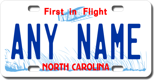
#41: North Carolina. First in flight? More like first design draft, am I right? But really, this is unacceptable.
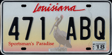
#40: Louisiana. The lowest-ranked of the faded photorealistic background plates. None are great but Louisiana’s is clearly the worst. And the cursive state name doesn& #39;t work great, either (that goes for you, too, California and Tennessee).
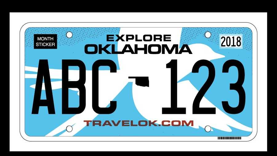
#39: Oklahoma. Apparently this is supposed to be a bird, which is not clear at all at first glance. Although I& #39;ve never been to Oklahoma, so maybe birds there are all just silhouettes. And the font is one of the worst used by any state.
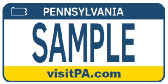
#38: Pennsylvania. Not distinctive and too easily mistaken for West Virginia or Nebraska.
To be continued later, because I spent way too long on this ranking to give you people all of this ~PRIME CONTENT~ all at once. A spreadsheet and entire pack of Post-Its may have been involved.

 Read on Twitter