I love assessment data. How much do I love assessment data?
I love assessment data so much that I built a database comprised of all 3 million+ parcels in New Jersey, just so I can map and analyze the data.
I love assessment data so much that I built a database comprised of all 3 million+ parcels in New Jersey, just so I can map and analyze the data.
New Jersey has a decent catalog of publicly available data at least compared to some of its peers (looking right at you, Connecticut). For assessments, tabular data can be downloaded from a service operated by Monmouth County. Parcel-level data can be downloaded for every county.
Every county but Ocean County, that is. For Ocean, I had to download parcel data maintained by the county& #39;s GIS personnel. This is more problematic than it seems because municipal assessors and state/county GIS staffers use different methodologies.
Still, it had to do.
Still, it had to do.
Having downloaded parcel-level data for each county, I imported them into SQL. A simple UNION ALL grouping set made it one big table.
For analysis, I downloaded relevant indicators at a variety of geographic levels.
I also created several custom geographies using ESRI including one for every tax block, with a unique municipal and tax block code.
I also created several custom geographies using ESRI including one for every tax block, with a unique municipal and tax block code.
I imported each of these tables into SQL and then the fun began.
Land records contain a bevy of valuable (re: interesting) columns. Their structure varies by jurisdiction but they should share many of the same components: land assessment, improvement assessment, total, last sale price and date, property class, etc.
So, yeah, a lot of cool stuff. I kept it simple and looked primarily at the land, improvement, and total assessment values. I added a new column and created an equalized value for each using the equalization ratios I downloaded from NJ DCA.
This was to adjust for any variations due to some municipalities conducting revaluations less often than others. Fortunately, this is less of a concern in New Jersey than it is in other states.
Land records have several geographic identifiers at several levels of geographic hierarchy. I also used ESRI to match every tax block to a specific Census block group.
The boundaries of Census block groups are a great tool to use for aggregating other types of local data. They& #39;re compact and cover a local area and yet they& #39;re large enough to view (and map!) at a more regional scale.
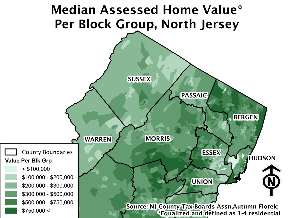
For instance, look at the following map for North Jersey. Though they& #39;re meant for granular analysis, block groups can be used to map patterns at the county and regional level.
A map of median assessed home value per block group. This gives you a rough idea of the distribution of wealth derived from housing throughout North Jersey. Yes, Northern Bergen and Eastern Morris counties have some of the wealthiest locales in the state.
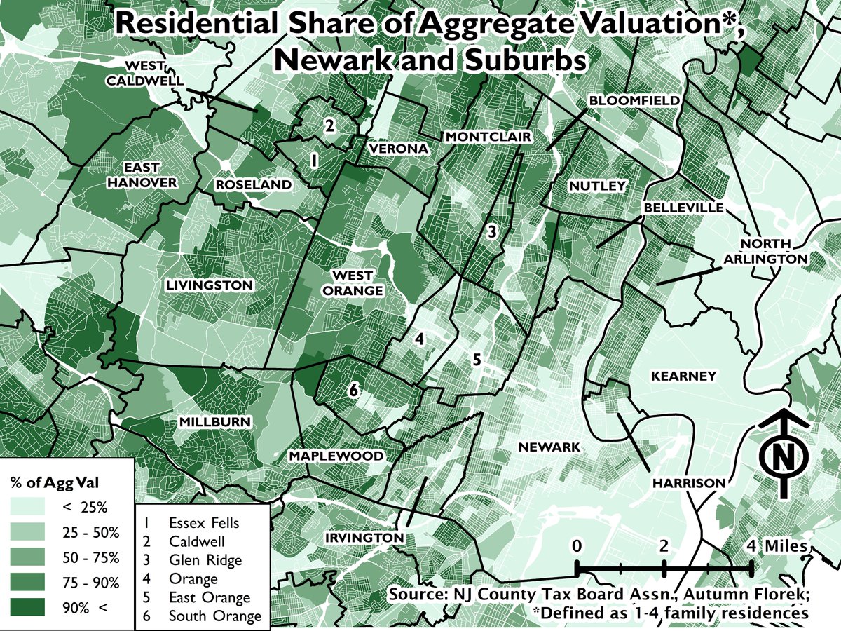
Zooming in, let& #39;s look at my favorite part of the state, Newark and the suburbs that surround it.
You can easily see Newark on the right. Assessed values are highest in Ironbound (the triangular dark green in the east), Vailsburg (the western panhandle) and in the neighborhoods around Branch Brook Park in the north.
As for the suburbs, values generally increase in proportion to distance from the urban core. The communities with some of the highest include Livingston, Essex Fells, Glen Ridge, and Millburn.
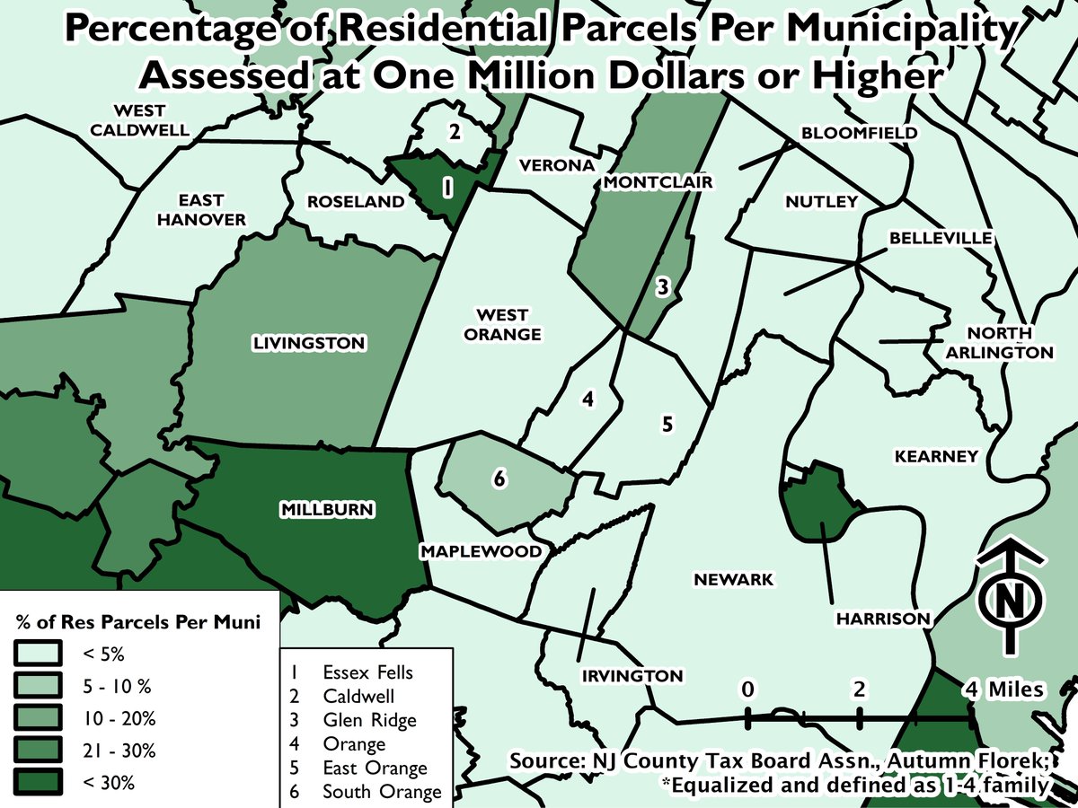
You can calculate - and map - the percentage of homes assessed at $1 million or more. Using that as a metric, Millburn, Essex Fells, and Summit are among the most exclusive suburbs in North Jersey. Also note Harrison where there has been a recent spurt of luxury construction.
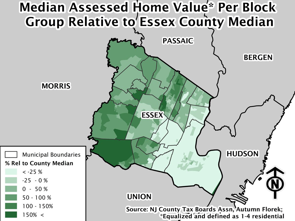
You can compare the median per block group to the median countywide. In places like Short Hills and in Montclair close to Eagle Rock, the median home can be at least 1.5 times the county median.
The other extreme is just as stark with values depressed in Essex County& #39;s urban municipalities - Newark, Irvington, Orange, and East Orange.
You could use this data to calculate a Gini coefficient though I didn& #39;t do that here.
You could use this data to calculate a Gini coefficient though I didn& #39;t do that here.
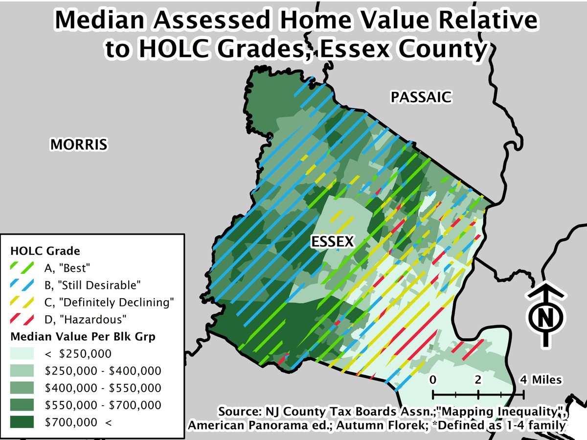
Interestingly, median home values overlap quite nicely with HOLC grades from the 1930s. Yes, HOLC appraisers looked at much of Essex County.
Using quartiles, you can get an even better look at the distribution in values as measured through assessment data.
What if you want to see the spatial distribution of assessed values *within* municipalities? You can calculate a municipal median, then get the percentage of parcels in each geography (here block group) that are above that median.
To put it another way, you can identify the neighborhoods that contribute the most in property taxes. These include places like Llewellyn Park in West Orange, Upper Montclair in Montclair, and Short Hills and Wyoming in Millburn.
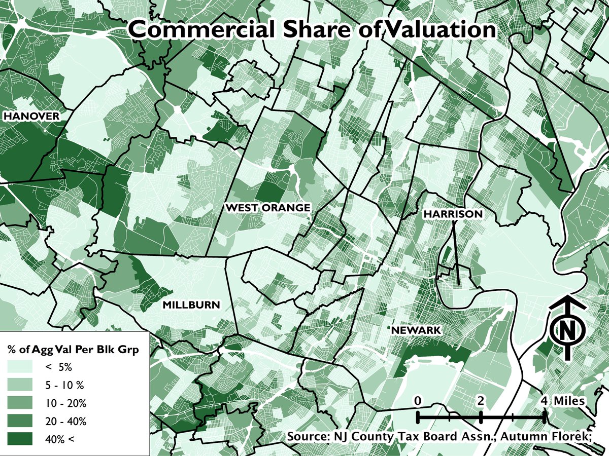
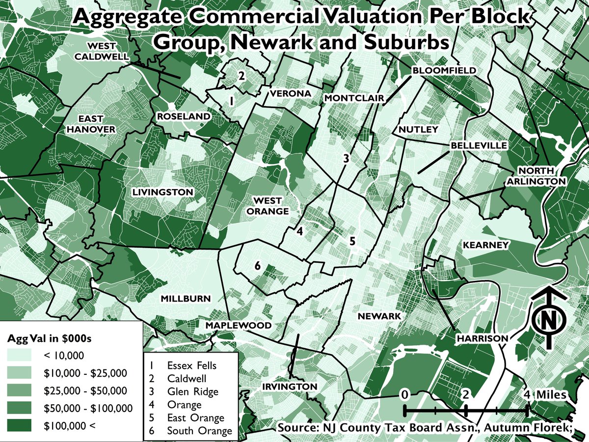
But Autumn, you say, I& #39;m not interested in residential data - I want to see data for nonresidential assessments. You can check that out, too. Who can spot the block groups with malls and large office parks?
If you obtain and map the aggregate commercial valuation per block group, you can get an even better idea of the long-term trends for the retail and especially the office real estate markets. Eastern Morris County (the left hand side) is chock full of large office complexes.
Back to residential. Public assessor valuation data typically includes two components: one for land and one for the improvements on the land. This can be useful in a whole bunch of ways.
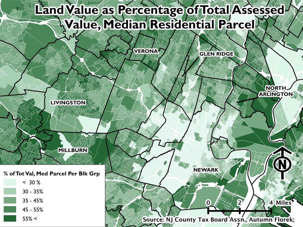
In particular, land (and improvements) can be calculated as a percentage of the total assessed value of a parcel. You can aggregate it and calculate a measure of central tendency as well. See below. cc @jongeeting
What story does this tell?
Higher land to total value ratios indicate that the value of the land accounts for a greater share of valuation - and inversely, that improvements account for a smaller share.
Higher land to total value ratios indicate that the value of the land accounts for a greater share of valuation - and inversely, that improvements account for a smaller share.
Darker shades of green indicate places where land is so valued so highly that it can sustain more development than currently exists.
So, this analysis could be used to identify places where zoning and other development regulations have impeded development even though it& #39;s economically feasible.
I just want to point out Glen Ridge. The entire municipality is designated as a local landmark district and its zoning code allows only a few types of multifamily residential in (I believe) a narrow corridor along Bloomfield Avenue.
(I& #39;ve been waiting for ages to call out Glen Ridge. Let me savor the moment.)
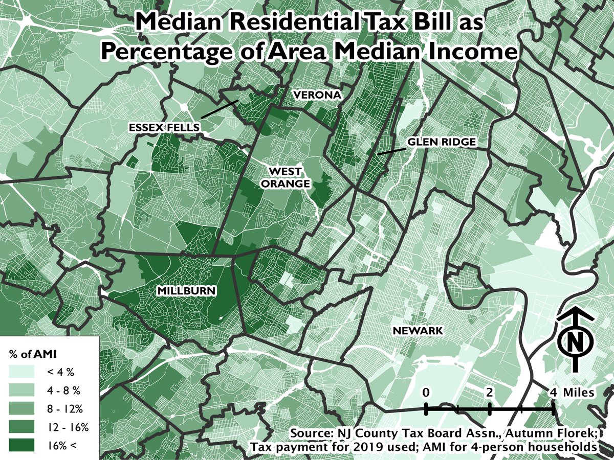
You can use assessment data to look at other subjects - not just valuation assessed. Property taxes, for instance. Here& #39;s a map of the median tax payment per block group as a percentage of the area median income.
It& #39;s another way of looking at spatial equity. You need to have a high net worth and/or income to afford the tax bills in many of these neighborhoods.
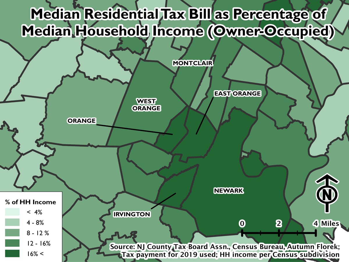
The absolute tax payment, however, doesn& #39;t get at the financial burden imposed by property taxes on the residents of a given municipality. Looking at median taxes as a % of the median owner-occupied income, you can see that the burden falls heaviest on Essex County& #39;s urban areas
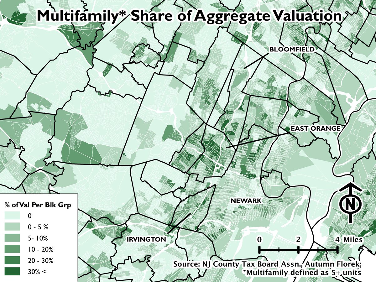
I know some of my followers care about multifamily housing as well. Can you look at that? In a way, yes!
Multifamily development comprises a relatively high share of assessed valuation in the cities as well as suburbs like Bloomfield, Montclair, and South Orange.
Multifamily development comprises a relatively high share of assessed valuation in the cities as well as suburbs like Bloomfield, Montclair, and South Orange.
Question: Multifamily is defined as any property with 5 or more parcels. How do we know if these parcels have large multiunit structures or so-called & #39;missing middle housing& #39;?
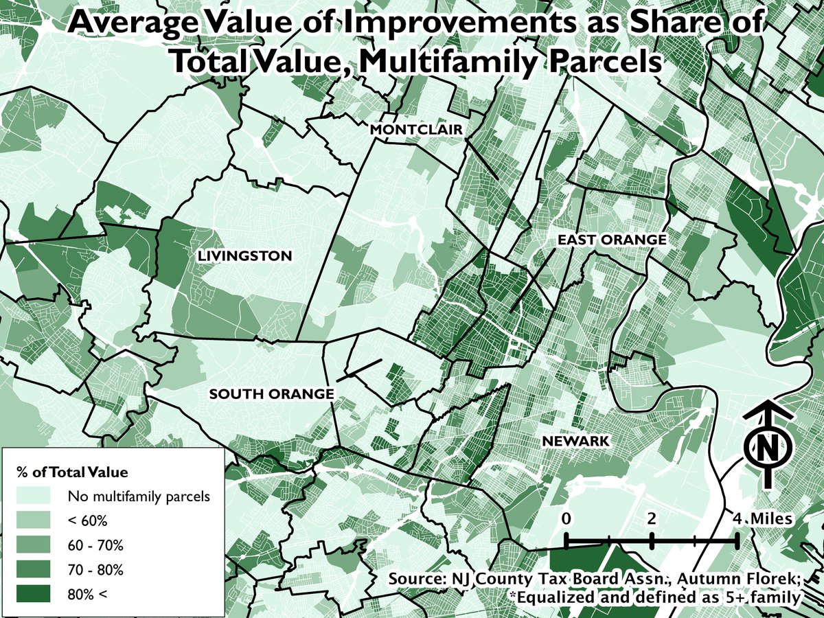
Well, we can look at the % of total value accounted for by improvements:
Well, we can look at the % of total value accounted for by improvements:
Montclair has some large, even very large apartment buildings, but it appears to have a a good number of smaller apartment buildings as well.
In my beloved South Orange, multifamily tends to be mostly in larger apartment buildings in the community& #39;s core.
In my beloved South Orange, multifamily tends to be mostly in larger apartment buildings in the community& #39;s core.
Special mention to my beloved South Orange. I spent a *lot* of time working there. It& #39;s an affluent suburb, but one with a lot of transit-oriented multifamily development. You wish that your suburb was like South Orange.
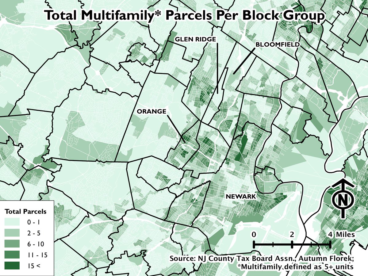
Which suburbs have made it illegal to develop any multifamily housing? Here& #39;s a map of the *total* number of multifamily parcels per block group. In general, Eastern Morris and Western Essex Counties have relatively little in the way of multifamily development.
What else, what else... Here& #39;s a map with the percentage of parcels that are vacant in each block group. In places like Newark this could show disinvestment while in affluent suburbs like Essex Fells it may indicate land designated for conservation (and development prohibited).
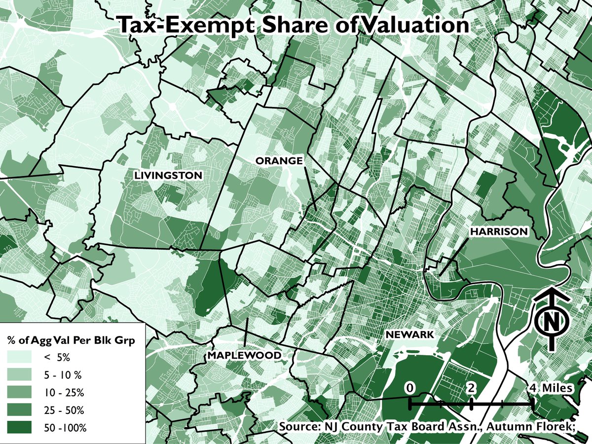
And here& #39;s a map of the share of total valuation that& #39;s exempt from taxation. As you can see, tax-exempt institutional uses can be a mammoth burden to the public finances of places like Newark.
I performed this analysis for all of New Jersey, so I may (probably?) have similar threads for other parts of the state. I hope to do something similar for sales data as well.
That& #39;s it for now though. (fin)
That& #39;s it for now though. (fin)

 Read on Twitter
