Why do we use godawful blue-background-with-bright-yellow-text for medical school lectures?
A https://abs.twimg.com/emoji/v2/... draggable="false" alt="🧵" title="Thread" aria-label="Emoji: Thread">on magic lanterns, darkrooms, path dependence, and “things we do for no reason”
 https://abs.twimg.com/emoji/v2/... draggable="false" alt="👇" title="Rückhand Zeigefinger nach unten" aria-label="Emoji: Rückhand Zeigefinger nach unten">
A
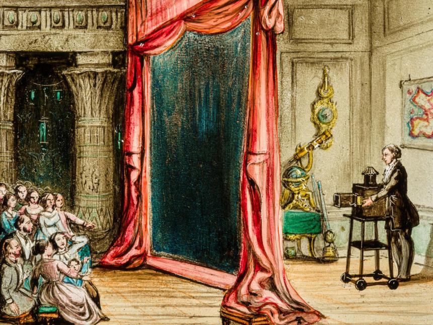
Projecting images is quite old, dating back to the 18th century with images painted directly on glass plates -- a magic lantern. During the Spanish Flu, the Surgeon General toured with a magic lantern with information on the pandemic.
As an aside, the @mfaboston had an amazing exhibit pre-pandemic called Phantasmagoria, showcasing magic lanterns and horror shows in particular. This demonstration (not a magic lantern BTW) on animalcules in the Thames was my favorite
https://twitter.com/AdamRodmanMD/status/998635334308126722">https://twitter.com/AdamRodma...
https://twitter.com/AdamRodmanMD/status/998635334308126722">https://twitter.com/AdamRodma...
You can imagine that painting images directly onto glass was time consuming to say the least. Some film alternatives were produced in the early 20C, but required incredibly bright bulbs and basically pitch dark.
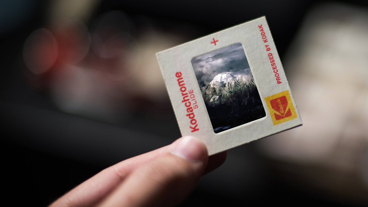
In the 1930s, Kodak released Kodachrome 35 mm slides, which used a “subtractive” development method, meaning they could be used in a normal (but darkened) room.
Then in 1960s, Kodak released the Carousel projector -- the first (or at least most popular) modern slide projector, which put slideshows within reach for pretty much anyone -- including scientists and medical school professors.
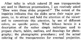
Graphs and charts were popular in scientific presentations, but they were harsh (and boring) to look at -- you were basically staring at a very bright light projection with thin squiggly lines. In 1972, CF Ignoffo published this on his apparently riveting entomology presentations
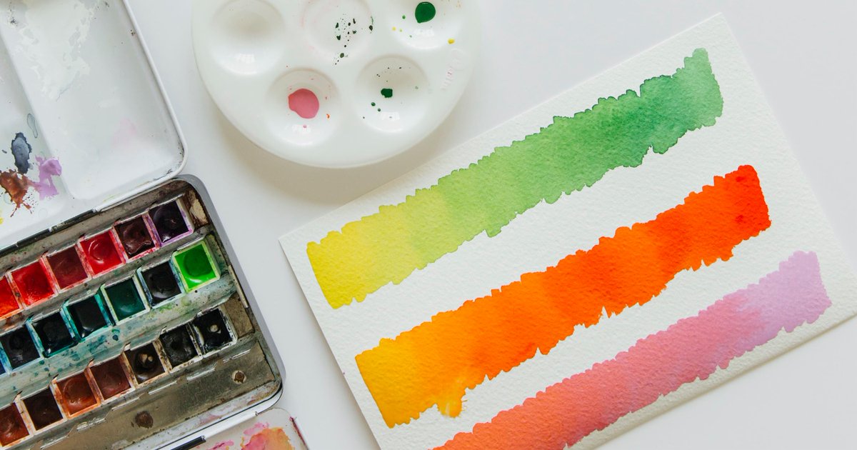
The process he describes called for “brilliant, concentrated watercolors” -- and apparently he used all different colors -- manually painting the background of slides, just like a magic lantern.
By the mid 70s, blue Diazo film had apparently become standard (“Most people prefer a blue background”), but the process was messy and time consuming (h/t @EViteriOft)
Funnily enough, an educational professor in 1972 actually tested this theory -- and found that blue was the WORST of all the colors for discerning information! (a plain white background was the best, even if annoying!
Despite this, by the early 1980s it had become standard to have blue slide backgrounds for scientific presentations. @EViteriOft sent me this wonderful forum discussion various development methods (including Diazo)
https://www.photrio.com/forum/threads/35-mm-word-slides-technique-1980s.172904/">https://www.photrio.com/forum/thr...
https://www.photrio.com/forum/threads/35-mm-word-slides-technique-1980s.172904/">https://www.photrio.com/forum/thr...
h/t here to @jbcarmody.
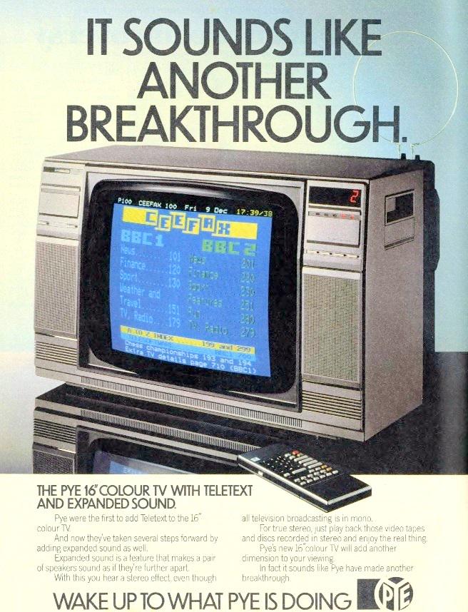
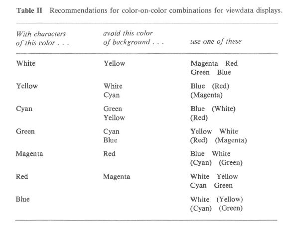
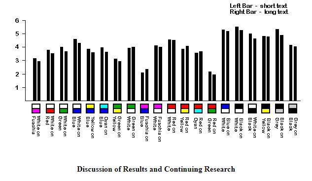
In 1982 Margaret Bruce tested a variety of combinations of teletext fonts and backgrounds (so on a commercial TV), and found that yellow on blue worked particularly well. (that being said, many colors did, including red on cyan).
In 1982 Margaret Bruce tested a variety of combinations of teletext fonts and backgrounds (so on a commercial TV), and found that yellow on blue worked particularly well. (that being said, many colors did, including red on cyan).
And if you& #39;re "a certain age" (as I am) you& #39;ll remember this was everywhere! My first programming language was QBASIC when I was 7 years old -- with a blue background and yellow/white/grey text!
What happened next? Apple released Powerpoint in 1987 -- originally designed to PREPARE 35mm slides, the company quickly realized it could replace them. They based its features by analyzing actual slidesets https://vimeo.com/181999729 ">https://vimeo.com/181999729...
In 1988 it was bought by Microsoft and a color version was released -- and since its features were based prominently on actual slides, its default was -- you guessed it! -- blue and yellow!
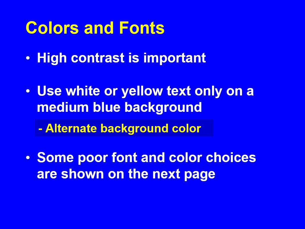
And that is how you end up with this guide to a national scientific conference in 2006 and the advice that @jbcarmody references to only use this at national meetings
There doesn& #39;t appear to be a particularly compelling scientific reason to use blue-yellow slides; the data for teletext suggest that there are plenty of good color combinations, and modern projectors are far stronger than what Ignoffo was using in the 70s.
And now time to get very meta. I just spent two hours tracking back a fairly innocuous (though annoying) “thing we do for now reason” in medicine.
What other things do we commonly do to patients today that have a similar evidence basis to “blue powerpoints with yellow text?
Why do we have a medical culture that largely accepts tradition?
What else do we only do because of path dependence?
Why do we have a medical culture that largely accepts tradition?
What else do we only do because of path dependence?
#spoileralert: a lot of things. And if you’re interested in that, I produce an entire podcast of medical history and how modern medicine came to be called @BedsideRounds. You can even get CME credit if you& #39;re a member of @ACPinternists!
I should also note that Powerpoint didn& #39;t because dominant until the late 90s. The "pre-powerpoint" Harvard Graphics also used the teletext blue...
... as did Powerpoint& #39;s biggest competitor, Lotus Freelance.
BTW, the Computer History Museum has a very interesting oral history of PPT! http://archive.computerhistory.org/resources/access/text/2012/06/102745695-01-acc.pdf">https://archive.computerhistory.org/resources...
BTW, the Computer History Museum has a very interesting oral history of PPT! http://archive.computerhistory.org/resources/access/text/2012/06/102745695-01-acc.pdf">https://archive.computerhistory.org/resources...
Are there better colors to use in a modern powerpoint? @JenniferSpicer4 pointed me to this modern research on PPT presentations -- it& #39;s actually remarkably similar to research in the 1970s showing black on white is the most readable! (and blue among the least)
(source: https://www.laurenscharff.com/research/survreslts.html)
And">https://www.laurenscharff.com/research/... in any event, we should generally try and rely less on powerpoints for text, and more on having an engaging presentation (h/t @FreedoBaggins who gives a great lecture on maximally using PPT)
And">https://www.laurenscharff.com/research/... in any event, we should generally try and rely less on powerpoints for text, and more on having an engaging presentation (h/t @FreedoBaggins who gives a great lecture on maximally using PPT)
TL;DR - 35mm  https://abs.twimg.com/emoji/v2/... draggable="false" alt="🎞️" title="Filmstreifen" aria-label="Emoji: Filmstreifen">used
 https://abs.twimg.com/emoji/v2/... draggable="false" alt="🔵" title="Blauer Kreis" aria-label="Emoji: Blauer Kreis">for visibility; early
  https://abs.twimg.com/emoji/v2/... draggable="false" alt="🖥️" title="Desktop-Computer" aria-label="Emoji: Desktop-Computer">used
  https://abs.twimg.com/emoji/v2/... draggable="false" alt="🔵" title="Blauer Kreis" aria-label="Emoji: Blauer Kreis">/
 https://abs.twimg.com/emoji/v2/... draggable="false" alt="🟡" title="Gelber Kreis" aria-label="Emoji: Gelber Kreis"> (among others) for visibility, and PPT and other slide presenters adopted these standards by default. Great example of path dependence!
I just saved you 20+ Tweets https://abs.twimg.com/emoji/v2/... draggable="false" alt="😄" title="Lächelndes Gesicht mit geöffnetem Mund und lächelnden Augen" aria-label="Emoji: Lächelndes Gesicht mit geöffnetem Mund und lächelnden Augen">
I just saved you 20+ Tweets

 Read on Twitter
 on magic lanterns, darkrooms, path dependence, and “things we do for no reason” https://abs.twimg.com/emoji/v2/... draggable="false" alt="👇" title="Rückhand Zeigefinger nach unten" aria-label="Emoji: Rückhand Zeigefinger nach unten">" title="Why do we use godawful blue-background-with-bright-yellow-text for medical school lectures?A https://abs.twimg.com/emoji/v2/... draggable="false" alt="🧵" title="Thread" aria-label="Emoji: Thread">on magic lanterns, darkrooms, path dependence, and “things we do for no reason” https://abs.twimg.com/emoji/v2/... draggable="false" alt="👇" title="Rückhand Zeigefinger nach unten" aria-label="Emoji: Rückhand Zeigefinger nach unten">" class="img-responsive" style="max-width:100%;"/>

