Data Scientists, Analysts, Visualization and Data Engineering skills are in demand now more than ever before. These skills could make your CV pop regardless of the industry you work in. It could also be the difference between a winning or a whack ass presentation. [Thread]
Roles defined:
Data Scientist - Someone who can predict the future based on past patterns
Data Analyst - Someone who derives meaningful insights from data
Data Engineer - Is responsible for developing a platform that Data Analysts and Data Scientists work on
Data Scientist - Someone who can predict the future based on past patterns
Data Analyst - Someone who derives meaningful insights from data
Data Engineer - Is responsible for developing a platform that Data Analysts and Data Scientists work on
Here& #39;s more details on Data Scientist vs Data Engineer vs Data Analyst, especially if you or someone you know is interested in working with data as a career:
https://data-flair.training/blogs/data-scientist-vs-data-engineer-vs-data-analyst/#:~:text=A%20data%20engineer%20is%20responsible%20for%20developing%20a%20platform%20that,to%20make%20data%2Ddriven%20decisions.">https://data-flair.training/blogs/dat...
https://data-flair.training/blogs/data-scientist-vs-data-engineer-vs-data-analyst/#:~:text=A%20data%20engineer%20is%20responsible%20for%20developing%20a%20platform%20that,to%20make%20data%2Ddriven%20decisions.">https://data-flair.training/blogs/dat...
BTW, my are of specialization is Data Engineering. I enjoy the analytical side of it as well, but I& #39;m not ready for Data Science yet https://abs.twimg.com/emoji/v2/... draggable="false" alt="🤣" title="Lachend auf dem Boden rollen" aria-label="Emoji: Lachend auf dem Boden rollen">
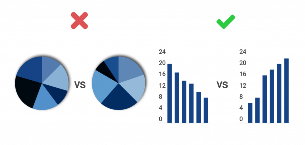
Visualization Specialists are seen as the spoiled youngest sibling and usually the least paid of the lot, but they are responsible for bringing the data to life. Something as small as using the right visual could make or break how well your data is presented.
The good news is that you don& #39;t need to study for many years to acquire some of these basic skills. You can bring some life to your PowerPoint presentations, CV& #39;s, websites, etc. This thread is to provide you with some info to give you that edge.
Most of you reading this thread will probably already know this, but for those of you who don& #39;t, MS Excel is still THE biggest data analysis tool! Keep those Excel skills sharp, and read this thread for more info about useful resources for Excel: https://twitter.com/Banker__X/status/1292822335070887940?s=20">https://twitter.com/Banker__X...
To show off your pretty pictures, PowerPoint is still the boss of them all. I was lazy so I didn& #39;t put much effort into finding the best PowerPoint courses, but here are some that I came across: https://digitaldefynd.com/best-powerpoint-courses/">https://digitaldefynd.com/best-powe...
Now to the fun stuff... Excel is great, but if you really want your data to pop, there& #39;s some great visualization tools available. The 3 most popular right now are MS Power BI, Qlik and Tableau. Each of them have a free version that you can use for your analysis.
Each of these tools have there advantages, but for anyone who is new to this, I would recommend Power BI. It& #39;s easy to get started up and there& #39;s lots of learning material online. I also happen to be a Microsoft fanboy, but that& #39;s a separate discussion https://abs.twimg.com/emoji/v2/... draggable="false" alt="🤣" title="Lachend auf dem Boden rollen" aria-label="Emoji: Lachend auf dem Boden rollen">
 https://abs.twimg.com/emoji/v2/... draggable="false" alt="🤣" title="Lachend auf dem Boden rollen" aria-label="Emoji: Lachend auf dem Boden rollen">
 https://abs.twimg.com/emoji/v2/... draggable="false" alt="🤣" title="Lachend auf dem Boden rollen" aria-label="Emoji: Lachend auf dem Boden rollen">
Here& #39;s a link for Power BI Learning material: https://powerbi.microsoft.com/en-us/learning/ ">https://powerbi.microsoft.com/en-us/lea...
Here& #39;s a link to the Power BI Desktop version, which is free: https://www.microsoft.com/en-us/download/details.aspx?id=58494">https://www.microsoft.com/en-us/dow...
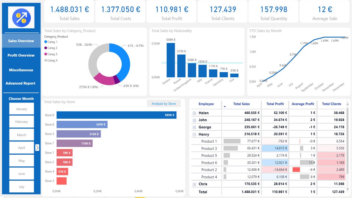
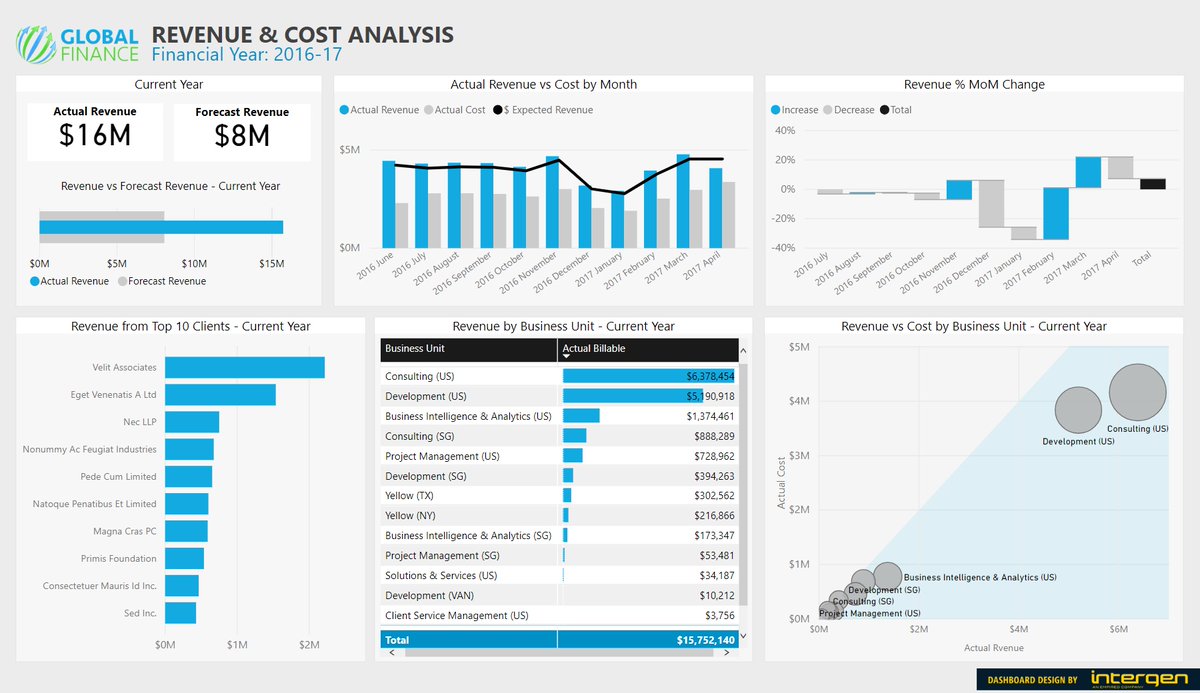
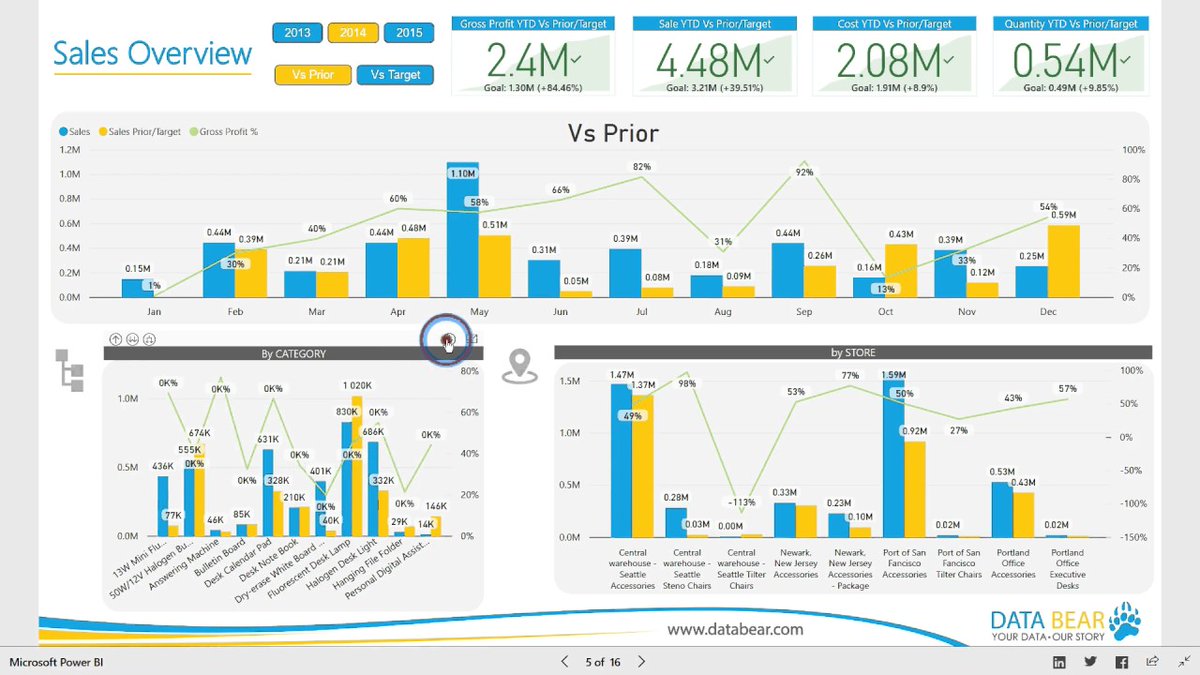
Here are some examples of dashboards created in Power BI. If you& #39;re a Finance or Sales Manager who& #39;s presenting this, I& #39;m inclined to believe you even if you& #39;re bullshitting me. This type of data is required in most organisations, very few present it like this though...
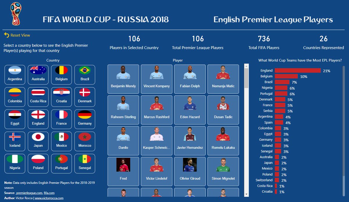
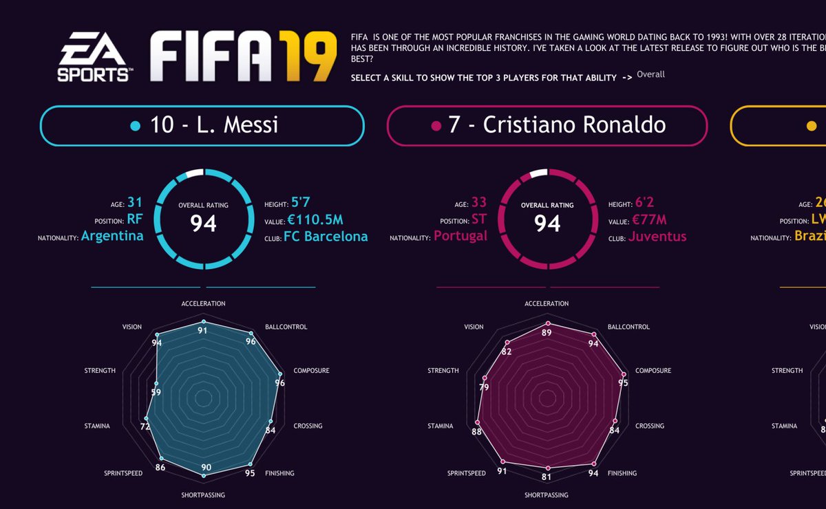
To sharpen up your analytical and predictive skills, make your learning fun by using datasets that you can relate to. I"m a sports fan, so I use football and cricket stats for practice. Here are examples of a World Cup dashboard in Power BI, and a player comparison in Tableau
Please swerve analysing COVID stats. It& #39;s depressing enough for us to have to live through this, don& #39;t let it into your learning. There are enough stats on the internet for this anyway.
If you want to keep up to date with the latest in Data Science, this will do: https://towardsdatascience.com/ ">https://towardsdatascience.com/">...
For Data Analysts who want to broaden there skills, learning to code in R Language and Python is a must. Datacamp offers some free learning, you will have to pay for more advanced modules, but it& #39;s a great place to start: https://www.datacamp.com/ ">https://www.datacamp.com/">...
Thanks to all the people who have contributed on @Banker__X so far. It& #39;s because of the great work being done there that gives me motivation to put together threads like these. The world needs more of us to pay it forward https://abs.twimg.com/emoji/v2/... draggable="false" alt="🙏🏽" title="Folded hands (mittlerer Hautton)" aria-label="Emoji: Folded hands (mittlerer Hautton)">
 https://abs.twimg.com/emoji/v2/... draggable="false" alt="🙏🏽" title="Folded hands (mittlerer Hautton)" aria-label="Emoji: Folded hands (mittlerer Hautton)">
 https://abs.twimg.com/emoji/v2/... draggable="false" alt="🙏🏽" title="Folded hands (mittlerer Hautton)" aria-label="Emoji: Folded hands (mittlerer Hautton)">

 Read on Twitter
![Data Scientists, Analysts, Visualization and Data Engineering skills are in demand now more than ever before. These skills could make your CV pop regardless of the industry you work in. It could also be the difference between a winning or a whack ass presentation. [Thread] Data Scientists, Analysts, Visualization and Data Engineering skills are in demand now more than ever before. These skills could make your CV pop regardless of the industry you work in. It could also be the difference between a winning or a whack ass presentation. [Thread]](https://pbs.twimg.com/media/EfP_bUtXgAE7Y4N.jpg)
