This valuation chart from Bloomberg is making the rounds, showing that world equities are overvalued because they exceed world GDP, like 2007, 2017 and the start of this year
Here’s a slightly longer term perspective, back to 1980, which shows that it was also overvalued (by slightly more) in 1999
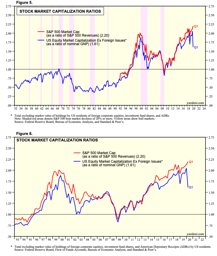
More than half of world equity market cap is just the US, so it’s a good barometer for the world. Here’s an even longer time series, back to 1950 from Doug Short
Is this a useful valuation metric? Not really, for two reasons. First: US market cap to GNP is about 147%. Is that good, bad or irrelevant? In Hong Kong, it& #39;s over 1000%. Japan is 120%. Singapore 187%. Switzerland 200%. Germany 54%. UK 64%, Argentina 9%.
Market Cap/GDP (blue line) is more or less the same as price/sales (red line), which has risen from less than 1 to over 2 since the early 1990s
Which brings up the second problem with this metric: profitability increases over time so each unit of sales brings greater returns. Since 1994, margins are up more than 100%, closely matching the increase in price/sales
US stocks are expensive - if next year’s EPS gets back to last year’s level, $SPX is trading at >20x FY21 and nearly 19x FY22 - but price/sales and market cap/GDP are faulty metrics best ignored

 Read on Twitter


