
 Read on Twitter
Hi, Twitter! It& #39;s Andi Egbert ( @dataANDInfo) with the APM Research Lab, here. Our #AMA is open now! Please use #ColorofCoronavirus to submit your questions. I& #39;ll get to as many as I can in the next 3 hours. What do you want to know about our work? https://www.apmresearchlab.org/covid/deaths-by-race">https://www.apmresearchlab.org/covid/dea...
 with the APM Research Lab, here. Our #AMA is open now! Please use #ColorofCoronavirus to submit your questions. I& #39;ll get to as many as I can in the next 3 hours. What do you want to know about our work? https://www.apmresearchlab.org/covid/dea...")
I& #39;ll reply to some of the  https://abs.twimg.com/emoji/v2/... draggable="false" alt="❓" title="Rotes Fragezeichen-Symbol" aria-label="Emoji: Rotes Fragezeichen-Symbol">s we& #39;ve received in our APM Research Lab inbox (info@apmresearchlab.org) over the course of this project as well. https://www.apmresearchlab.org/covid/deaths-by-race
https://www.apmresearchlab.org/covid/dea... href="https://twtext.com//hashtag/ColorofCoronavirus"> #ColorofCoronavirus
First up:
Q: What trends in mortality have you seen over the summer?
A: I just wrote a blog on this topic. In short, #COVID19 deaths dipped mid-summer but are now rebounding across all race groups: https://www.apmresearchlab.org/blog/summer-of-grief
https://www.apmresearchlab.org/blog/summ... href="https://twtext.com//hashtag/ColorofCoronavirus"> #ColorofCoronavirus
Q: What trends in mortality have you seen over the summer?
A: I just wrote a blog on this topic. In short, #COVID19 deaths dipped mid-summer but are now rebounding across all race groups: https://www.apmresearchlab.org/blog/summer-of-grief
Q from a health journalist: Where can I find #COVID19 death data by age AND race?
A: Our #ColorofCoronavirus data is compiled by race/ethnicity group and then adjusted for age differences we know exist in the groups. Most states do not release data by race AND age.
A: Our #ColorofCoronavirus data is compiled by race/ethnicity group and then adjusted for age differences we know exist in the groups. Most states do not release data by race AND age.
A, cont: The data submitted by states to the Natl Center for Health Stats (in the @CDCgov) shows deaths by race AND age but much of it is suppressed at the state level. However, national data is more robust (but lagged). Available here: https://data.cdc.gov/NCHS/Deaths-involving-coronavirus-disease-2019-COVID-19/ks3g-spdg">https://data.cdc.gov/NCHS/Deat...
Q: Why are you compiling data at #ColorofCoronavirus [ https://www.apmresearchlab.org/covid/deaths-by-race]?">https://www.apmresearchlab.org/covid/dea... Doesn& #39;t the @CDCgov do this?
A: No, the CDC data on #COVID19 mortality by race is not very timely & much of the data is suppressed (hidden).
A: No, the CDC data on #COVID19 mortality by race is not very timely & much of the data is suppressed (hidden).
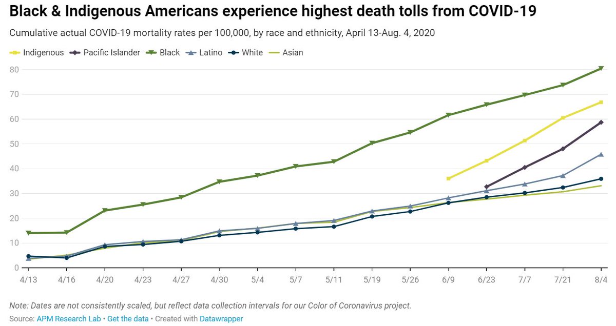
Q: Have the disparities in #COVID19 mortality by race gotten any better since you& #39;ve been tracking them?
A: Sadly, no. We see "deep & durable" racial disparities in the likelihood of dying that have been observed since we began monitoring in April. Trend:
#ColorofCoronavirus

A: Sadly, no. We see "deep & durable" racial disparities in the likelihood of dying that have been observed since we began monitoring in April. Trend:
#ColorofCoronavirus
A (cont): Actually, the #COVID19 mortality disparities are WIDENING over time between Black, Indigenous, Pacific Islander & Latino Americans vs. Whites. https://www.apmresearchlab.org/covid/deaths-by-race
https://www.apmresearchlab.org/covid/dea... href="https://twtext.com//hashtag/ColorofCoronavirus"> #ColorofCoronavirus #AMA
 #ColorofCoronavirus #AMA" title="A (cont): Actually, the #COVID19 mortality disparities are WIDENING over time between Black, Indigenous, Pacific Islander & Latino Americans vs. Whites. https://www.apmresearchlab.org/covid/dea... href="https://twtext.com//hashtag/ColorofCoronavirus"> #ColorofCoronavirus #AMA" class="img-responsive" style="max-width:100%;"/>
. @chjournalist, thanks. Nationally trends are very troubling, with deaths rising again. Hyper-local data about infections will help guide plans. I think the back-to-school issue is an unsolvable Rubiks cube. There are no good answers.
https://twitter.com/chjournalist/status/1293211297811705858
https://twitter.com/chjournal... href="https://twtext.com//hashtag/ColorofCoronavirus"> #ColorofCoronavirus
https://twitter.com/chjournalist/status/1293211297811705858
I found this article by @JonathanSShaw of @HarvardMagazine very illuminating: https://harvardmagazine.com/2020/08/covid-19-test-for-public-health
https://harvardmagazine.com/2020/08/c... href="https://twitter.com/michaelmina_lab">@michaelmina_lab argues that "we& #39;re doing it wrong" when it comes to testing. Imagine what a $1, paper-based, at-home test could do to chg this trajectory. #ColorofCoronavirus
A/1: @chjournalist, I& #39;m a mother to 2 of school-age kiddos so I can speak from my experience. Both my elem. & middle school-age child have grown comfortable with masks & disinfectants in their lives. Both want to help "solve the problem." That bodes well. https://twitter.com/chjournalist/status/1293215971306545152">https://twitter.com/chjournal...
A/2: @chjournalist, but the big BUT is, school is a numbers game. The # of exposures will be compounded. Research tells us younger kids may be less mask compliant, but less of a spreader threat, while older kids are more compliant but a higher threat. https://twitter.com/chjournalist/status/1293215971306545152">https://twitter.com/chjournal...
Q: Which states are not releasing helpful data on #COVID19 mortality by race?
A/1: I& #39;ll take this one in parts. Hawaii, N. Dakota, New Mexico, W. Virginia are the only 4 states still NOT releasing data on their websites. NM, however, provides data to @apmresearch via request.

A/1: I& #39;ll take this one in parts. Hawaii, N. Dakota, New Mexico, W. Virginia are the only 4 states still NOT releasing data on their websites. NM, however, provides data to @apmresearch via request.
A/2: When we began #ColorofCoronavirus (data thru April 8), only 7 states were reporting data on #COVID19 deaths by race & we knew the race of only 38% of deaths. Now we know the race of 93% of deaths in the U.S. So the picture has improved, but still plagued by uneven data.
A/3: The following states aggregate #Asian & #PacificIslander deaths into an API category: Arizona, Connecticut, Delaware, Idaho, Michigan, New Mexico, Oklahoma & Wisconsin. And 20 states do not report #Indigenous deaths but have classified them as “Other.” It& #39;s so aggravating.
This is an answer to the question y& #39;all didn& #39;t know you had: Q: Will @APMResearch feature some thought-leaders in an online #ColorofCoronavirus Response Panel?
A: Yes! 10 experts who& #39;ve shared insights w/ us will be featured on our website this THURSDAY. https://www.apmresearchlab.org/ ">https://www.apmresearchlab.org/">...
A: Yes! 10 experts who& #39;ve shared insights w/ us will be featured on our website this THURSDAY. https://www.apmresearchlab.org/ ">https://www.apmresearchlab.org/">...
Q: How much more likely are ppl of color to die of #COVID than whites?
A: Here& #39;s the latest: Adjusted for age, Black, Indigenous & Pacific Islanders are more than 3 times more likely to die than Whites & Latinos just below that 2.8X. Asians are 1.4X as likely.
#ColorofCoronavirus

A: Here& #39;s the latest: Adjusted for age, Black, Indigenous & Pacific Islanders are more than 3 times more likely to die than Whites & Latinos just below that 2.8X. Asians are 1.4X as likely.
#ColorofCoronavirus
Q from a CNN reporter in our inbox: At the state level, why you don& #39;t show how many times (a ratio) worse the mortality is between Whites & other groups?
A/1: Good Q. We present the data sorted from the largest absolute gap in mortality rates btwn groups.
#ColorofCoronavirus
 worse the mortality is between Whites & other groups?A/1: Good Q. We present the data sorted from the largest absolute gap in mortality rates btwn groups. #ColorofCoronavirus")
A/1: Good Q. We present the data sorted from the largest absolute gap in mortality rates btwn groups.
#ColorofCoronavirus
A/2: We do this because saying "XX times more" grows very large quickly with small numbers. E.g., a rate of 1 vs. 5 is a five-fold difference, whereas a rate of 100 vs 300 is only a 3-fold difference, but a much larger gap in outcomes.
#ColorofCoronavirus

#ColorofCoronavirus
A/3: However, we share all the data so that it can be reported that way as well. Black Americans, for example, are 4.5 times more likely to die in #NewYork than Whites, & 6.2 times more likely to die in #Michigan than Whites (top 2 states shown; divide green bar by grey bar).
.")
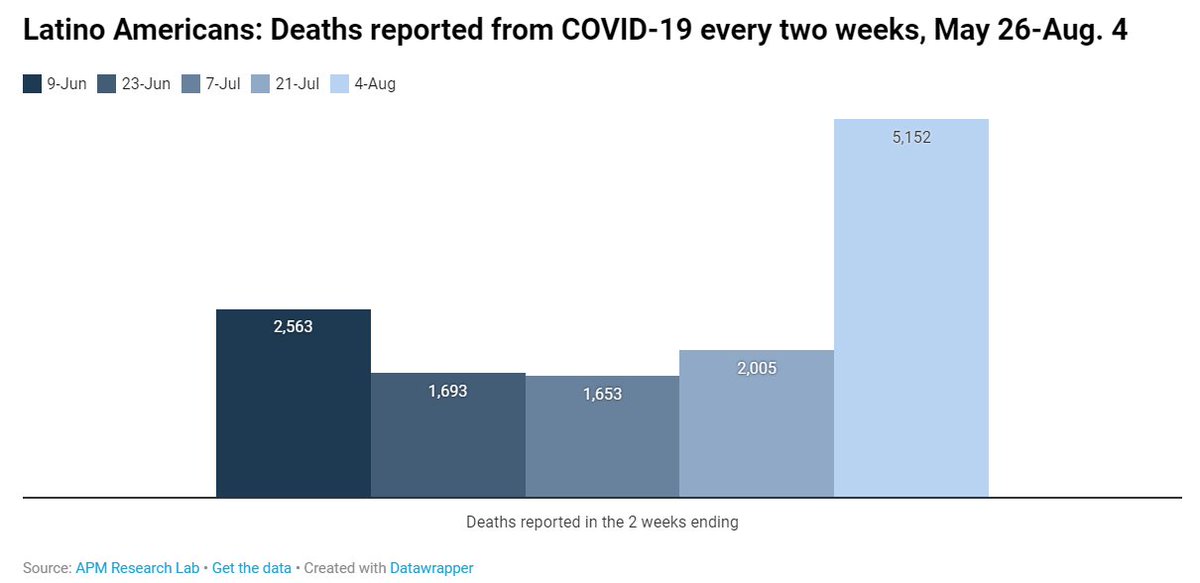
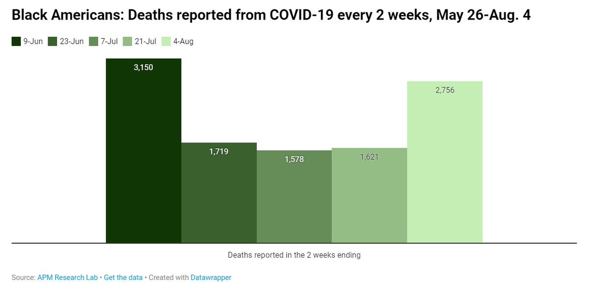
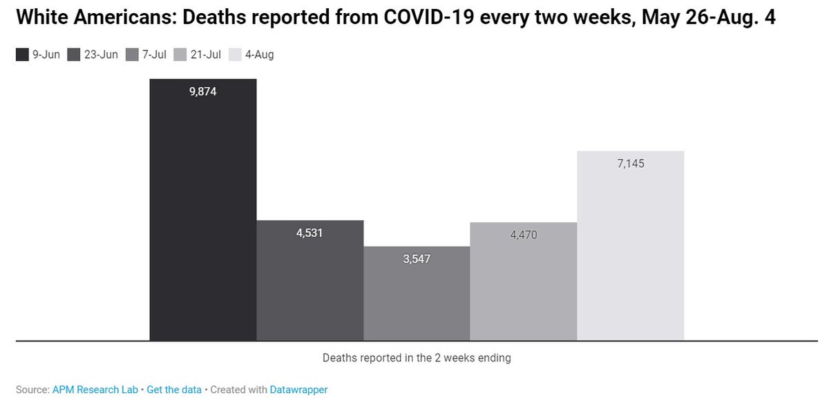
Q: Are things getting better?
A/1: Unfortunately our latest #ColorofCoronavirus analysis shows #COVID19 deaths rebounding across all race/ethnic groups nationally. See my new blog for more discussion on this: https://www.apmresearchlab.org/blog/summer-of-grief
https://www.apmresearchlab.org/blog/summ... href="https://twtext.com//hashtag/healthequity"> #healthequity #epitwitter #medtwitter
A/1: Unfortunately our latest #ColorofCoronavirus analysis shows #COVID19 deaths rebounding across all race/ethnic groups nationally. See my new blog for more discussion on this: https://www.apmresearchlab.org/blog/summer-of-grief
 #healthequity #epitwitter #medtwitter" title="Q: Are things getting better?A/1: Unfortunately our latest #ColorofCoronavirus analysis shows #COVID19 deaths rebounding across all race/ethnic groups nationally. See my new blog for more discussion on this: https://www.apmresearchlab.org/blog/summ... href="https://twtext.com//hashtag/healthequity"> #healthequity #epitwitter #medtwitter">
 #healthequity #epitwitter #medtwitter" title="Q: Are things getting better?A/1: Unfortunately our latest #ColorofCoronavirus analysis shows #COVID19 deaths rebounding across all race/ethnic groups nationally. See my new blog for more discussion on this: https://www.apmresearchlab.org/blog/summ... href="https://twtext.com//hashtag/healthequity"> #healthequity #epitwitter #medtwitter">
 #healthequity #epitwitter #medtwitter" title="Q: Are things getting better?A/1: Unfortunately our latest #ColorofCoronavirus analysis shows #COVID19 deaths rebounding across all race/ethnic groups nationally. See my new blog for more discussion on this: https://www.apmresearchlab.org/blog/summ... href="https://twtext.com//hashtag/healthequity"> #healthequity #epitwitter #medtwitter">
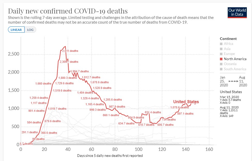
A/2: This graph of daily U.S. #COVID19 deaths by @OurWorldInData shows the summer rebound also. The question is, When do we peak again? Right now the trend is (sadly) growing infections & deaths.
#ColorofCoronavirus
https://ourworldindata.org/covid-deaths?country=~USA
https://ourworldindata.org/covid-dea... href="https://twtext.com//hashtag/healthequity"> #healthequity #epitwitter #medtwitter
#ColorofCoronavirus
https://ourworldindata.org/covid-deaths?country=~USA
 #healthequity #epitwitter #medtwitter" title="A/2: This graph of daily U.S. #COVID19 deaths by @OurWorldInData shows the summer rebound also. The question is, When do we peak again? Right now the trend is (sadly) growing infections & deaths. #ColorofCoronavirus https://ourworldindata.org/covid-dea... href="https://twtext.com//hashtag/healthequity"> #healthequity #epitwitter #medtwitter" class="img-responsive" style="max-width:100%;"/>
A/3: So big picture, things are not improving for the U.S. But at the state or local level, the trajectory may be far better (or far worse). The graphs & interactives @NPR by @alykat @DanielPWWood @connjie @shmcminn & others are especially helpful: https://www.npr.org/sections/health-shots/2020/03/16/816707182/map-tracking-the-spread-of-the-coronavirus-in-the-u-s">https://www.npr.org/sections/...
As mentioned before 10 experts who& #39;ve shared insights about our #ColorofCoronavirus project will be featured on our website this THURSDAY (8/13). Incl. @uche_blackstock @SpeakPatrice @berubea1 @alastanford @echohawkd3 @agrantth @Mona__Shah @kalamehta23
https://abs.twimg.com/emoji/v2/... draggable="false" alt="👀" title="Augen" aria-label="Emoji: Augen"> https://apmresearchlab.org"> https://apmresearchlab.org
 https://apmresearchlab.org " title="As mentioned before 10 experts who& #39;ve shared insights about our #ColorofCoronavirus project will be featured on our website this THURSDAY (8/13). Incl. @uche_blackstock @SpeakPatrice @berubea1 @alastanford @echohawkd3 @agrantth @Mona__Shah @kalamehta23 https://abs.twimg.com/emoji/v2/... draggable="false" alt="👀" title="Augen" aria-label="Emoji: Augen"> https://apmresearchlab.org " class="img-responsive" style="max-width:100%;"/>
If you& #39;re not already receiving our e-newsletter, you can subscribe here to keep up with insights on #ColorofCoronavirus & our other work: https://cloud.connect.americanpublicmedia.org/apm_research_lab_subscribe">https://cloud.connect.americanpublicmedia.org/apm_resea...
That& #39;s a wrap on our #ColorofCoronavirus #AMA! Thanks to all who sent questions via email or Twitter. Reach us anytime at info@apmresearchlab.org. I& #39;m on Twitter @DataANDInfo w/ my own insights. Take good care, all!
Our latest:
https://www.apmresearchlab.org/blog/summer-of-grief
https://www.apmresearchlab.org/blog/summ... href=" https://www.apmresearchlab.org/covid/deaths-by-race">https://www.apmresearchlab.org/covid/dea...
Our latest:
https://www.apmresearchlab.org/blog/summer-of-grief


