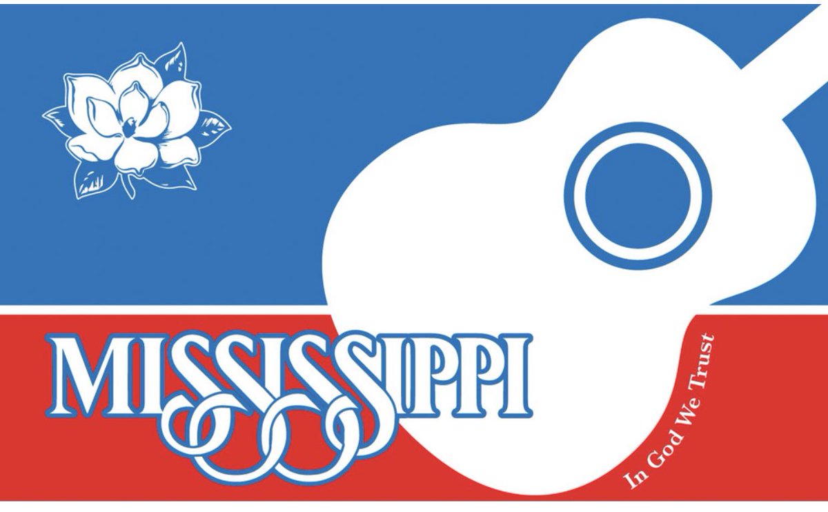
Scoring my favorite submissions for the new Mississippi State flag: a thread
First off we have this one 7/10 for the modernistic interpretation of the state. Also it looks like a shoe
Next we have this one which shows that a lack of graphic design skills can’t stop you if you own a pair of scissors and some tape. 6/10
0/10 you can’t fool us, we know you just tilted the rebel flag. Good effort adding in the required text though
My personal favorite because it uses the same photo as my college spanish book, also because I just want to see it as a real flag 8/10
Strike that I have a new favorite, nothing like a fish inside a magnolia to represent our Mississippi values 8.5/10
Honestly vibing with the alternative shape of this one 7/10 but not sure how I feel about the blue text theta.
I feel like this shape mixed with another design could have been a stronger contender
I feel like this shape mixed with another design could have been a stronger contender
I appreciate this ode to college football which seems to give a solid middle finger to every other college other than @OleMissRebels & @msstate
Thought I was nearing the end of the list and realized I have only been through about 1/4 of the page of submitted designs https://abs.twimg.com/emoji/v2/... draggable="false" alt="😳" title="Errötetes Gesicht" aria-label="Emoji: Errötetes Gesicht">
Imagine if we put a fidget spinner on our state flag??? In 2017 it probably could have been a more viable option

 Read on Twitter


