Happy British Columbia Day.
Over the last year, I& #39;ve collected pins from all 162 municipalities in this wonderful province.
And now, we& #39;re going to rank all of them.
Over the last year, I& #39;ve collected pins from all 162 municipalities in this wonderful province.
And now, we& #39;re going to rank all of them.
NOTES BEFORE WE START:
- Feel VERY free to mute this thread, it will go on all day
- Sometimes I had multiple pins for a municipality; I picked the one I liked most; there may be a "better" or "more recent" pin, this not a definitive exercise
- Two friends helped with judging
- Feel VERY free to mute this thread, it will go on all day
- Sometimes I had multiple pins for a municipality; I picked the one I liked most; there may be a "better" or "more recent" pin, this not a definitive exercise
- Two friends helped with judging
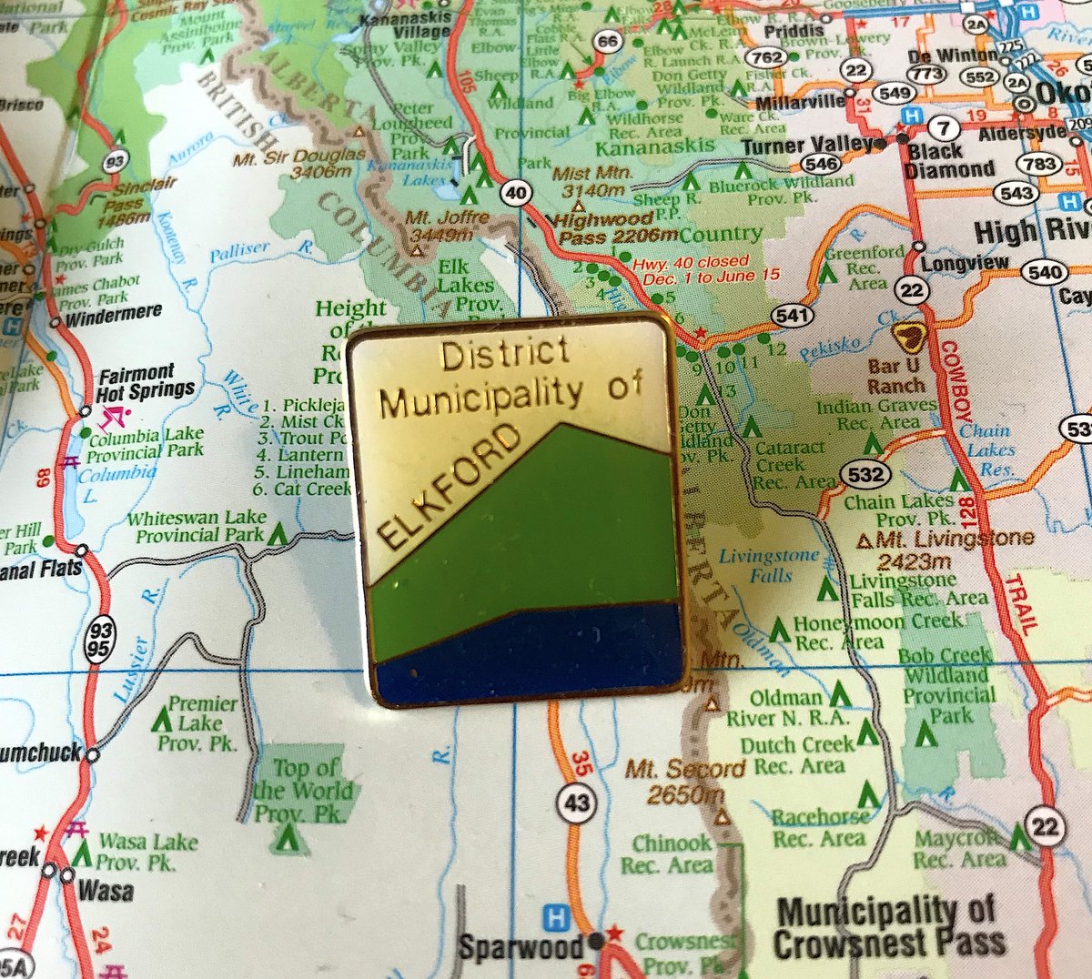
162. ELKFORD
- hi, my name is elkford
- incredibly unexciting
- this will be a common complaint, but nobody cares you& #39;re a district municipality
- we gave points for "clarity", "locality" and "design", this did badly everywhere
- hi, my name is elkford
- incredibly unexciting
- this will be a common complaint, but nobody cares you& #39;re a district municipality
- we gave points for "clarity", "locality" and "design", this did badly everywhere
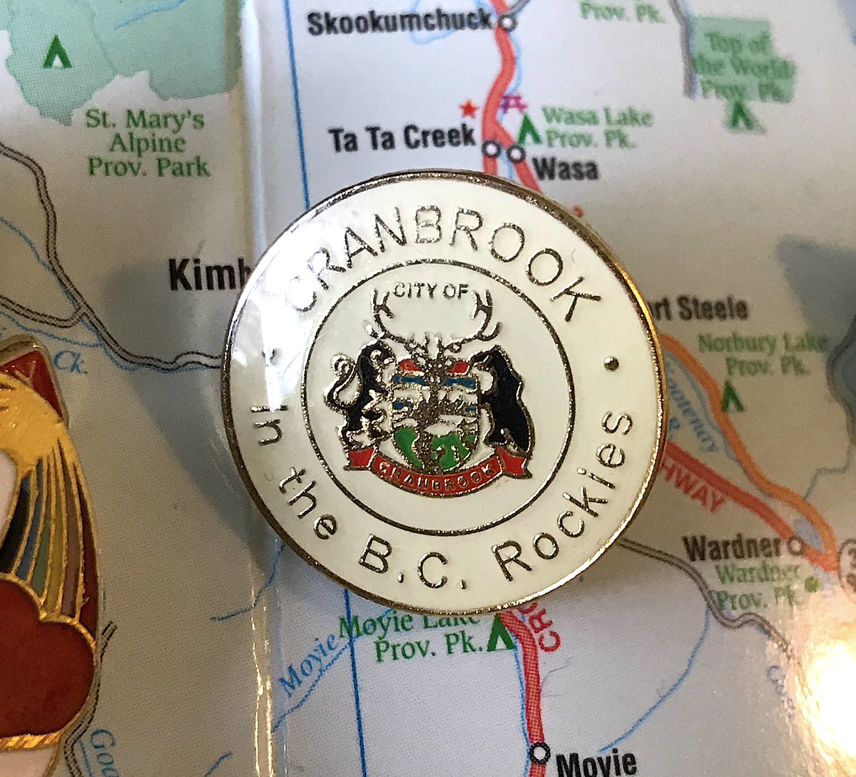
161. CRANBROOK
- everyone knows you& #39;re in the rockies
- crests make for bad pins; they make for even worse pins when they& #39;re crammed in a tiny circle
- dated colour scheme is not helping
- everyone knows you& #39;re in the rockies
- crests make for bad pins; they make for even worse pins when they& #39;re crammed in a tiny circle
- dated colour scheme is not helping
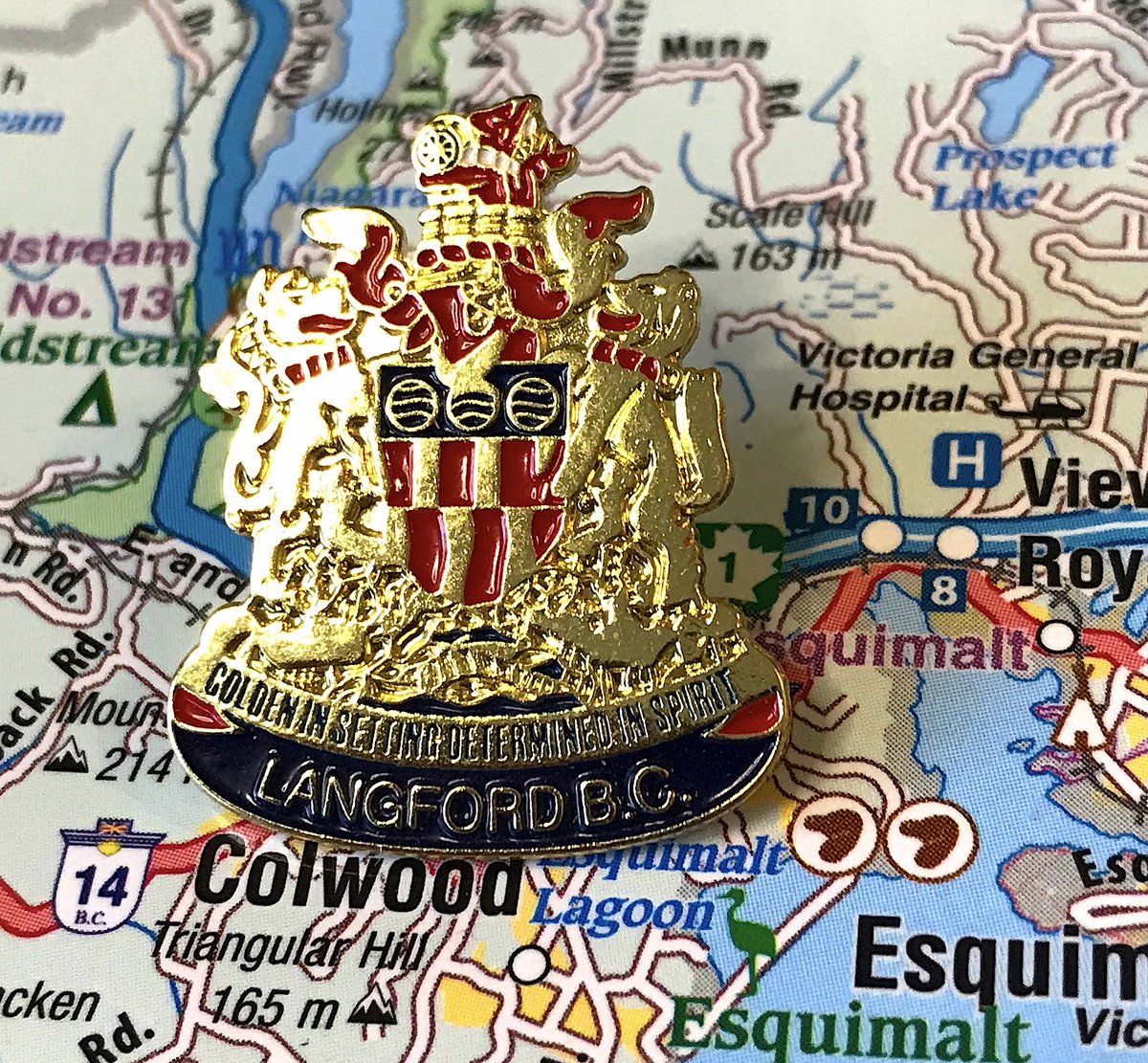
160. LANGFORD
- The first of the crest pins; none of them are good because there& #39;s way too much going on and crests are overrated generally
- ANYWAYS, everything blends together on this one
- "Golden in setting, determined in spirit" isn& #39;t the worst
- The first of the crest pins; none of them are good because there& #39;s way too much going on and crests are overrated generally
- ANYWAYS, everything blends together on this one
- "Golden in setting, determined in spirit" isn& #39;t the worst
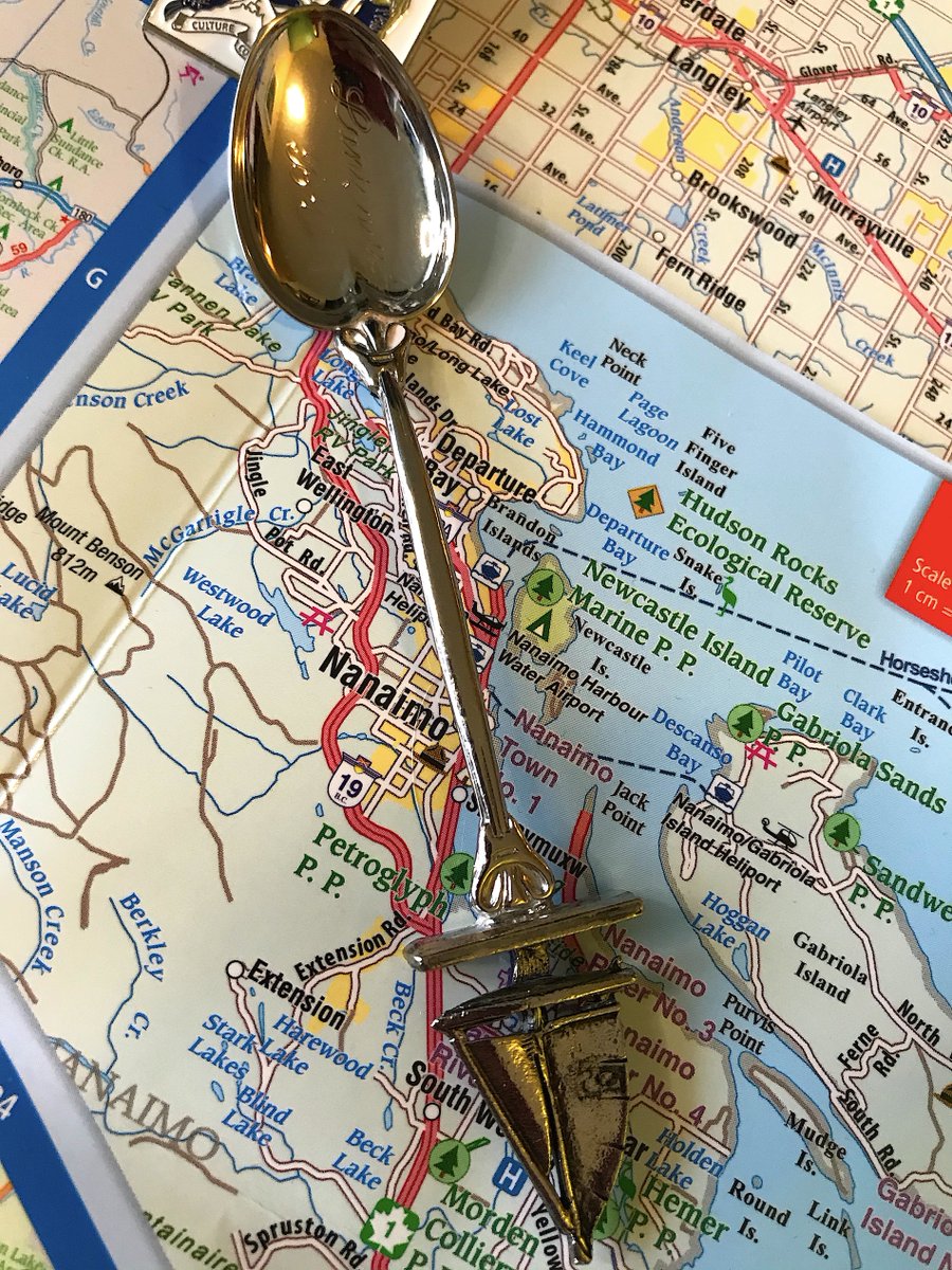
159. LANTZVILLE
- I couldn& #39;t find a pin for Lantzville, so I bought a Lantzville spoon from a website called "SpoonWorld" and pinned it to a thing you& #39;ll see later
- you& #39;re right, i& #39;m weird
- this spoon says "Lantzville" in cursive in the main spoon part
- The boat is nice?
- I couldn& #39;t find a pin for Lantzville, so I bought a Lantzville spoon from a website called "SpoonWorld" and pinned it to a thing you& #39;ll see later
- you& #39;re right, i& #39;m weird
- this spoon says "Lantzville" in cursive in the main spoon part
- The boat is nice?
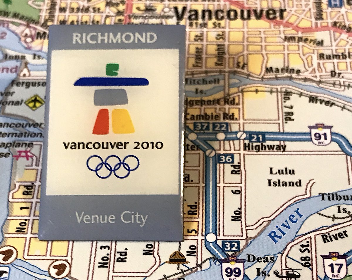
158. RICHMOND
- the city really went in hard on the fact it hosted one event out of like 23 in the olympics
- anyways, it& #39;s the olympic pin, it says richmond& #39;s name on it
- fine
- the city really went in hard on the fact it hosted one event out of like 23 in the olympics
- anyways, it& #39;s the olympic pin, it says richmond& #39;s name on it
- fine
157. KENT
- The first of what I call the "corporate pins", ones that are essentially business cards plopped on a pin
- These are never fun or take advantage of what a pin can offer
- why is agassiz in small font right below kent, CONFUSING
- The first of what I call the "corporate pins", ones that are essentially business cards plopped on a pin
- These are never fun or take advantage of what a pin can offer
- why is agassiz in small font right below kent, CONFUSING
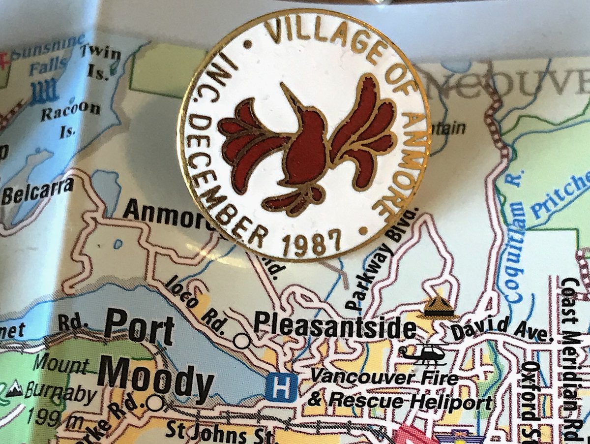
156. ANMORE
- The hummingbird looks great on the city& #39;s flag; here it just looks cramped and confusing
- Nobody cares when you were incorporated
- Nobody cares you& #39;re a village
- The hummingbird looks great on the city& #39;s flag; here it just looks cramped and confusing
- Nobody cares when you were incorporated
- Nobody cares you& #39;re a village
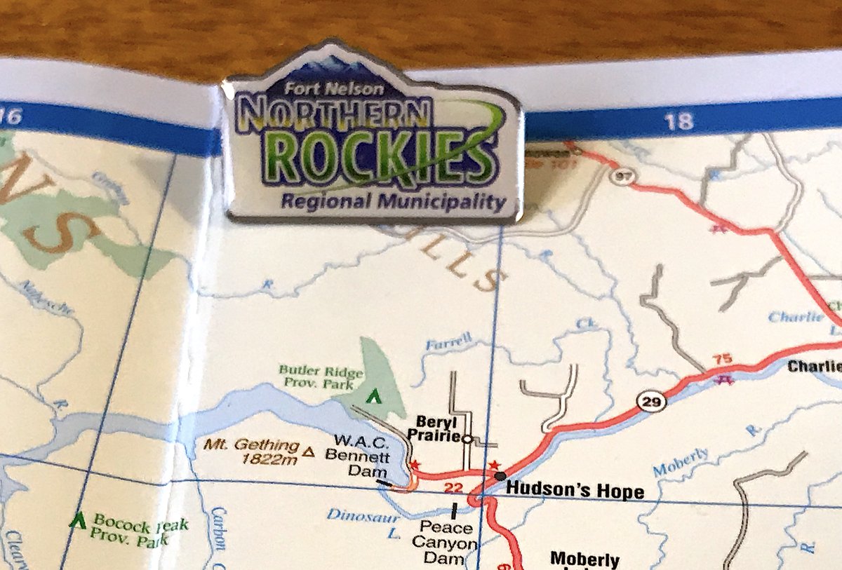
155. NORTHERN ROCKIES REGIONAL MUNICIPALITY
- Fort Nelson has many interesting pins!
- Unfortunately, Fort Nelson transformed into a mega municipality containing all of northeastern B.C. in 2009
- So we have this corporate logo, done by someone who took a few photoshop courses
- Fort Nelson has many interesting pins!
- Unfortunately, Fort Nelson transformed into a mega municipality containing all of northeastern B.C. in 2009
- So we have this corporate logo, done by someone who took a few photoshop courses
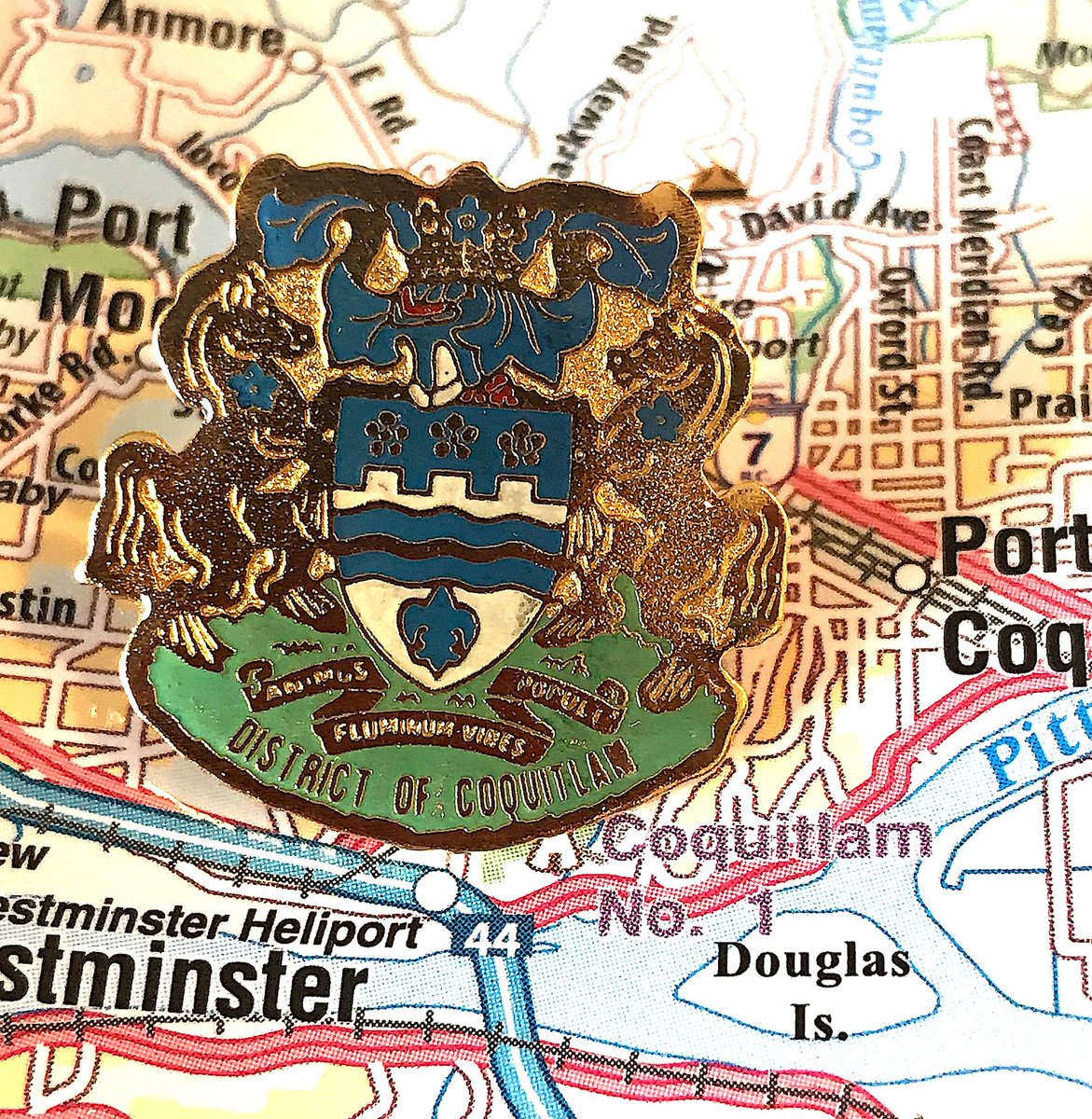
154. COQUITLAM
- It& #39;s a busy crest pin!
- This one with an angry elephant?
- Nobody speaks latin anymore, Coquitlam
- Technically it means "Spirit of the Rivers is the Strength of the People", neat, I guess
- It& #39;s a busy crest pin!
- This one with an angry elephant?
- Nobody speaks latin anymore, Coquitlam
- Technically it means "Spirit of the Rivers is the Strength of the People", neat, I guess
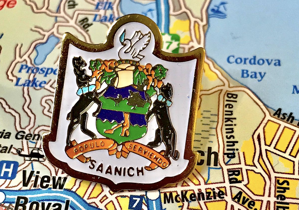
153. SAANICH
- Another crest pin!
- This time with a better colour scheme
- Is that bear...vacuuming?
- Latin saying means "serving the people," that& #39;s literally your job, BORING
- Another crest pin!
- This time with a better colour scheme
- Is that bear...vacuuming?
- Latin saying means "serving the people," that& #39;s literally your job, BORING
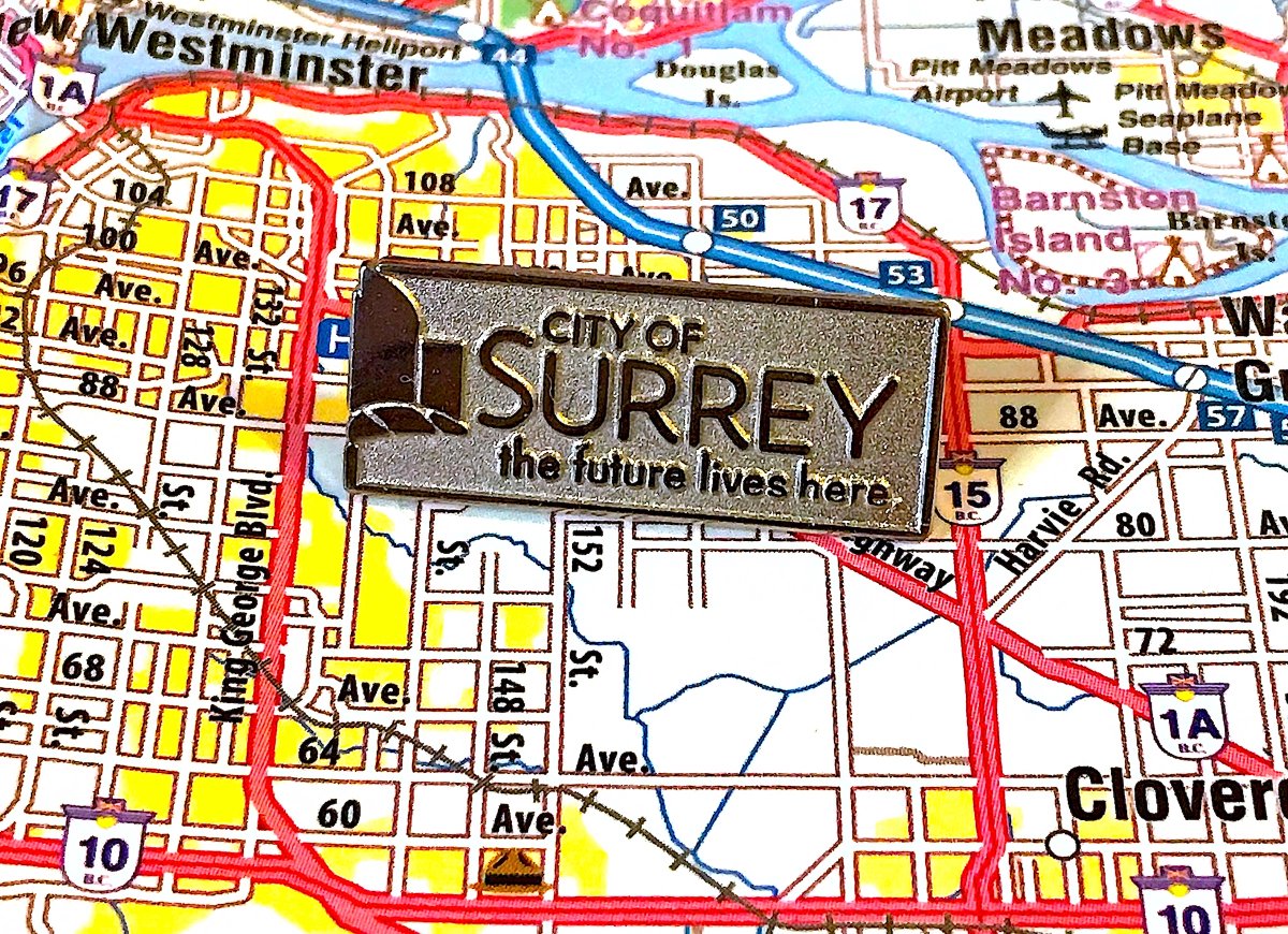
152. SURREY
- the future lives here, and is boring
- again, if you want people to have a business card, just give them a business card
- honestly sad i didn& #39;t come across any old pins with a beaver
- the future lives here, and is boring
- again, if you want people to have a business card, just give them a business card
- honestly sad i didn& #39;t come across any old pins with a beaver
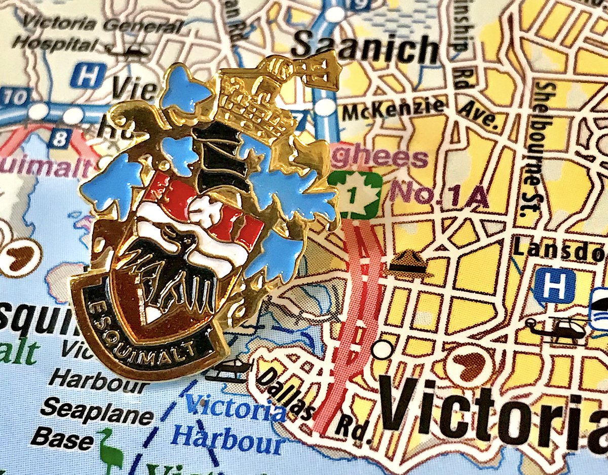
151. ESQUIMALT
- busy crest!
- what& #39;s going on with that birds mouth in the middle
- what& #39;s on top of the crown?
- splashes of blue are fun, i guess
- busy crest!
- what& #39;s going on with that birds mouth in the middle
- what& #39;s on top of the crown?
- splashes of blue are fun, i guess
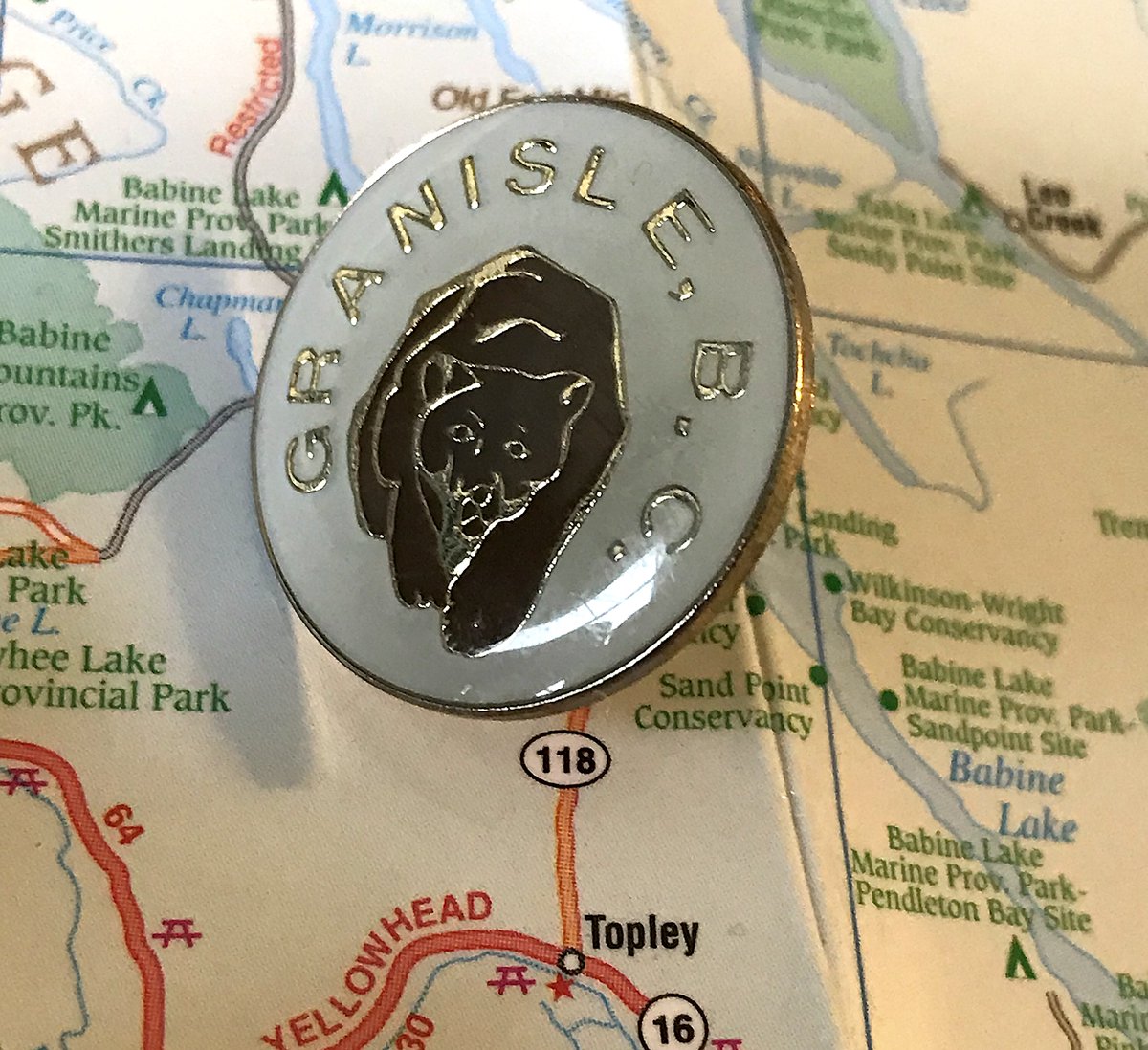
150. GRANISLE
- ROAR I& #39;M A BEAR
- you did not need to make the letters so big and the kerning so wide so that it went all the way around
- Do I have to make a third point? It& #39;s just a bear on a pin
- ROAR I& #39;M A BEAR
- you did not need to make the letters so big and the kerning so wide so that it went all the way around
- Do I have to make a third point? It& #39;s just a bear on a pin
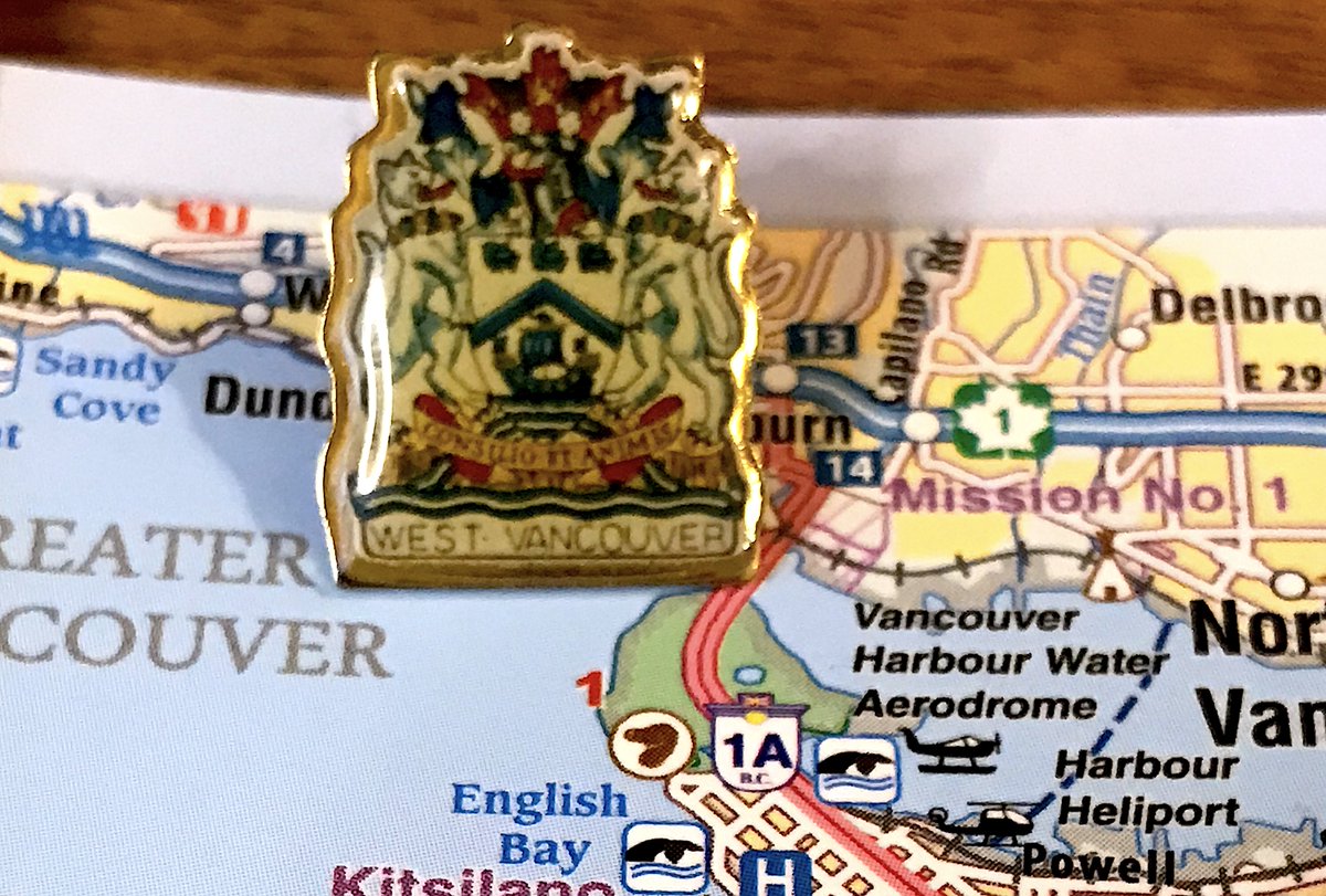
149. WEST VANCOUVER
- cresssssssst pin
- the boat in the middle is nice?
- the weird laminated finish amuses me?
- Latin motto means "By Wisdom and Courage", which is how all people who own land there think they got it
- cresssssssst pin
- the boat in the middle is nice?
- the weird laminated finish amuses me?
- Latin motto means "By Wisdom and Courage", which is how all people who own land there think they got it
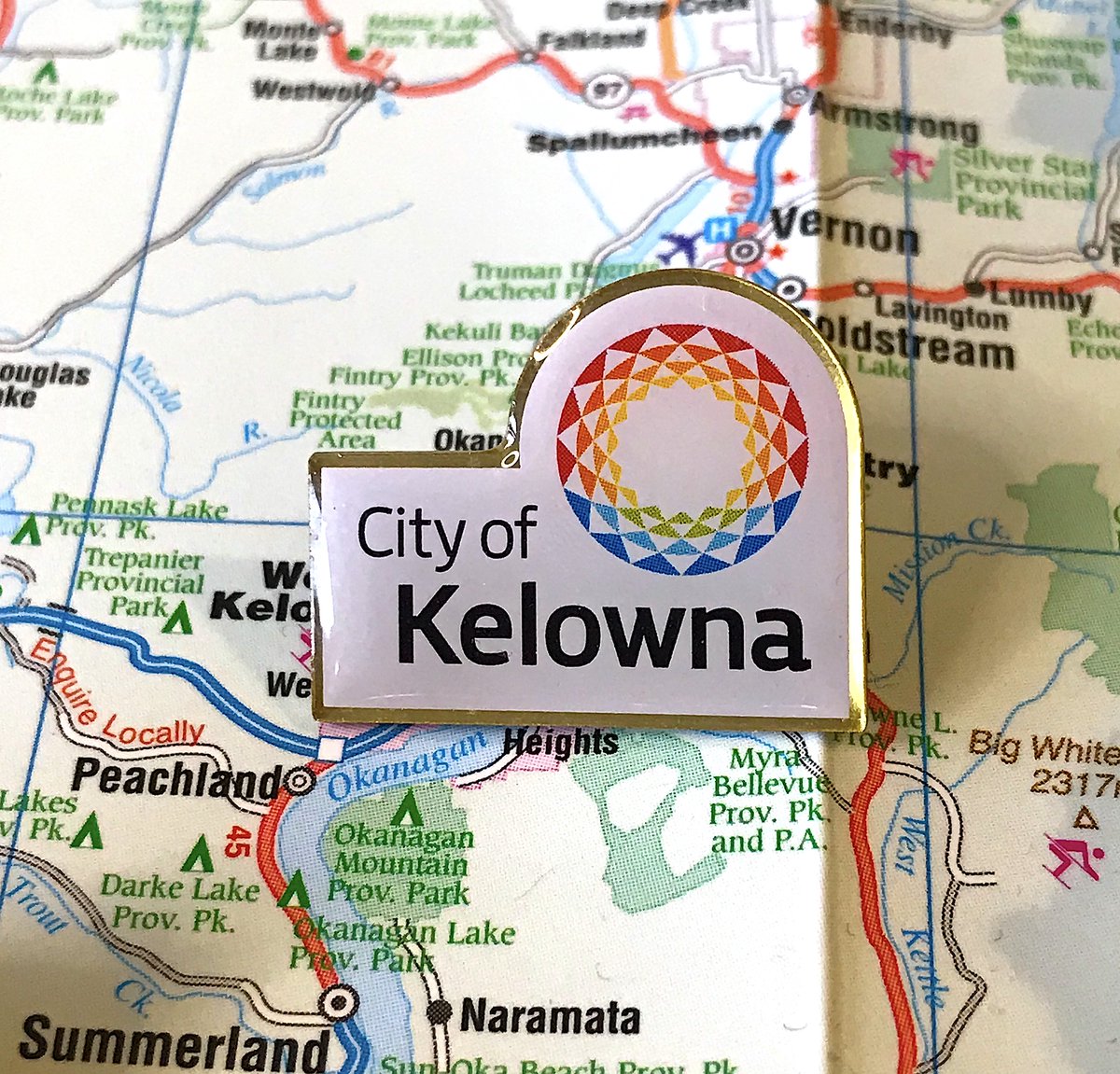
148. KELOWNA
- Corporate pin!
- How does the weird science world thing represent kelowna in any way
- Designed well, sparks zero joy
- Corporate pin!
- How does the weird science world thing represent kelowna in any way
- Designed well, sparks zero joy
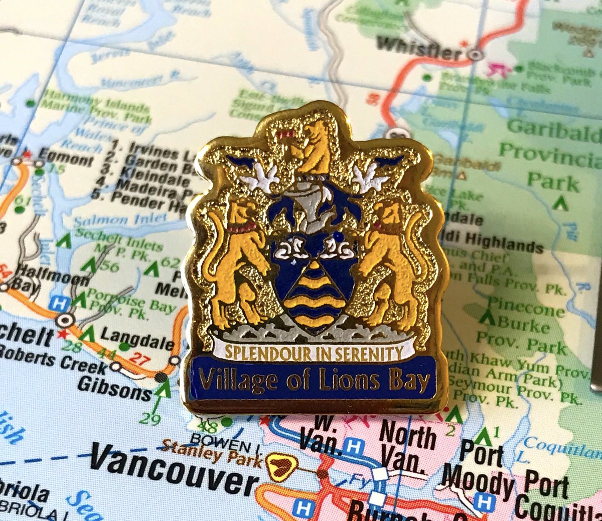
147. LIONS BAY
- I promise most of these aren& #39;t crest pins, otherwise I never would have started this project
- Good job not including latin!
- WHO& #39;S LAUGHING NOW KAREN
- I promise most of these aren& #39;t crest pins, otherwise I never would have started this project
- Good job not including latin!
- WHO& #39;S LAUGHING NOW KAREN
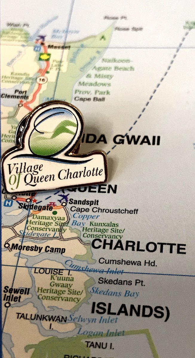
146. QUEEN CHARLOTTE
- Cooooooorporate
- Sort of interesting with the off-centred oval?
- Welcome to the Village of Queen Charlotte! We& #39;re about...um...
- Cooooooorporate
- Sort of interesting with the off-centred oval?
- Welcome to the Village of Queen Charlotte! We& #39;re about...um...
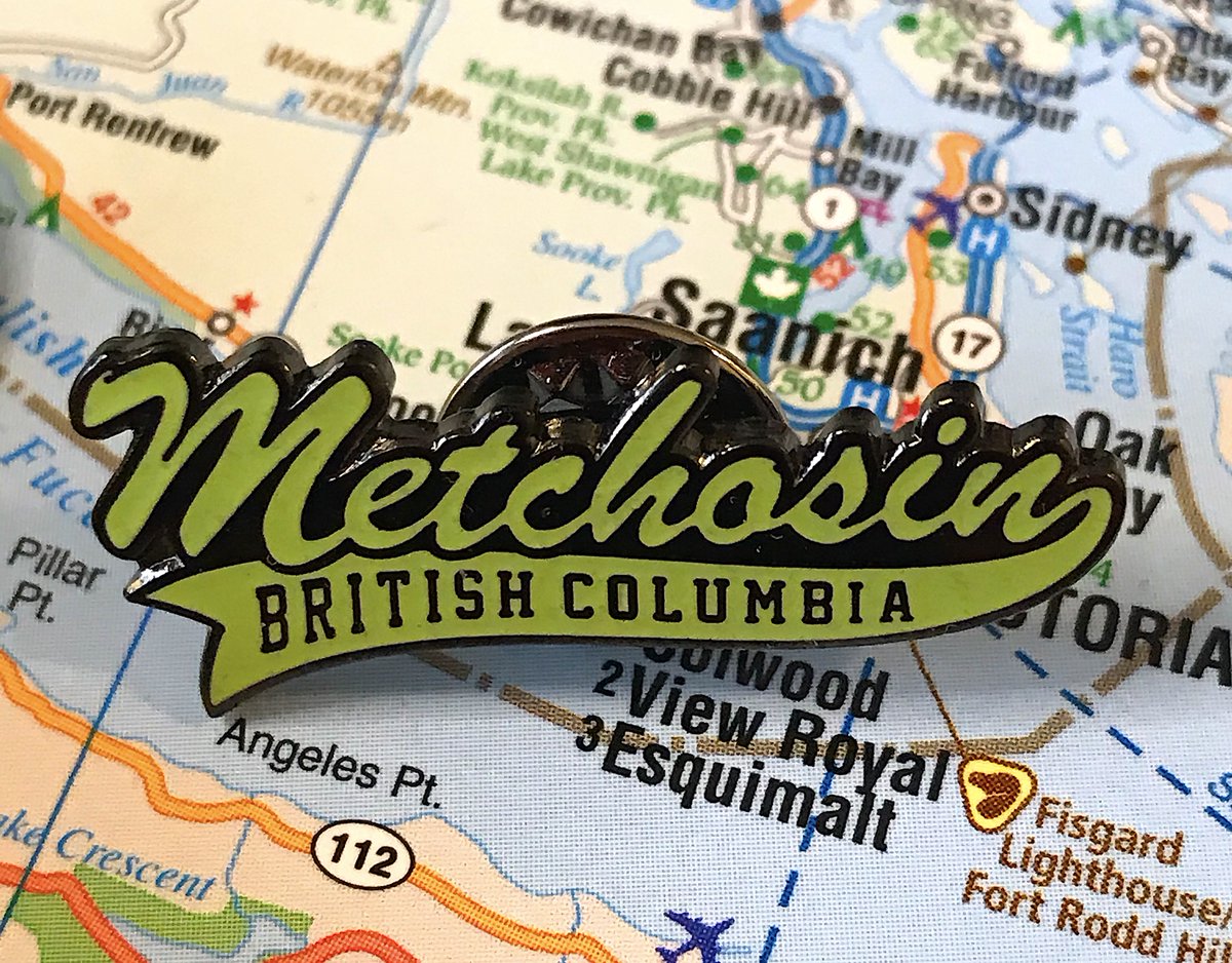
145. METCHOSIN
- This is not from the city, but just a company that sells Metchosin paraphernalia, STILL COUNTS
- Big Little League Baseball vibes
- yes we& #39;re in british columbia, we know
- This is not from the city, but just a company that sells Metchosin paraphernalia, STILL COUNTS
- Big Little League Baseball vibes
- yes we& #39;re in british columbia, we know
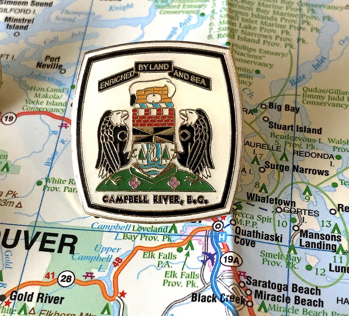
144. CAMPBELL RIVER
- crest crest crest
- those are sinister looking birds
- is that yellow brick wearing headphones?
- crest crest crest
- those are sinister looking birds
- is that yellow brick wearing headphones?
143. MONTROSE
- Council decided not to spend money on a colour pin, sad
- The font is 20% too beefy
- I forgot to take a photo of this on the map, so unmemorable it is
- Council decided not to spend money on a colour pin, sad
- The font is 20% too beefy
- I forgot to take a photo of this on the map, so unmemorable it is
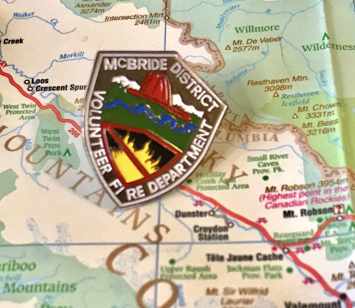
142. MCBRIDE
- Had to make due with the fire department pin, so it loses points
- "You guys know what fires are, right? Well those are NOT allowed in McBride!"
- big oof on the transition from "fi" to "re" in the text
- Had to make due with the fire department pin, so it loses points
- "You guys know what fires are, right? Well those are NOT allowed in McBride!"
- big oof on the transition from "fi" to "re" in the text
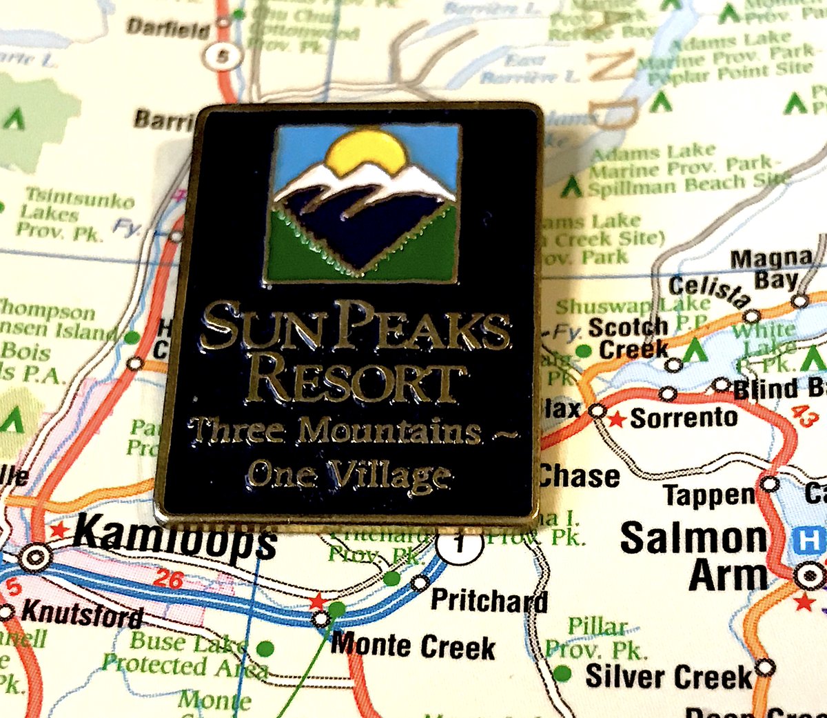
141. SUN PEAKS
- The most generic representation of B.C. imaginable, all it needs is some ocean and we& #39;re set
- Good if boring colours
- It& #39;s fine for what it is
- The most generic representation of B.C. imaginable, all it needs is some ocean and we& #39;re set
- Good if boring colours
- It& #39;s fine for what it is
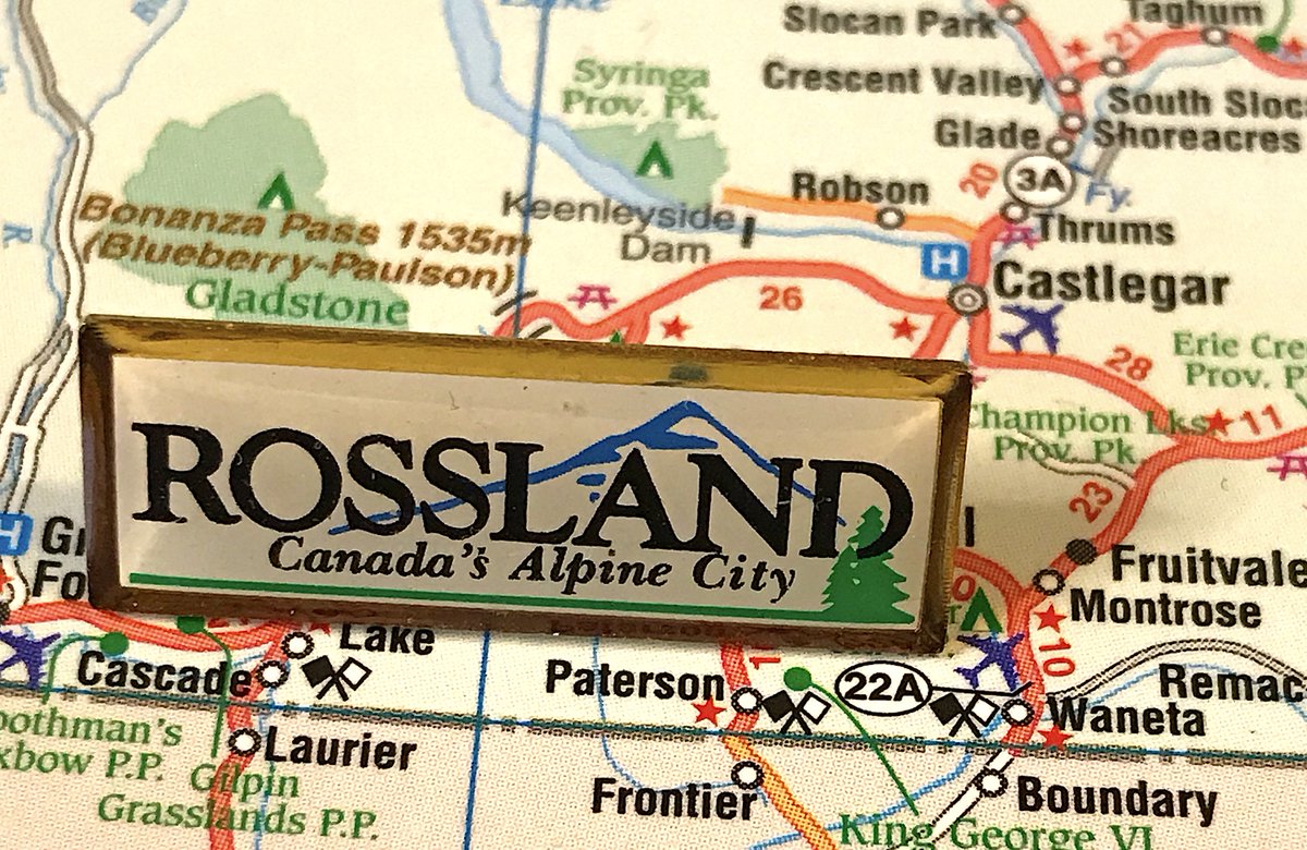
140. ROSSLAND
- Rossland is a great quirky town and I& #39;m annoyed they have a boring corporate pin
- "Canada& #39;s Alpine City", debatable whether it& #39;s even B.C.& #39;s
- happy little tree in the corner is a nice touch
- Rossland is a great quirky town and I& #39;m annoyed they have a boring corporate pin
- "Canada& #39;s Alpine City", debatable whether it& #39;s even B.C.& #39;s
- happy little tree in the corner is a nice touch
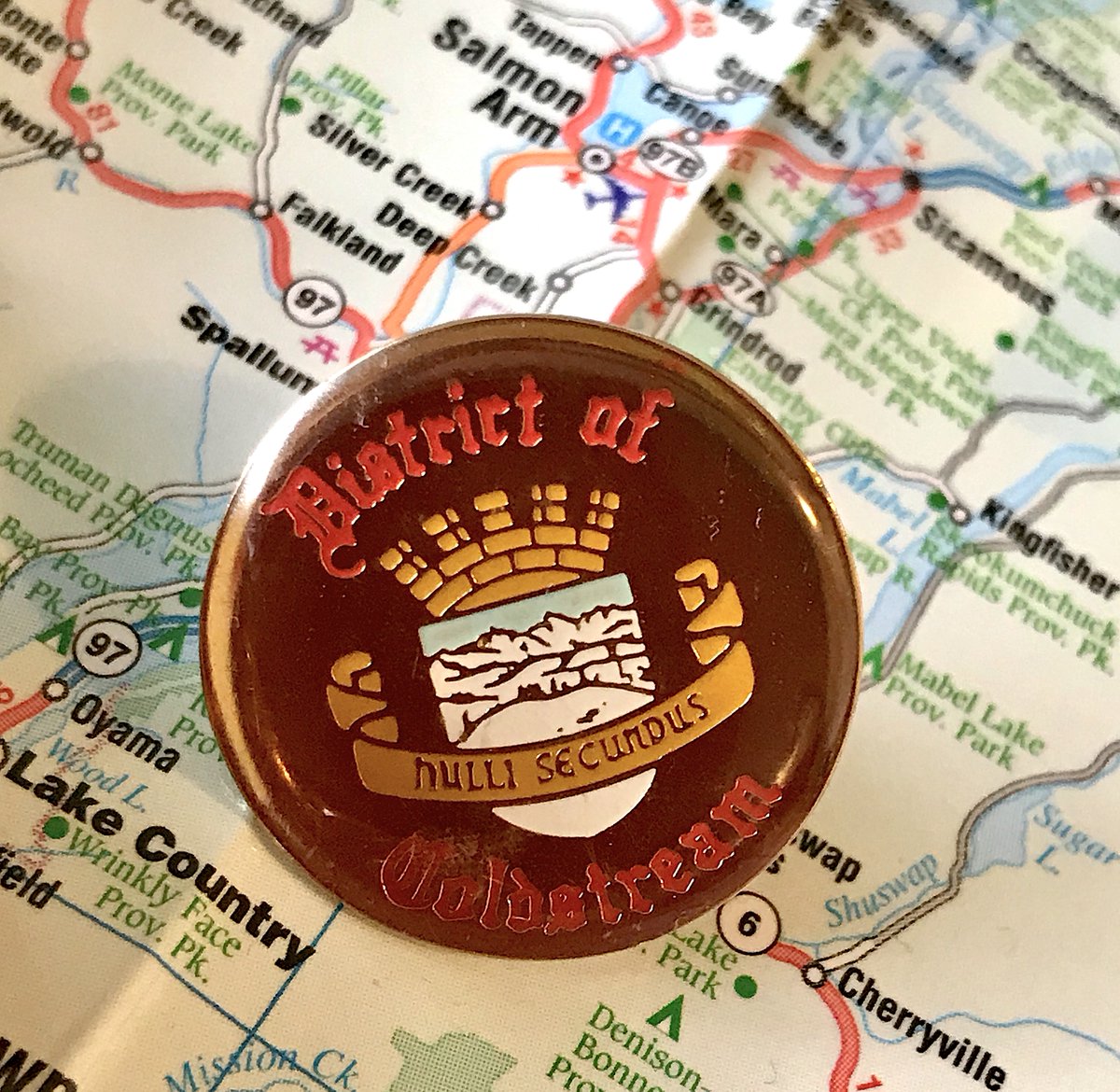
139. COLDSTREAM
- Mr. Coldstream was a Knight in King Arthur& #39;s Court, this is canon
- Latin is "Nulli Secundus", which means "Second to None", agree to disagree
- It& #39;s 2020, you can have an identity outside the British guard regiment you were originally named for
- Mr. Coldstream was a Knight in King Arthur& #39;s Court, this is canon
- Latin is "Nulli Secundus", which means "Second to None", agree to disagree
- It& #39;s 2020, you can have an identity outside the British guard regiment you were originally named for
138. NORTH VANCOUVER DISTRICT
- crest crest crest but this one is okay
- why does one of the animals have a crown
- fun boat on top!
- crest crest crest but this one is okay
- why does one of the animals have a crown
- fun boat on top!
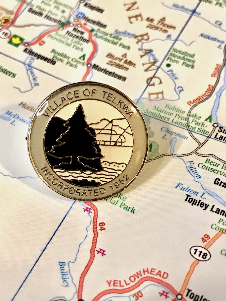
137. TELKWA
- Clean, but boring!
- Nobody cares when you were incorporated
- next time splurge for colour
- Clean, but boring!
- Nobody cares when you were incorporated
- next time splurge for colour
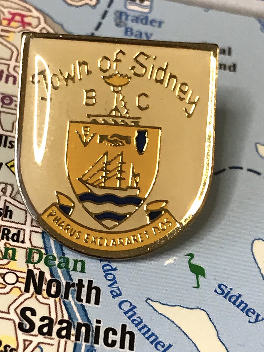
136. SIDNEY
- Not great, but interesting
- Enjoy the font, enjoy whatever is dividing the B.C.
- Latin is "PHARUS EXCLARET NOS," meaning "let a beacon enlighten us", the latin is actually cooler this time
- Not great, but interesting
- Enjoy the font, enjoy whatever is dividing the B.C.
- Latin is "PHARUS EXCLARET NOS," meaning "let a beacon enlighten us", the latin is actually cooler this time
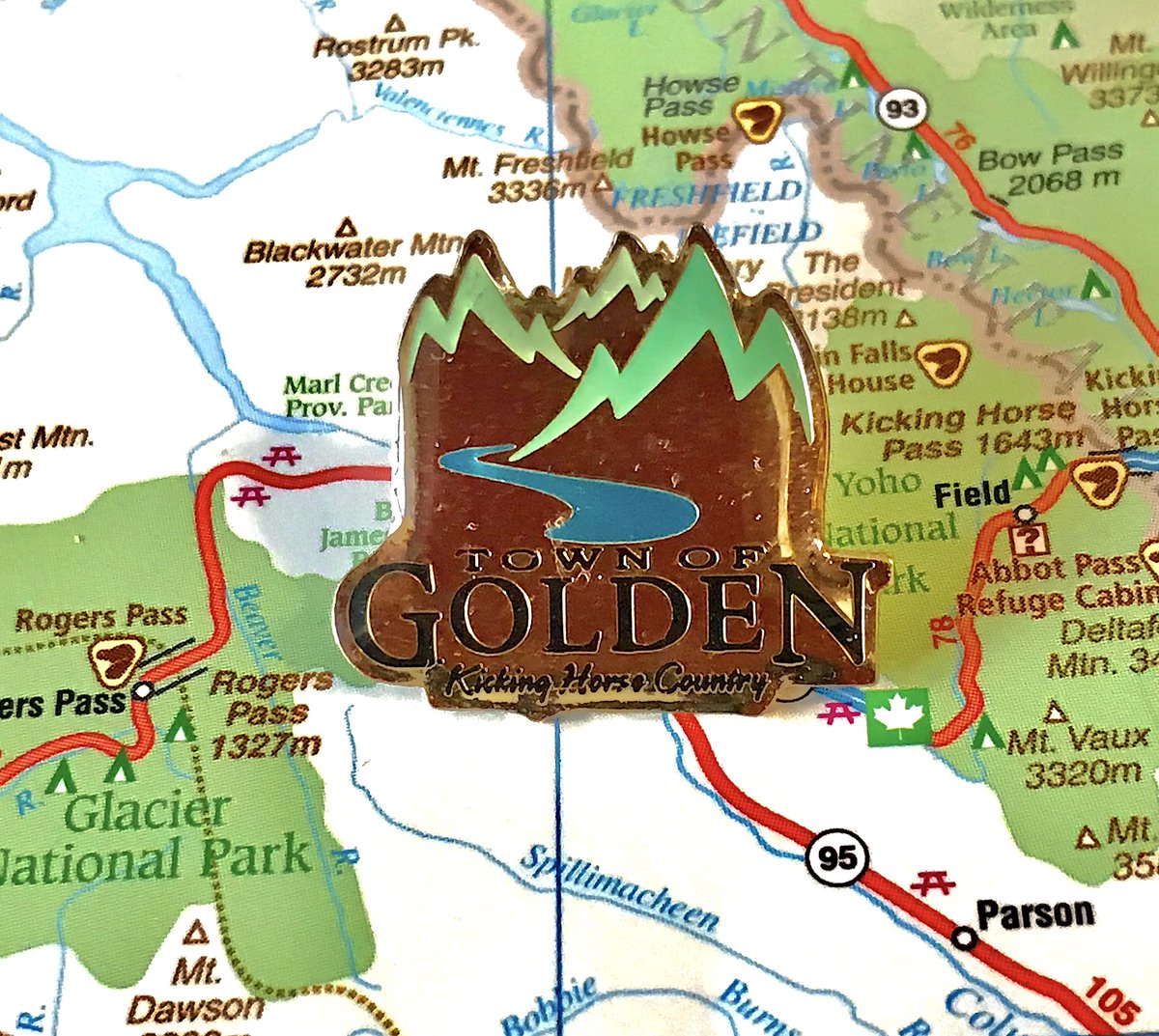
135. GOLDEN
- Cooooooooorporate
- But not bad, if generic B.C. with "river and mountains!" theme
- Too many words, fun design with mountains sticking out
- Cooooooooorporate
- But not bad, if generic B.C. with "river and mountains!" theme
- Too many words, fun design with mountains sticking out
(we shall now take a quick break as i get on the ferry)
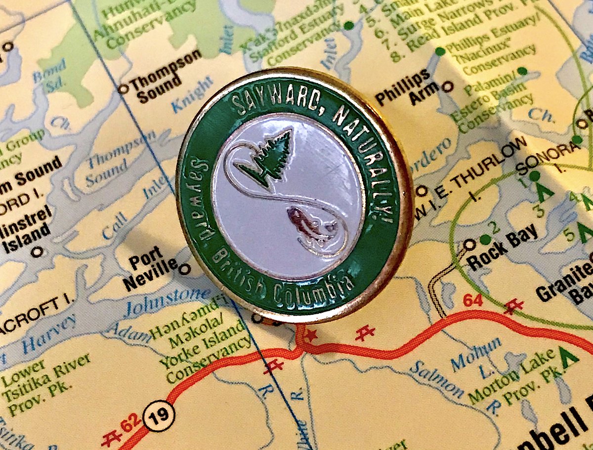
133. SAYWARD
- WHY ARE YOU SAYING SAYWARD TWICE ON THE PIN
- Fish and tree, nowhere else in B.C. has these things
- Green and white theme is pretty nice
- WHY ARE YOU SAYING SAYWARD TWICE ON THE PIN
- Fish and tree, nowhere else in B.C. has these things
- Green and white theme is pretty nice
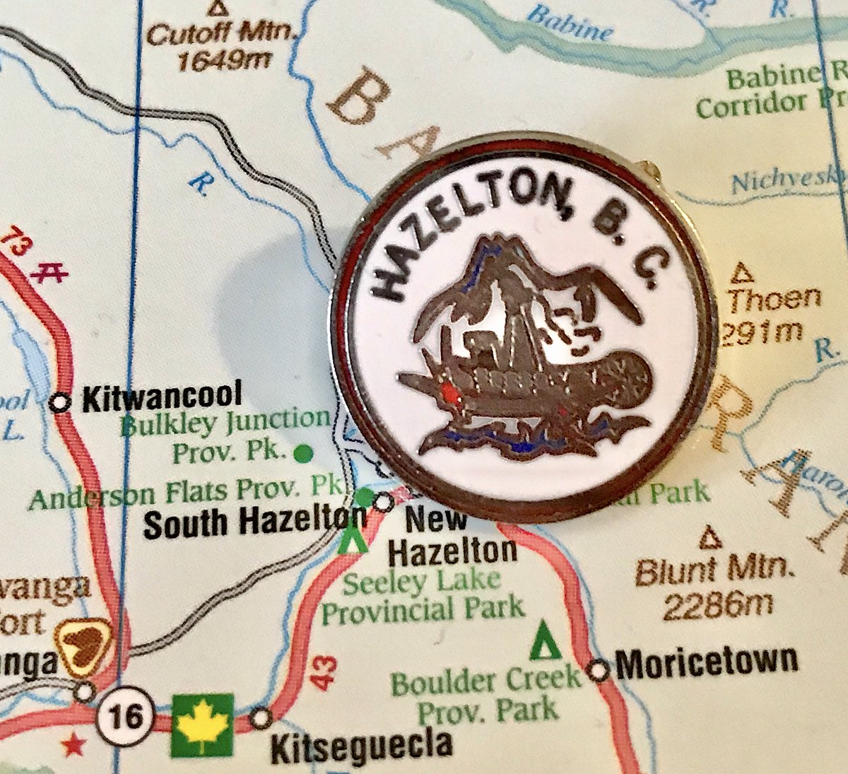
132. HAZELTON
- tried to cram way too much on a very tiny pin
- 90% sure that& #39;s a boat and not a terrifying sea creature
- it& #39;s fun when you can tell a municipality went "we& #39;ll pay for two colours, and no more"
- tried to cram way too much on a very tiny pin
- 90% sure that& #39;s a boat and not a terrifying sea creature
- it& #39;s fun when you can tell a municipality went "we& #39;ll pay for two colours, and no more"
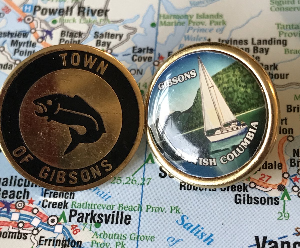
131. GIBSONS
- Sometimes I have more than one pin from a municipality, in those cases the one being ranked is on the left
- good fishy
- striking, but not really representative of gibsons as a whole
- Sometimes I have more than one pin from a municipality, in those cases the one being ranked is on the left
- good fishy
- striking, but not really representative of gibsons as a whole
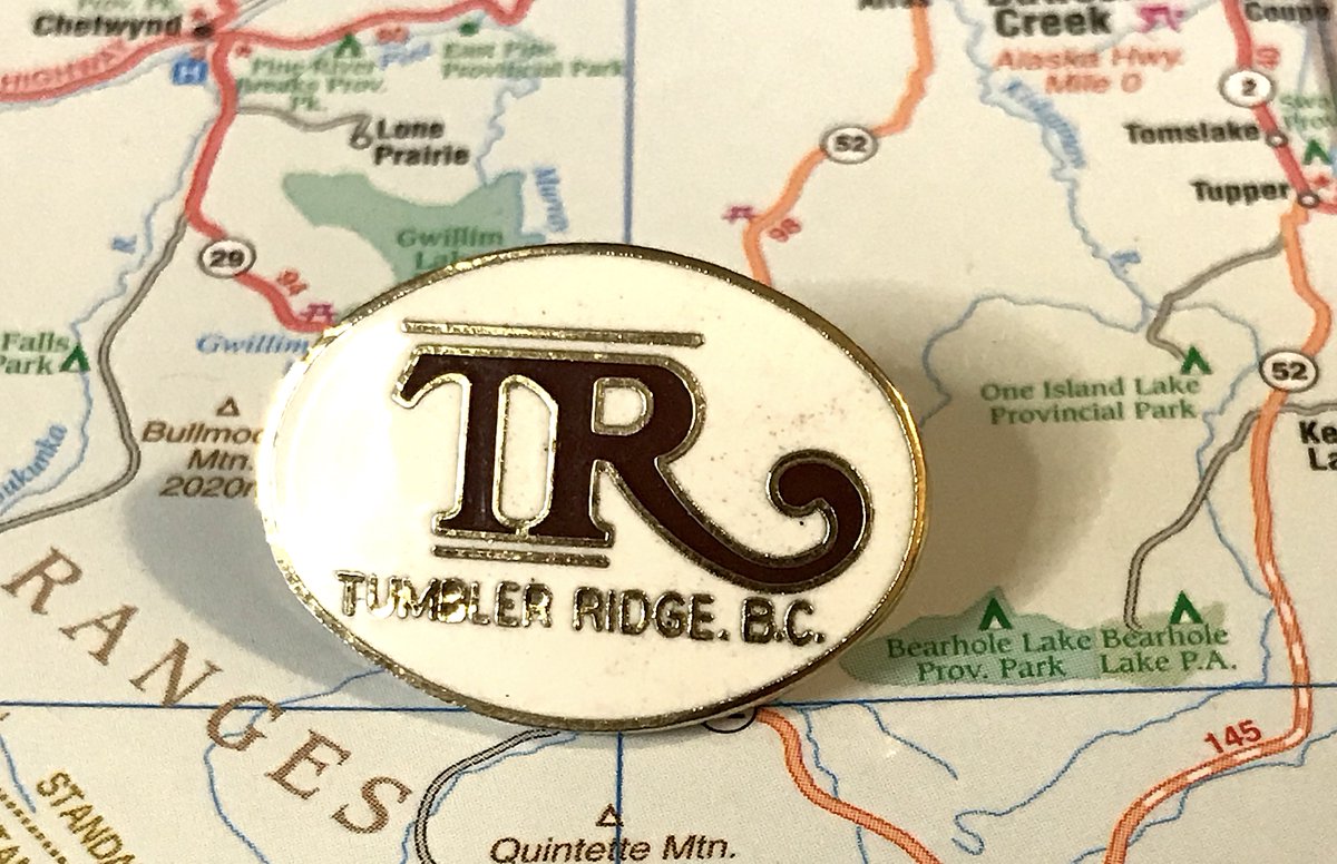
130. TUMBLER RIDGE
- You have so many things that are interesting about your planned mining community!
- And you went with "we& #39;ll just put the initials in a big fun font"
- Decently striking though
- You have so many things that are interesting about your planned mining community!
- And you went with "we& #39;ll just put the initials in a big fun font"
- Decently striking though
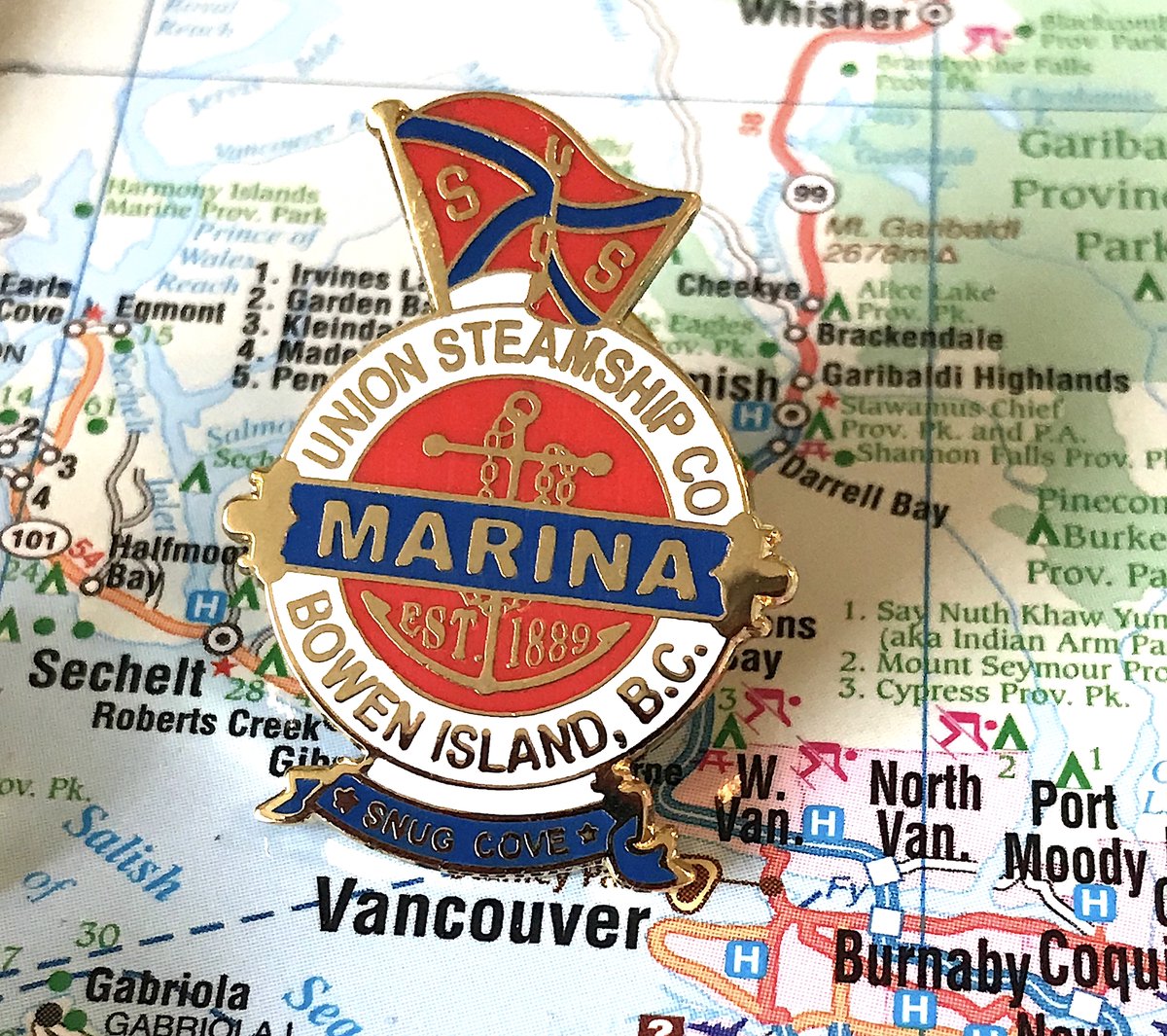
129. BOWEN ISLAND
- Not actually of Bowen Island, but of the Union Steamship Company in the harbour
- It’s genuinely weird that Bowen has never had a municipal pin, right?
- Anyways this is okay, if 10% too busy
- Not actually of Bowen Island, but of the Union Steamship Company in the harbour
- It’s genuinely weird that Bowen has never had a municipal pin, right?
- Anyways this is okay, if 10% too busy
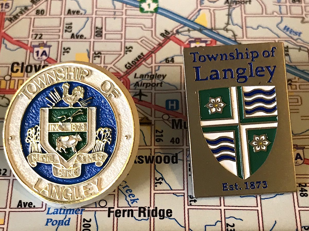
128. LANGLEY TOWNSHIP
- Gets a slight pass for its establishment date by being so old, still annoying
- Cute crest! Ruined by putting a big grey rectangle over things
- Most people don’t associate Langley with the river, I will defend this take to the death
- Gets a slight pass for its establishment date by being so old, still annoying
- Cute crest! Ruined by putting a big grey rectangle over things
- Most people don’t associate Langley with the river, I will defend this take to the death
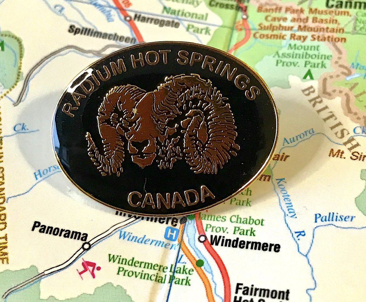
127. RADIUM HOT SPRINGS
- BIGHORN SHEEP, THAT’S WHAT WE’RE ABOUT
- Actually pretty interesting detailing for the design!
- we’re from CANADA, okay let& #39;s calm down
- BIGHORN SHEEP, THAT’S WHAT WE’RE ABOUT
- Actually pretty interesting detailing for the design!
- we’re from CANADA, okay let& #39;s calm down
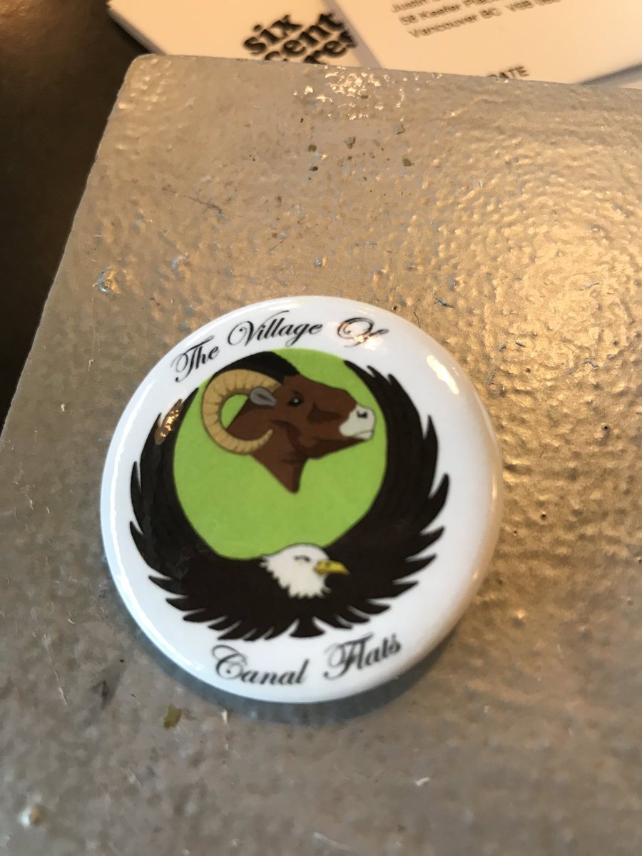
126. CANAL FLATS
- Canal Flats doesn& #39;t have a pin, I checked with the longtime former mayor who said it was often debated
- So I paid a friend to replicate the municipality& #39;s flag onto a button, why are you all looking at me like that
- "we have animals!", cool
- Canal Flats doesn& #39;t have a pin, I checked with the longtime former mayor who said it was often debated
- So I paid a friend to replicate the municipality& #39;s flag onto a button, why are you all looking at me like that
- "we have animals!", cool
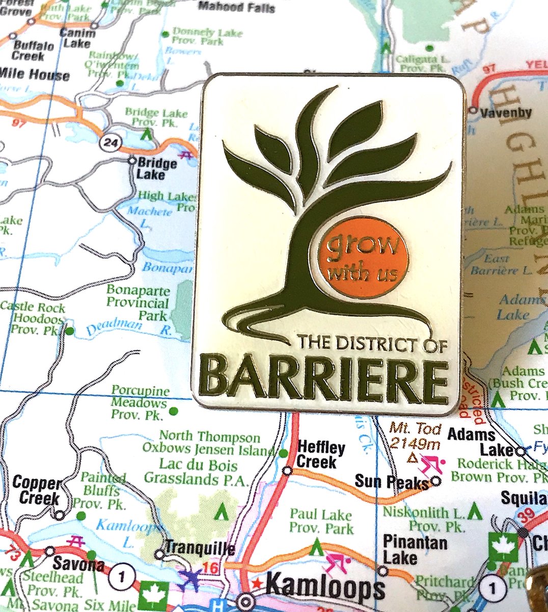
125. BARRIERE
- They& #39;re big into the "grow with us" motto, and it will never stop amusing me
- A bit too corporate, a bit too chonky, nobody cares you& #39;re a district
- is that a giant orange or a tiny sun
- They& #39;re big into the "grow with us" motto, and it will never stop amusing me
- A bit too corporate, a bit too chonky, nobody cares you& #39;re a district
- is that a giant orange or a tiny sun
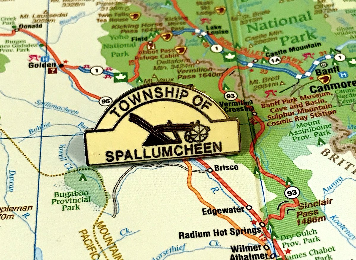
124. SPALLUMCHEEN
- Interesting shape!
- Boring colours
- They& #39;re really into the fact that a walking plow is part of their identity, and you know, each to their own, but design-wise it& #39;s not particularly pleasing
- Interesting shape!
- Boring colours
- They& #39;re really into the fact that a walking plow is part of their identity, and you know, each to their own, but design-wise it& #39;s not particularly pleasing
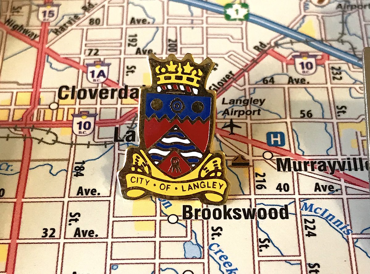
123. LANGLEY CITY
- Crest, but in the actual shape, and pretty clean!
- Still doesn& #39;t tell me much about Langley, other than its royalty, you& #39;ll have to fight new west on that
- The other pin is very corporate and annoys me
- Crest, but in the actual shape, and pretty clean!
- Still doesn& #39;t tell me much about Langley, other than its royalty, you& #39;ll have to fight new west on that
- The other pin is very corporate and annoys me
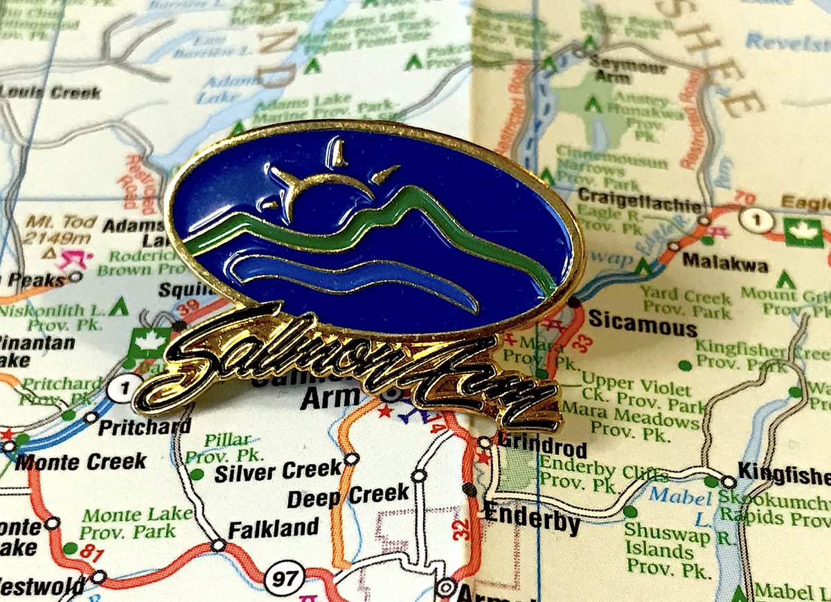
122. SALMON ARM
- This is a logo for a car company, not a flag for a city
- tails on the A and M in "Arm" are VERY aggressive
- this is better than their flag, but it& #39;s still very strange for a pin
- This is a logo for a car company, not a flag for a city
- tails on the A and M in "Arm" are VERY aggressive
- this is better than their flag, but it& #39;s still very strange for a pin
121. ARMSTRONG
- We& #39;re now in a section of pins where municipalities tried cramming a bunch of things on that made them special
- Railway! Sun! Cornucopia! TOO MANY AND TOO CRAMPED
- Pins from here on out I mostly enjoy
- We& #39;re now in a section of pins where municipalities tried cramming a bunch of things on that made them special
- Railway! Sun! Cornucopia! TOO MANY AND TOO CRAMPED
- Pins from here on out I mostly enjoy
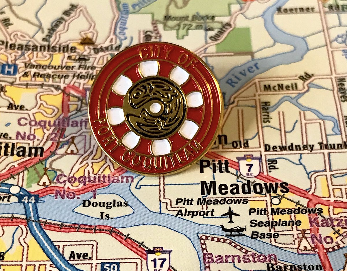
120. PORT COQUITLAM
- Almost seems like a puzzle more than a pin?
- Yes, you have fish, so does everyone
- They have a new corporate pin too, which, fine
- Almost seems like a puzzle more than a pin?
- Yes, you have fish, so does everyone
- They have a new corporate pin too, which, fine
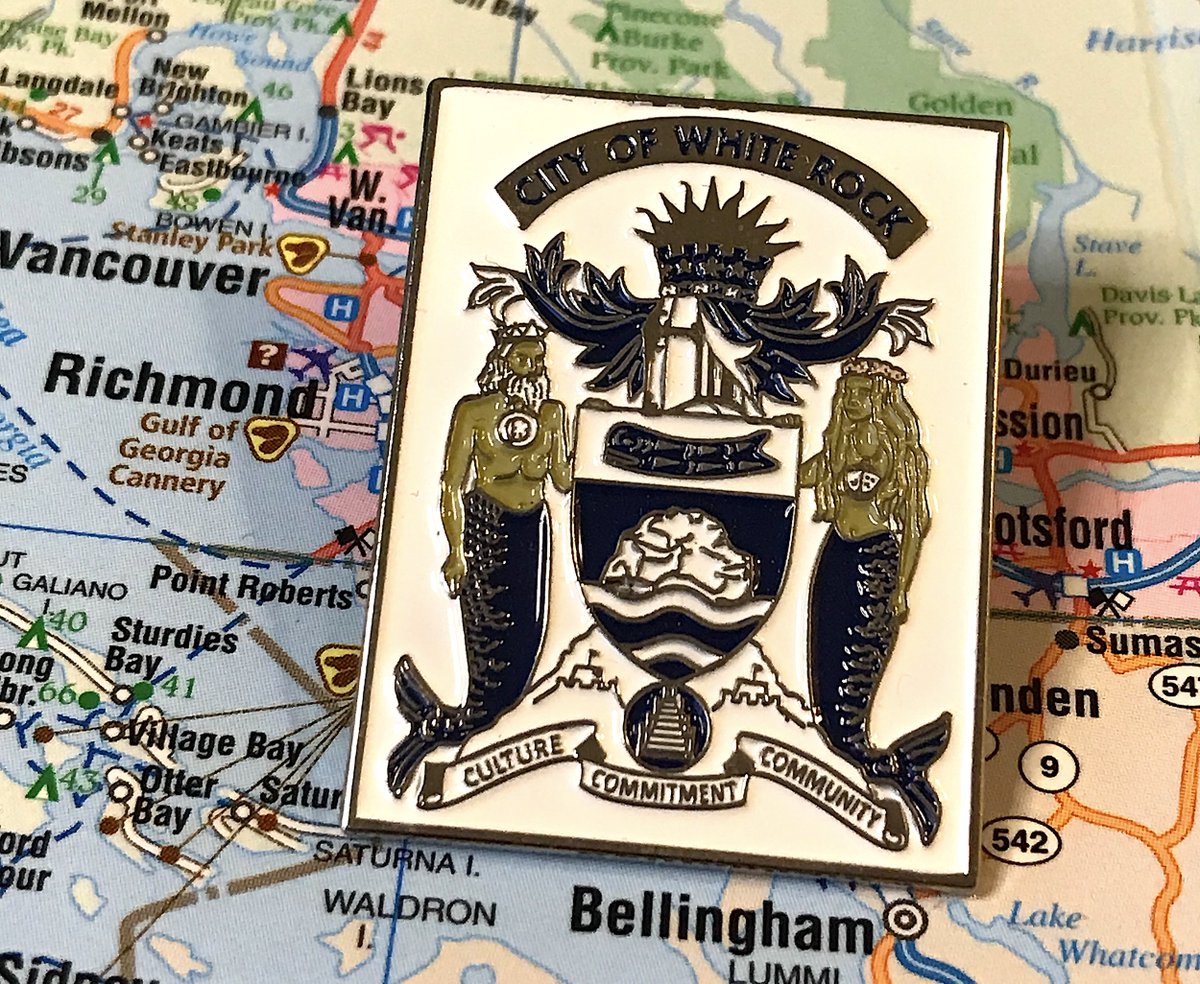
119. WHITE ROCK
- Crest pin but SO MUCH HAPPENING
- The mer people are holding up the rock? Which is holding up the pier?
- Still too chunky, still too cresty, but I’m amused
- Crest pin but SO MUCH HAPPENING
- The mer people are holding up the rock? Which is holding up the pier?
- Still too chunky, still too cresty, but I’m amused
118. UCLUELET
- Ucluelet doesn& #39;t have a pin, so I went with the Lions Club edition
- As a rule, Lions Club pins are fairly well designed, but also quite large
- This is nice enough, but again, not the municipality, so loses points, c’est la vie
- Ucluelet doesn& #39;t have a pin, so I went with the Lions Club edition
- As a rule, Lions Club pins are fairly well designed, but also quite large
- This is nice enough, but again, not the municipality, so loses points, c’est la vie
117. HOPE
- Love the bold font, love the fact it’s in a circle, amused by BIG H
- Don’t love how many things they’re trying to fit into the middle
- Is there some sort of battle going on?
- Love the bold font, love the fact it’s in a circle, amused by BIG H
- Don’t love how many things they’re trying to fit into the middle
- Is there some sort of battle going on?
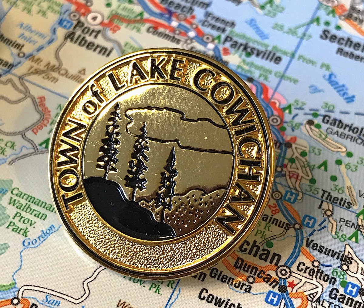
116. LAKE COWICHAN
- Clean! Simple! Circle! Good start
- “Town of Lake” is unbearably clunky, just say your name!
- We have trees and a lake! so does everywhere in b.c.
- Clean! Simple! Circle! Good start
- “Town of Lake” is unbearably clunky, just say your name!
- We have trees and a lake! so does everywhere in b.c.
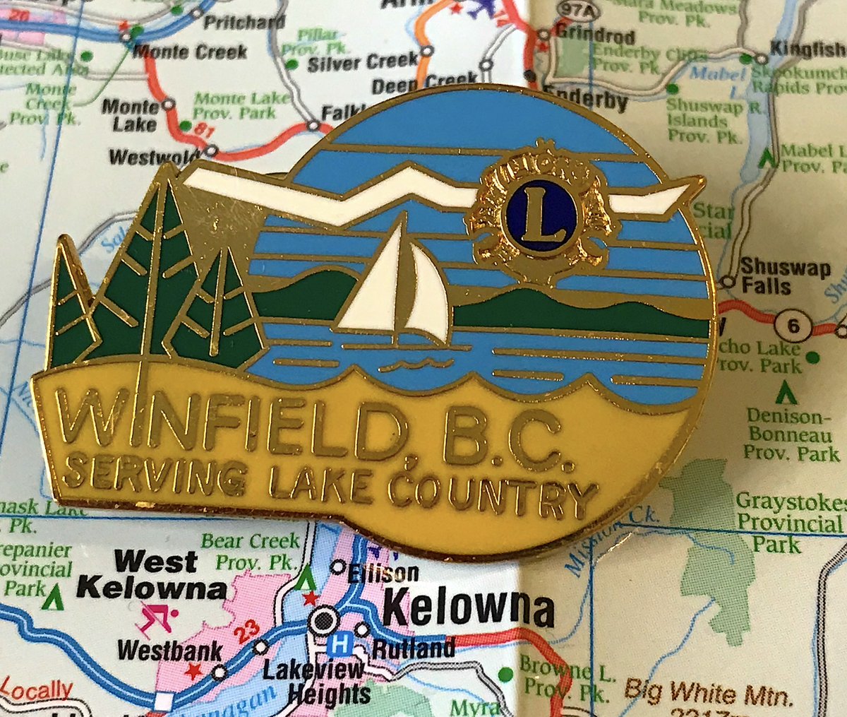
115. LAKE COUNTRY
- Another huuuuge Lions pin, also for Winfield, which is a neighbourhood within Lake Country, look sometimes I had to make big stretches
- Design on the (say it with me) trees and the lake is fun
- What’s going on with that white thing through the L?
- Another huuuuge Lions pin, also for Winfield, which is a neighbourhood within Lake Country, look sometimes I had to make big stretches
- Design on the (say it with me) trees and the lake is fun
- What’s going on with that white thing through the L?
114. SLOCAN
- “1901 CORP. OF THE” come on, this is design 101
- You can tell everyone when you were founded, or you can tell everyone you’re the gateway to Valhalla Provincial Park, you can’t do both
- All this overwhelms a delightfully homespun middle area
- “1901 CORP. OF THE” come on, this is design 101
- You can tell everyone when you were founded, or you can tell everyone you’re the gateway to Valhalla Provincial Park, you can’t do both
- All this overwhelms a delightfully homespun middle area
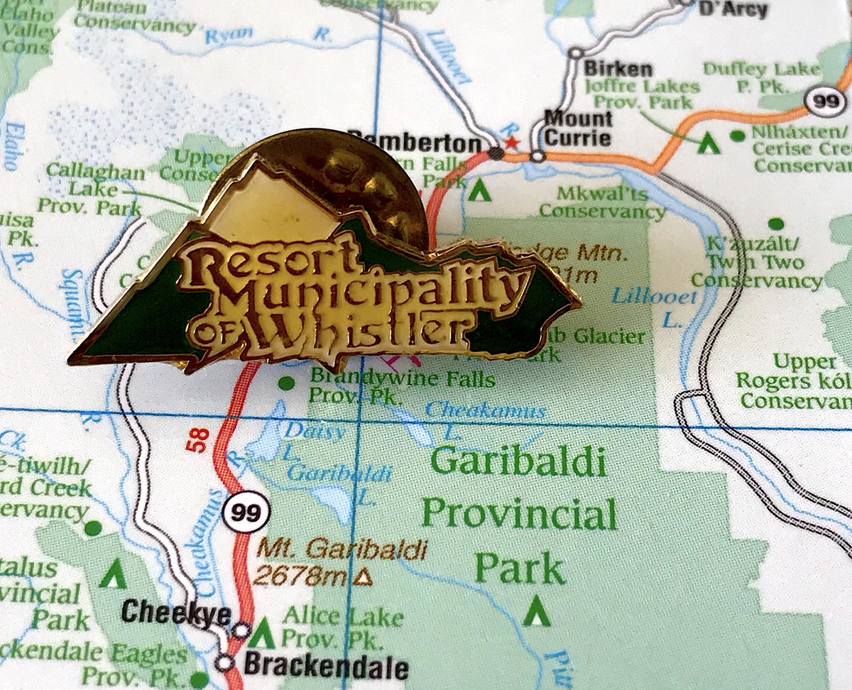
113. WHISTLER
- Has big 1970s “Whistler was filmed before a live studio audience” vibes
- Enjoy the crunchiness
- All of Whistler’s modern logos are all corporate and boring, this is fun enough
- Has big 1970s “Whistler was filmed before a live studio audience” vibes
- Enjoy the crunchiness
- All of Whistler’s modern logos are all corporate and boring, this is fun enough
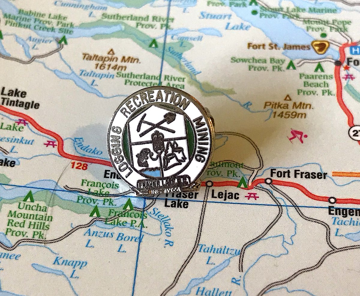
112. FRASER LAKE
- This is very small and too much is going on
- You said "logging recreation and mining" and then you showed them, do one!
- Ultimately cute if underdeveloped
- This is very small and too much is going on
- You said "logging recreation and mining" and then you showed them, do one!
- Ultimately cute if underdeveloped
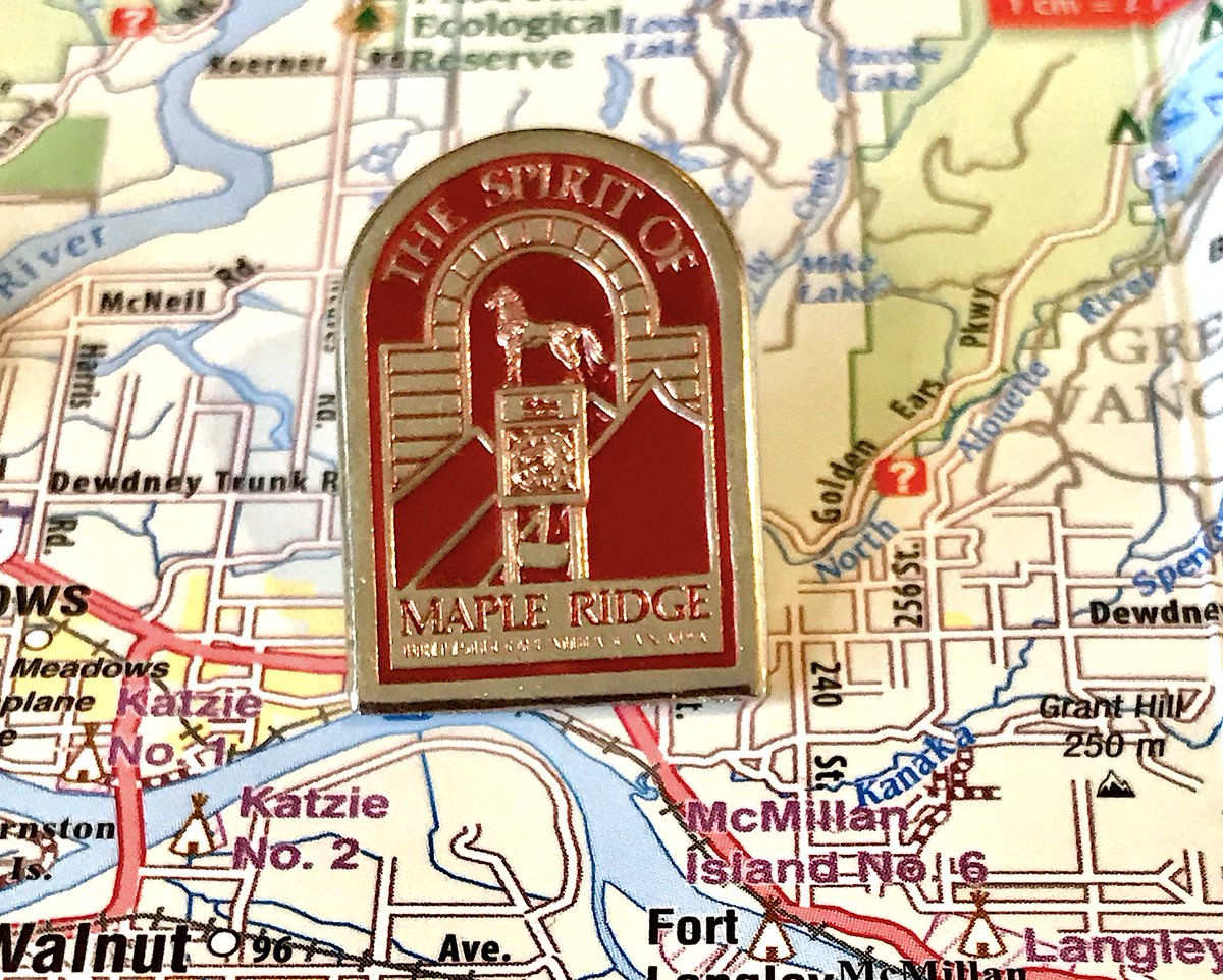
111. MAPLE RIDGE
- Pros: features the angry horse on top of the clock tower at city hall
- Cons: weird borders, needless "the spirit of", colours don& #39;t completely mesh
- Let& #39;s appreciate that angry horse though
- Pros: features the angry horse on top of the clock tower at city hall
- Cons: weird borders, needless "the spirit of", colours don& #39;t completely mesh
- Let& #39;s appreciate that angry horse though
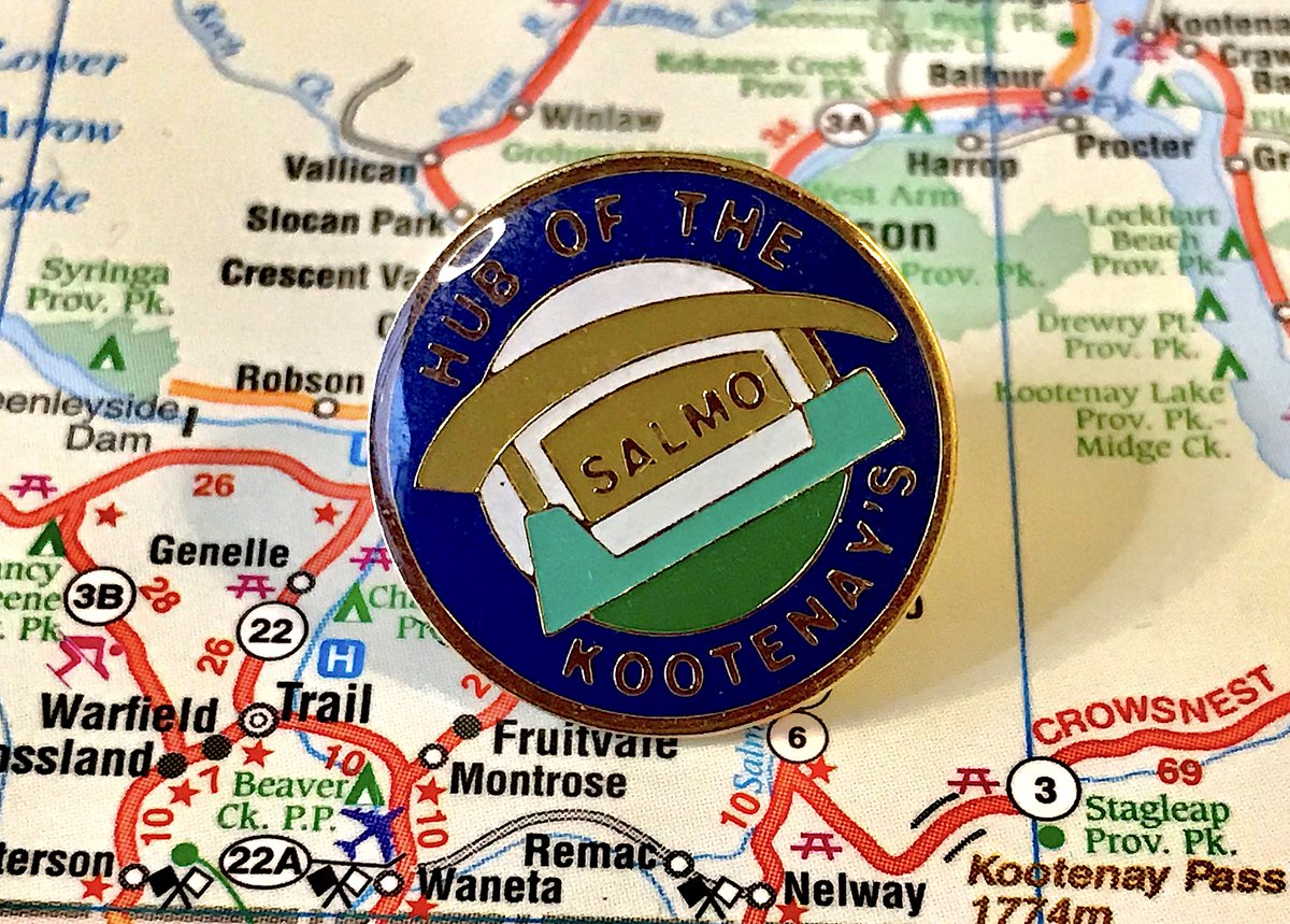
110. SALMO
- UNNECESSARY APOSTROPHE IN KOOTENAYS
- Points for being accurate with the welcome sign
- Points deducted for not adding to that
- UNNECESSARY APOSTROPHE IN KOOTENAYS
- Points for being accurate with the welcome sign
- Points deducted for not adding to that
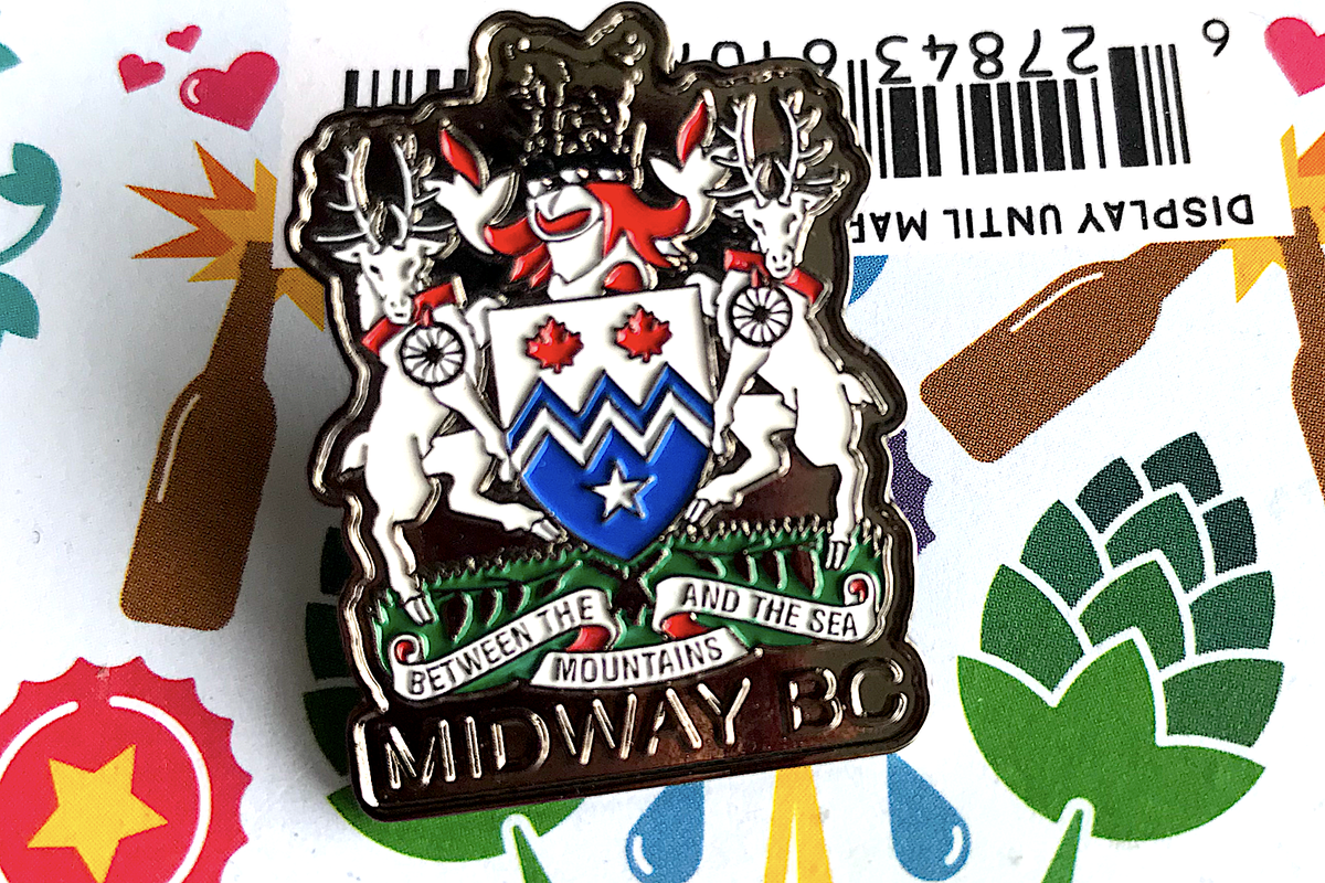
109. MIDWAY
- Coat of arms, ugh
- But a non-latin phrase, fun red collar
- Accurate representation of where Midway is in B.C.!
- Coat of arms, ugh
- But a non-latin phrase, fun red collar
- Accurate representation of where Midway is in B.C.!
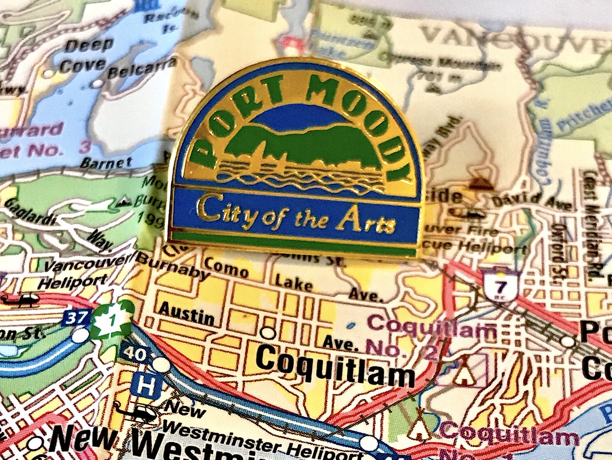
108. PORT MOODY
- Corporate but not bad?
- Fun boats, decent fonts, strange kerning on PORT
- Too many words, water blends into "City of the Arts"
- Corporate but not bad?
- Fun boats, decent fonts, strange kerning on PORT
- Too many words, water blends into "City of the Arts"
107. BELCARRA
- As teeny tiny as the municipality itself!
- Again, having a tree and wateris not an identity
- Cute enough though
- As teeny tiny as the municipality itself!
- Again, having a tree and wateris not an identity
- Cute enough though
106. HIGHLANDS
- Tree and water, but distinct arbutus tree!
- "District of" WHO CARES
- Pretty good for something modern
- Tree and water, but distinct arbutus tree!
- "District of" WHO CARES
- Pretty good for something modern
105. WEST KELOWNA
- Yes, that& #39;s a dinosaur holding a bowling ball WITH HIS SON
- It& #39;s for a bowling alley in Westbank, which was formerly a Kelowna neighbourhood, which is now IN West Kelowna, it counts okay
- very fun but also not a real municipal pin
- Yes, that& #39;s a dinosaur holding a bowling ball WITH HIS SON
- It& #39;s for a bowling alley in Westbank, which was formerly a Kelowna neighbourhood, which is now IN West Kelowna, it counts okay
- very fun but also not a real municipal pin
(laptop is running out of power, so another brief break and then we& #39;ll be able to go much quicker when i& #39;m actually at home)
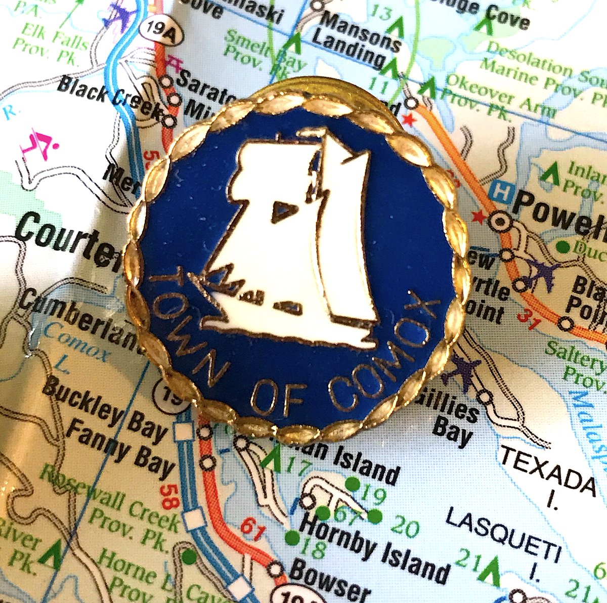
104. COMOX
- Simple, but reasonably effective
- Yes, lots of B.C. places has boats, but Comox has more, I will cut some slack
- Nice outer border, good gold trim for the boat
- Simple, but reasonably effective
- Yes, lots of B.C. places has boats, but Comox has more, I will cut some slack
- Nice outer border, good gold trim for the boat
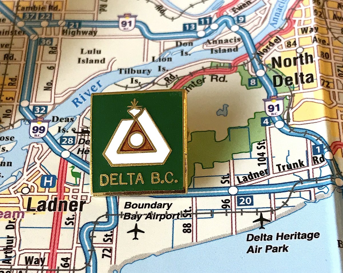
103. DELTA
- Delta& #39;s flag is the 5th best in the province, but they ported that over to the pin, and doesn& #39;t work quite as well
- Too square, too much green space, words take up too much space
- Overall theme (triangle of communities, farming in the middle) still solid though
- Delta& #39;s flag is the 5th best in the province, but they ported that over to the pin, and doesn& #39;t work quite as well
- Too square, too much green space, words take up too much space
- Overall theme (triangle of communities, farming in the middle) still solid though
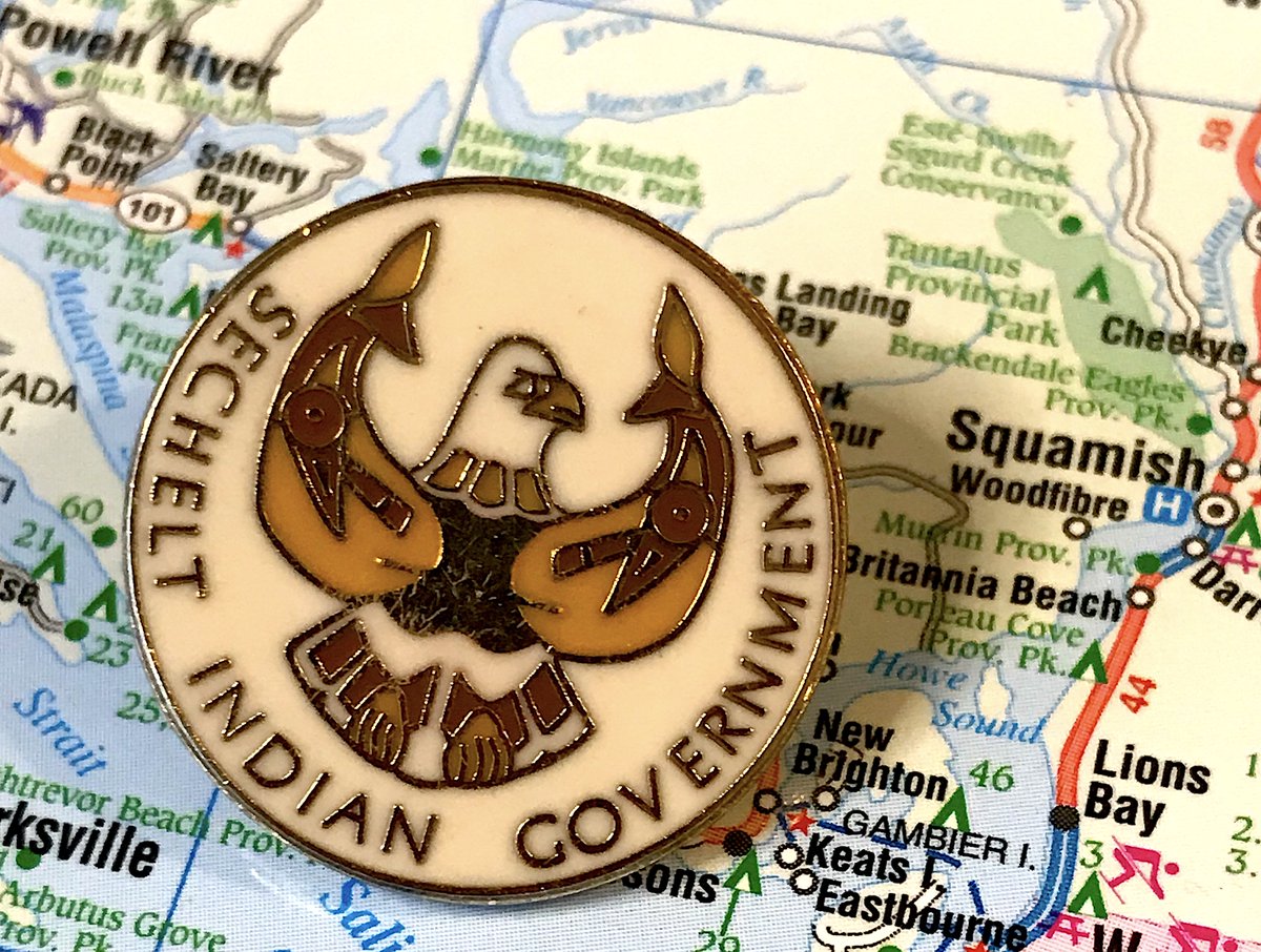
102. SECHELT INDIAN GOVERNMENT DISTRICT
- Honestly don& #39;t know why Sechelt is the only First Nation with separate municipal status
- That bird is fierce
- Colour scheme a little too bland
- Honestly don& #39;t know why Sechelt is the only First Nation with separate municipal status
- That bird is fierce
- Colour scheme a little too bland
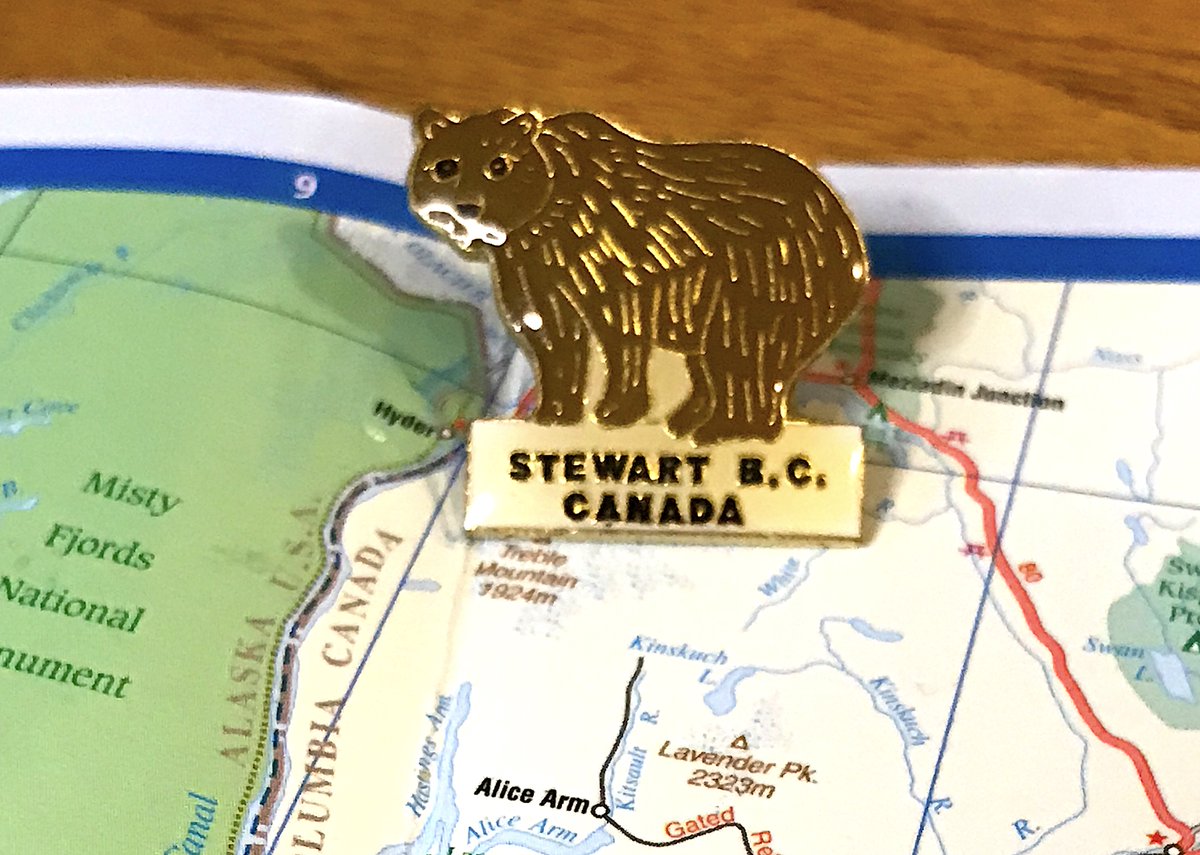
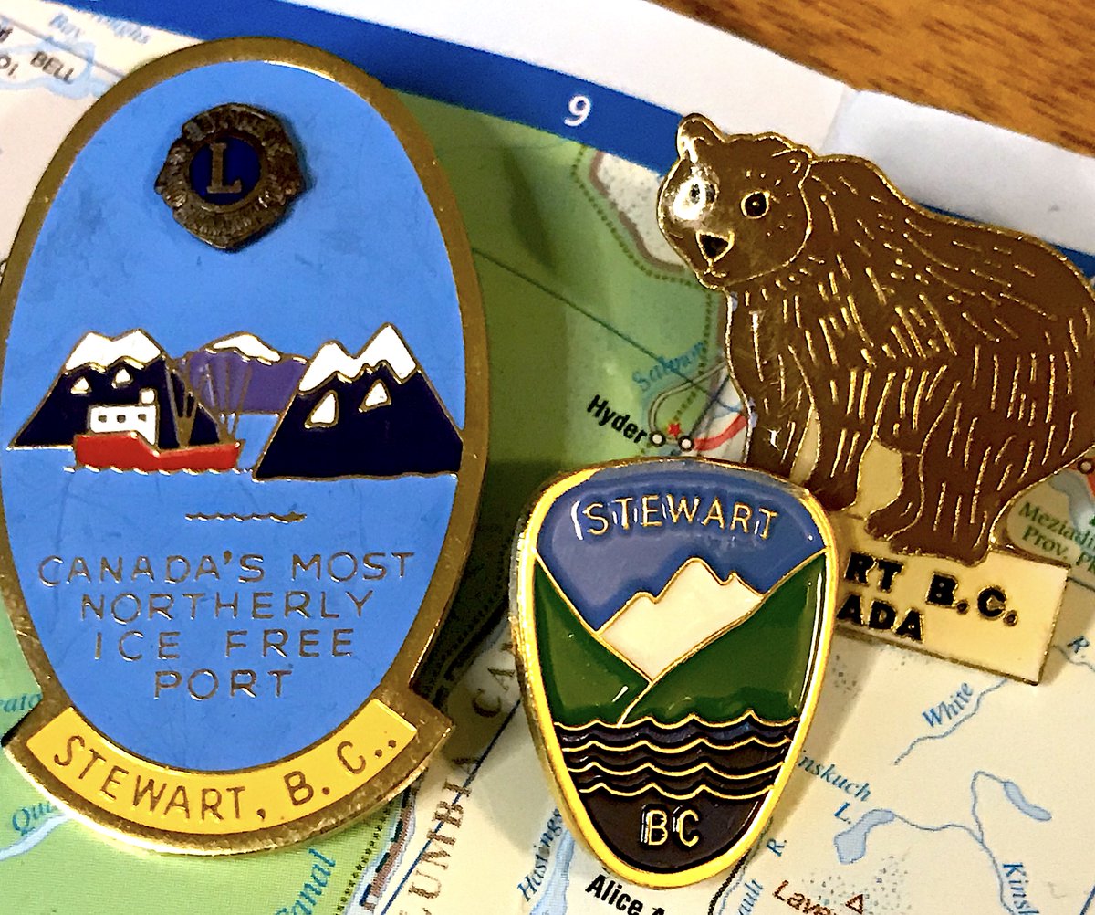
101. STEWART
- ROAR A BEAR
- The detail on it is nice and the bear is cute though
- Lions pin is better, but I had to go with the official one
- Stewart has 401 people, somehow I have three pins from there, what has become of my life
- ROAR A BEAR
- The detail on it is nice and the bear is cute though
- Lions pin is better, but I had to go with the official one
- Stewart has 401 people, somehow I have three pins from there, what has become of my life
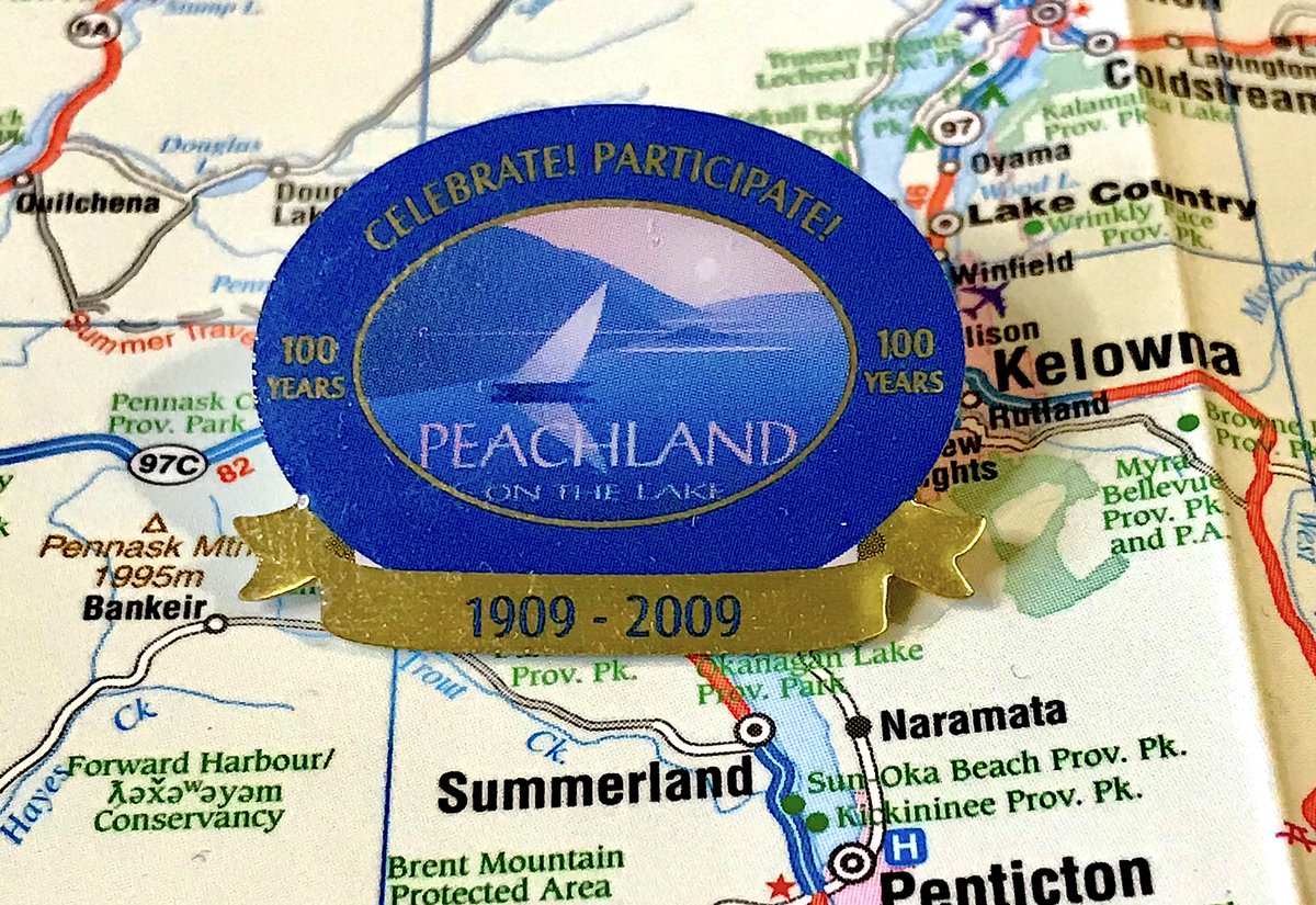
100. PEACHLAND
- Celebrate! Participate!
- How & #39;bout we just chill on beaches and enjoy some fruit
- Love the faux 3D banner at the bottom
- It& #39;s Peach "land", but it& #39;s "on the lake", you know what never mind
- Celebrate! Participate!
- How & #39;bout we just chill on beaches and enjoy some fruit
- Love the faux 3D banner at the bottom
- It& #39;s Peach "land", but it& #39;s "on the lake", you know what never mind
99. CLINTON
- MOOSE
- Less of a pin, more of a mini taxidermy thing
- Still delightful if vaguely unsettling
- MOOSE
- Less of a pin, more of a mini taxidermy thing
- Still delightful if vaguely unsettling
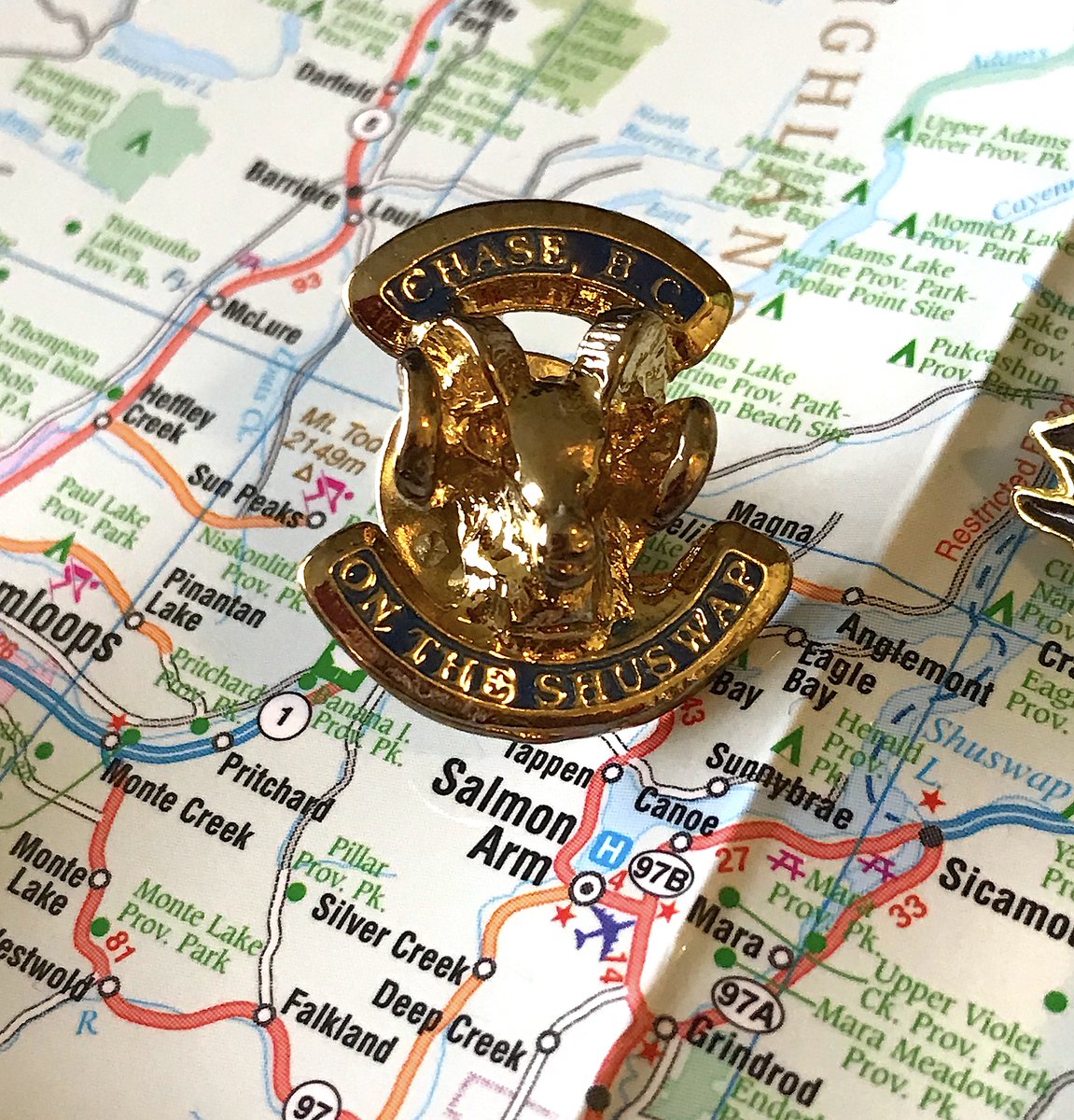
98. CHASE
- BIGHORN SHEEP
- Gets more points than Clinton because it helpfully points out it& #39;s "On The Shuswap"
- Again, delightful if vaguely unsettling
- BIGHORN SHEEP
- Gets more points than Clinton because it helpfully points out it& #39;s "On The Shuswap"
- Again, delightful if vaguely unsettling
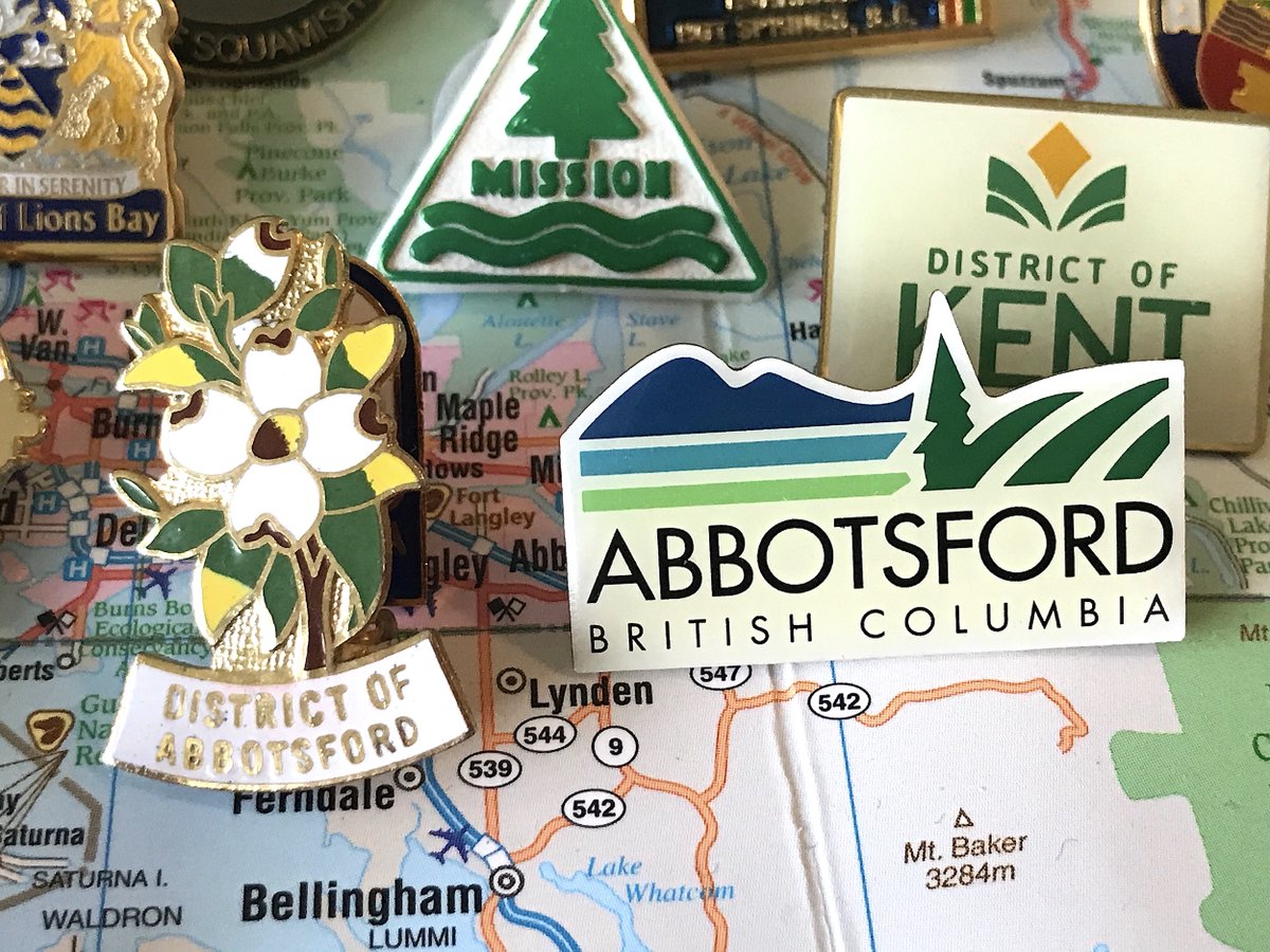
97. ABBOTSFORD
- We& #39;re counting the one on the left, not the boring corporate one to the right
- Dogwood flower is fun, if a bit too busy
- You can tell it& #39;s old because it& #39;s quirky and it refers to Abbotsford as a District
- We& #39;re counting the one on the left, not the boring corporate one to the right
- Dogwood flower is fun, if a bit too busy
- You can tell it& #39;s old because it& #39;s quirky and it refers to Abbotsford as a District
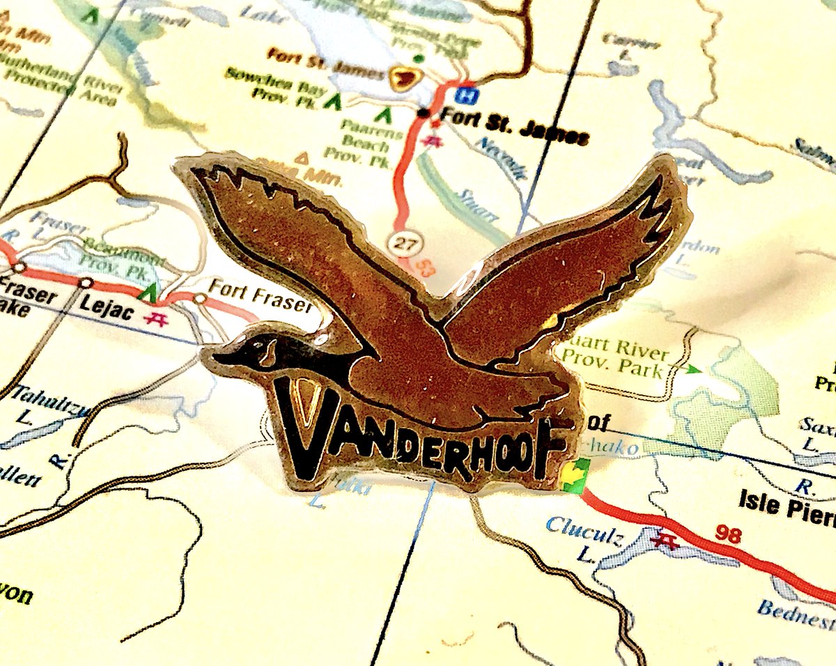
96. VANDERHOOF
- Assuming this is a reference to the Nechako River Migratory Bird Sanctuary, which, points for that
- Also some neat choices with the text
- Otherwise this is fine but boring, wish there was one pointing out it& #39;s at the centre of B.C.
- Assuming this is a reference to the Nechako River Migratory Bird Sanctuary, which, points for that
- Also some neat choices with the text
- Otherwise this is fine but boring, wish there was one pointing out it& #39;s at the centre of B.C.
95. LADYSMITH
- Ladysmith: we& #39;re on a hill
- Simple colour scheme, but a little too busy
- Unsure if the white space is good or lazy
- Ladysmith: we& #39;re on a hill
- Simple colour scheme, but a little too busy
- Unsure if the white space is good or lazy
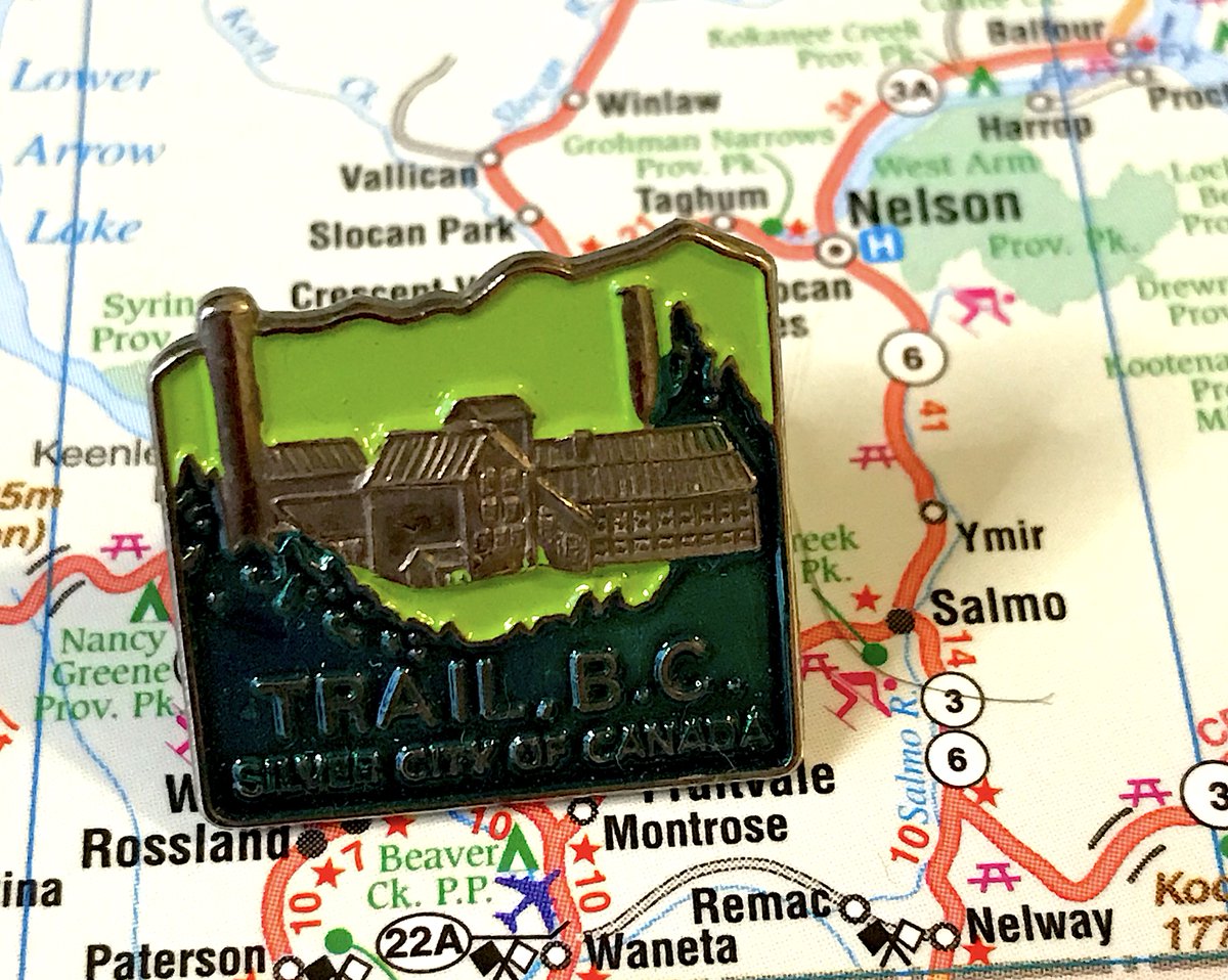
94. TRAIL
- Does the pin reference the smelter? Multiple times! Bless Trail
- There is one building too many
- Love the different tones of green, but also contributes to the busyness
- Does the pin reference the smelter? Multiple times! Bless Trail
- There is one building too many
- Love the different tones of green, but also contributes to the busyness
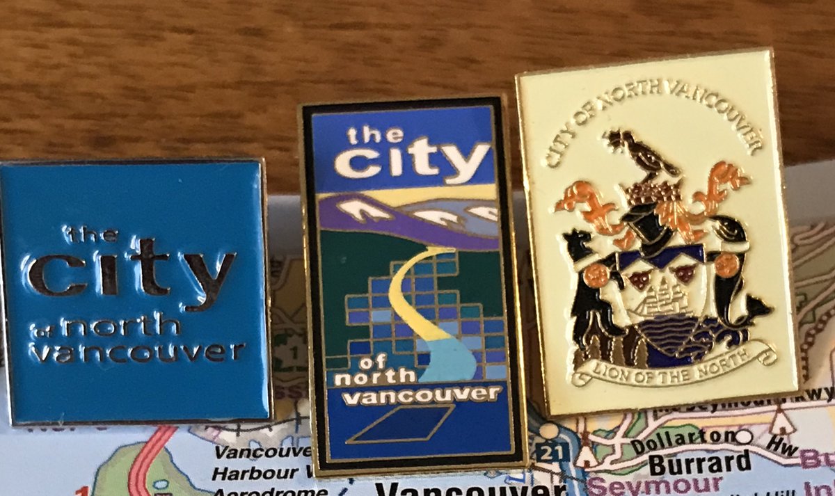
93. NORTH VANCOUVER CITY
- Really enjoy the mid-90s Myst knockoff vibes to the artwork
- Did...did the boat sink in the water?
- The city has many pins and none of them are particularly great
- Really enjoy the mid-90s Myst knockoff vibes to the artwork
- Did...did the boat sink in the water?
- The city has many pins and none of them are particularly great
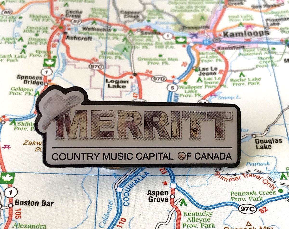
92. MERRITT
- Yee-haw!
- That cowboy hat!
- I really enjoyed this, one of the rankers did not, he& #39;s no longer my friend
- Yee-haw!
- That cowboy hat!
- I really enjoyed this, one of the rankers did not, he& #39;s no longer my friend
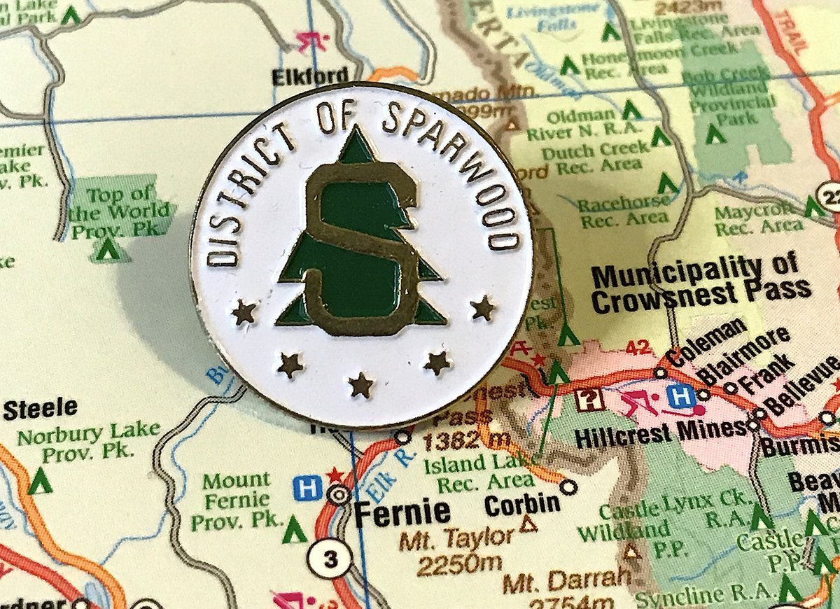
91. SPARWOOD
- Apparently Sparwood is now a football team in the Big Ten Conference
- Nobody cares you& #39;re a district, Vol. 4,567
- Overall there& #39;s a pretty good balance to everything here
- Apparently Sparwood is now a football team in the Big Ten Conference
- Nobody cares you& #39;re a district, Vol. 4,567
- Overall there& #39;s a pretty good balance to everything here
90. POUCE COUPE
- More stylized and less busy than its flag, still confusing
- Those brown pepper shakers are supposed to be wheat sheaves
- Not bad despite Village, B.C., 1932
- More stylized and less busy than its flag, still confusing
- Those brown pepper shakers are supposed to be wheat sheaves
- Not bad despite Village, B.C., 1932
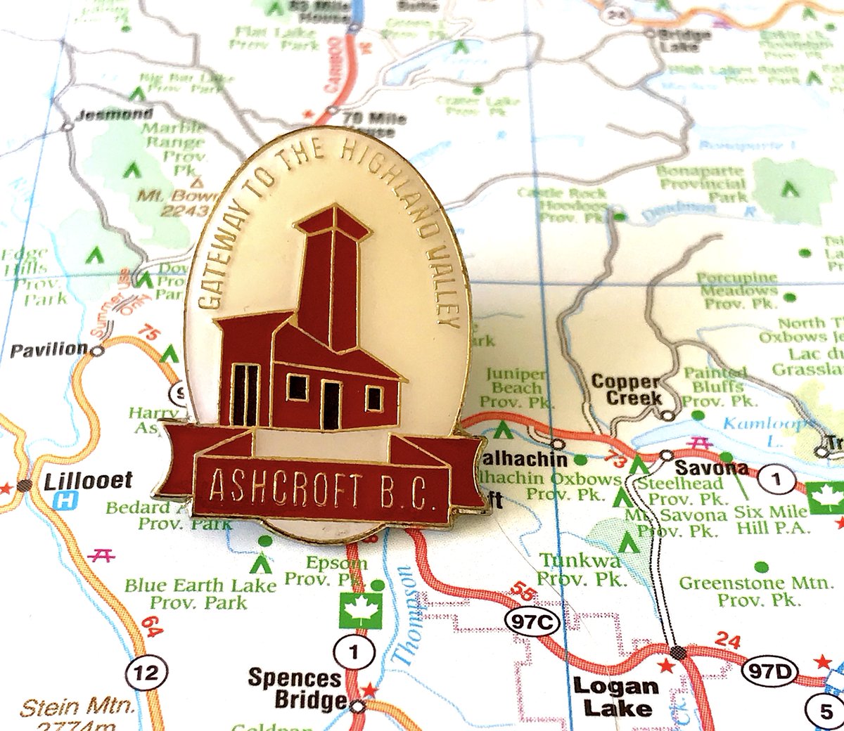
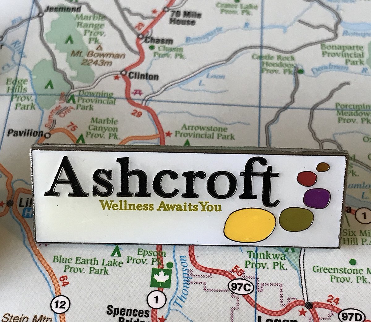
89. ASHCROFT
- Love them repping the heritage fire hall
- Weird to say "welcome to our town! we& #39;re a gateway to other things!"
- The new logo promises "Wellness", and that& #39;s...that& #39;s a strange thing for a town to promise
- Love them repping the heritage fire hall
- Weird to say "welcome to our town! we& #39;re a gateway to other things!"
- The new logo promises "Wellness", and that& #39;s...that& #39;s a strange thing for a town to promise
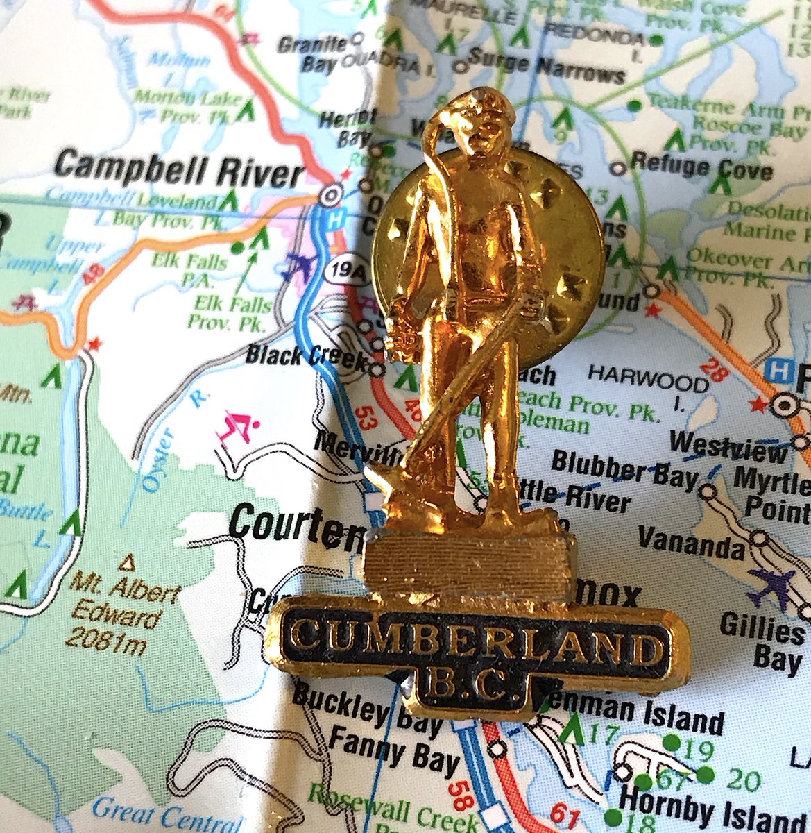
88. CUMBERLAND
- Heck yes let& #39;s celebrate the town& #39;s mining past
- Unfortunately, the actual design makes it hard to really see the details in the design
- Also again, not really a pin, still fun!
- Heck yes let& #39;s celebrate the town& #39;s mining past
- Unfortunately, the actual design makes it hard to really see the details in the design
- Also again, not really a pin, still fun!
87. TERRACE
- Terrace leans really hard into "sometimes you can see Spirit Bears in our town!"
- Terrace really never builds off that branding
- Also that& #39;s the Nelvana logo
- Terrace leans really hard into "sometimes you can see Spirit Bears in our town!"
- Terrace really never builds off that branding
- Also that& #39;s the Nelvana logo
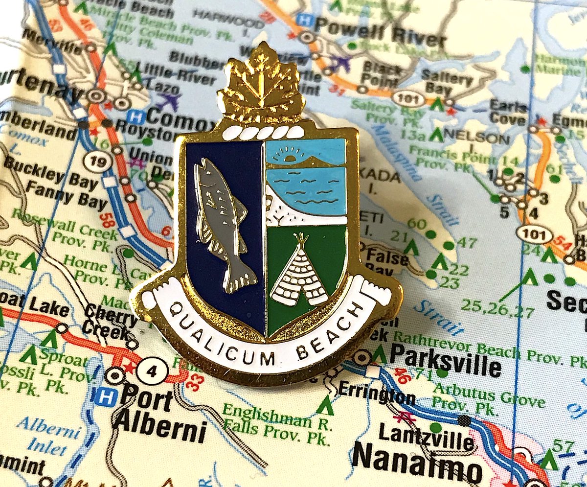
86. QUALICUM BEACH
- Time for another "there are three things we like about our community, and couldn& #39;t decide which was most important, so you get all of them" pin
- fish and ocean very generic, teepee is a choice alright
- Neat design though, much video game items energy
- Time for another "there are three things we like about our community, and couldn& #39;t decide which was most important, so you get all of them" pin
- fish and ocean very generic, teepee is a choice alright
- Neat design though, much video game items energy
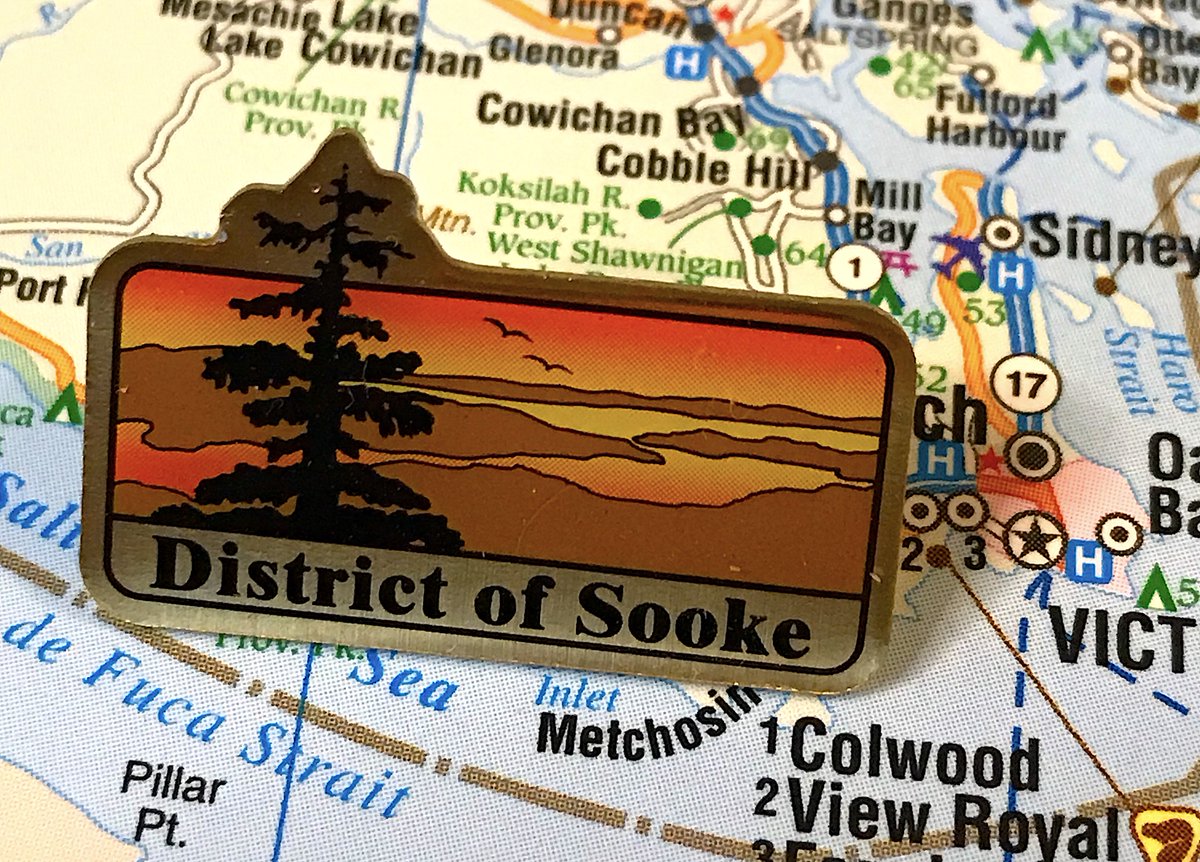
85. SOOKE
- Corporate but interesting!
- Nice colours, tree sticking out makes it unique, birds flying away a nice touch
- how many times will have to grouse about the fact nobody cares you& #39;re a district
- Corporate but interesting!
- Nice colours, tree sticking out makes it unique, birds flying away a nice touch
- how many times will have to grouse about the fact nobody cares you& #39;re a district
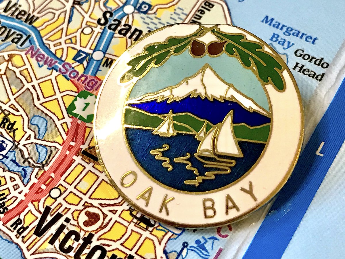
84. OAK BAY
- Oak Bay: you can see a mountain that& #39;s not in Oak Bay if you& #39;re in the water near Oak Bay!
- Clean design, fun boats, no "city of the district of the corporation established in 1909" nonsense
- Ultimately pretty generic
- Oak Bay: you can see a mountain that& #39;s not in Oak Bay if you& #39;re in the water near Oak Bay!
- Clean design, fun boats, no "city of the district of the corporation established in 1909" nonsense
- Ultimately pretty generic
83. DUNCAN
- There& #39;s a lot to unpack with B.C. municipalities collecting totem poles, but that& #39;s another story!
- Interesting design, colours a bit dated
- Can& #39;t decide if the totem being on an angle is good or bad
- There& #39;s a lot to unpack with B.C. municipalities collecting totem poles, but that& #39;s another story!
- Interesting design, colours a bit dated
- Can& #39;t decide if the totem being on an angle is good or bad
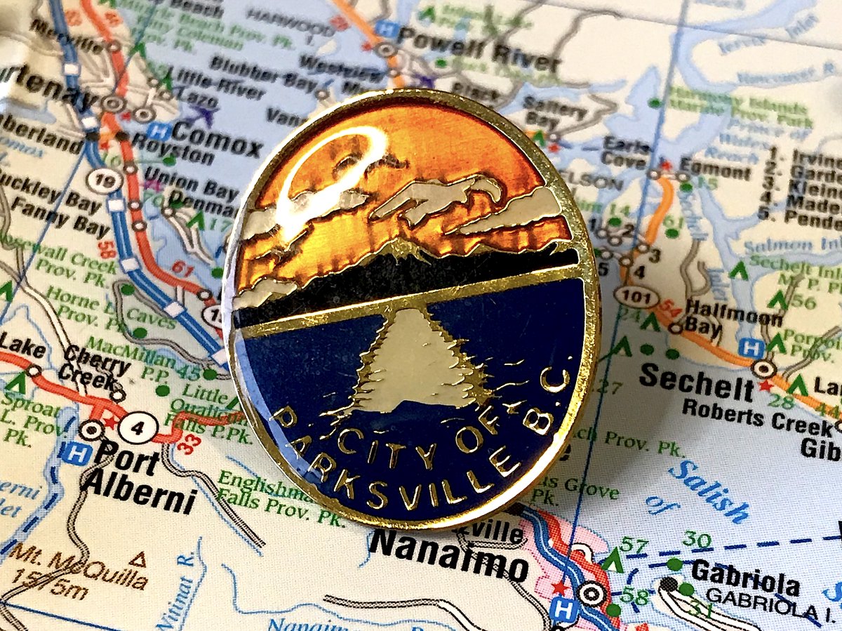
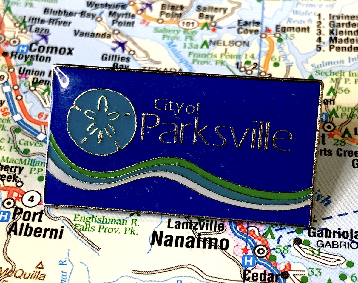
82. PARKSVILLE
- Generic idea, but unique colour choices and angle
- are those clouds or weird birds
- Does the city have a boring corporate pin? Sure does!
- Generic idea, but unique colour choices and angle
- are those clouds or weird birds
- Does the city have a boring corporate pin? Sure does!
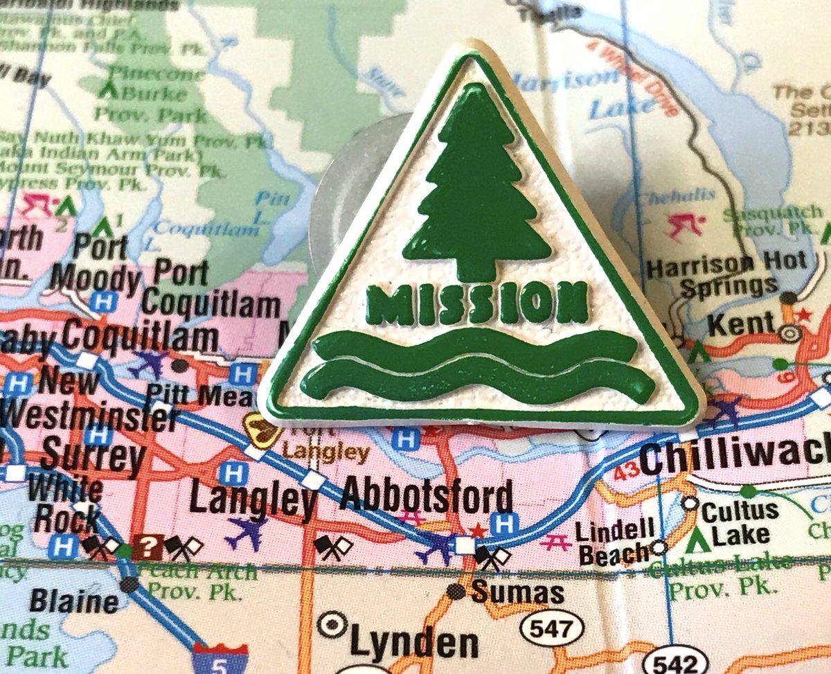
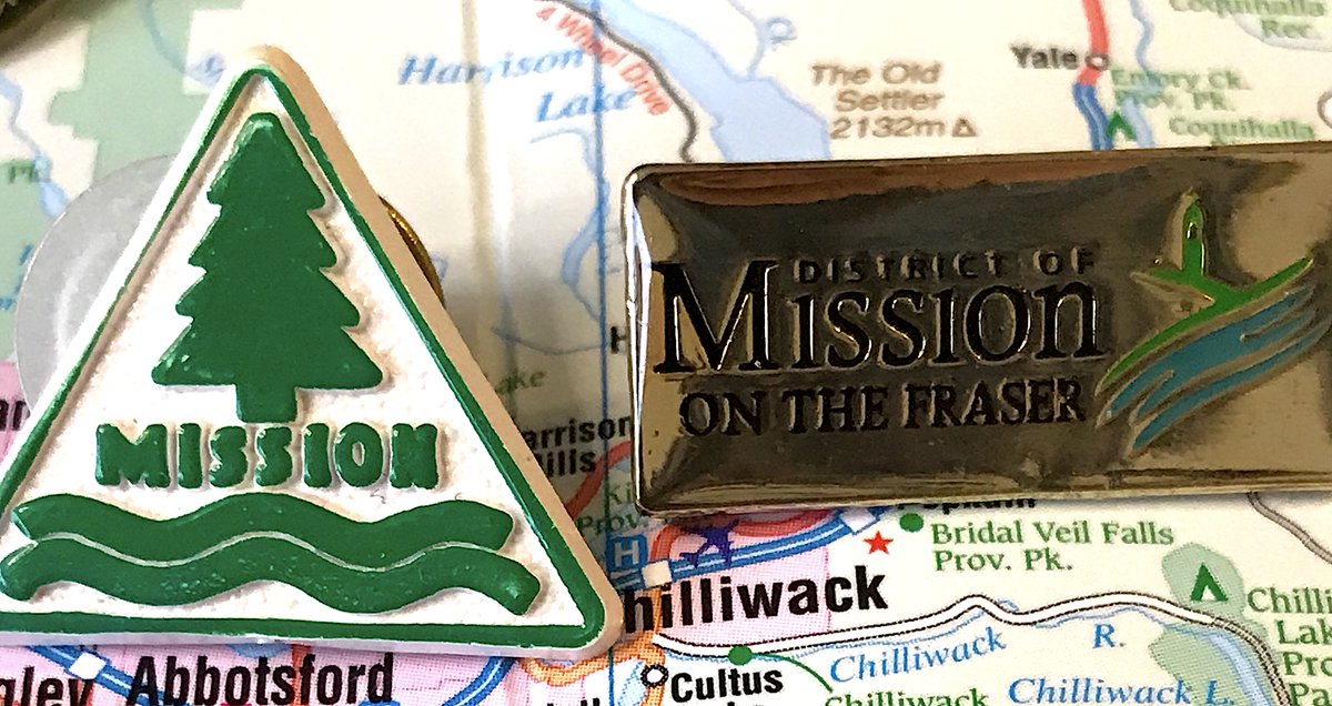
81. MISSION
- yessss we& #39;ve got ourselves a triangle pin
- still just reflecting the "tree+water" sentiment like everyone else, but does it with STYLE
- corporate pin is corporate, film at 11
- yessss we& #39;ve got ourselves a triangle pin
- still just reflecting the "tree+water" sentiment like everyone else, but does it with STYLE
- corporate pin is corporate, film at 11
(There are 162 municipalities, so time for a halftime break to get food/have folks make jokes about my obsessiveness)
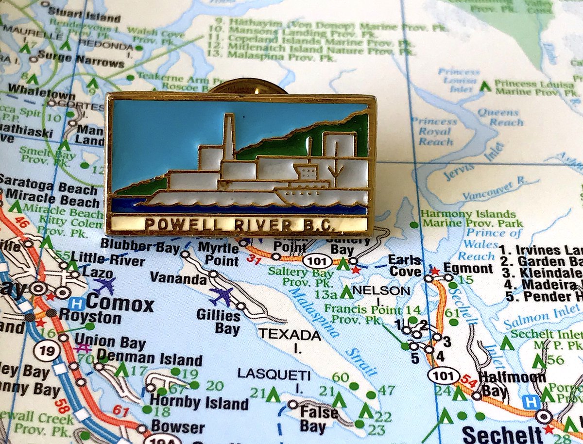
80. POWELL RIVER
- let our pin praise the paper mill, sweet titan of industry that sustains us
- having literally all the buildings be white was a choice, but that& #39;s what happens when you use up your colours on generic green/blue stuff
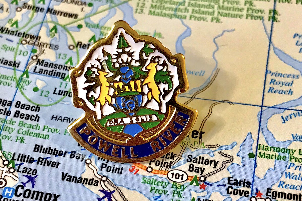
- there& #39;s a pin for the crest, boo
- let our pin praise the paper mill, sweet titan of industry that sustains us
- having literally all the buildings be white was a choice, but that& #39;s what happens when you use up your colours on generic green/blue stuff
- there& #39;s a pin for the crest, boo
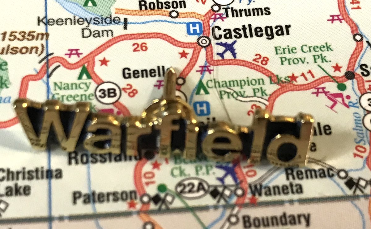
79. WARFIELD
- "Jewel of the Kootenays" is debatable for what is essentially Trail& #39;s bedroom community
- all the important things: bridge, smelter, weird glowing orb
- The modern pin is one of the first I collected (at a UBCM trade show two years ago) and also one of the saddest
- "Jewel of the Kootenays" is debatable for what is essentially Trail& #39;s bedroom community
- all the important things: bridge, smelter, weird glowing orb
- The modern pin is one of the first I collected (at a UBCM trade show two years ago) and also one of the saddest
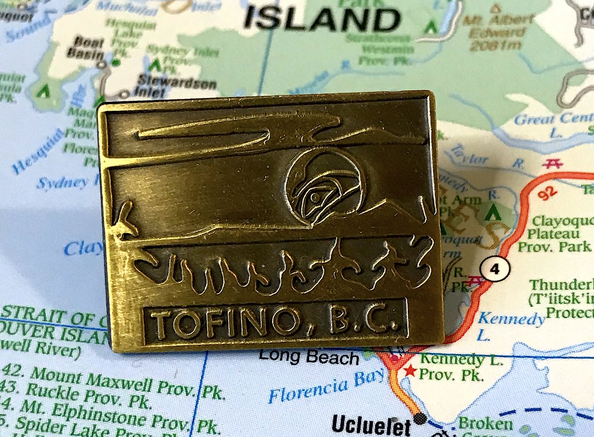
78. TOFINO
- Explicit choice to have no colours, and it mostly works
- Trees! But also water!
- Let& #39;s all enjoy the hilarious article about the ownership of the design sparked by the 2018 flag ranking: https://www.westerlynews.ca/news/municipal-flag-ranking-project-sparks-controversy-in-tofino/">https://www.westerlynews.ca/news/muni...
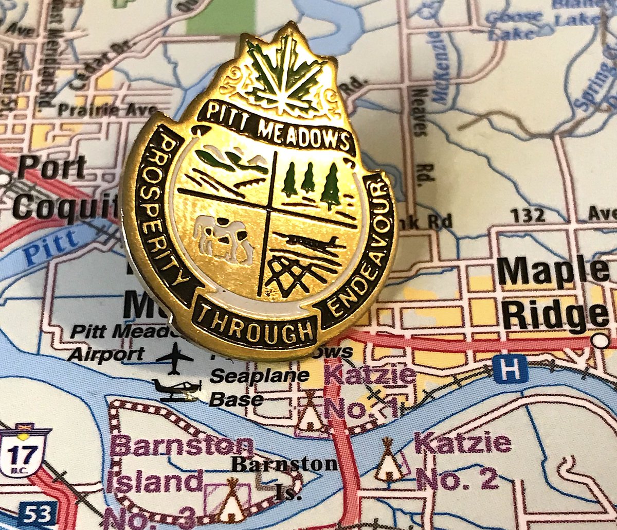
77. PITT MEADOWS
- Fields and trees are boring, but airplanes and cows? Sign me up.
- Leaf at the top unnecessary
- "Prosperity through endeavour," good that you didn& #39;t go with the latin, but it& #39;s still very bland
- Fields and trees are boring, but airplanes and cows? Sign me up.
- Leaf at the top unnecessary
- "Prosperity through endeavour," good that you didn& #39;t go with the latin, but it& #39;s still very bland
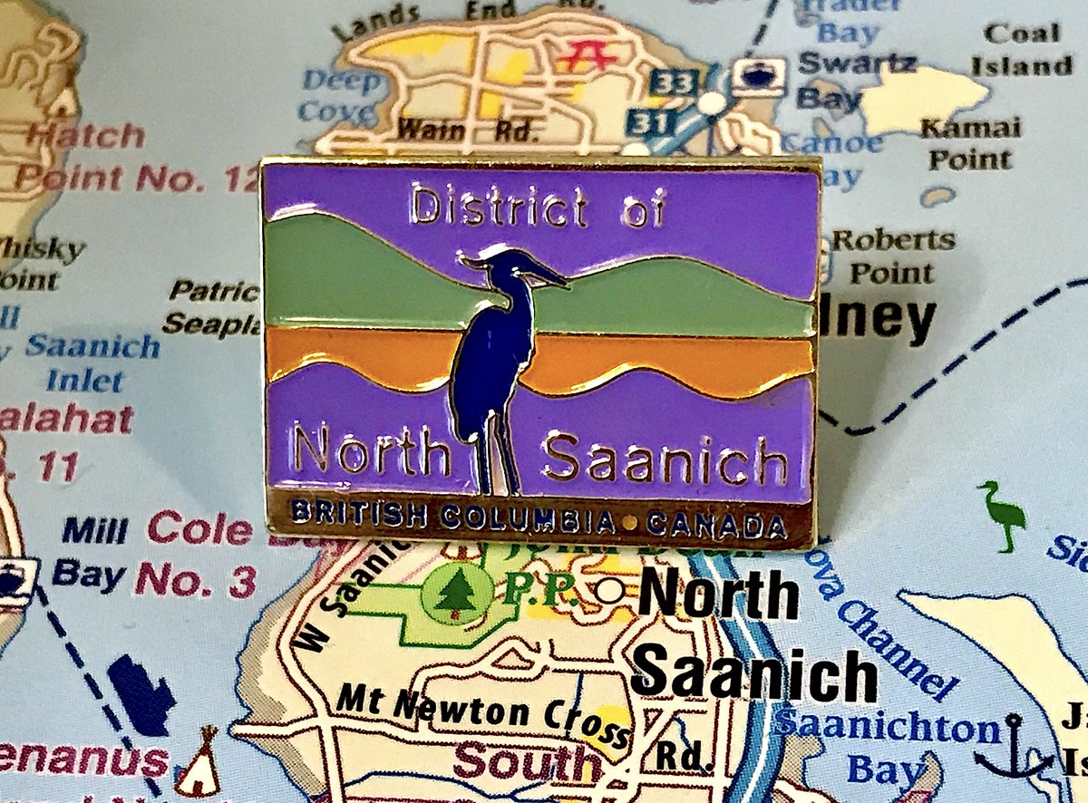
76. NORTH SAANICH
- Dig the colour scheme, dig the birb
- Makes up for all the text and corporate feel of it
- The fact that there& #39;s a North Saanich, Central Saanich, but no "South Saanich", just "Saanich" is one of those weird B.C. geography things we blindly accept
- Dig the colour scheme, dig the birb
- Makes up for all the text and corporate feel of it
- The fact that there& #39;s a North Saanich, Central Saanich, but no "South Saanich", just "Saanich" is one of those weird B.C. geography things we blindly accept
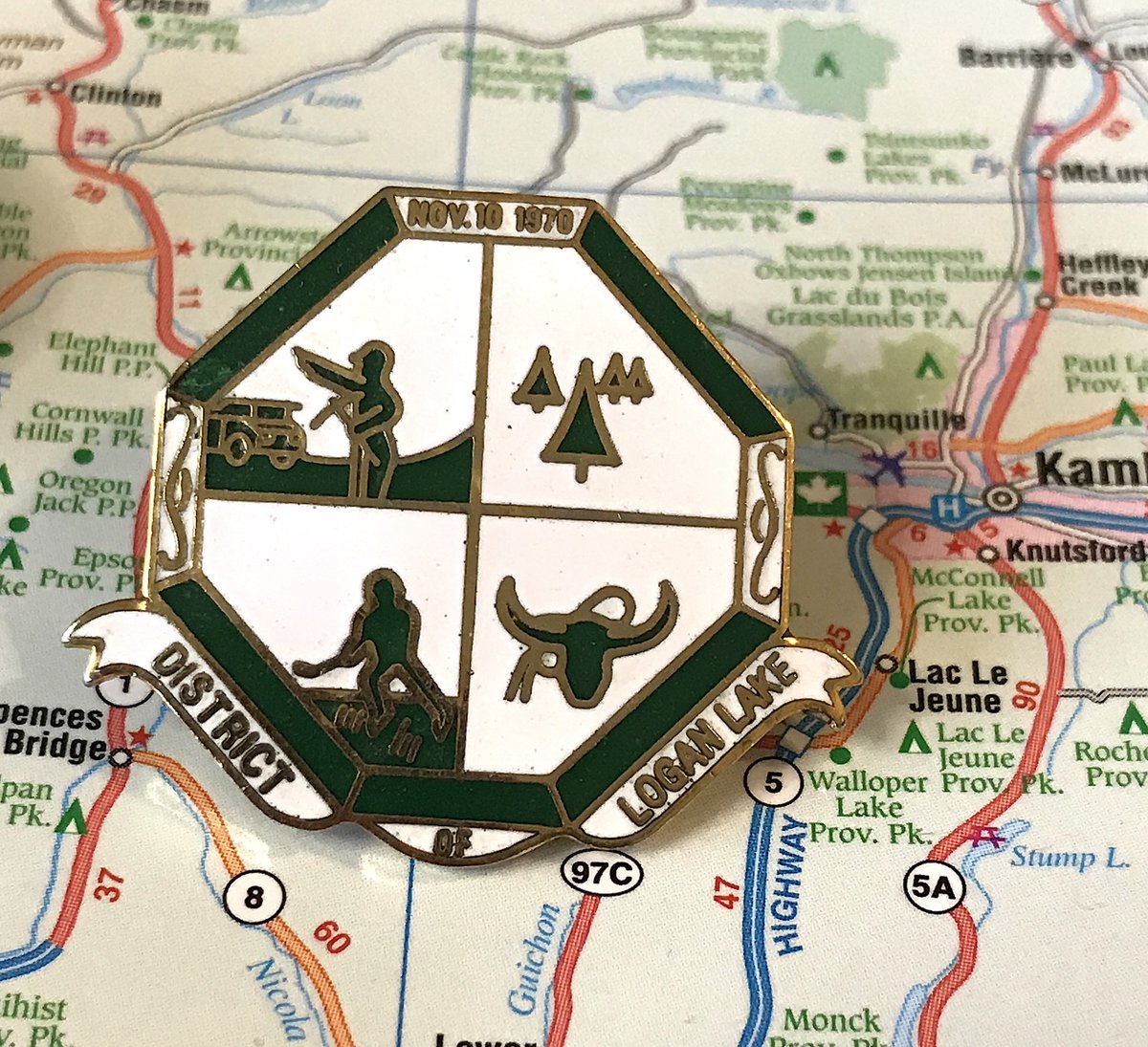
75. LOGAN LAKE
- They not only put the year the town was founded, but the exact day!
- Mining, trees, cattle, and hockey: the most random "here& #39;s our deal" pin yet
- entire useless "of" at the bottom
- They not only put the year the town was founded, but the exact day!
- Mining, trees, cattle, and hockey: the most random "here& #39;s our deal" pin yet
- entire useless "of" at the bottom
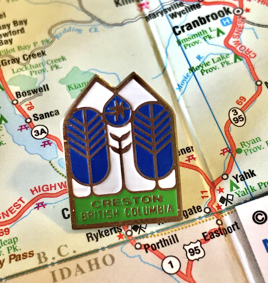
74. CRESTON
- Clean, gets the point across, completely inoffensive, you passed the pin test
- Also boring, also superfluous "British Columbia" at the bottom"
- why is the sun trapped
- Clean, gets the point across, completely inoffensive, you passed the pin test
- Also boring, also superfluous "British Columbia" at the bottom"
- why is the sun trapped
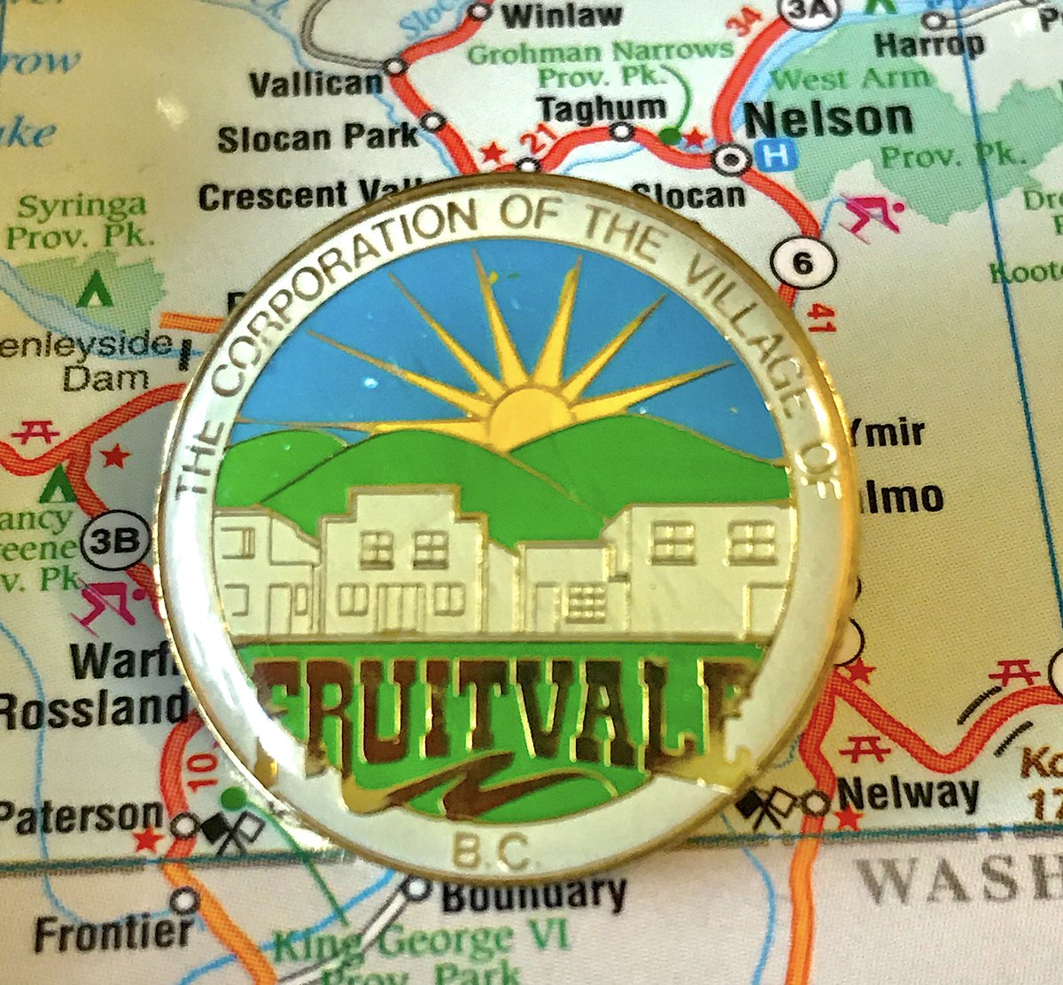
73. FRUITVALE
- The Corporation of the Village of WHO CARES
- Bold to show specific buildings on your pin that may not exist in future decades
- Good colours, fun font for Fruitvale, fully acceptable pin
- The Corporation of the Village of WHO CARES
- Bold to show specific buildings on your pin that may not exist in future decades
- Good colours, fun font for Fruitvale, fully acceptable pin
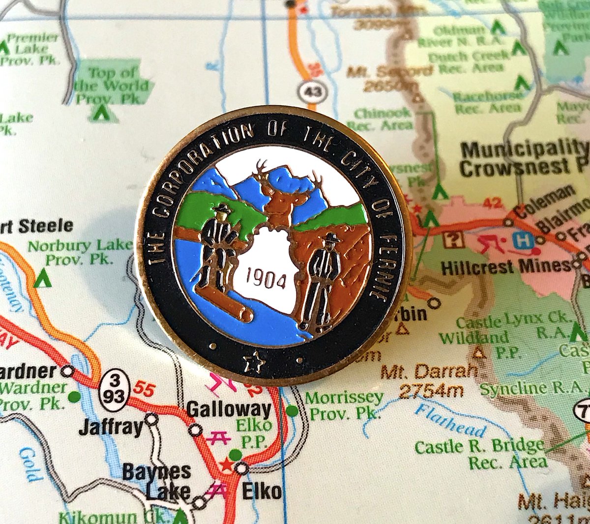
72. FERNIE
- What is that moose hiding behind?
- Why is he 14 feet tall
- do the log and mine men know they& #39;re about to be devoured by the moose? SOMEBODY WARN THEM
- yes, 1904, very important, good for you fernie
- What is that moose hiding behind?
- Why is he 14 feet tall
- do the log and mine men know they& #39;re about to be devoured by the moose? SOMEBODY WARN THEM
- yes, 1904, very important, good for you fernie
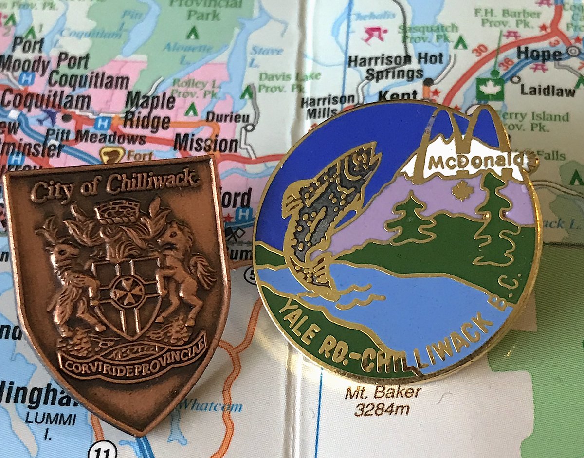
71. CHILLIWACK
- We& #39;re using the McDonald& #39;s pin on the right because it& #39;s amazing and the official pin is boring
- The salmon is 40 feet tall and will destroy us all
- The trees are drawn by children? I think?
- Yes, McDonald& #39;s made pins for specific B.C. stores, very normal
- We& #39;re using the McDonald& #39;s pin on the right because it& #39;s amazing and the official pin is boring
- The salmon is 40 feet tall and will destroy us all
- The trees are drawn by children? I think?
- Yes, McDonald& #39;s made pins for specific B.C. stores, very normal
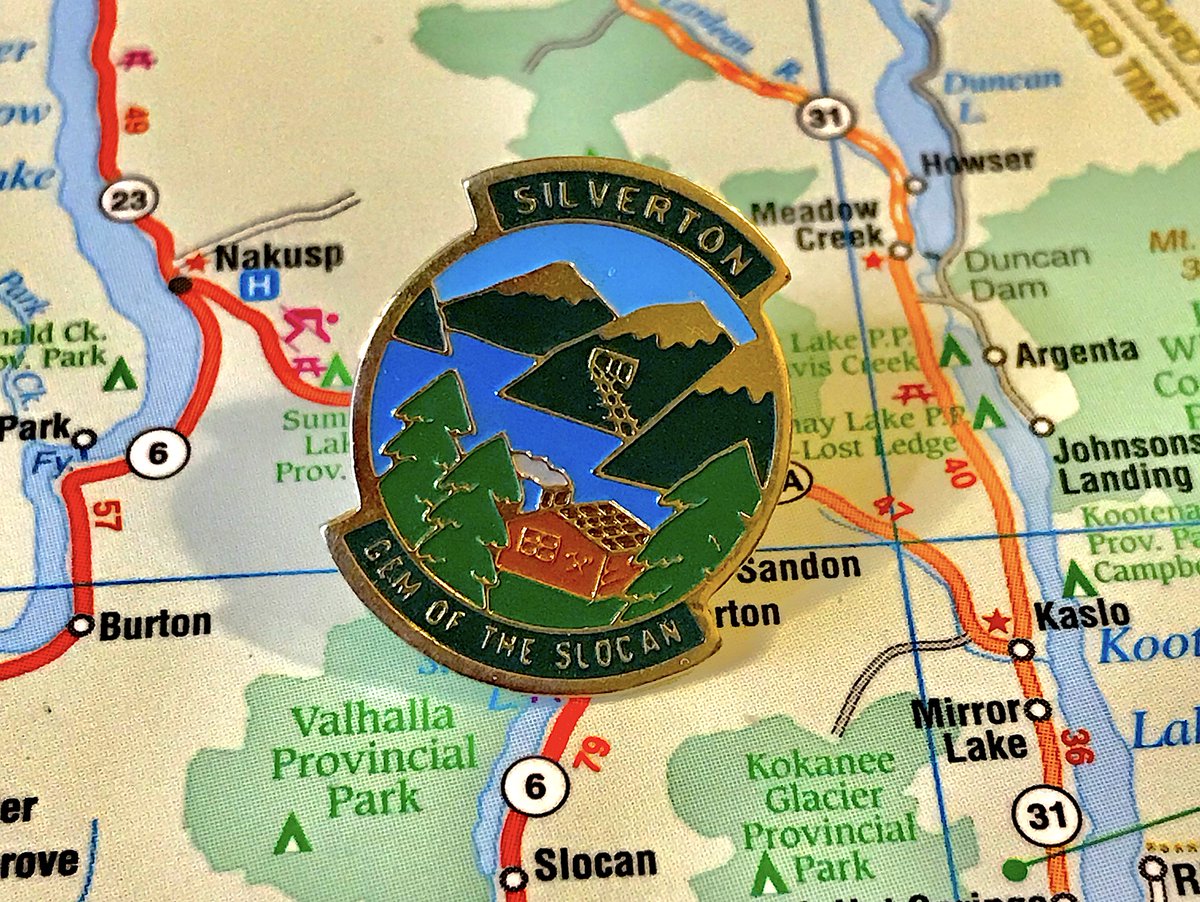
70. SILVERTON
- d& #39;awwwwe this is cute
- "Gem of the Slocan" is...you know what, maybe
- the chimney smoke!
- train tracks going into the mountain are weird
- d& #39;awwwwe this is cute
- "Gem of the Slocan" is...you know what, maybe
- the chimney smoke!
- train tracks going into the mountain are weird
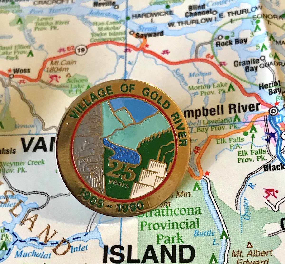
69. GOLD RIVER
- Ah, the days when mill towns in the middle of Vancouver Island had enough money to splurge on 25th anniversary pins
- There is too much going on here but it mostly works
- Middle is very generic B.C.
- Ah, the days when mill towns in the middle of Vancouver Island had enough money to splurge on 25th anniversary pins
- There is too much going on here but it mostly works
- Middle is very generic B.C.
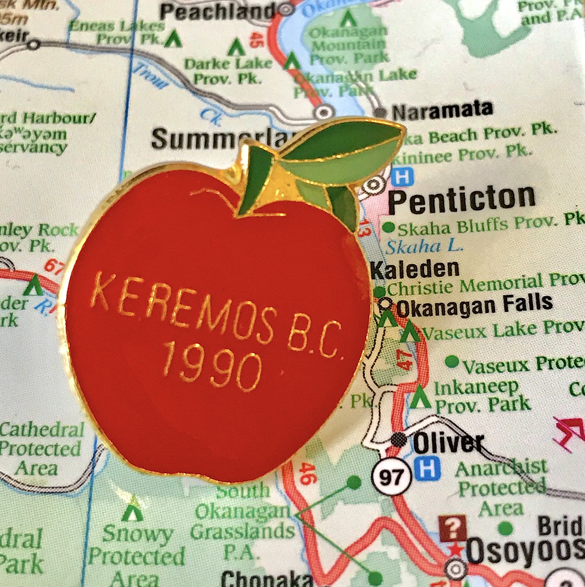
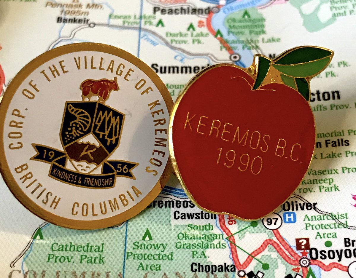
68. KEREMEOS
- The spelling mistake on the apple is hilarious
- Also Keremeos incorporated in 1956, what happened in 1990
- Cute and on brand though
- Modern corporate pin is not bad, "Kindness and Friendship" makes me smile
- The spelling mistake on the apple is hilarious
- Also Keremeos incorporated in 1956, what happened in 1990
- Cute and on brand though
- Modern corporate pin is not bad, "Kindness and Friendship" makes me smile
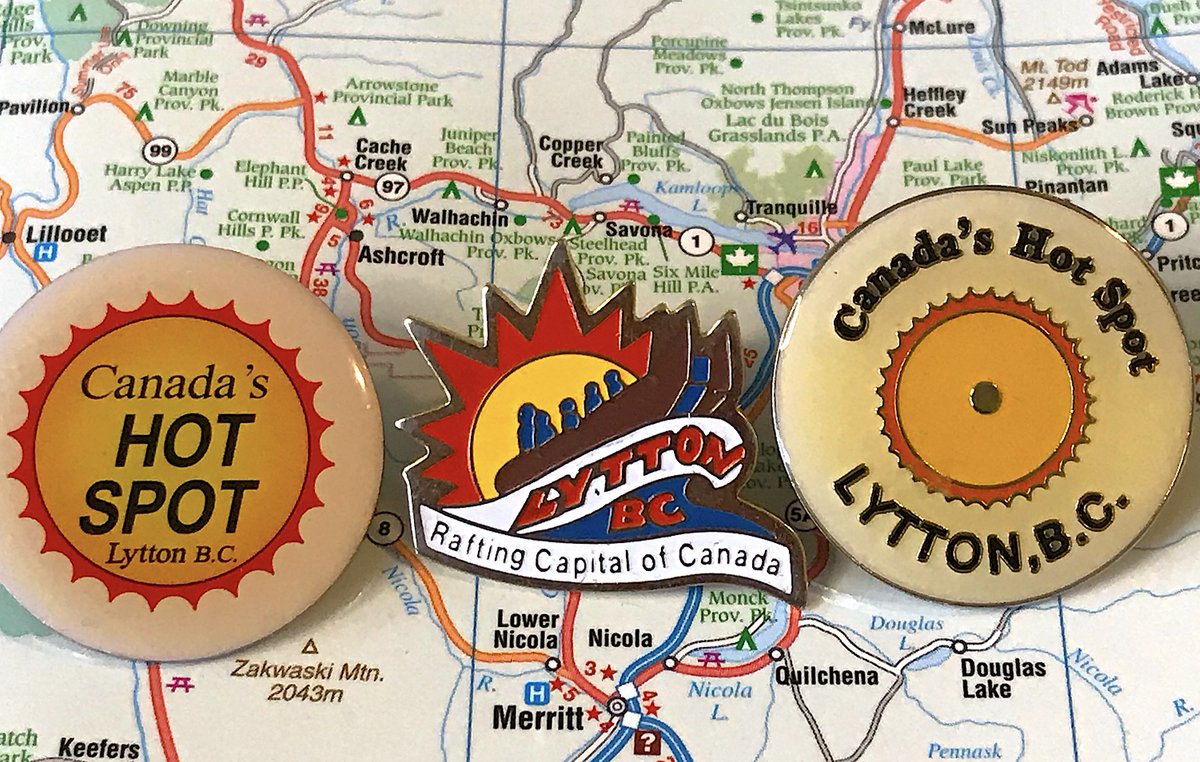
67. LYTTON
- Microsoft Paint Presents: Lytton
- HOT SPOT
- One person in the ranking team hated this pin, they are wrong
- Lytton has three fun pins and 249 residents, an incredibly impressive ratio
- Microsoft Paint Presents: Lytton
- HOT SPOT
- One person in the ranking team hated this pin, they are wrong
- Lytton has three fun pins and 249 residents, an incredibly impressive ratio
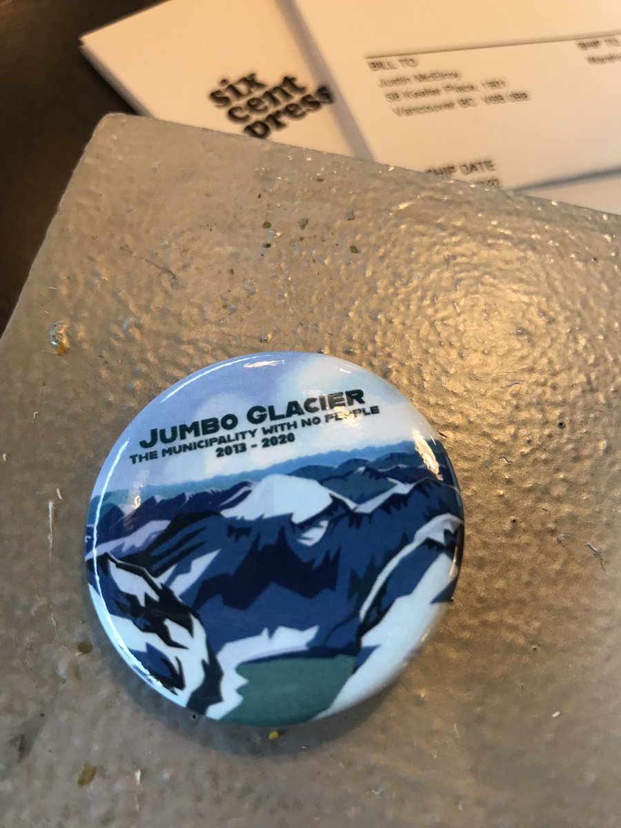
66. JUMBO GLACIER
- Town was created by the past government when a ski resort was planned, it didn& #39;t happen for a lot of reasons, there was a mayor and council, now its being decommissioned: https://www.cbc.ca/news/canada/british-columbia/jumbo-glacier-disincorporation-2020-1.5434090
-">https://www.cbc.ca/news/cana... It still exists for now, so I made this
- I have no regrets
(I only ordered 10 Jumbo Glacier buttons, and I will give 9 of them out judiciously over time, in fun and weird ways that I& #39;m already excited about planning)
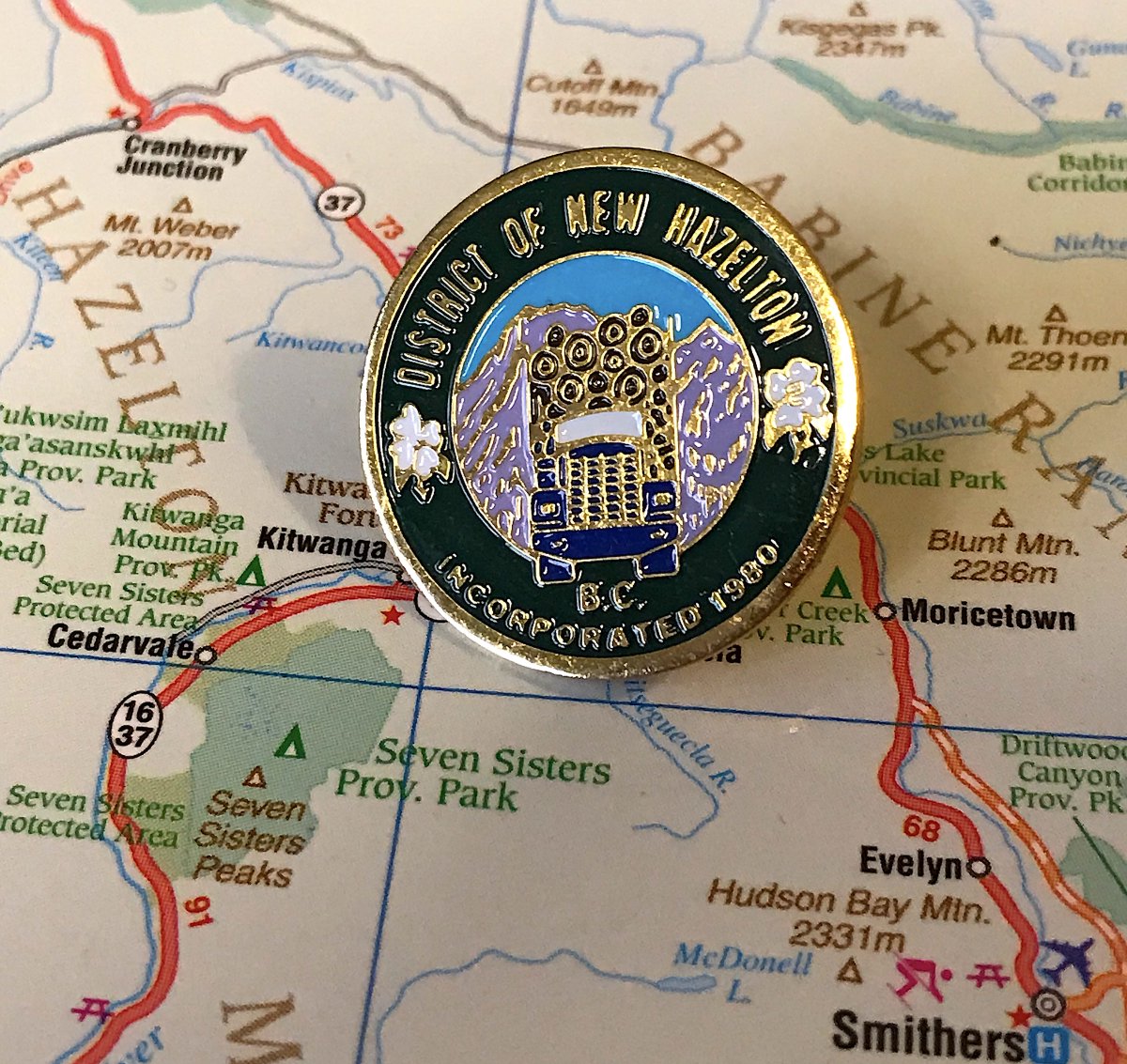
65. NEW HAZELTON
- TRUCK WITH LOGS, THAT& #39;S WHY WE EXIST, BLESS THIS PROVINCE
- Dogwood is a nice touch
- Purple mountains are pretty!
- Very nice in spite of all the text
- TRUCK WITH LOGS, THAT& #39;S WHY WE EXIST, BLESS THIS PROVINCE
- Dogwood is a nice touch
- Purple mountains are pretty!
- Very nice in spite of all the text
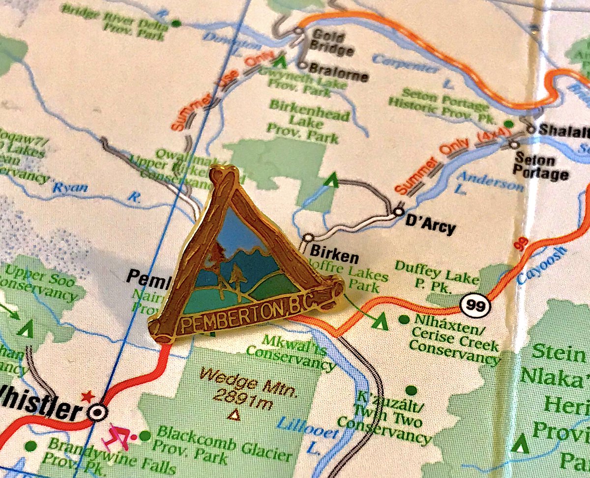
64. PEMBERTON
- Triangle pin! And with a slightly odd shape to make the logs authentic!
- Middle is B.C. 101, but that& #39;s fine
- I keep showing the modern corporate pins because I want to shame municipalities into getting ride of them and bring back the fun ones
- Triangle pin! And with a slightly odd shape to make the logs authentic!
- Middle is B.C. 101, but that& #39;s fine
- I keep showing the modern corporate pins because I want to shame municipalities into getting ride of them and bring back the fun ones
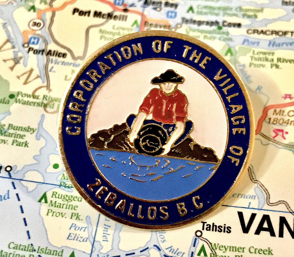
63. ZEBALLOS
- gold pan man loves his corporation of the village
- the balance on this pin is pretty good
- yes, I have a Barkerville pin, but it& #39;s not a municipality so I& #39;m not showing it as part of this
- gold pan man loves his corporation of the village
- the balance on this pin is pretty good
- yes, I have a Barkerville pin, but it& #39;s not a municipality so I& #39;m not showing it as part of this
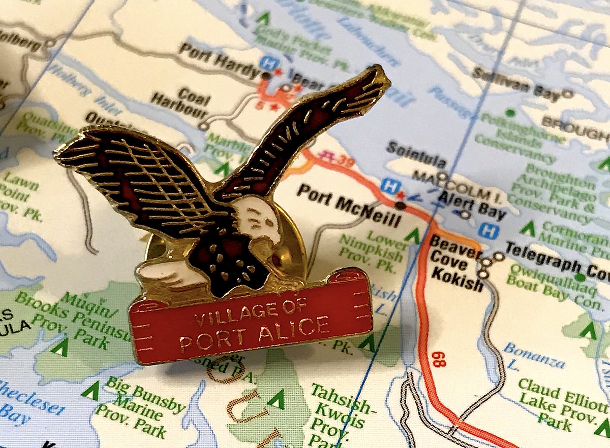
62. PORT ALICE
- Bird attack!
- Is there anything else to Port Alice? Who knows
- Got 7/10 scores from all of the rankers, which is fair: it& #39;s fun but not amazing
- Bird attack!
- Is there anything else to Port Alice? Who knows
- Got 7/10 scores from all of the rankers, which is fair: it& #39;s fun but not amazing
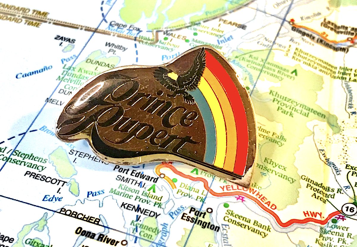
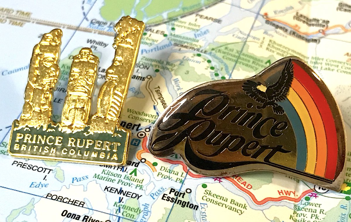
61. PRINCE RUPERT
- Municipality& #39;s nickname is "city of rainbows," so this works
- "city of rainbows" is also a sneaky way of saying "it rains all the time here", but anyway
- The theme is generic, but the execution is well done
- Municipality& #39;s nickname is "city of rainbows," so this works
- "city of rainbows" is also a sneaky way of saying "it rains all the time here", but anyway
- The theme is generic, but the execution is well done
(meanwhile, people upset at my opinion of warfield not being the "jewel of the kootenays" include ray ferraro and my boss, i respect their opinions, but the correct answer is rossland) https://twitter.com/stevecbc/status/1290406730313039872">https://twitter.com/stevecbc/...
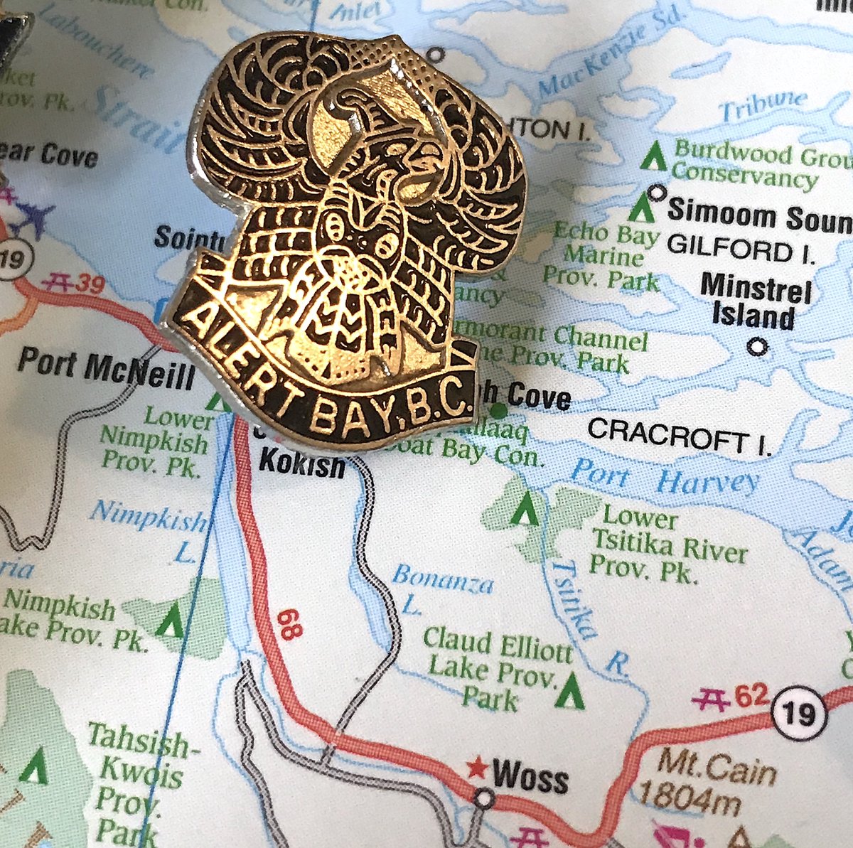
60. ALERT BAY
- Clean design, simple naming at the bottom, one of the few pins to full incorporate Indigenous themes
- would be more striking if the space between the head and wings was eliminated
- there& #39;s a backstory to the thing that looks like a hat i must know about
- Clean design, simple naming at the bottom, one of the few pins to full incorporate Indigenous themes
- would be more striking if the space between the head and wings was eliminated
- there& #39;s a backstory to the thing that looks like a hat i must know about
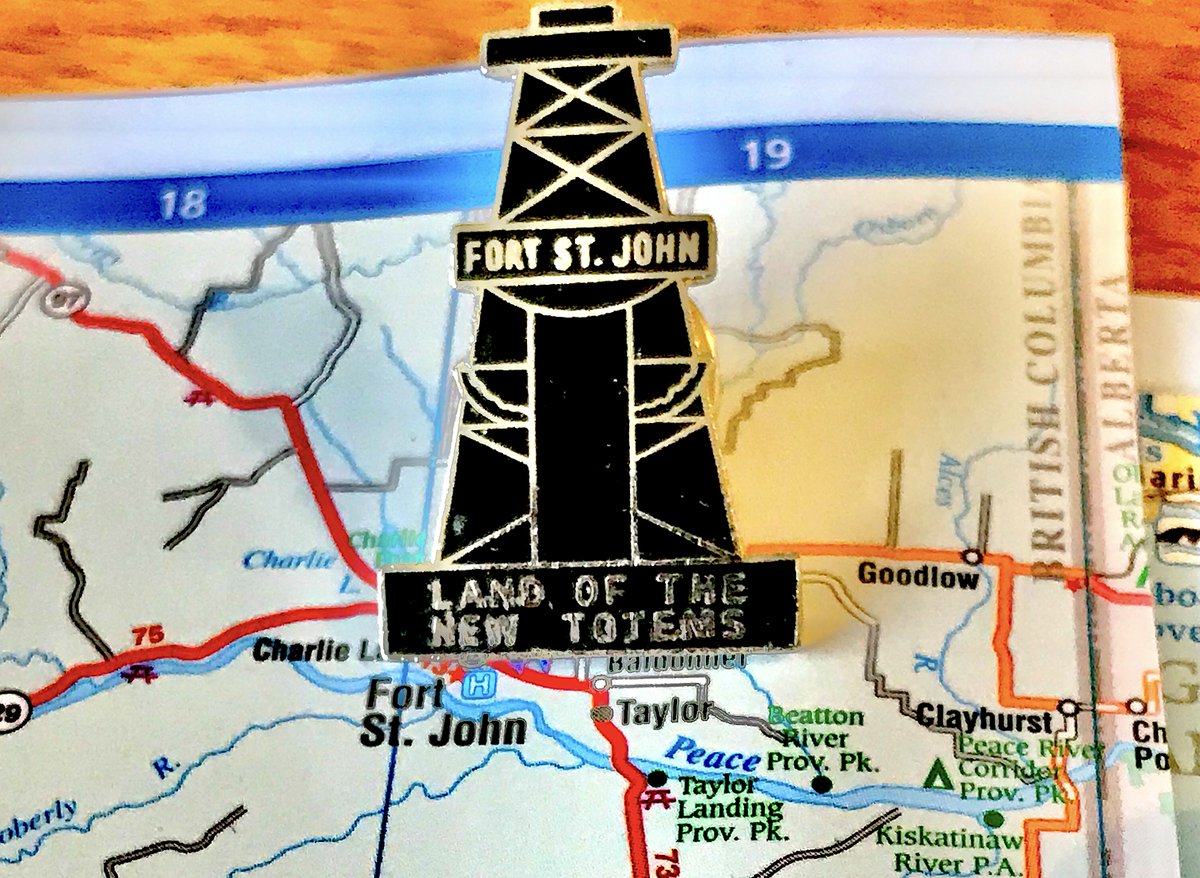
59. FORT ST. JOHN
- "Land of the New Totems", so oil is the new, um, what?
- Also if this is "new totem", what happened to the old to...help my brain is broken
- Anyhow, this sure denotes a specific time and place in B.C.& #39;s conception of itself! Pins!
- "Land of the New Totems", so oil is the new, um, what?
- Also if this is "new totem", what happened to the old to...help my brain is broken
- Anyhow, this sure denotes a specific time and place in B.C.& #39;s conception of itself! Pins!
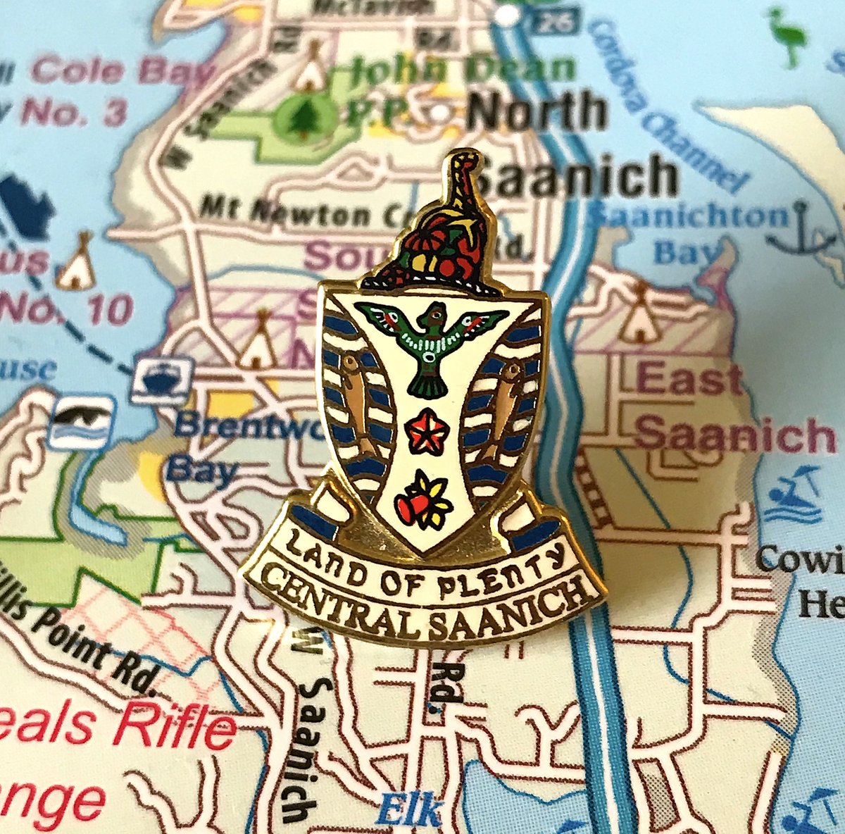
58. CENTRAL SAANICH
- It& #39;s still a crest, but it& #39;s pretty good!
- Look at the fruit! And the fish! So much detail to enjoy
- "Land of Plenty" is reasonable, actually
- It& #39;s still a crest, but it& #39;s pretty good!
- Look at the fruit! And the fish! So much detail to enjoy
- "Land of Plenty" is reasonable, actually
57. GREENWOOD
- hoo boy what a hot mess of a flag, breaks so many of my rules but also is good?
- love the smokestack, annoyed at the brown path it bleeds into
- what is going on with those trees
- hoo boy what a hot mess of a flag, breaks so many of my rules but also is good?
- love the smokestack, annoyed at the brown path it bleeds into
- what is going on with those trees
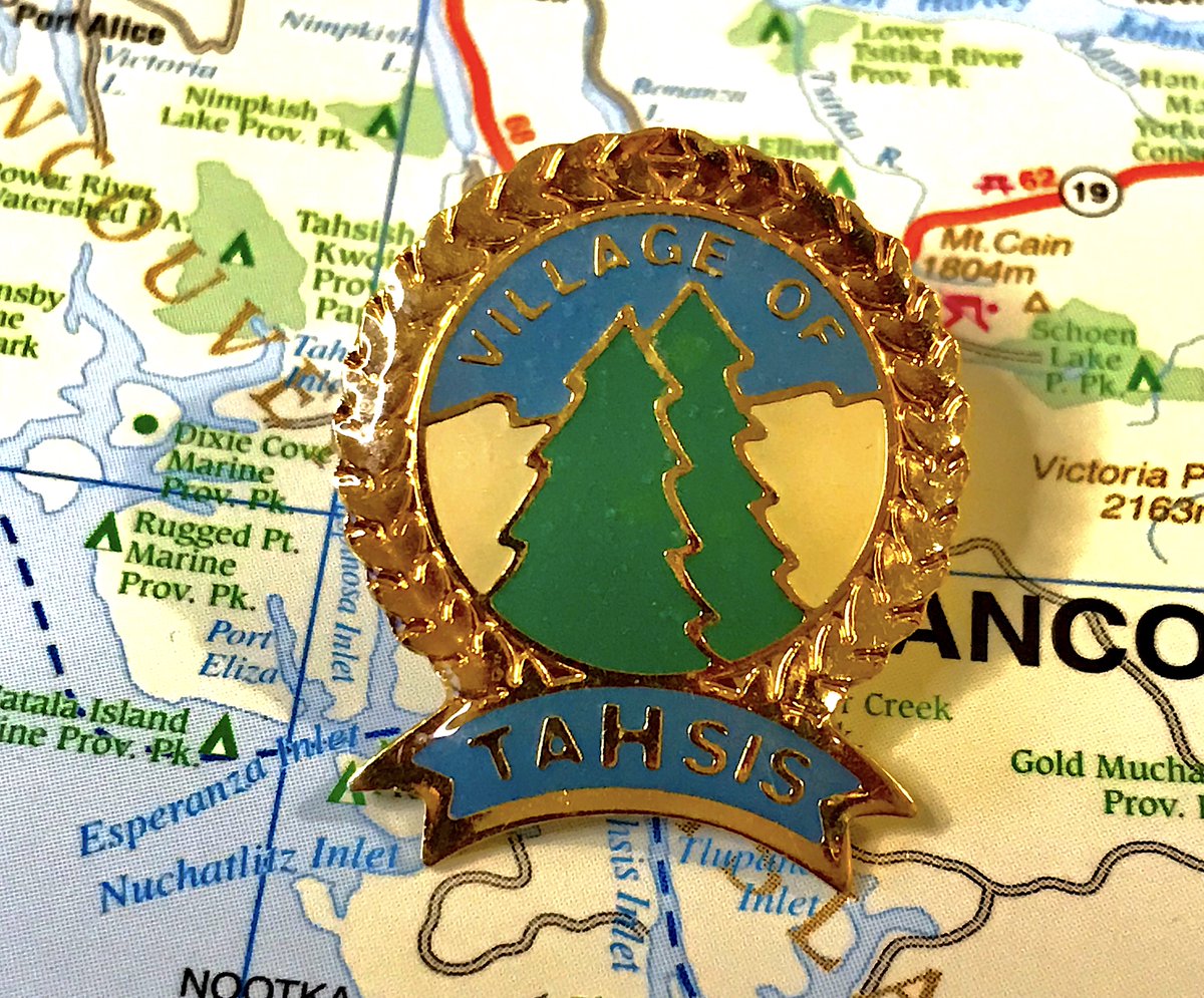
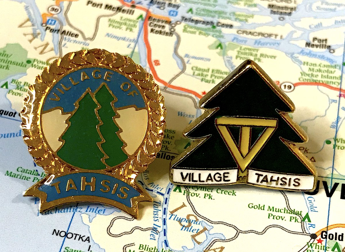
56. TAHSIS
- Example of how a lot of tiny touches can make an average pin concept really pop
- The banner, the border, the background, all very good
- The "h" is bigger and that& #39;s objectively weird
- Example of how a lot of tiny touches can make an average pin concept really pop
- The banner, the border, the background, all very good
- The "h" is bigger and that& #39;s objectively weird
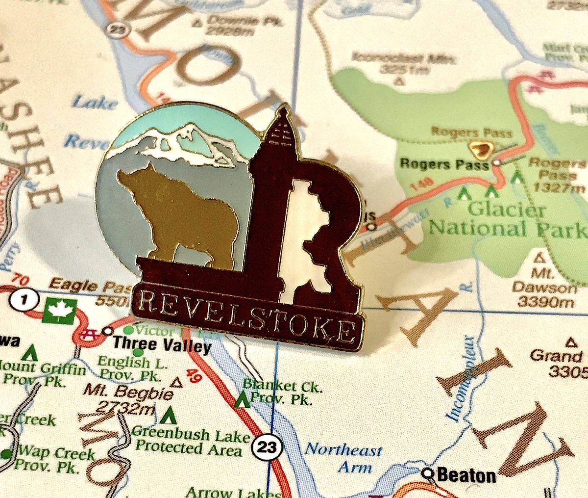
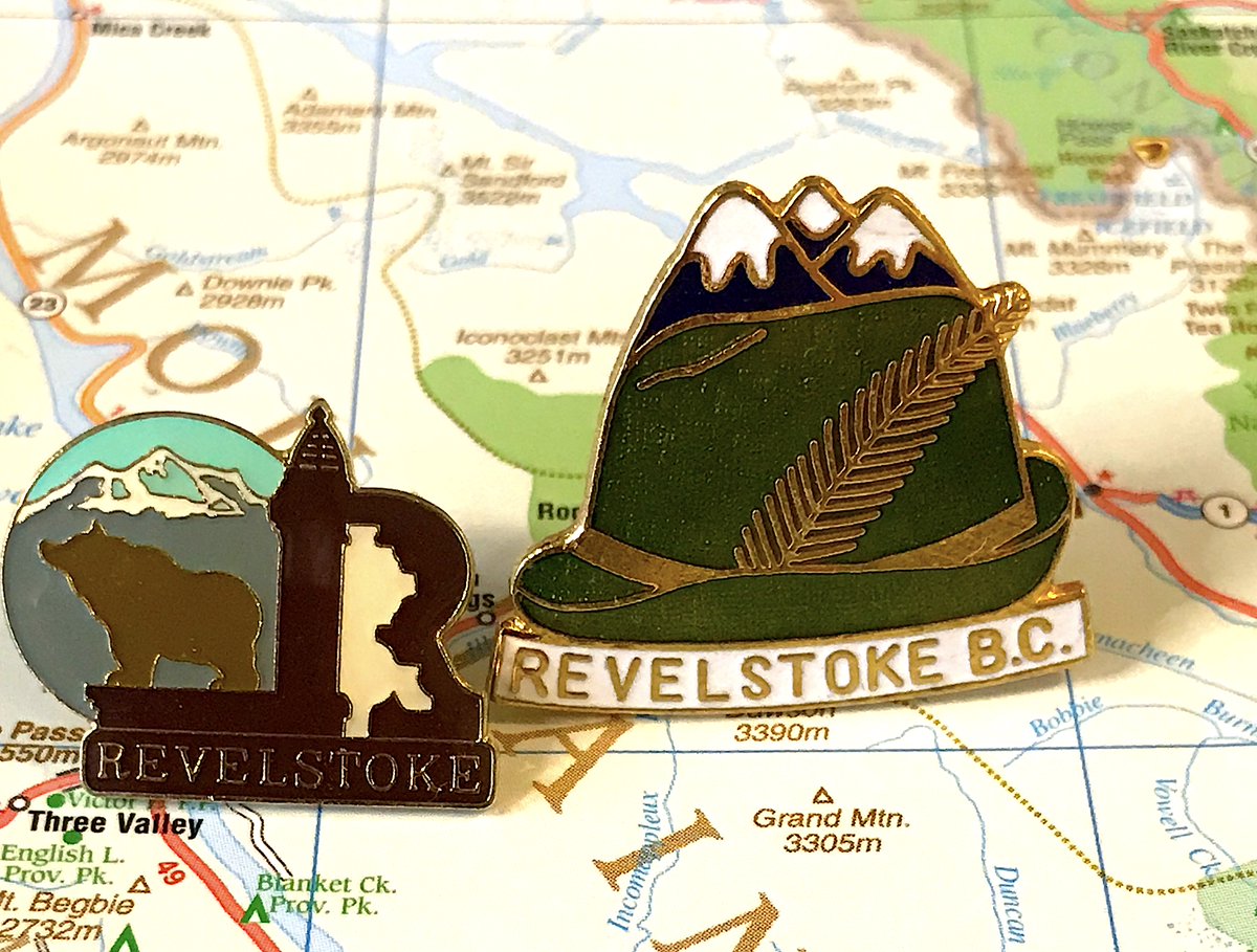
55. REVELSTOKE
- Is the bear howling at an imaginary moon?
- what is happening with that stylized r
- Secondary pin is also fun, if weirdly robin hood themed for some reason
- Is the bear howling at an imaginary moon?
- what is happening with that stylized r
- Secondary pin is also fun, if weirdly robin hood themed for some reason
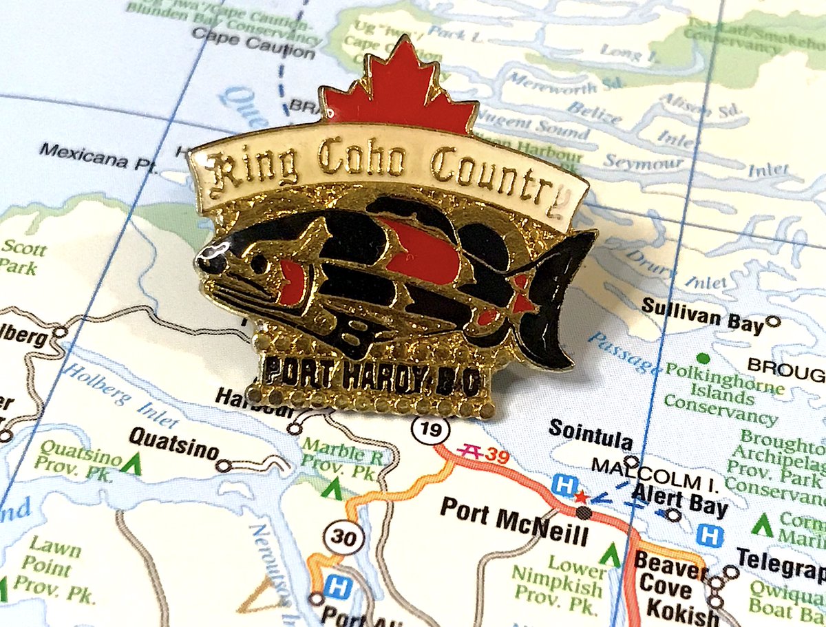
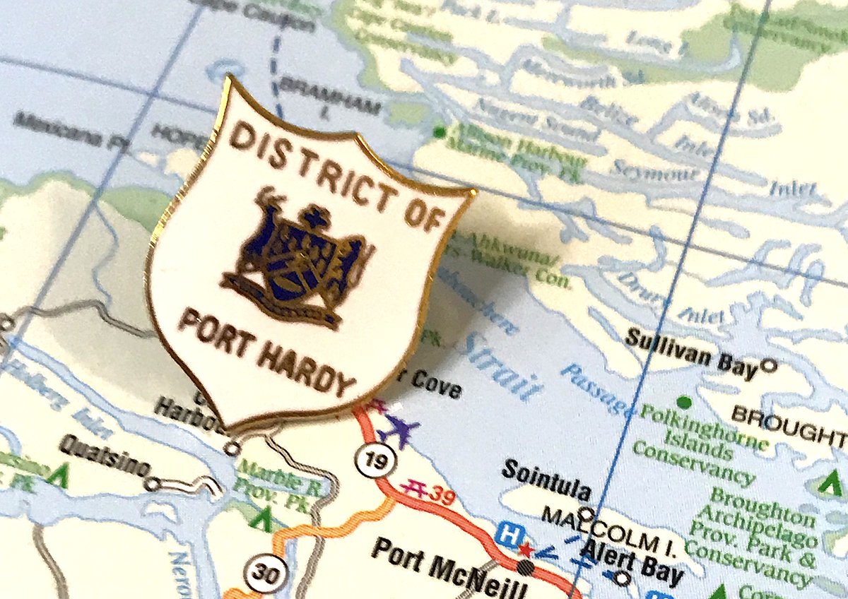
54. PORT HARDY
- someone& #39;s VERY excited that they catch fish
- maple leaf peeking out from behind is a nice touch
- port hardy is very lucky I found a good pin, because the official one would have a much worse ranking
- someone& #39;s VERY excited that they catch fish
- maple leaf peeking out from behind is a nice touch
- port hardy is very lucky I found a good pin, because the official one would have a much worse ranking
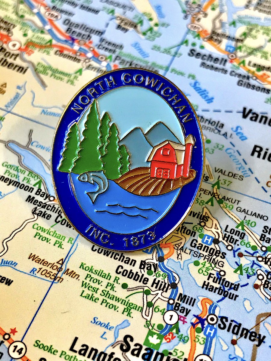
53. NORTH COWICHAN
- did north cowichan and silverton hire the same artist
- trees and fish BUT ALSO farm?
- colours are bold and it all comes together nicely
- did north cowichan and silverton hire the same artist
- trees and fish BUT ALSO farm?
- colours are bold and it all comes together nicely
52. ENDERBY
- Yes it& #39;s another river, but love how the details around the Shuswap
- Nice bend to the wording as well, helping with the flow
- Take out "B.C." and "Canada", make Enderby bigger, and we& #39;ve got a stew going
- Yes it& #39;s another river, but love how the details around the Shuswap
- Nice bend to the wording as well, helping with the flow
- Take out "B.C." and "Canada", make Enderby bigger, and we& #39;ve got a stew going
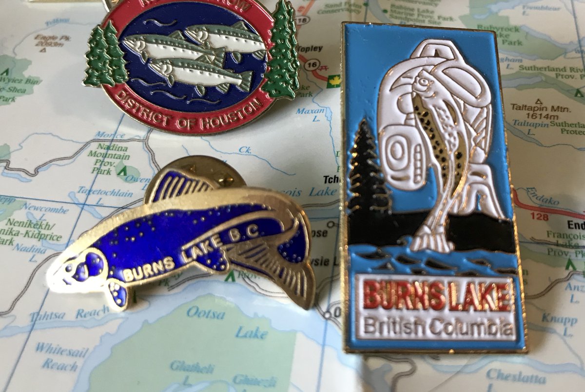
51. BURNS LAKE
- Unique thin rectangle design!
- Town said they consulted with local First Nations, but main design was done by a local librarian decades earlier, so
- At first I was excited by the secondary pin, then I found it& #39;s sort of a default fish pin that many towns have
- Unique thin rectangle design!
- Town said they consulted with local First Nations, but main design was done by a local librarian decades earlier, so
- At first I was excited by the secondary pin, then I found it& #39;s sort of a default fish pin that many towns have
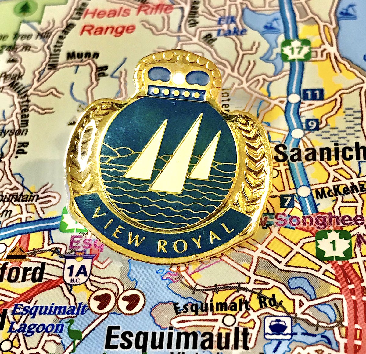
50. VIEW ROYAL
- Really striking design, fun shade of blue that makes things pop more
- Crown on the top, separately sticking out, is a delight
- It& #39;s still just boats on the water
- Really striking design, fun shade of blue that makes things pop more
- Crown on the top, separately sticking out, is a delight
- It& #39;s still just boats on the water
(brief break as i glare at the social media desk for the umpteenth time) https://twitter.com/cbcnewsbc/status/1290405134694903808">https://twitter.com/cbcnewsbc...
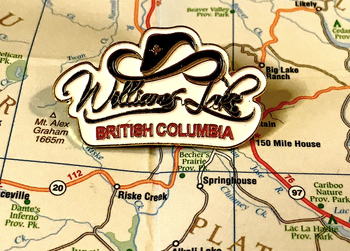
49. WILLIAMS LAKE
- Just a hat and some text, but what a hat
- The font works too, ditto the colour difference between the two lines
- Ultimately a bit too one-note
- Just a hat and some text, but what a hat
- The font works too, ditto the colour difference between the two lines
- Ultimately a bit too one-note
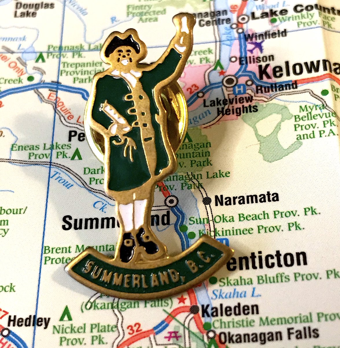
48. SUMMERLAND
- Hear ye, hear ye!
- ok so you laugh BUT summerland was created with an old england design, so it sort of makes sense?
- also there& #39;s a man who (successfully?) reprised the tradition? https://www.summerlandreview.com/local-news/town-crier-seeks-role-in-summerland/">https://www.summerlandreview.com/local-new...
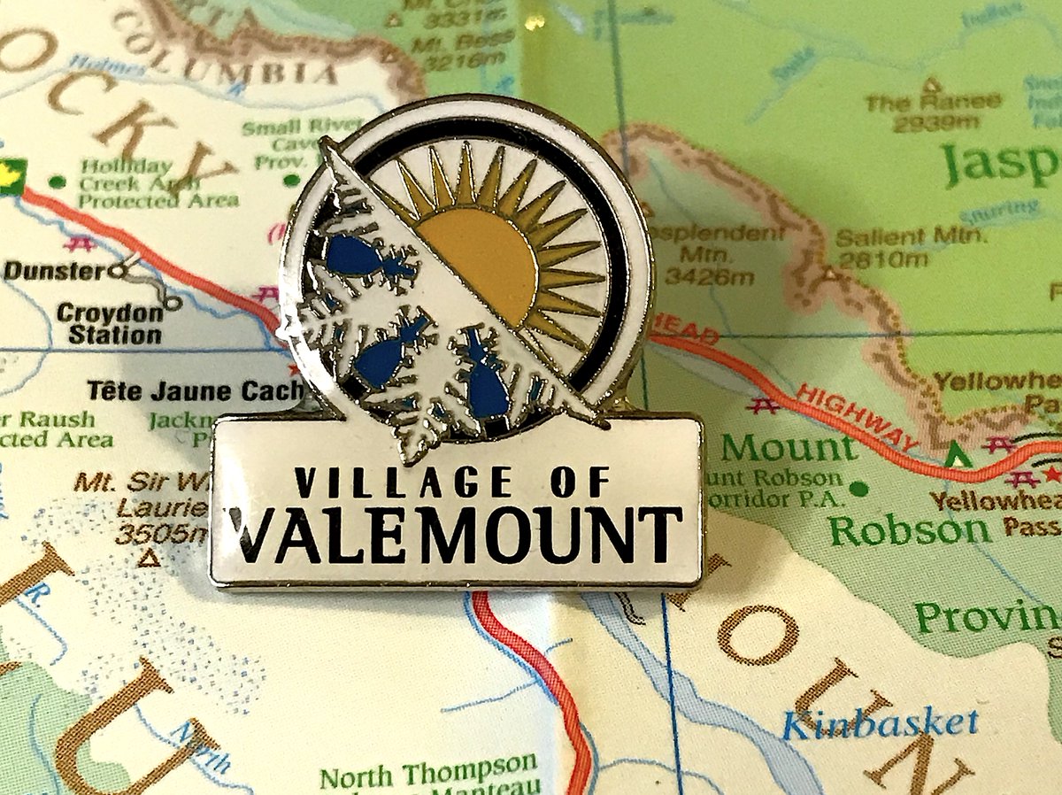
47. VALEMOUNT
- Simple but effective!
- Love the angular approach to the two-face theme
- Again, just imagine how bold this would be if we weren& #39;t reminding people "WE& #39;RE A VILLAGE", a mostly arbitrary designation
- Simple but effective!
- Love the angular approach to the two-face theme
- Again, just imagine how bold this would be if we weren& #39;t reminding people "WE& #39;RE A VILLAGE", a mostly arbitrary designation
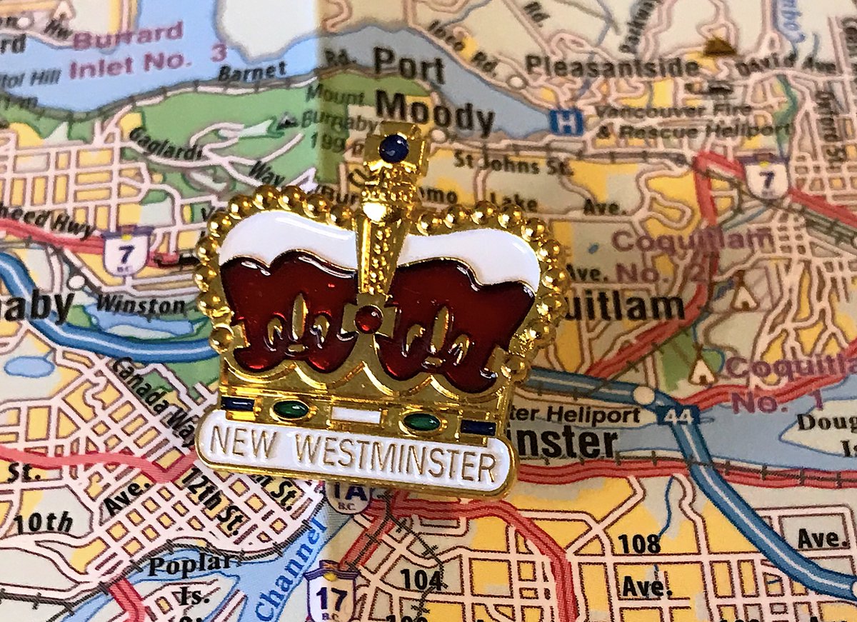
46. NEW WESTMINSTER
- To the point, in line with New West& #39;s "royal city" theme, hard to find fault
- Some nice touches on the crown, including the very top
- Ultimately too generic to go higher, even if New West Twitter (a real thing) gets angry at me
- To the point, in line with New West& #39;s "royal city" theme, hard to find fault
- Some nice touches on the crown, including the very top
- Ultimately too generic to go higher, even if New West Twitter (a real thing) gets angry at me
45. GRAND FORKS
- big oregon trail energy
- a lot happening, but not too busy!
- are the minerals talking? excited?
- latin is “Divitiae ex Solo” means "riches from the soil", fine
- big oregon trail energy
- a lot happening, but not too busy!
- are the minerals talking? excited?
- latin is “Divitiae ex Solo” means "riches from the soil", fine
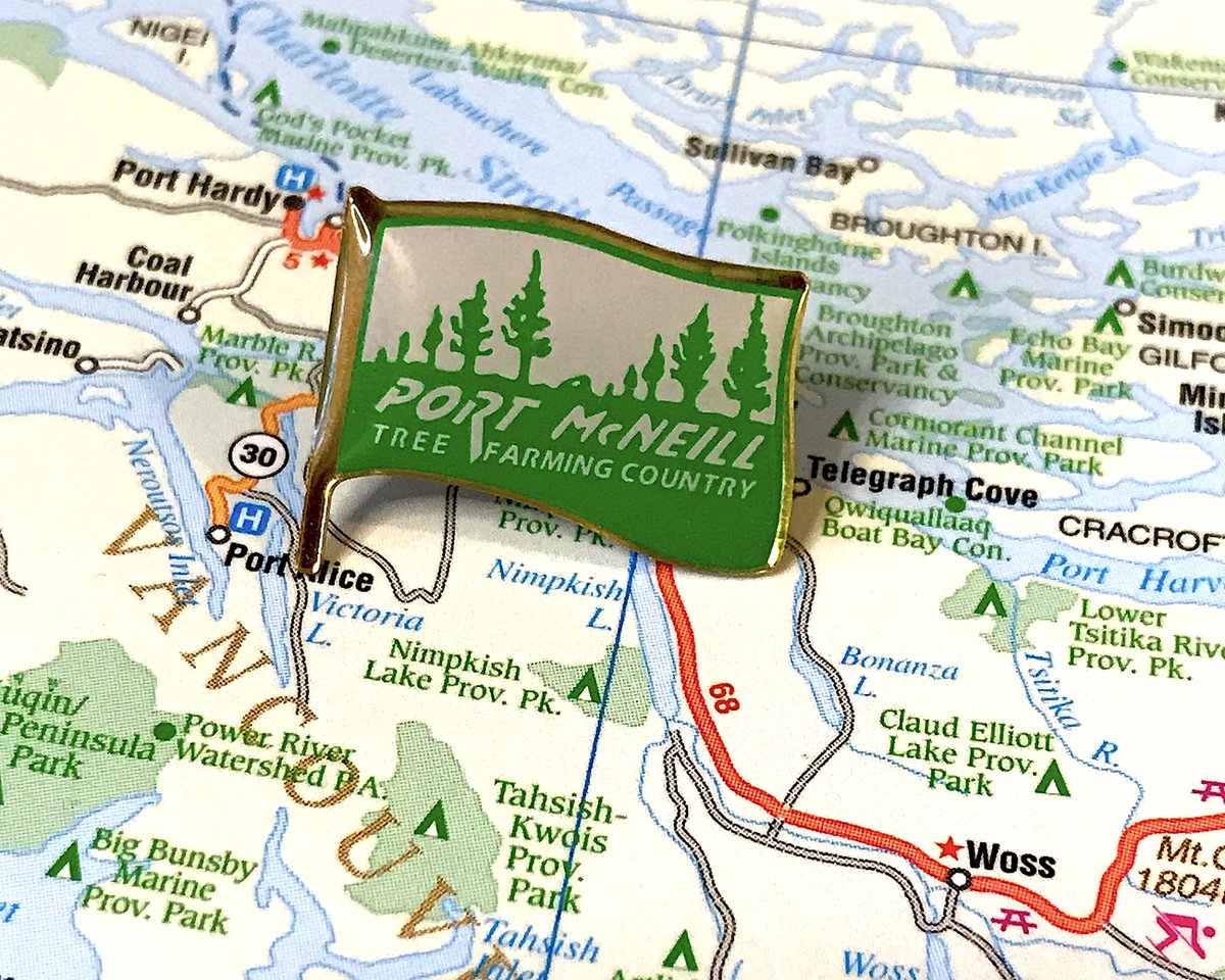
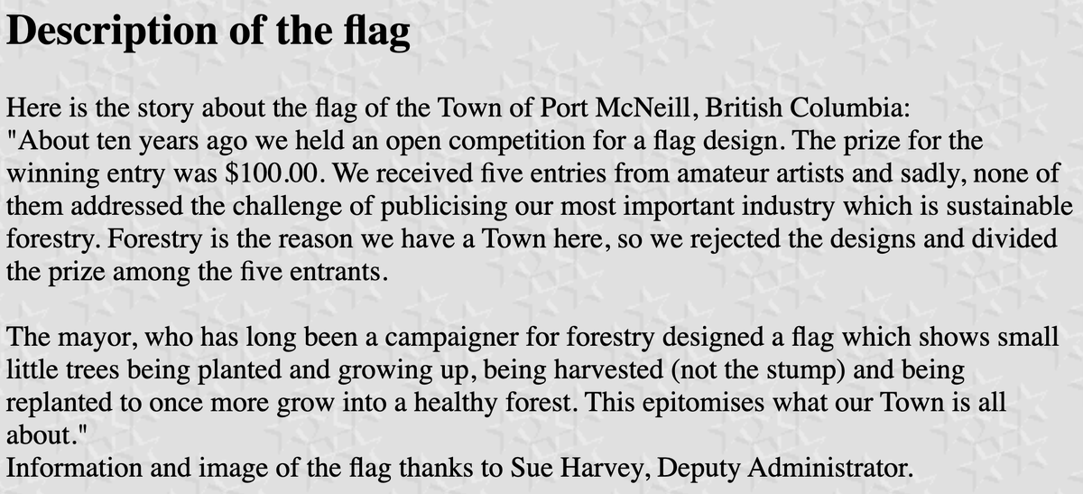
44. PORT MCNEILL
- The pin is in the shape of a flag, tremendous idea
- Simple but effective colour scheme
- I& #39;ve linked to this before, but it& #39;s important you all know how this design came to be, bless small town mayors
- The pin is in the shape of a flag, tremendous idea
- Simple but effective colour scheme
- I& #39;ve linked to this before, but it& #39;s important you all know how this design came to be, bless small town mayors
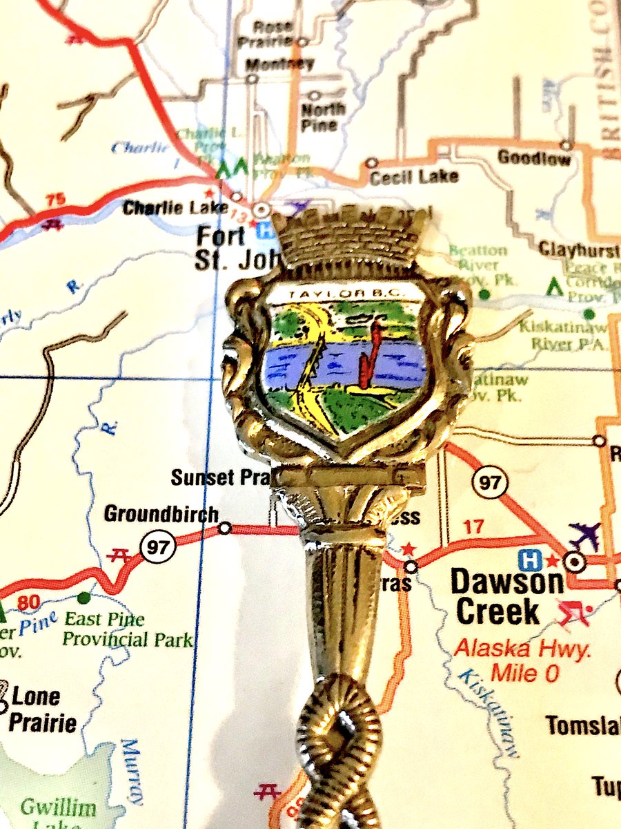
43. TAYLOR
- Okay so this is the other spoon I was forced to buy and pretend was a pin for the purposes of this
- Accurately shows how terrifying the bridge to town is
- Crown on top is not needed but also very fun
- Okay so this is the other spoon I was forced to buy and pretend was a pin for the purposes of this
- Accurately shows how terrifying the bridge to town is
- Crown on top is not needed but also very fun
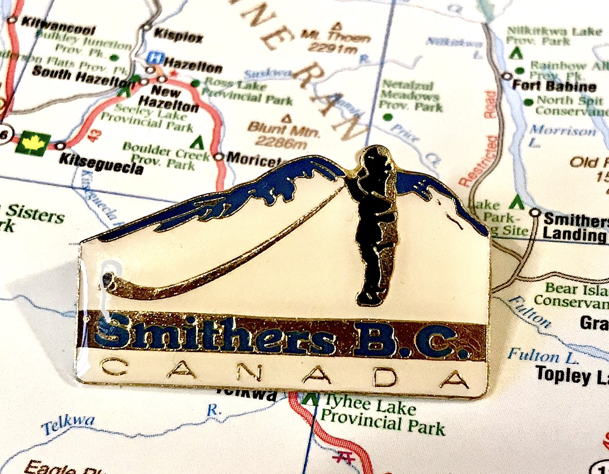
42. SMITHERS
- Riiiii-cola! (i& #39;m so sorry)
- Anyway this fun, good subtle design touches for the mountain
- Too many words, too much space in C A N A D A, poor colour space for background behind Smithers
- Riiiii-cola! (i& #39;m so sorry)
- Anyway this fun, good subtle design touches for the mountain
- Too many words, too much space in C A N A D A, poor colour space for background behind Smithers
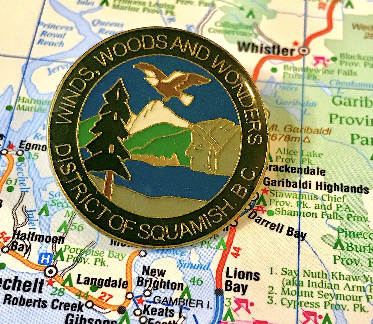
41. SQUAMISH
- "Winds, woods and wonders" is objectively great
- The rest of the pin is mostly normal, but good job with the chief being distinctive!
- Let& #39;s not overthink how big the eagle is
- "Winds, woods and wonders" is objectively great
- The rest of the pin is mostly normal, but good job with the chief being distinctive!
- Let& #39;s not overthink how big the eagle is
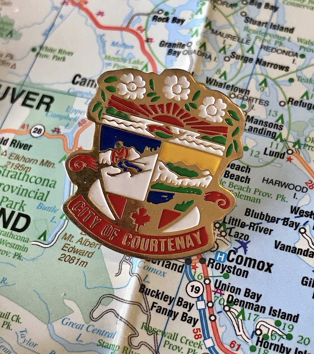
40. COURTENAY
- Possibly the best "we couldn& #39;t decide on one thing" pin
- Did anyone else on Vancouver Island save up too much money for a Mt. Washington field trip, or was that just my school?
- Bold colours and clean design go a long way
- Possibly the best "we couldn& #39;t decide on one thing" pin
- Did anyone else on Vancouver Island save up too much money for a Mt. Washington field trip, or was that just my school?
- Bold colours and clean design go a long way
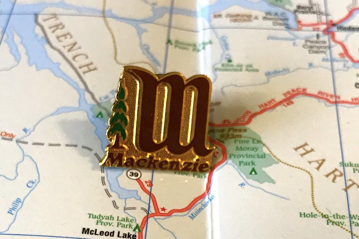
39. MACKENZIE
- Quiet, distinguished, to the point
- try looking at it as a W instead of an M and let your mind play tricks with you!
- Amazing what a single tree can do to a design
- Quiet, distinguished, to the point
- try looking at it as a W instead of an M and let your mind play tricks with you!
- Amazing what a single tree can do to a design
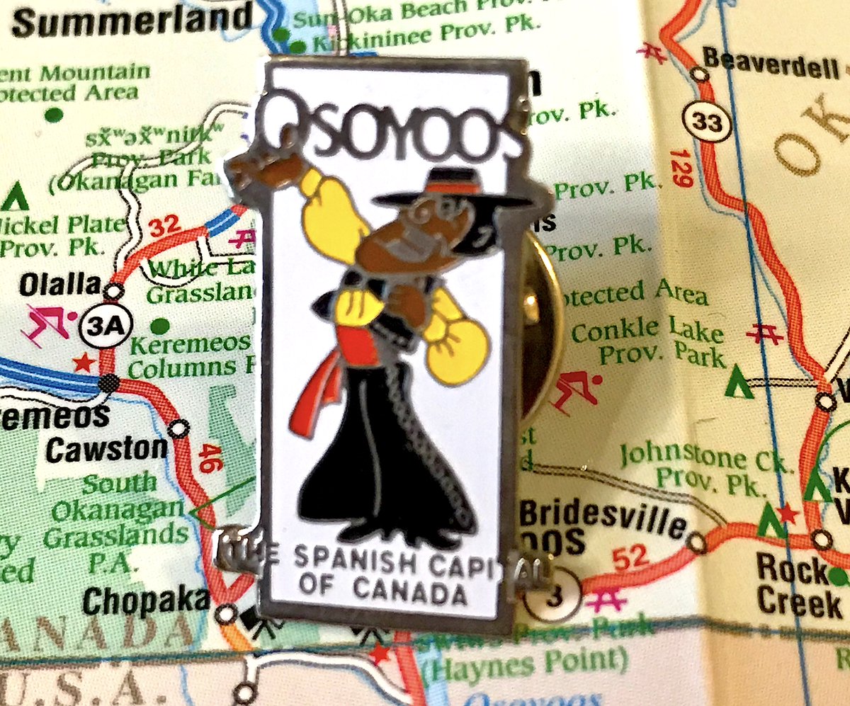
38. OSOYOOS
- In the middle of the 20th century people in B.C. were VERY excited when a lot of their immigrants came from a specific european country
- the man is so excited (to sing?) his hand is BREAKING OUT of the pin!
- boring crest pin is boring and a crest
- In the middle of the 20th century people in B.C. were VERY excited when a lot of their immigrants came from a specific european country
- the man is so excited (to sing?) his hand is BREAKING OUT of the pin!
- boring crest pin is boring and a crest
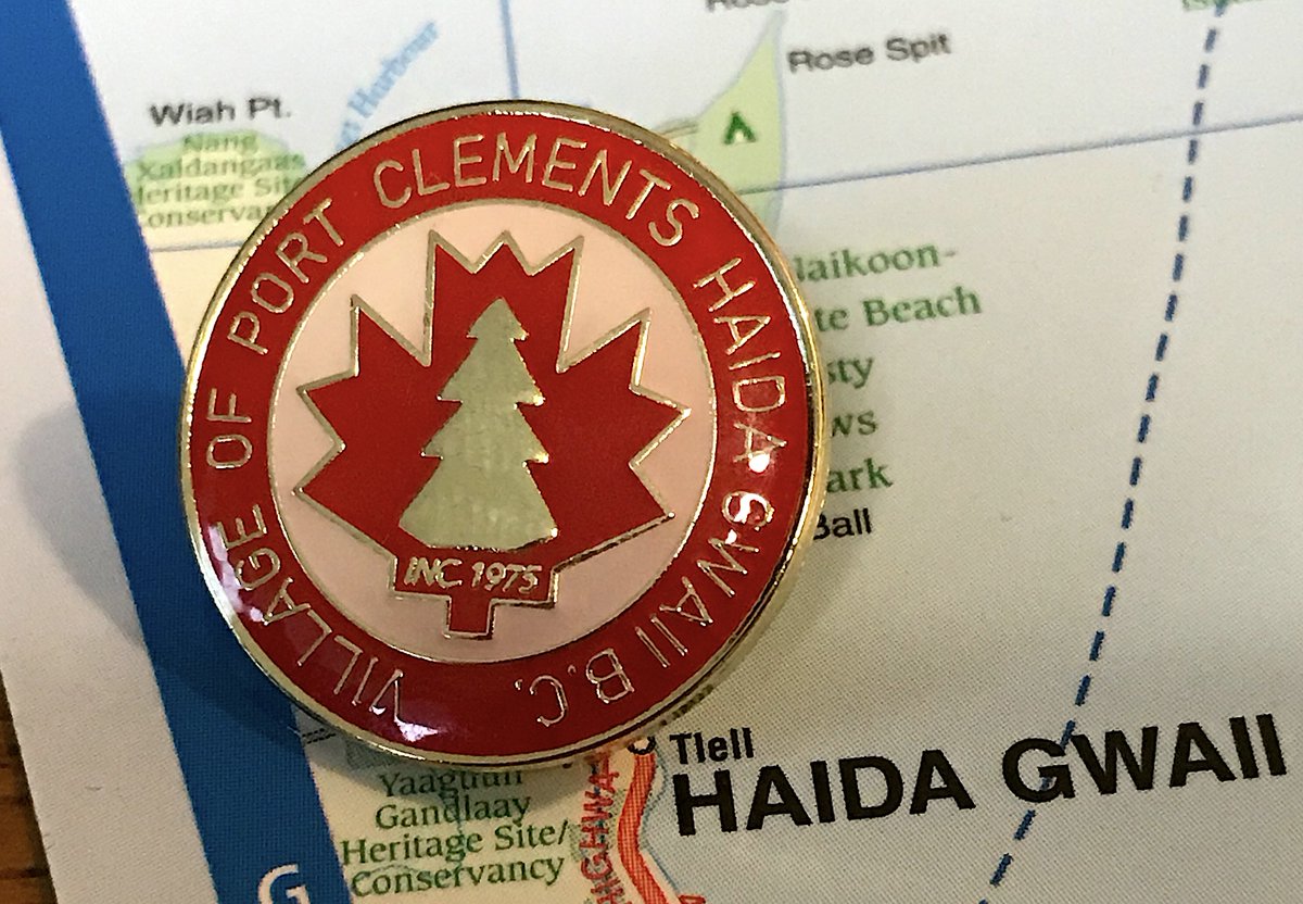
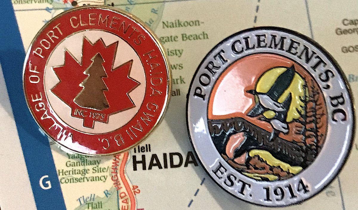
37. PORT CLEMENTS
- Established in 1975 or 1914, it can& #39;t be both Port Clements
- Anyhow, I thought the Maple Leaf one was fun, someone on the ranking team pushed hard to choose the one with the birds and colours instead, they& #39;re both good
- Orange/yellow colour scheme works
- Established in 1975 or 1914, it can& #39;t be both Port Clements
- Anyhow, I thought the Maple Leaf one was fun, someone on the ranking team pushed hard to choose the one with the birds and colours instead, they& #39;re both good
- Orange/yellow colour scheme works
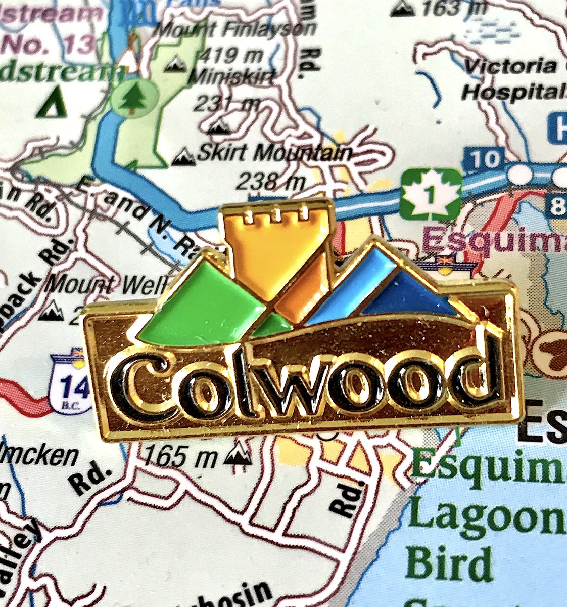
36. COLWOOD
- Yes it& #39;s corporate, but Royal Roads castle is very solid
- Good colours, good choice of only including "Colwood", not "district of village of town established in 1912"
- One of those that I liked much more than other rankers
- Yes it& #39;s corporate, but Royal Roads castle is very solid
- Good colours, good choice of only including "Colwood", not "district of village of town established in 1912"
- One of those that I liked much more than other rankers
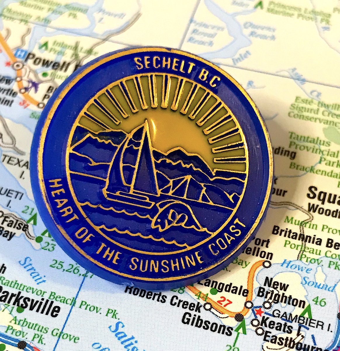
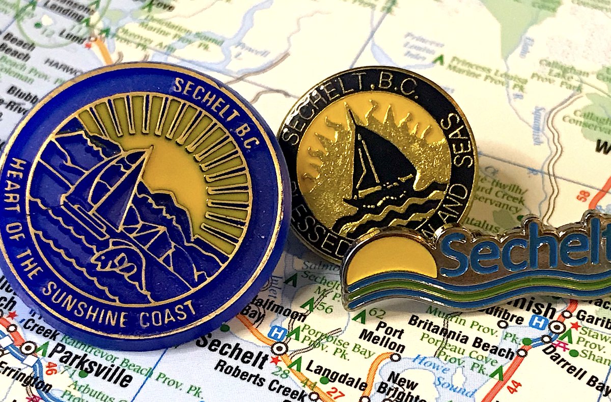
35. SECHELT
- look at that little cute fish!
- really great variation on the "we have sun and ocean" theme
- also a really good job using just two colours
- i have too many sechelt pins
- look at that little cute fish!
- really great variation on the "we have sun and ocean" theme
- also a really good job using just two colours
- i have too many sechelt pins
34. CLEARWATER
- The moose is literally holding up Clearwater, just the best
- not every pin in this area of B.C. is about nearby animals, it just seems that way
- the moose is well designed and it& #39;s old-school in a very fun way
- The moose is literally holding up Clearwater, just the best
- not every pin in this area of B.C. is about nearby animals, it just seems that way
- the moose is well designed and it& #39;s old-school in a very fun way
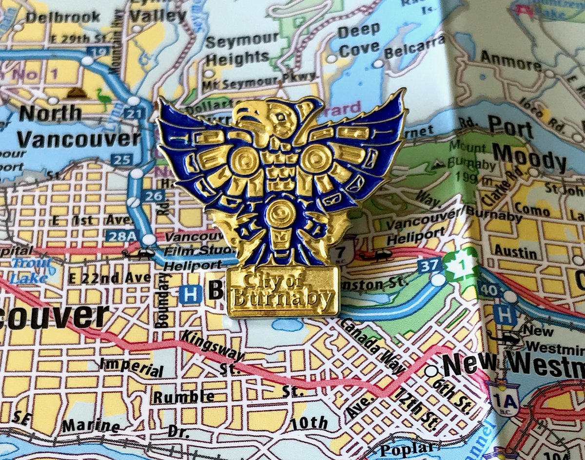
33. BURNABY
- What happens when you have the best flag in B.C. but don& #39;t change it for the pin? 33rd is what happens
- Still very cool
- I have a rant on why B.C.& #39;s municipal pins are better than flags because there& #39;s more room to play with and less rules to follow, but 280 char
- What happens when you have the best flag in B.C. but don& #39;t change it for the pin? 33rd is what happens
- Still very cool
- I have a rant on why B.C.& #39;s municipal pins are better than flags because there& #39;s more room to play with and less rules to follow, but 280 char
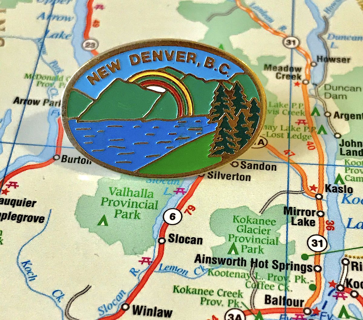
32. NEW DENVER
- It& #39;s another small town with water and trees and mountains
- BUT. This one has a rainbow. And I& #39;m a sucker for a good rainbow
- Love the little waves on the lake
- It& #39;s another small town with water and trees and mountains
- BUT. This one has a rainbow. And I& #39;m a sucker for a good rainbow
- Love the little waves on the lake
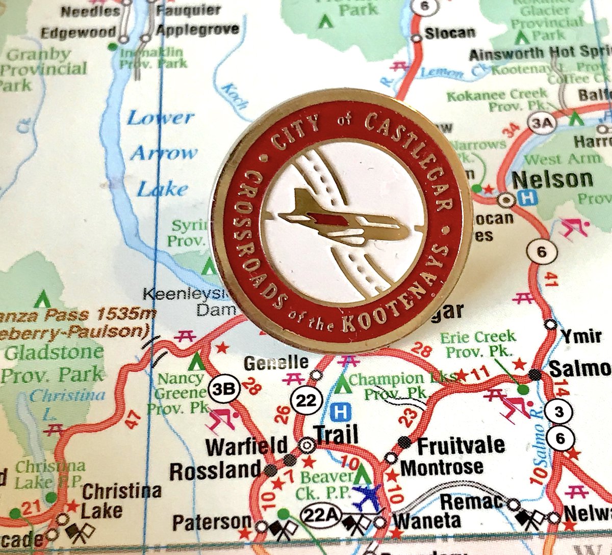
31. CASTLEGAR
- Bold choice to highlight your airport when your airport is so bad that your town& #39;s nickname is "Cancel-Gar"
- Otherwise it& #39;s very good, simple design executed well
- why do so many towns in the kootenays want to say their particular role in the kootenays
- Bold choice to highlight your airport when your airport is so bad that your town& #39;s nickname is "Cancel-Gar"
- Otherwise it& #39;s very good, simple design executed well
- why do so many towns in the kootenays want to say their particular role in the kootenays
30. MASSETT
- Off-kilter but fun!
- Is the bird on the ship wheel, or Haida Gwaii? Is it pointing to Masset, or attacking it?
- The "Village of" etc. is relatively unobtrusive
- Off-kilter but fun!
- Is the bird on the ship wheel, or Haida Gwaii? Is it pointing to Masset, or attacking it?
- The "Village of" etc. is relatively unobtrusive
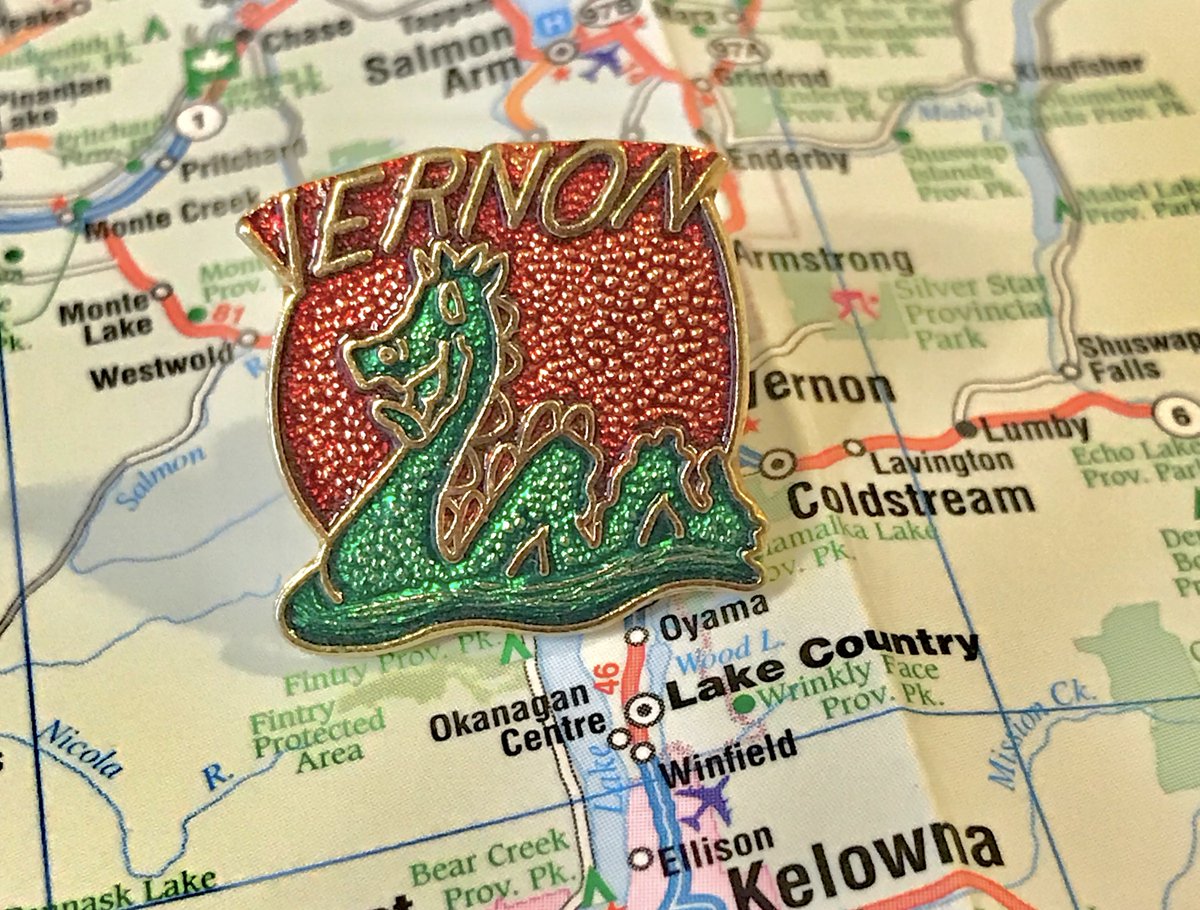
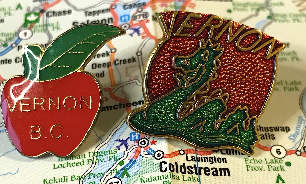
29. VERNON
- love me some ogopogo
- the background has a fun physical feel to it, and also adds some fun variety to the pin
- vernon also an apple pin, and unlike keremeos can spell its name correctly
- love me some ogopogo
- the background has a fun physical feel to it, and also adds some fun variety to the pin
- vernon also an apple pin, and unlike keremeos can spell its name correctly
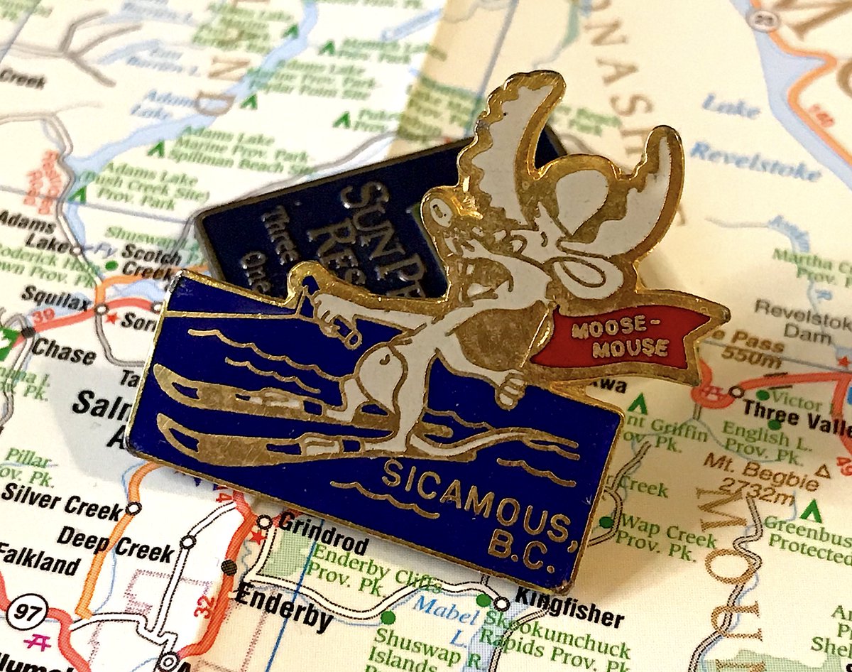
28. SICAMOUS
- WATER SKIING MOOSE, ALL THE POINTS
- Wait, it& #39;s a combination moose, and mouse?
- How...how does that...oh no i& #39;m scared what the internet will do with this
- WATER SKIING MOOSE, ALL THE POINTS
- Wait, it& #39;s a combination moose, and mouse?
- How...how does that...oh no i& #39;m scared what the internet will do with this
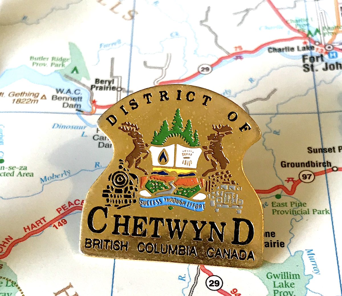
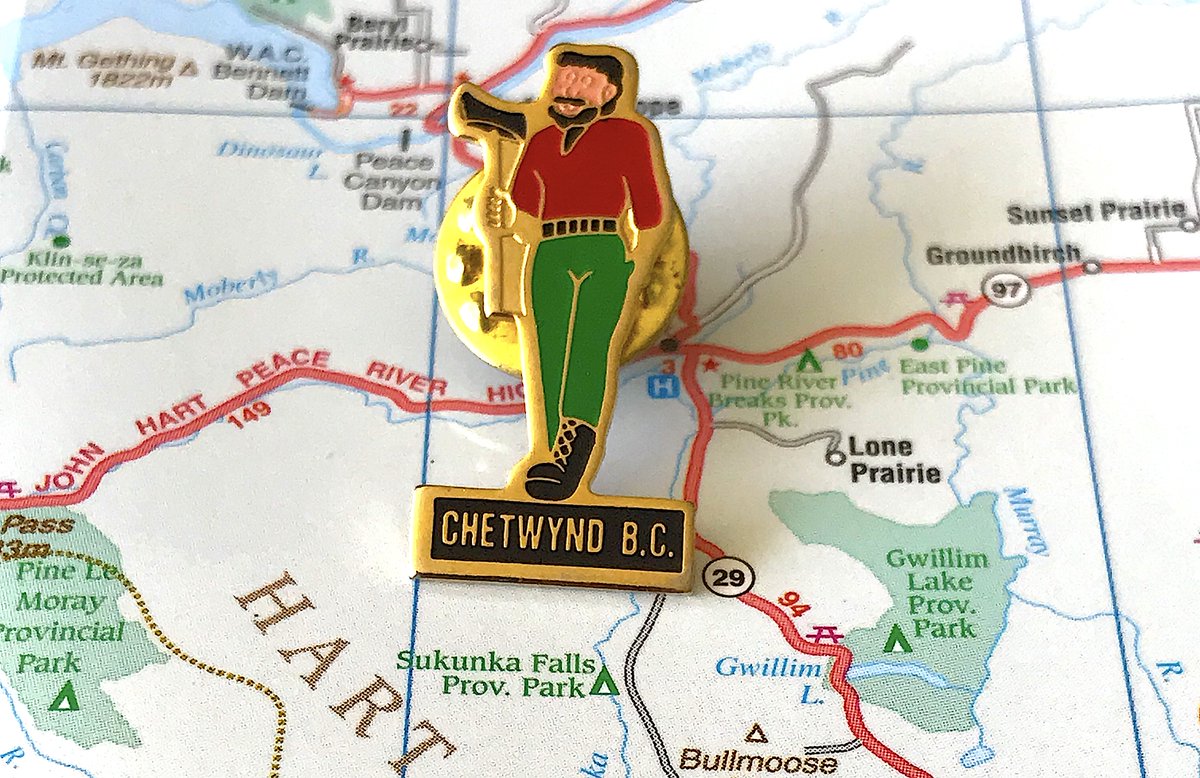
27. CHETWYND
- Deer! On a truck! Carrying logs! Tremendous
- Also the detail on the pin is very impressive
- The secondary pin of carving man is also strong
- Deer! On a truck! Carrying logs! Tremendous
- Also the detail on the pin is very impressive
- The secondary pin of carving man is also strong
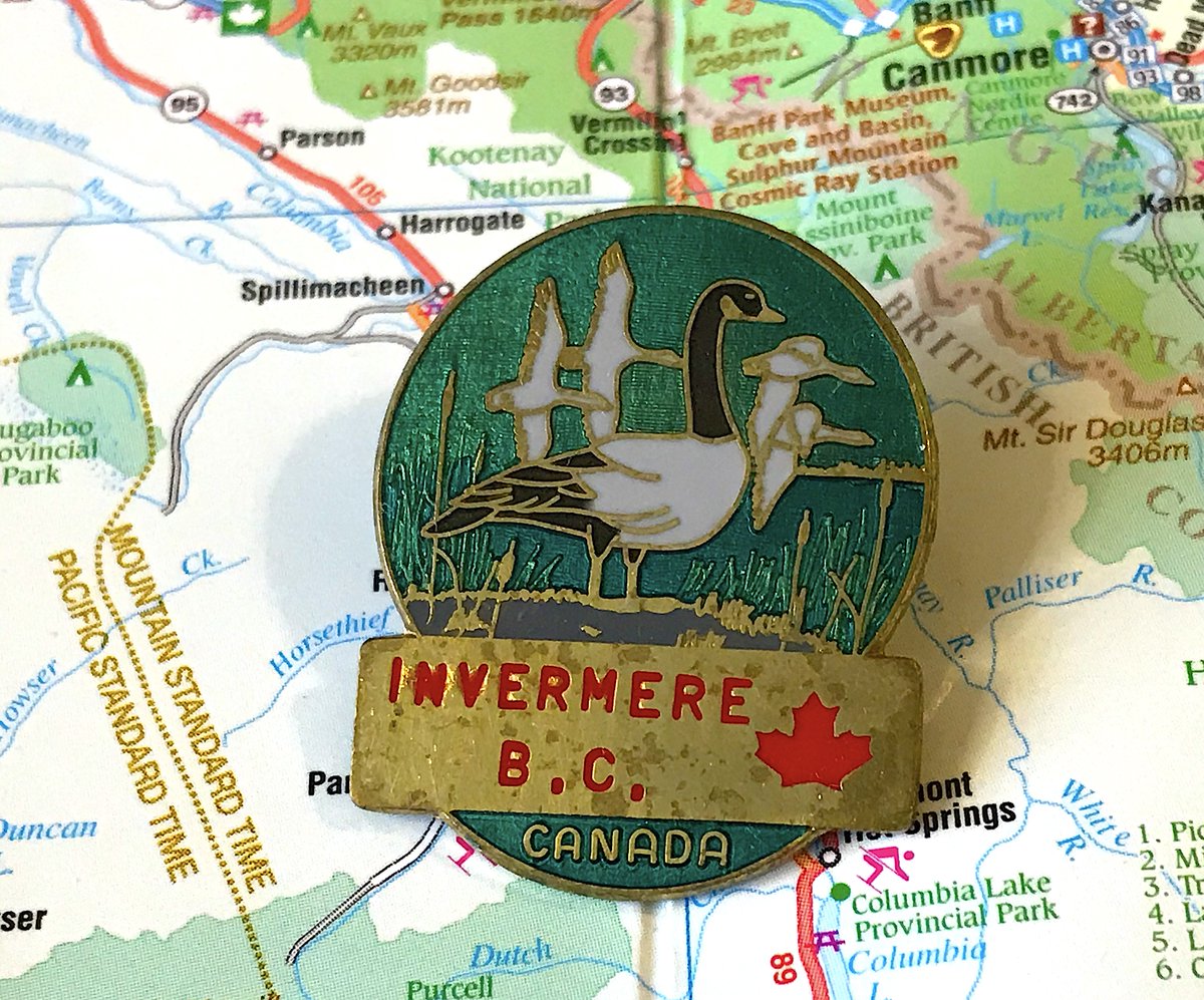
26. INVERMERE
- Hinterland Who& #39;s Who presents Invermere
- Maple Leaf + "CANADA" combo is silly
- It& #39;s a good loon and I love the aesthetic
- Hinterland Who& #39;s Who presents Invermere
- Maple Leaf + "CANADA" combo is silly
- It& #39;s a good loon and I love the aesthetic
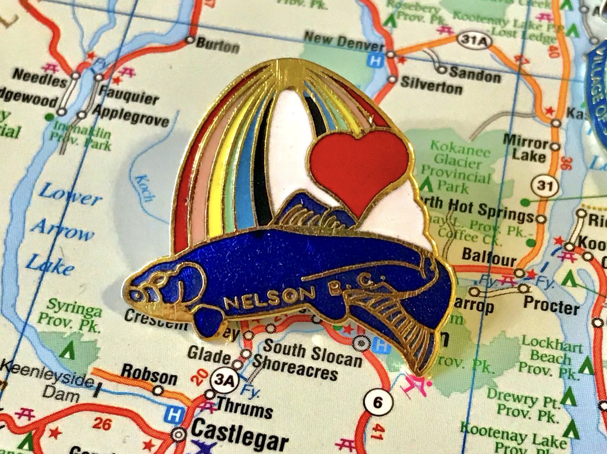
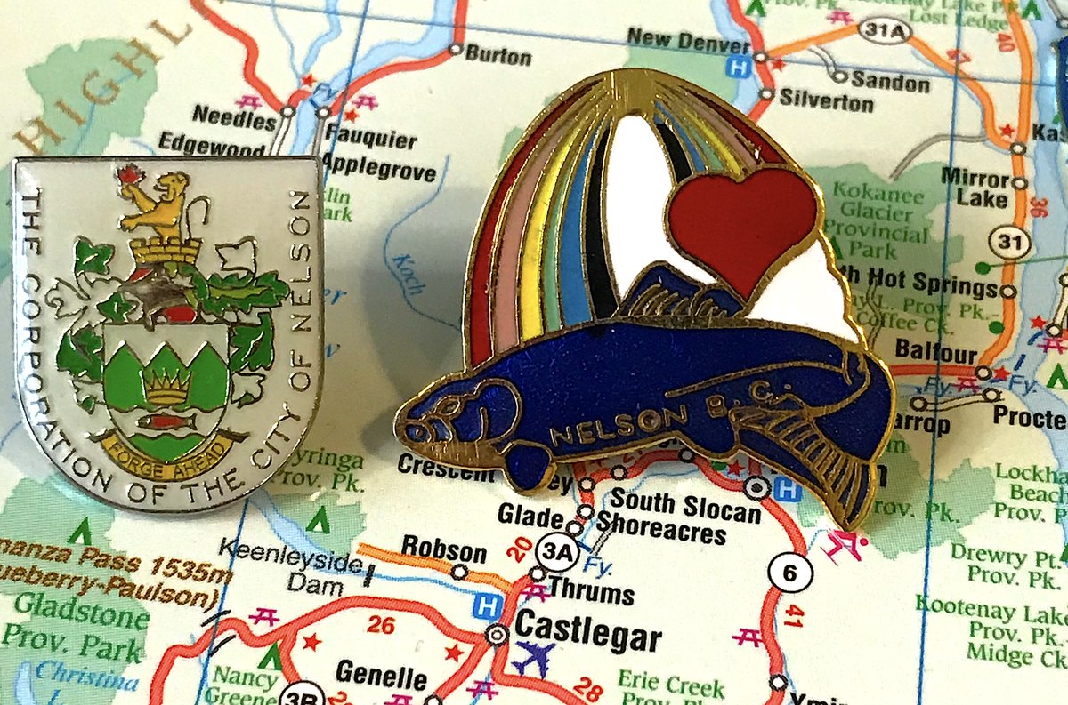
25. NELSON
- Is the heart creating the rainbow? Is the rainbow creating the heart?
- And what role does the fish play?
- I wish I had a Nelson pin that didn& #39;t combine a bunch of weird generic B.C. themes or wasn& #39;t a sad crest, but it& #39;s hilarious
- Is the heart creating the rainbow? Is the rainbow creating the heart?
- And what role does the fish play?
- I wish I had a Nelson pin that didn& #39;t combine a bunch of weird generic B.C. themes or wasn& #39;t a sad crest, but it& #39;s hilarious
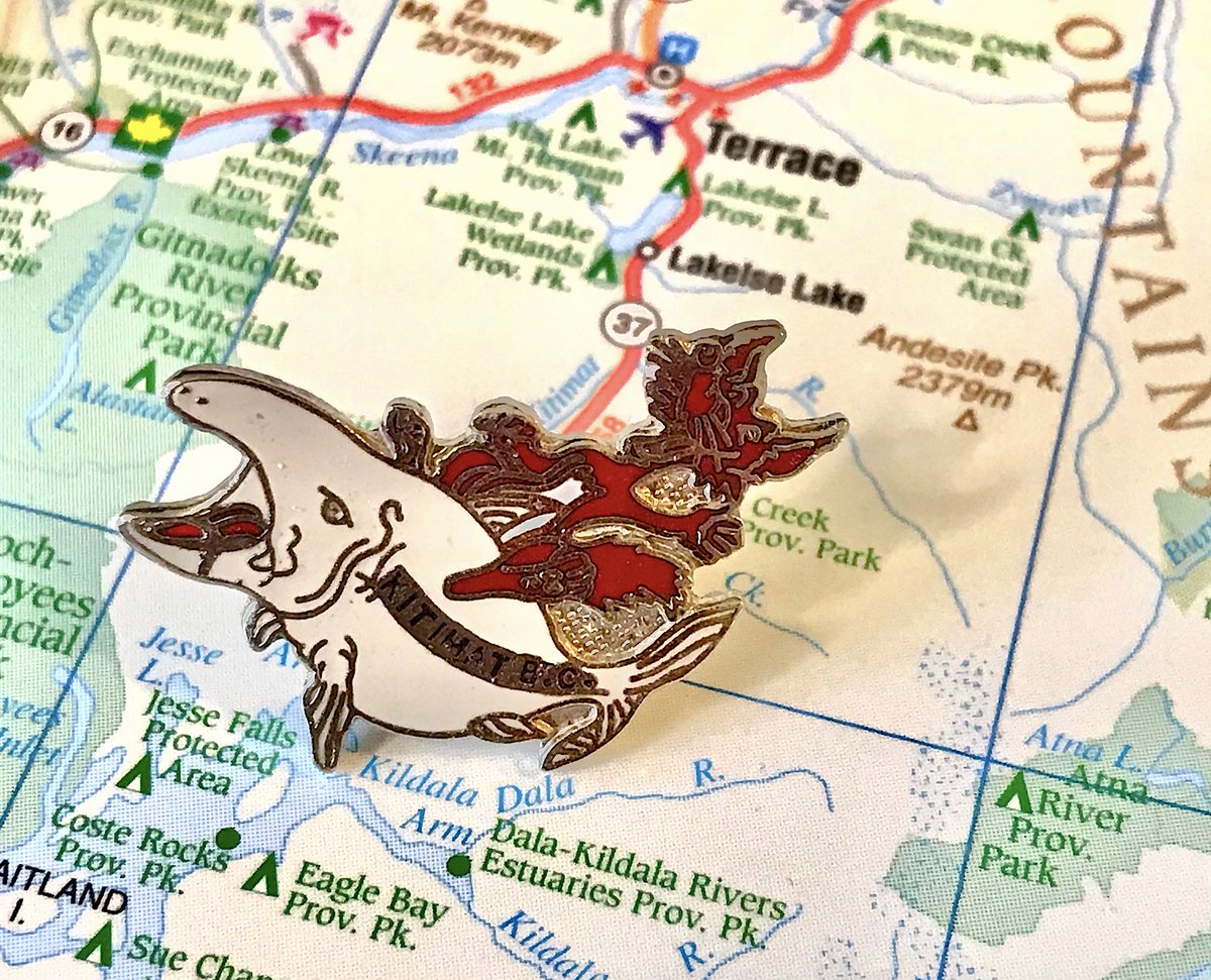
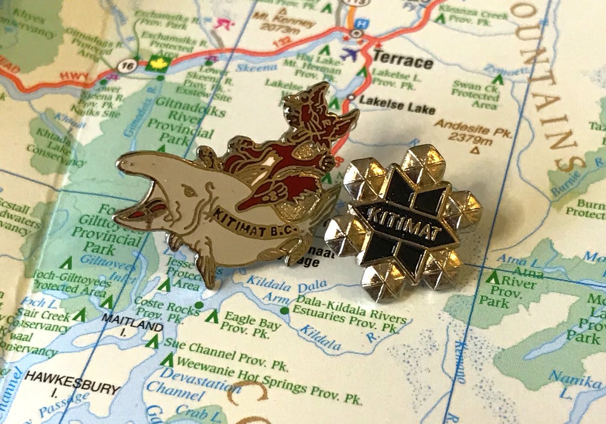
24. KITIMAT
- Is that a fox riding a whale?
- The fox is DELIGHTED, the whale is ANGRY, I have no idea what any of this has to do with Kitimat
- Secondary pin is also good and on theme for the town
- Is that a fox riding a whale?
- The fox is DELIGHTED, the whale is ANGRY, I have no idea what any of this has to do with Kitimat
- Secondary pin is also good and on theme for the town
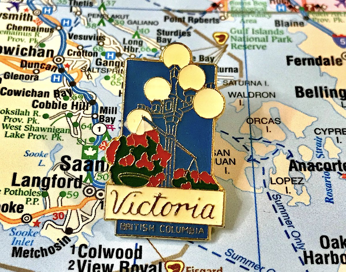
23. VICTORIA
- ahhhh my childhood
- remember the eaton& #39;s centre? or christmas town? anyways i can talk about downtown 1992 victoria all day
- classy, unique, ultimately not particularly exciting
- ahhhh my childhood
- remember the eaton& #39;s centre? or christmas town? anyways i can talk about downtown 1992 victoria all day
- classy, unique, ultimately not particularly exciting
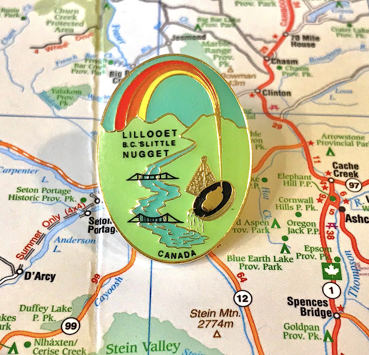
22. LILLOOET
- "B.C.& #39;s little nugget" OW MY HEART
- rainbows only have three colours now
- least necessary placement of "Canada" yet
- my favourite messy boy of a pin
- "B.C.& #39;s little nugget" OW MY HEART
- rainbows only have three colours now
- least necessary placement of "Canada" yet
- my favourite messy boy of a pin
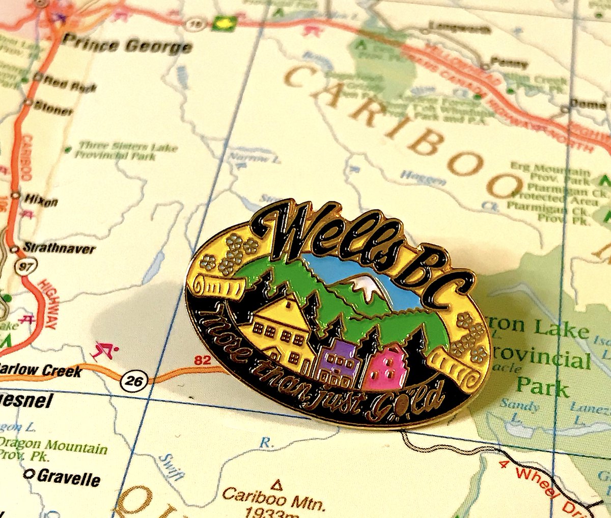
21. WELLS
- Almost as many homes in the pin as in Wells itself
- Love the bold colours, the cursive for Wells, the little dogwoods on the side
- "More than just gold," okay, but what then, you can& #39;t leave us hanging
- Almost as many homes in the pin as in Wells itself
- Love the bold colours, the cursive for Wells, the little dogwoods on the side
- "More than just gold," okay, but what then, you can& #39;t leave us hanging
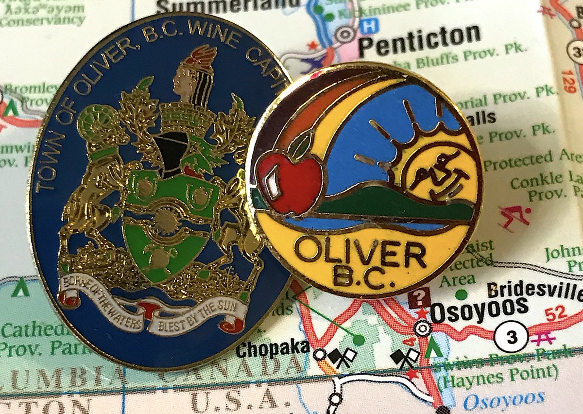
20. OLIVER
- We& #39;re going with the one that has an apple and rainbow and HAPPY SUN, obviously
- What& #39;s the incision in the apple, is that someone taking a bite from it?
- So tiny, yet packed with so much fun
- We& #39;re going with the one that has an apple and rainbow and HAPPY SUN, obviously
- What& #39;s the incision in the apple, is that someone taking a bite from it?
- So tiny, yet packed with so much fun
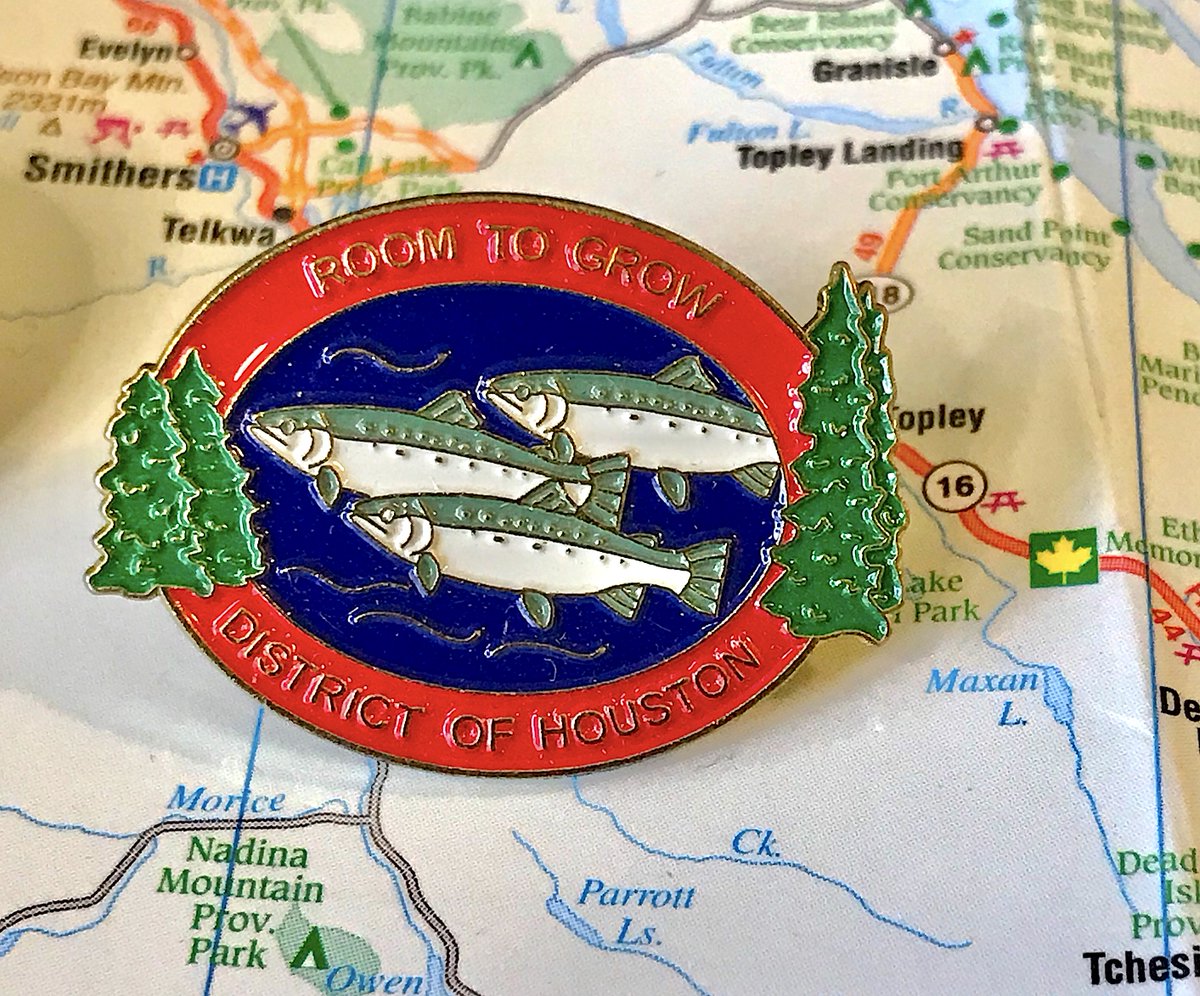
19. HOUSTON
- "Room To Grow" can be interpreted in many ways
- Very fun variation on the (say it again) fish+trees theme, particularly with the trees jutting out
- Everyone gave this 8/10; everything is good, nothing is thrilling
- "Room To Grow" can be interpreted in many ways
- Very fun variation on the (say it again) fish+trees theme, particularly with the trees jutting out
- Everyone gave this 8/10; everything is good, nothing is thrilling
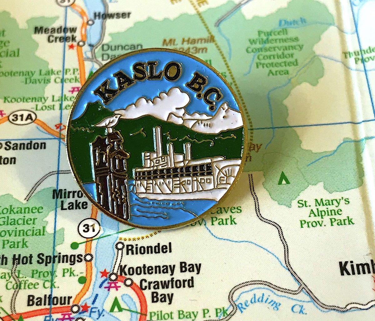
18. KASLO
- Didn& #39;t overthink it, the focused on the Moyie and that makes sense
- Great detail on the ship, really good way to display the name, bird is fun
- Weird how the cloud and mountain sort of blend together
- Didn& #39;t overthink it, the focused on the Moyie and that makes sense
- Great detail on the ship, really good way to display the name, bird is fun
- Weird how the cloud and mountain sort of blend together
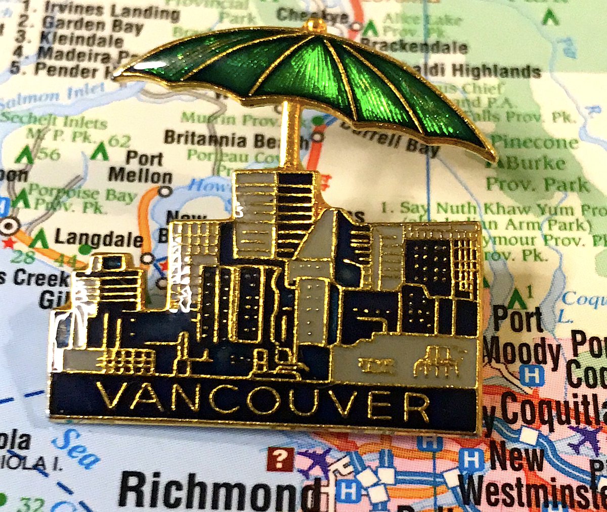
17. VANCOUVER
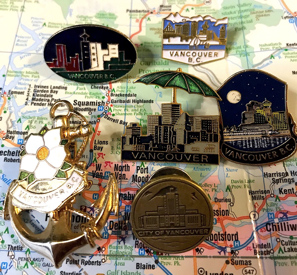
- There are many Vancouver pins; most are quite good
- None 100% excite me but maybe that& #39;s because I live here
- Love how cool and 80s the first one is, delighted by the umbrella in the second
- We need more pins with Science World instead of Harbour Centre
- There are many Vancouver pins; most are quite good
- None 100% excite me but maybe that& #39;s because I live here
- Love how cool and 80s the first one is, delighted by the umbrella in the second
- We need more pins with Science World instead of Harbour Centre
16. KIMBERLEY
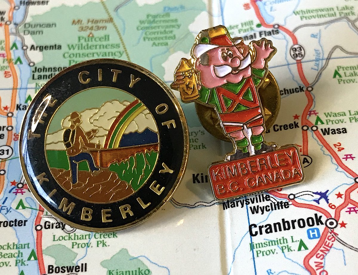
- It& #39;s Happy Hans, Kimberley& #39;s beer drinking celebration of its Bavarian heritage!
- What a fun sentence to write, almost as much fun as Hans
- The alternate pin is fine enough
- It& #39;s Happy Hans, Kimberley& #39;s beer drinking celebration of its Bavarian heritage!
- What a fun sentence to write, almost as much fun as Hans
- The alternate pin is fine enough
15. PORT EDWARD
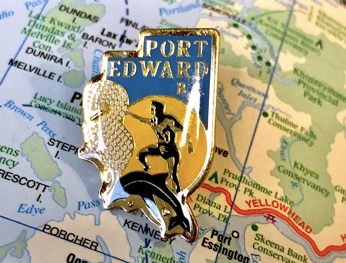
- YES THE MAN IS ON THE FISH
- AND IS TRYING TO CATCH THE FISH AT THE SAME TIME, BUT ALSO POSING?
- Good colours, very confusing
- YES THE MAN IS ON THE FISH
- AND IS TRYING TO CATCH THE FISH AT THE SAME TIME, BUT ALSO POSING?
- Good colours, very confusing
14. LUMBY
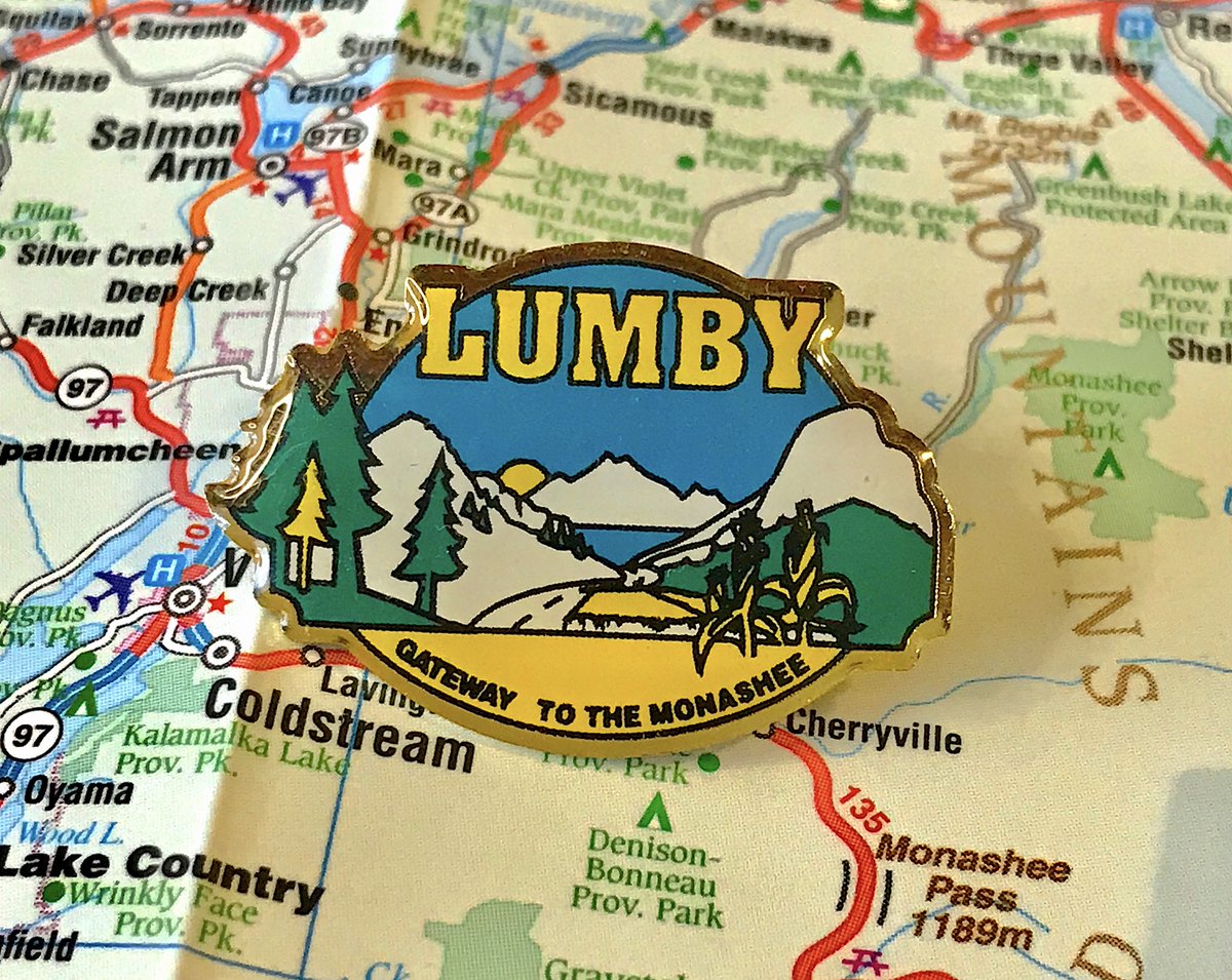
- Lumby, I hate to break it to you, but pretty much nobody cares about the Monashee
- Very good STRONG LUMBY FONT, also fun games with perspective for the art
- Why is one of the trees yellow
- Lumby, I hate to break it to you, but pretty much nobody cares about the Monashee
- Very good STRONG LUMBY FONT, also fun games with perspective for the art
- Why is one of the trees yellow
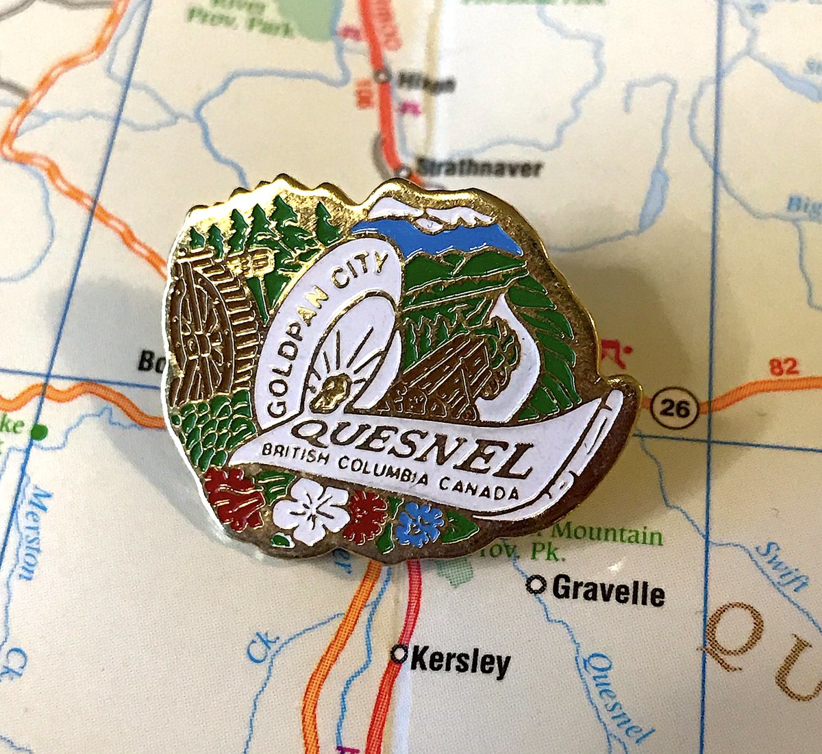
13. QUESNEL
- Oh wow just a lot happening, most of it good!
- Is that a truck taking trees away?
- Really good of how pins work better in B.C. than flags if a town hires someone to make one logo, because they can bend to a unique shape instead of fitting in a rectangle
- Oh wow just a lot happening, most of it good!
- Is that a truck taking trees away?
- Really good of how pins work better in B.C. than flags if a town hires someone to make one logo, because they can bend to a unique shape instead of fitting in a rectangle
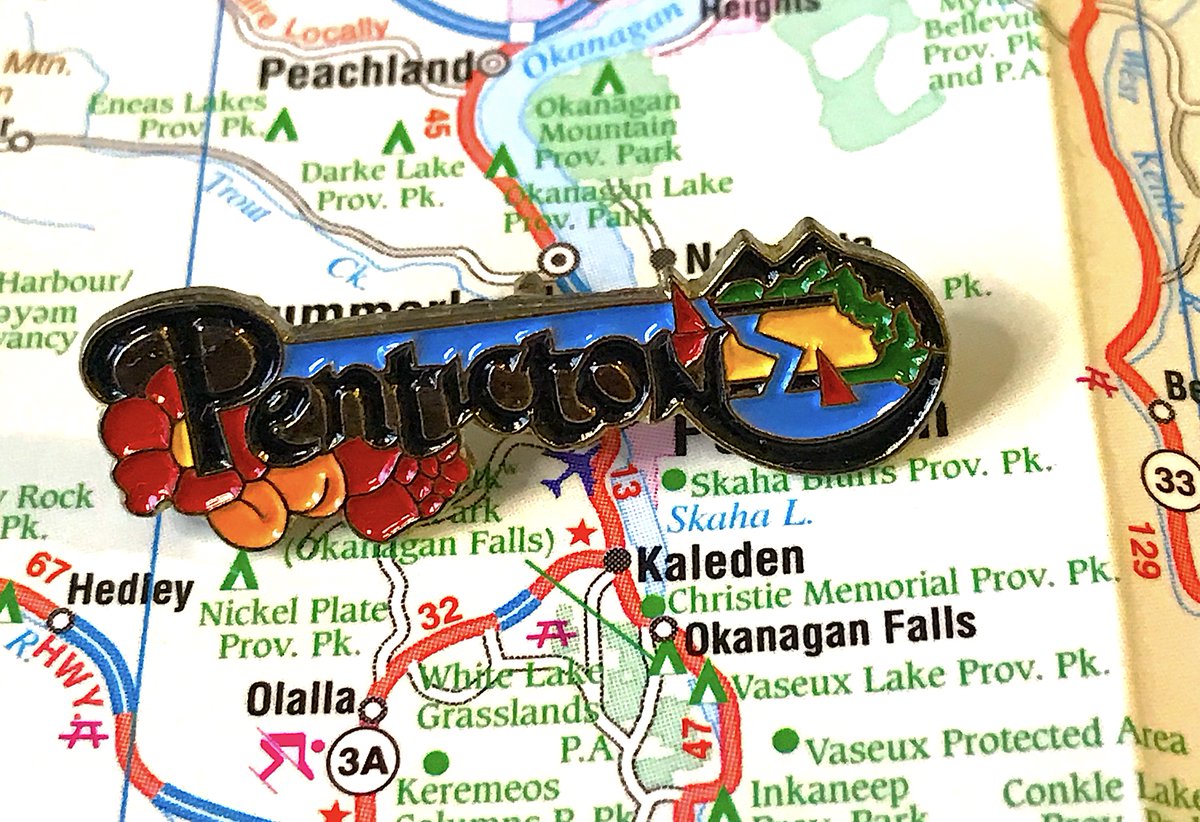
12. PENTICTON
- Now that& #39;s how you make the text the dominant thing but still keep it interesting
- Just a really fun shape to the whole thing
- Boats, trees, yadda yadda, but good job with the flowers
- Now that& #39;s how you make the text the dominant thing but still keep it interesting
- Just a really fun shape to the whole thing
- Boats, trees, yadda yadda, but good job with the flowers
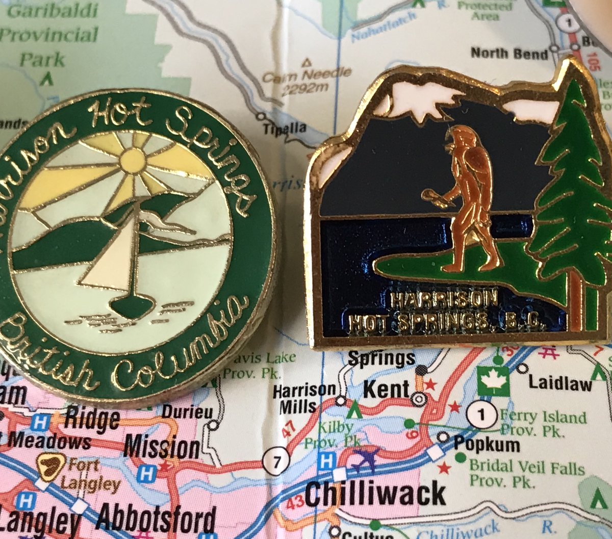
11. HARRISON HOT SPRINGS
- Yes, that& #39;s bigfoot staring out towards the water, some people out there think bigfoot is real or something, I don& #39;t know what to tell you
- Is bigfoot holding a mic? SING FOR US BIGFOOT
- Secondary pin has a great retro feel, could be top-30 by itself
- Yes, that& #39;s bigfoot staring out towards the water, some people out there think bigfoot is real or something, I don& #39;t know what to tell you
- Is bigfoot holding a mic? SING FOR US BIGFOOT
- Secondary pin has a great retro feel, could be top-30 by itself
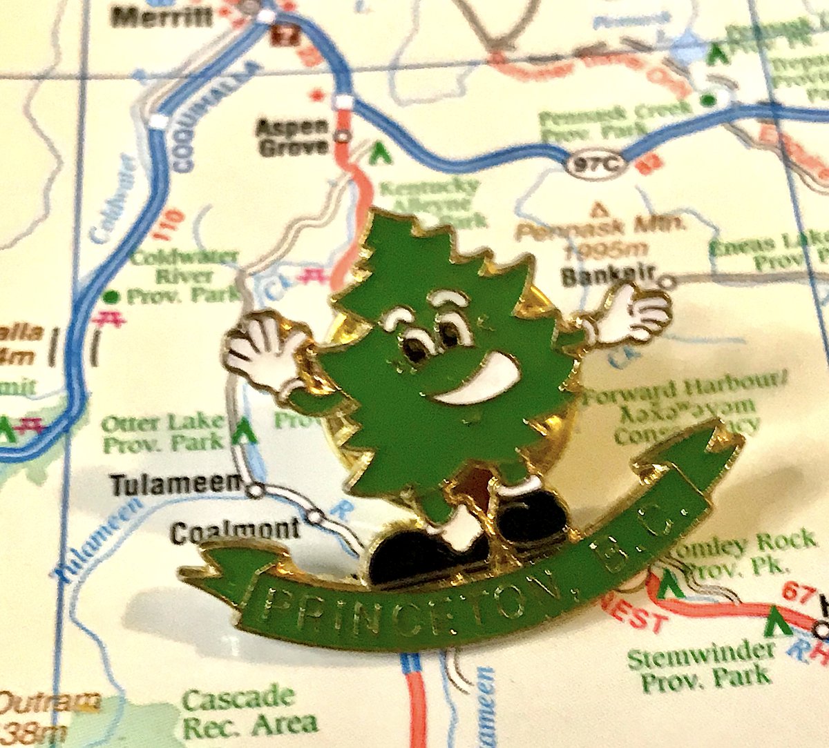
10. PRINCETON
- Peter Pine! Objectively B.C.& #39;s most adorable mascot
- Peter is mixed heritage: father is a pine, mother is a fir/spruce, this is actually canon, I& #39;m not making it up
- Peter Pine was so amazing he started the search for flags, so he always gets bonus points
- Peter Pine! Objectively B.C.& #39;s most adorable mascot
- Peter is mixed heritage: father is a pine, mother is a fir/spruce, this is actually canon, I& #39;m not making it up
- Peter Pine was so amazing he started the search for flags, so he always gets bonus points
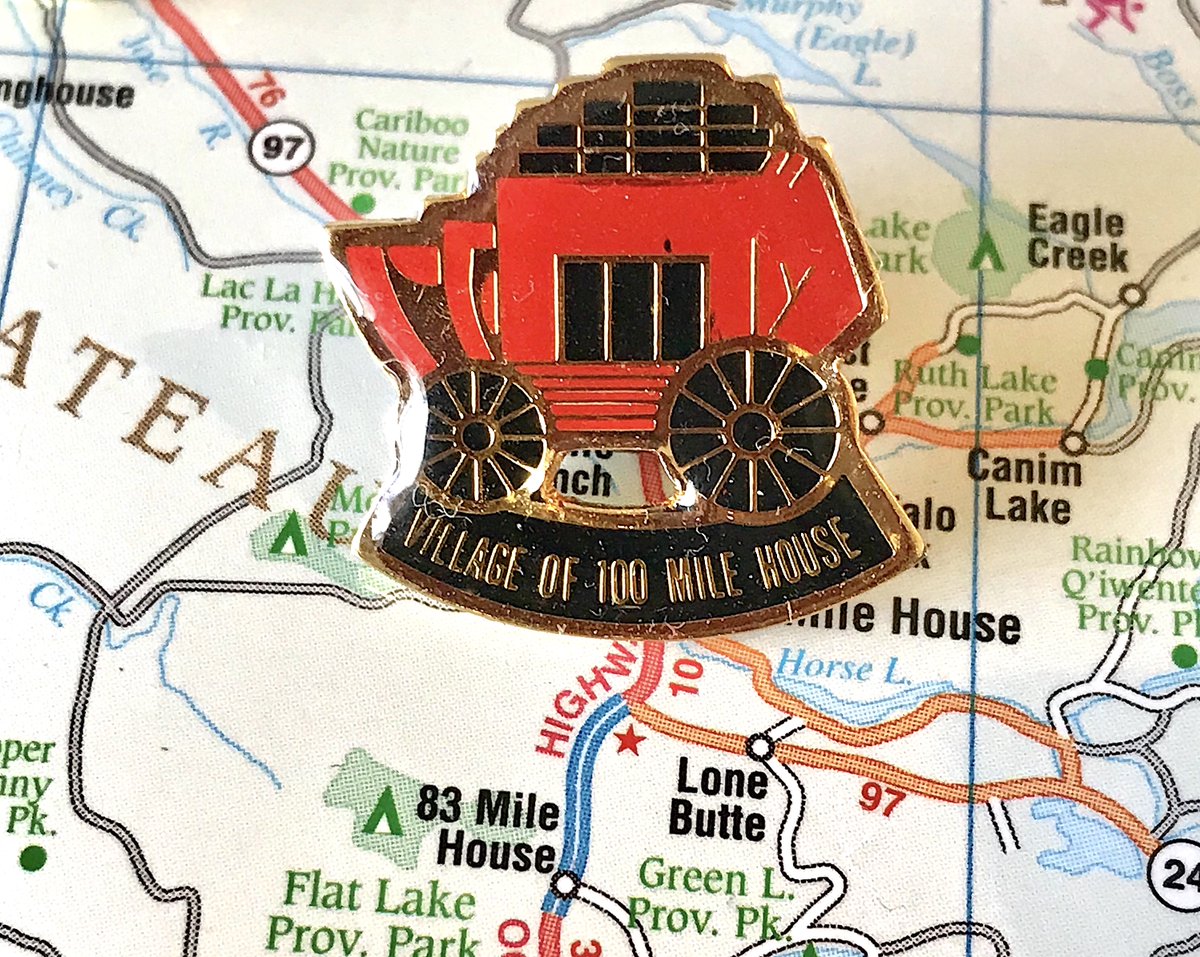
9. 100 MILE HOUSE
- Cute, simple, shows heritage, well balanced, great job using two colours, that& #39;s how you do it
- Are those gold bars on top of the stagecoach?
- Willing to overlook the "Village of" business at the bottom
- Cute, simple, shows heritage, well balanced, great job using two colours, that& #39;s how you do it
- Are those gold bars on top of the stagecoach?
- Willing to overlook the "Village of" business at the bottom
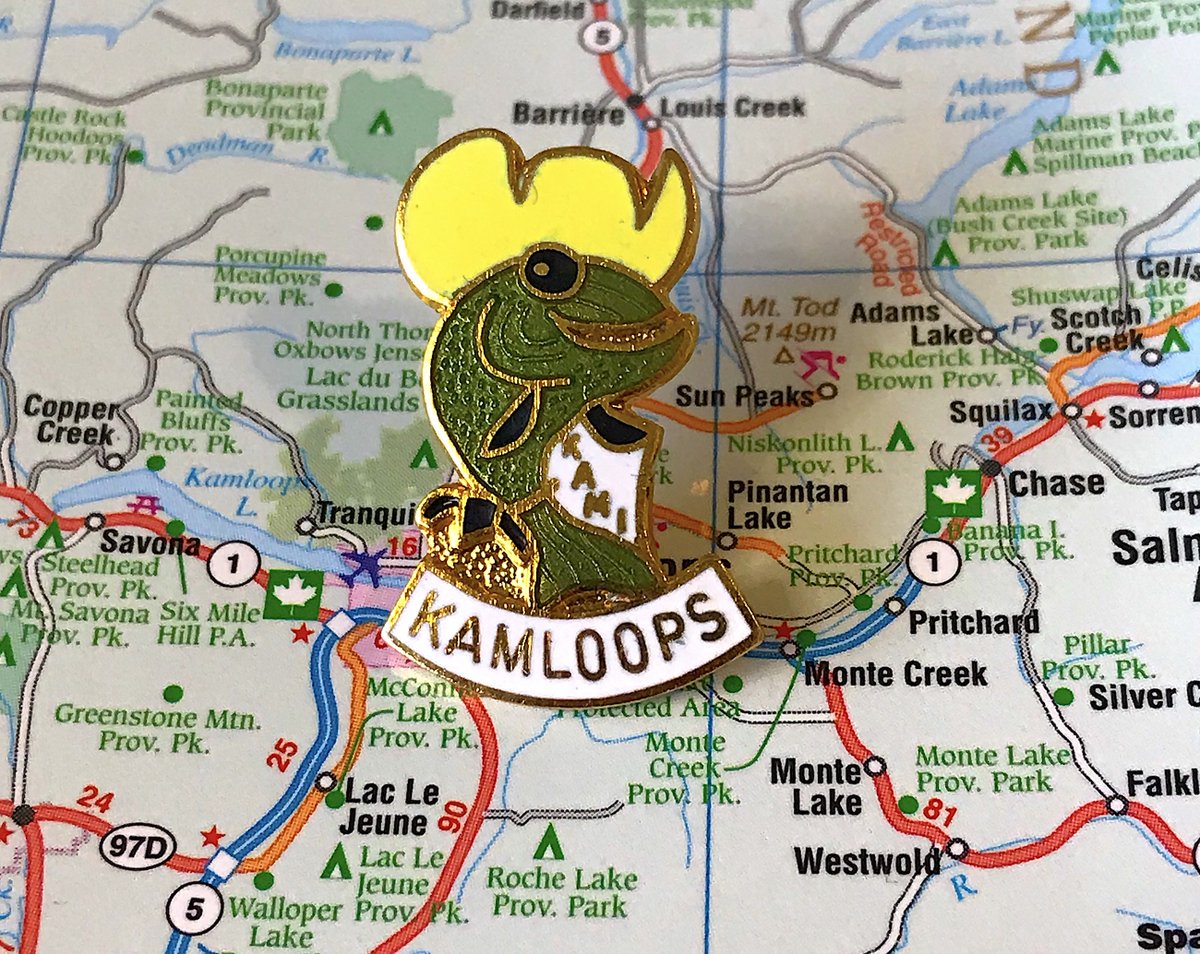
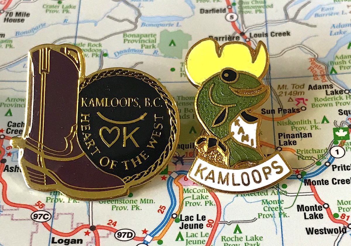
8. KAMLOOPS
- It& #39;s Kami time!
- He& #39;s the town mascot: a fish, who packs heat, and wears a cowboy hat, if you don& #39;t understand why that& #39;s not awesome, I can& #39;t help you
- Alternative pin has big energy, but is no Kami
- It& #39;s Kami time!
- He& #39;s the town mascot: a fish, who packs heat, and wears a cowboy hat, if you don& #39;t understand why that& #39;s not awesome, I can& #39;t help you
- Alternative pin has big energy, but is no Kami
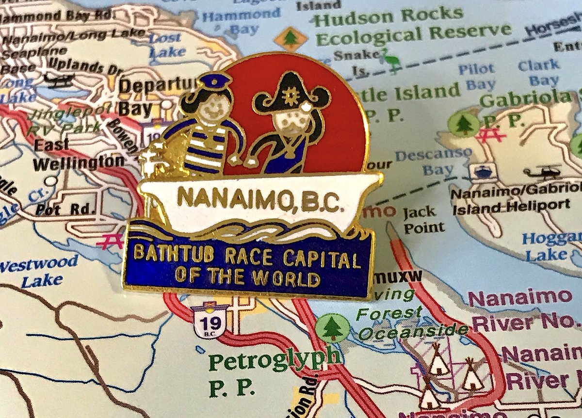
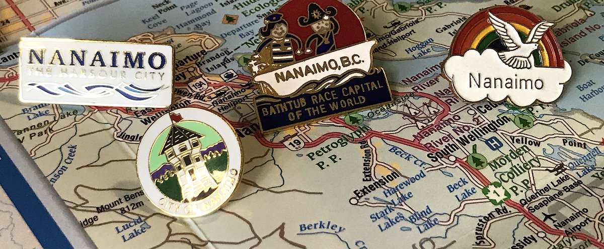
7. NANAIMO
- Branding yourself as "Bathtub Race Capital of the World" is wonderful
- The true delight is the couple: don& #39;t they look happy? Aren& #39;t we all looking optimistically over the horizon in our own bathtub, tossed about by fate and the seas?
- i have too many nanaimo pins
- Branding yourself as "Bathtub Race Capital of the World" is wonderful
- The true delight is the couple: don& #39;t they look happy? Aren& #39;t we all looking optimistically over the horizon in our own bathtub, tossed about by fate and the seas?
- i have too many nanaimo pins
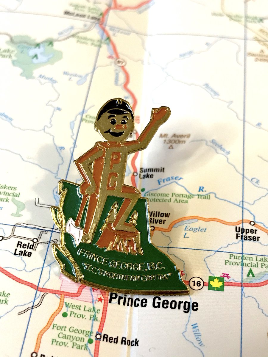
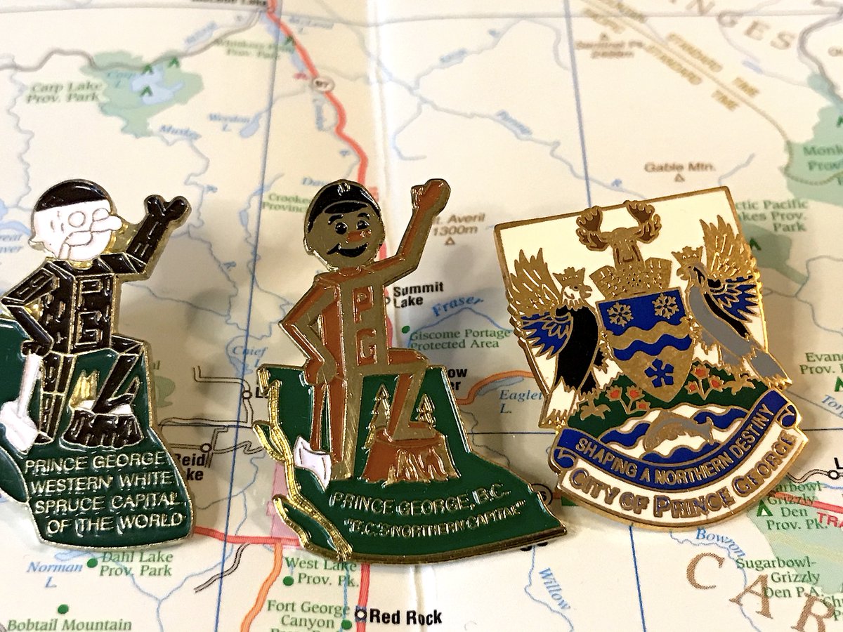
6. PRINCE GEORGE
- It& #39;s Mr. PG, he rocks, we literally did a bracket last year that was 20% Mr. PG content, not rehashing for you
- Love how different Mr. PG pins have different descriptions for Prince George
- Love the pin that is literally "this is where we are in B.C."
- It& #39;s Mr. PG, he rocks, we literally did a bracket last year that was 20% Mr. PG content, not rehashing for you
- Love how different Mr. PG pins have different descriptions for Prince George
- Love the pin that is literally "this is where we are in B.C."
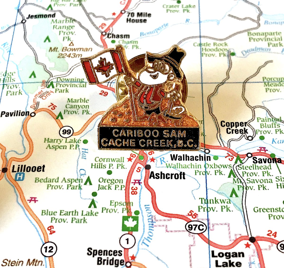
5. CACHE CREEK
- It& #39;s Cariboo Sam! Mascot for mostly American gold miners, but he& #39;s reformed and loves Canada now!
- Love his spirit, love how they explicitly say "this is cariboo sam, fyi"
- yes i& #39;m a sucker for a happy mascot as a pin
- It& #39;s Cariboo Sam! Mascot for mostly American gold miners, but he& #39;s reformed and loves Canada now!
- Love his spirit, love how they explicitly say "this is cariboo sam, fyi"
- yes i& #39;m a sucker for a happy mascot as a pin
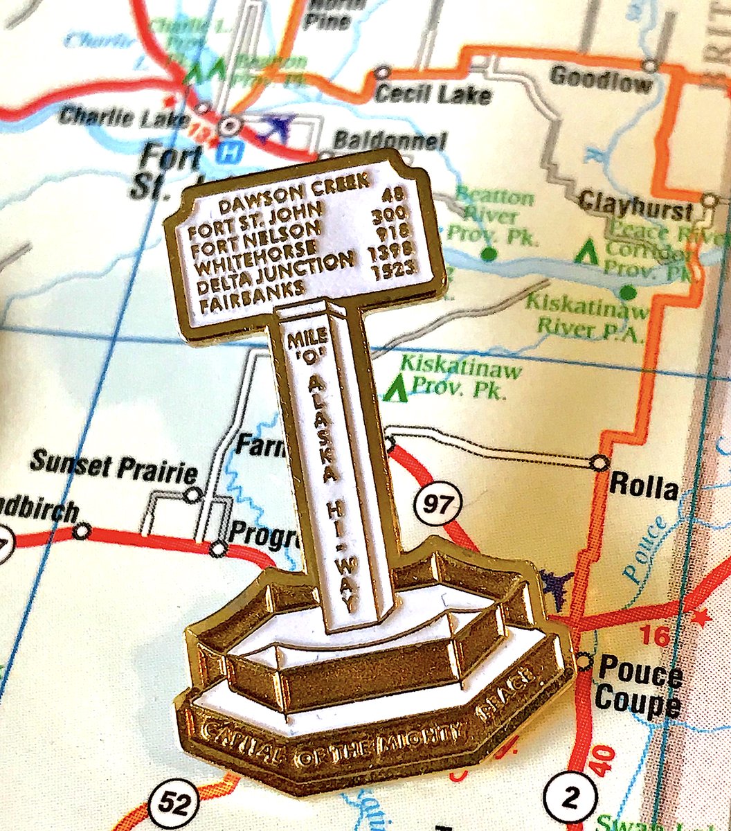
4. DAWSON CREEK
- Literally the Mile Zero monument in the middle of town that begins the Alaska Highway
- Look at the detail! The distance markers are readable! And it& #39;s just two colours!
- Fun, educational, cool shape, just great in so many ways
- Literally the Mile Zero monument in the middle of town that begins the Alaska Highway
- Look at the detail! The distance markers are readable! And it& #39;s just two colours!
- Fun, educational, cool shape, just great in so many ways
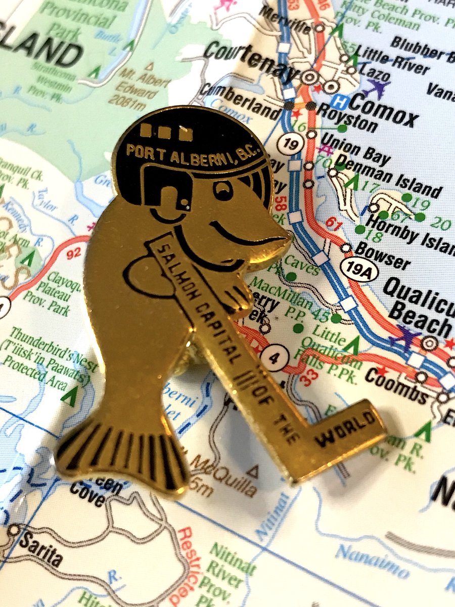
3. PORT ALBERNI
- A salmon playing hockey, combining B.C.& #39;s greatest obsession with Canada& #39;s, fantastic
- "Good to see the salmon is wearing a helmet," the first time in history that& #39;s been typed
- Very adorable, exactly what you think of for "weird local B.C. pins"
- A salmon playing hockey, combining B.C.& #39;s greatest obsession with Canada& #39;s, fantastic
- "Good to see the salmon is wearing a helmet," the first time in history that& #39;s been typed
- Very adorable, exactly what you think of for "weird local B.C. pins"
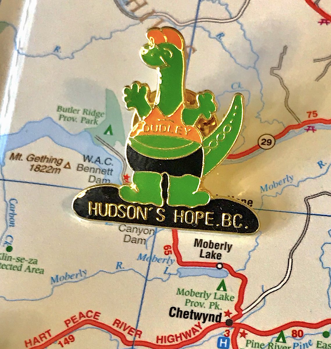
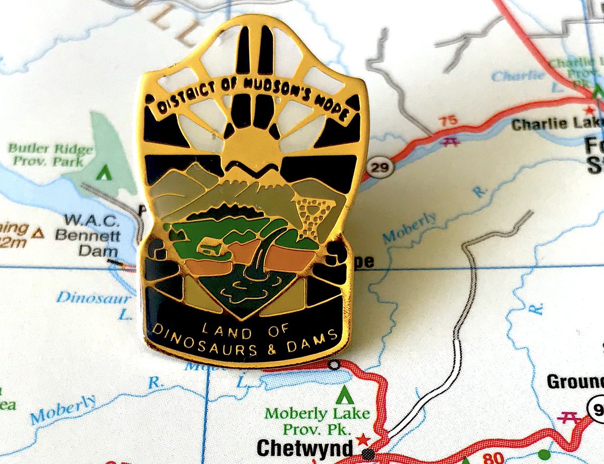
2. HUDSON& #39;S HOPE
- Dudley is now my best friend
- Crop top + shorts combo is interesting, but I& #39;ll allow it
- Example of how simplicity is a virtue
- Alternative pin is also great, "Land of Dinosaurs and Dams" is fantastic
- Dudley is now my best friend
- Crop top + shorts combo is interesting, but I& #39;ll allow it
- Example of how simplicity is a virtue
- Alternative pin is also great, "Land of Dinosaurs and Dams" is fantastic
FINALLY
THE BEST MUNICIPAL PIN IN BRITISH COLUMBIA
FORT ST. JAMES
- Simple, neat shape, elegant
- Great placement of the name
- Pays monument to the town& #39;s role as a float plane base
- Is it the best? Maybe, but the joy of rankings comes from the journey, not the destination
THE BEST MUNICIPAL PIN IN BRITISH COLUMBIA
FORT ST. JAMES
- Simple, neat shape, elegant
- Great placement of the name
- Pays monument to the town& #39;s role as a float plane base
- Is it the best? Maybe, but the joy of rankings comes from the journey, not the destination
Anyhow, here& #39;s the full story of charming but eccentric local man who collected pins for every municipality in British Columbia over the past year
Lots of you were very, very kind to send me about half of these pins over the past year.
Constantly amazed and delighted so many people folks enjoy these little celebrations of our grand province.
Now it& #39;s time to find a new hobby.
Constantly amazed and delighted so many people folks enjoy these little celebrations of our grand province.
Now it& #39;s time to find a new hobby.

 Read on Twitter