THREAD:
Using data from @StatsBomb (via @fbref), I tried to quantify the speed of teams& #39; ball movement, as well as their use of possession, defining them as follows:
1. Speed of movement: The total distance covered by the team
Using data from @StatsBomb (via @fbref), I tried to quantify the speed of teams& #39; ball movement, as well as their use of possession, defining them as follows:
1. Speed of movement: The total distance covered by the team
...while passing/carrying the ball per second in possession. The unit for this measure is metres/second.
When measuring this metric for individual players, I calculated the player& #39;s time in possession to be:
((touches per 90/team touches per 90)*team time in possession))
This
When measuring this metric for individual players, I calculated the player& #39;s time in possession to be:
((touches per 90/team touches per 90)*team time in possession))
This
...is obviously a pretty rough evaluation, but I feel it works well enough here.
2. Possession Efficiency: The shots taken by a team per minute in possession of the ball.
Again, slight adjustment when calculating for players, by taking (shots taken+shot creating actions) (SCA
2. Possession Efficiency: The shots taken by a team per minute in possession of the ball.
Again, slight adjustment when calculating for players, by taking (shots taken+shot creating actions) (SCA
...as defined on @fbref ).
First up, here& #39;s a look at how teams in the top 5 leagues perform:
Initially, what jumps out is how Man Utd (1st overall) and
Man City (last overall) are quite literally on opposite ends of the speed spectrum.
Utd possibly rank quite high due their
First up, here& #39;s a look at how teams in the top 5 leagues perform:
Initially, what jumps out is how Man Utd (1st overall) and
Man City (last overall) are quite literally on opposite ends of the speed spectrum.
Utd possibly rank quite high due their
...ability on the counter-attack, which is also why Gladbach rank quite high for that metric as well.
In terms of efficiency, Sampdoria are the best at turning their possession into shots, but the fact that they have only scored 46 times so far shows that these aren& #39;t
In terms of efficiency, Sampdoria are the best at turning their possession into shots, but the fact that they have only scored 46 times so far shows that these aren& #39;t
...high-quality chances (they rank last in Europe for npxG per shot, with 0.074).
Sides like Barca and Arsenal rank low here due to their relative inability to exploit their usually high possession numbers.
Sides like Barca and Arsenal rank low here due to their relative inability to exploit their usually high possession numbers.
Now, to individual players.
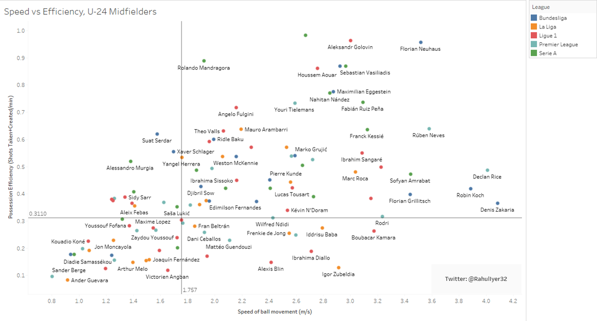
I took a sample of central/defensive midfielders aged 24 and below and got the following graph.
(It does have to be noted that playing at a low tempo or having low efficiency especially in this position is not necessarily a bad thing, this is only
I took a sample of central/defensive midfielders aged 24 and below and got the following graph.
(It does have to be noted that playing at a low tempo or having low efficiency especially in this position is not necessarily a bad thing, this is only
...meant to provide an insight into a player& #39;s style of play.)
A couple of interesting names that popped up wrt efficiency were Vasiliadis and Maiga, who both play for bottom-half teams in Paderborn and Metz respectively.
Arthur& #39;s presence in the 3rd quadrant only reinforces
A couple of interesting names that popped up wrt efficiency were Vasiliadis and Maiga, who both play for bottom-half teams in Paderborn and Metz respectively.
Arthur& #39;s presence in the 3rd quadrant only reinforces
...the perception of him as a good keeper of possession, but not quite as effective a creator.
If Arsenal wanted someone to create from midfield, they could do a lot worse than someone like Eggestein or Fulgini.
If Arsenal wanted someone to create from midfield, they could do a lot worse than someone like Eggestein or Fulgini.
Another little thing I tried was a bit of analysis on Manchester United.
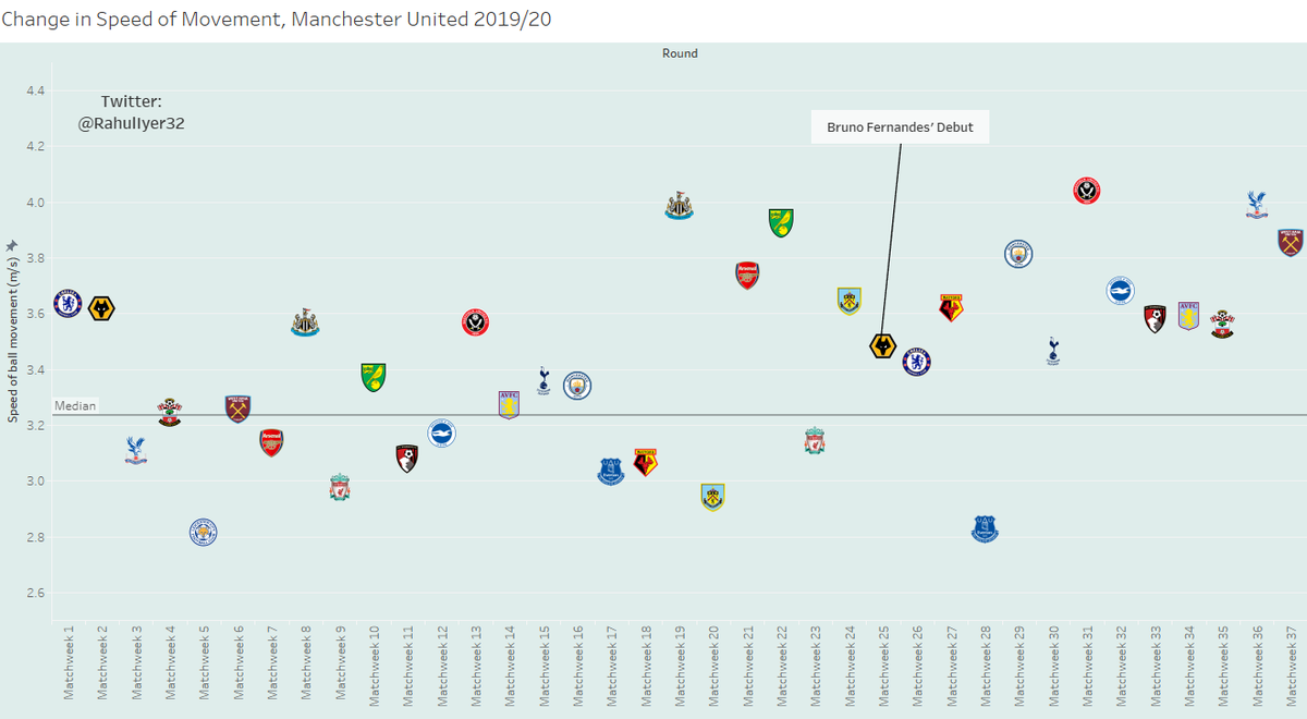
This is a game-by-game look at their speed of ball movement, and a couple of interesting insights can be gained here:
1. The 2nd time they played any given team, their speed of movement increased
This is a game-by-game look at their speed of ball movement, and a couple of interesting insights can be gained here:
1. The 2nd time they played any given team, their speed of movement increased
...except against CHE, WOL and EVE (and obviously LEI, who they play later today).
Maybe it& #39;s a case of having played the opponent once and now being able to predict their behaviour better?
2. In Bruno Fernandes& #39; 13 games so far, Utd& #39;s speed has dipped below league average
Maybe it& #39;s a case of having played the opponent once and now being able to predict their behaviour better?
2. In Bruno Fernandes& #39; 13 games so far, Utd& #39;s speed has dipped below league average
...only once, compared to 11 times in the last 24 which is a bit quirky, considering his individual speed is the 4th lowest in the current squad at 1.025 m/s (smaller sample size, yes, but still).
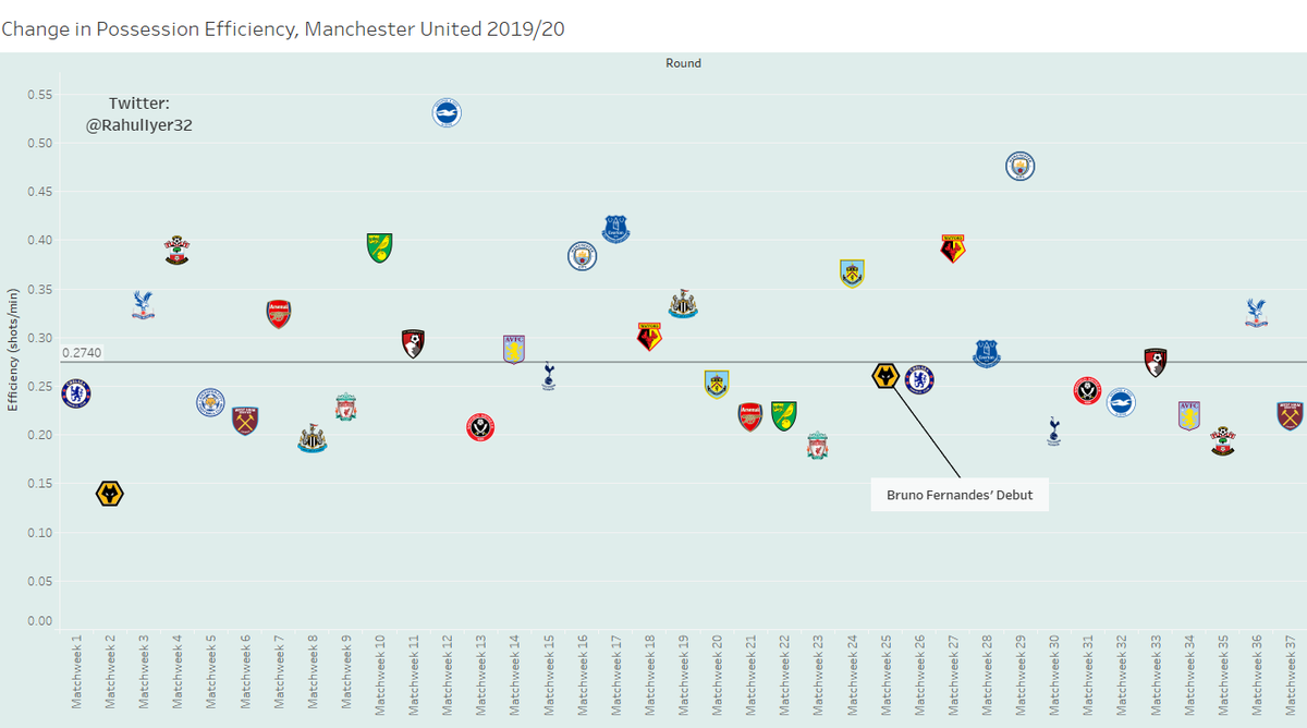
Looking at the same type of graph for efficiency,
Looking at the same type of graph for efficiency,
that& #39;s pretty much fallen off a cliff since Bruno& #39;s arrival.
Essentially, because I& #39;ve defined it as shots per minute in possession, it& #39;s probably due to the fact that the team is now averaging more possession, but most likely not creating any more shots than they did before.
Essentially, because I& #39;ve defined it as shots per minute in possession, it& #39;s probably due to the fact that the team is now averaging more possession, but most likely not creating any more shots than they did before.
This is potentially a slight cause for concern in the long term, as Greenwood ridiculously over-performing his xG can only take you so far.
As long as you& #39;re still here, there& #39;s another little something I& #39;ve been working on, using free data provided by Centre Circle
As long as you& #39;re still here, there& #39;s another little something I& #39;ve been working on, using free data provided by Centre Circle
...Data ( @canpldata ) on the Canadian Premier League& #39;s inaugural 2019 season:
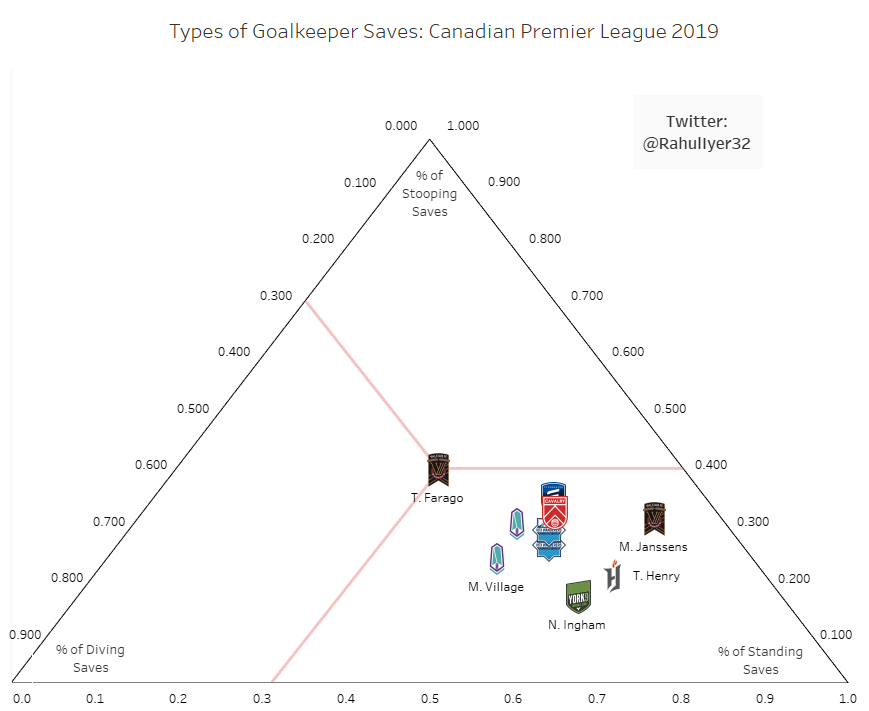
I used the data to try my hand at creating ternary charts, which are useful to look at the composition of anything made of 3 factors.
I used the data to try my hand at creating ternary charts, which are useful to look at the composition of anything made of 3 factors.
So, I looked at the different ways keepers made their saves (diving, standing or stooping) as defined in the dataset.
I& #39;ve also provided the red lines which show how the chart needs to be interpreted (using Farago as an example). The horizontal axis denotes the percentage of
I& #39;ve also provided the red lines which show how the chart needs to be interpreted (using Farago as an example). The horizontal axis denotes the percentage of
...diving saves made, the right diagonal axis shows the % of standing saves made and the left diagonal axis shows the % of stooping saves made.
This is just an experiment I tried, so if anyone out there knows more, I& #39;d love some advice. Alternatively, if you want to read more
This is just an experiment I tried, so if anyone out there knows more, I& #39;d love some advice. Alternatively, if you want to read more
about ternary charts, the Wikipedia page itself is pretty good.
https://en.wikipedia.org/wiki/Ternary_plot
As">https://en.wikipedia.org/wiki/Tern... always, any and all comments, criticisms and interactions are welcomed. Thanks a lot!
https://en.wikipedia.org/wiki/Ternary_plot
As">https://en.wikipedia.org/wiki/Tern... always, any and all comments, criticisms and interactions are welcomed. Thanks a lot!

 Read on Twitter


