A short thread on #accessibility in #ttrpg - or, what did I learn between one PDF and the next. On the layout and PDF-creation side. 1/
We& #39;ve released the Freshwater Marshes guide as a pretty-pictures thingie. It took me a couple of days (and some @thesamwisest& #39;s tweets) to realize I should probably check how does it work with screen readers. It didn& #39;t. 2/
In case you don& #39;t know, for a PDF to be accessible, it should be properly named, have good text-to-background contrast, alt text for images, bookmarks, layers (if your background is complex and makes for a harder read). And it should be tagged - think HTML tags <h1><p> etc 3/
Freshwater Marshes were a test, I admit. Originally, I& #39;ve used a dingbats font to make ornaments - but they ended up being read as & #39;p& #39; and a pain to listen to. So they got replaced with full stops and stopped being annoying - with little to no hurt to the & #39;aesthetics.& #39; 4/
As it& #39;s easy to notice, we were covered on the high-contrast front as I love the black font on white paper. I might be a graphic designer but the librarian in me wins every time. Giving your document a title is not hard - you can set it up in document preferences. 5/
Alt text. You can set it up in InDesing or Acrobat. I am still learning how to write them properly. So far, that& #39;s the best article I& #39;ve found on the matter. If you need another reason to use alt text than #accessibility, it also helps your SEO efforts. https://aceseditors.org/news/2020/how-to-write-great-alt-text-and-why-it-matters">https://aceseditors.org/news/2020... 6/
Bookmarks. For longer documents it& #39;s easiest to get these done at the layout stage - if you export an interactive PDF, you can include bookmarks and clickable table of contents. If you prefer, you can make the bookmarks in Acrobat too. If your PDF have 20+ pages, add bookmarks 7/
Tags and reading structure. Oh, here we go. I still struggle with those, to be honest. They are both a tool guiding the screen reader soft how to read the document - what are the headers, what& #39;s the body text, and what& #39;s the ornament or pagination that can be skipped. 8/
This is how a structured PDF looks like in InDesign. If you& #39;ve ever used HTML, you& #39;ll find it self-explanatory. In case of #WayfarersDeck, each card is a separate article, and it lists all the elements on the card in order, with assigned headers, images and paragraphs. 9/
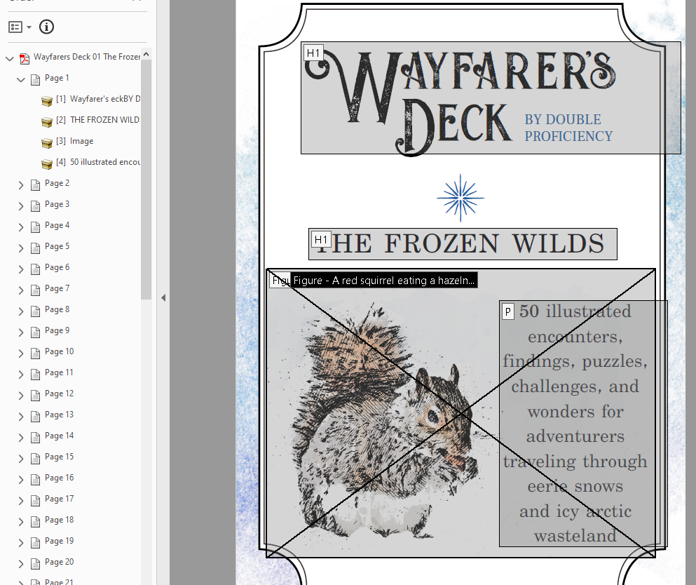
This is how the exact same thing looks in Adobe Acrobat. You& #39;ll notice that the headers are headers, paragraphs are paragraphs, and figures are images with assigned alt text. 10/
Here& #39;s the thing. Professional as it all looks, *I did have to redo it by hand in Acrobat*. Which is kind of the point. I& #39;ve spent two days fiddling with settings in InDesign. No matter what I did, Acrobat skipped 98% of alt text assigned, 60% of tags (...) 11/
... and misinterpreted the rest as <span>. I had to go through all 52 cards re-assigning tags, rewriting alt texts, and rebuilding the whole document structure. (Yes, I know what settings to use in InDesign, don& #39;t @me.) 12/
Best solution I& #39;ve found on @Adobe website was & #39;it& #39;s probably a bug, try recreating the whole document from scratch.& #39;
Seriously? That& #39;s your advice?
People should not have to jump through two days of hoops to provide basic accessibility to their products. 13/
Seriously? That& #39;s your advice?
People should not have to jump through two days of hoops to provide basic accessibility to their products. 13/
I know me spending extra two days on figuring out how to make it work may sound unimportant. After all, nobody has forced me to do it. But! If we want our products to really be accessible, maybe we could use some proper support? Better guides? @affinitybyserif? @Adobe? 14/
Okay, that& #39;s all I have so far. #WayfarersDeck is as accessible as I could make it. *It should not be as hard.* If you want to see how it had worked out, it& #39;s on @itchio. If you want more detailed tips on the process, DM me, I& #39;ll help out as much as I can. https://double-proficiency.itch.io/wayfarers-deck-the-frozen-wilds">https://double-proficiency.itch.io/wayfarers...

 Read on Twitter


