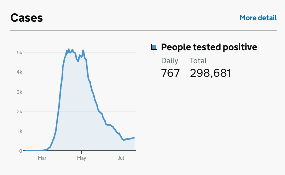
Because the government told me to #stayalert I& #39;ve been watching the new cases graph for the past two weeks, since the unlocking on 4 July. This is the latest graph on the gov& #39;s daily data charts. Bottom right there is now a gentle, but unmistakeable, slope upwards. HOWEVER
this is not necessarily a moment to start panicking about a second peak. It could be that cases were always going to rise two weeks after a widespread unlocking (2 weeks roughly the time it takes for illness to show itself and test results to come back positive)
so does this graph simply show what was always going to show? We know about localised outbreaks. There are bound to be *some* more cases if people are mixing. The key difference between now and mid-March when our line started shooting almost vertically upwards is that we have
community testing in place. There is a track and trace system. It is not perfect, but it is so much more than we had in mid-March when the govt stopped ALL community testing and tested in hospitals only. People are now wearing masks on public transport and in shops.
Any rise in cases is terrible, of course, because more people will be left seriously ill. But there& #39;s also now a treatment for seriously ill patients that we didn& #39;t have in March. (Btw the death rate graph is still going steadily, but slowly, downwards, but there is always a lag)
The big big question, then, is does this bottom right uptick show the start of another huge peak, or a flattened curve, because we have many more measures in place today than we didn& #39;t have in March (including travel quarantines)?
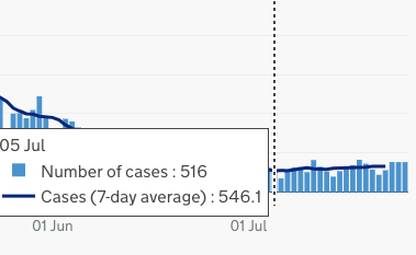
If you want to a closer look at the curve and the 7-day average, here it is zoomed in. 5 July was the lowest 7-day average for new cases since March (546.1)
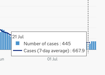
Scroll forward to 21 July (latest date for 7-day average figures) and it& #39;s 667.9 a day, two weeks on from un-lockdown. It& #39;s clear that 4 July has caused cases to go up, but whether this means a nationwide peak, or just a much flatter curve that the govt is going to carry on
flattening, I don& #39;t know. That& #39;s because I& #39;m not a scientist, I& #39;m just a journalist who spends Saturday evenings staring at coronavirus data. It would be great if a scientist or medic could tell us what this means, at a No10 press conference?
and failing that, maybe a govt scientist could tell us directly, on here, how to interpret the chart? @uksciencechief @CMO_England

 Read on Twitter


