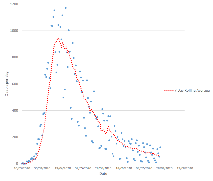
Shockingly another 123 fatalities from Covid-19 reported in the UK yesterday. Thats up from last Friday. Here& #39;s the overall picture (1)
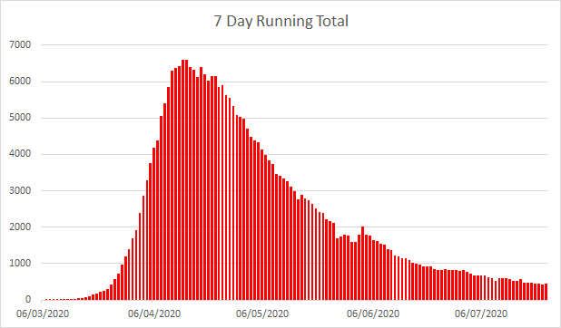
The seven day running total is still going down. Its not going down fast, and it obviously didn& #39;t go down yesterday. Yesterdays 123 fatalities are among the 60,000+ excess deaths we failed to avoid by locking down incompletely three weeks too late (2)
Its easy to look at one days figures being above or below where you& #39;re expecting them to be and either get too pessimistic or start yelling effusively about how well we& #39;re doing. There& #39;s too much of both of those going on. We can, should, indeed must be better than that (3)
Its not just about whether the number of dead is going up or down, its about rates, and with the best will in the world no one can look at a graph like that and immediately & #39;get& #39; whats going on. That needs more analysis (4)
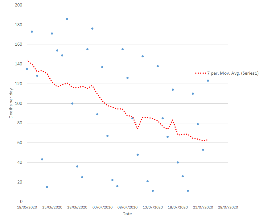
A closer look at the daily figures, with a trend line through them, shows something close to a straight line decline in the number of fatalities but with such scatter that only a fool would trust that (5)
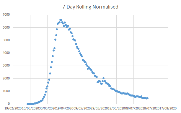
So we need to normalise for daily variation and then see what we get. Take the 7 day total, divide by 7, plot that out, and the whole normalised picture looks like this (6)
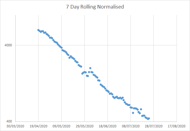
If we take that decline and drop a log on it, we can then learn whether the rate is proportionally constant. What does that mean? An exponential decline might be 100, 50, 25, 12.5, etc. Log it you get a straight line. Here& #39;s a log of the normalised decline in death rates (7)
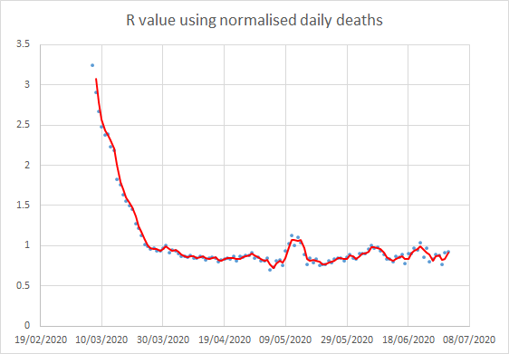
And look, you& #39;ve got maybe four phases. We can use this data, knowing when peak infectivity happens (5 days after catching it) and peak death happens (23 days after catching it) to work out an infection rate, R. And thats where we see the impact of government policy (8)
Those same four phases there, where you see the rate of decline stall, pan out to show three peaks in R, where the rate of infection got back up to 1 (or thereabouts) (9)
And if you check the dates of those - VE day weekend, loosening lockdown, and opening shops/BLM (and anti BLM) protests. The three peaks in R correlate directly with those events (10)
And after each, we can see reversion towards the same mean, i.e. one people got past the street parties of the VE day weekend things went back to normal very quickly. After the initial enthusiasm for getting to the beach people started acting more sensibly (11)
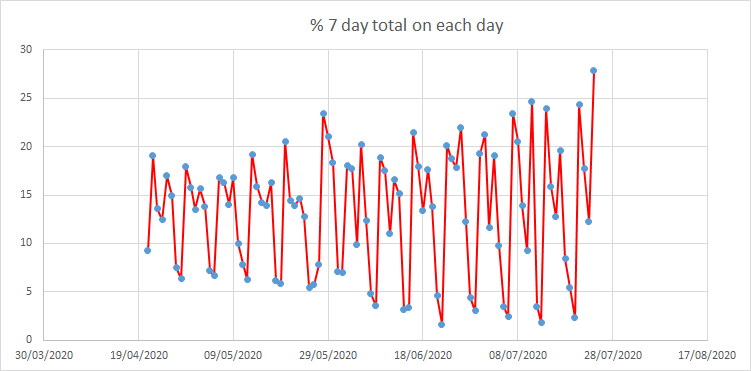
Many seem keen to point out that overall deaths continue to decline. True. But you need to look more closely. We are indeed still going down, but the rate of decline is now terrifyingly slow and as the data gets noisier (see graph) harder to see (12)
Positives? Yeah, deaths are going down. Negatives? Three times that has reversed. And that correlates exactly to changes in government policy. Unless infection rate was low enough to avoid that, we& #39;re about to see that happen a fourth time, 23 days from the pubs reopening (13)
...and the slowing down of the rate of decline both means many more fatalities (we& #39;re a hundred above the seven day total we would have predicted from the trend a month ago) which in turn means we& #39;re stuck in this for longer (14)
Ultimately, this precarious state means more cost, more time locked down or restricted in some way and most important of all more fatalities. We locked down three weeks too late, too softly, leading to longer term restrictions than we would have needed... (15)
...which meant more pressure to open up again while many more were dying than when we locked down, which lead to those three peaks in R and a slower rate of decline. The financial and human costs of these mistakes is substantial (16)
So, no, it isn& #39;t all negative. The number of deaths per day continues to unreliably trend downwards but at an ever slowing rate. Errors compound errors, and more die than should. It is not enough that the number continues to decline. Not enough at all. (fin)

 Read on Twitter