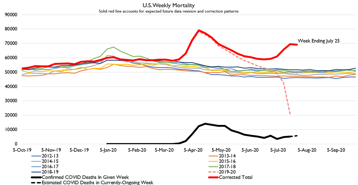
but i was assured that only the us was having a second wave because we are totally the worst in the world https://twitter.com/DavidKeo/status/1286749985204297728">https://twitter.com/DavidKeo/...
sidenote: France is also behind on reporting mortality data. No new stats covering period after June 15 when I checked last week. Gonna check again in a few minutes once I finish my US mortality data work.
so spoiler alert DEATH DATA COMIN IN HOT
so spoiler alert DEATH DATA COMIN IN HOT
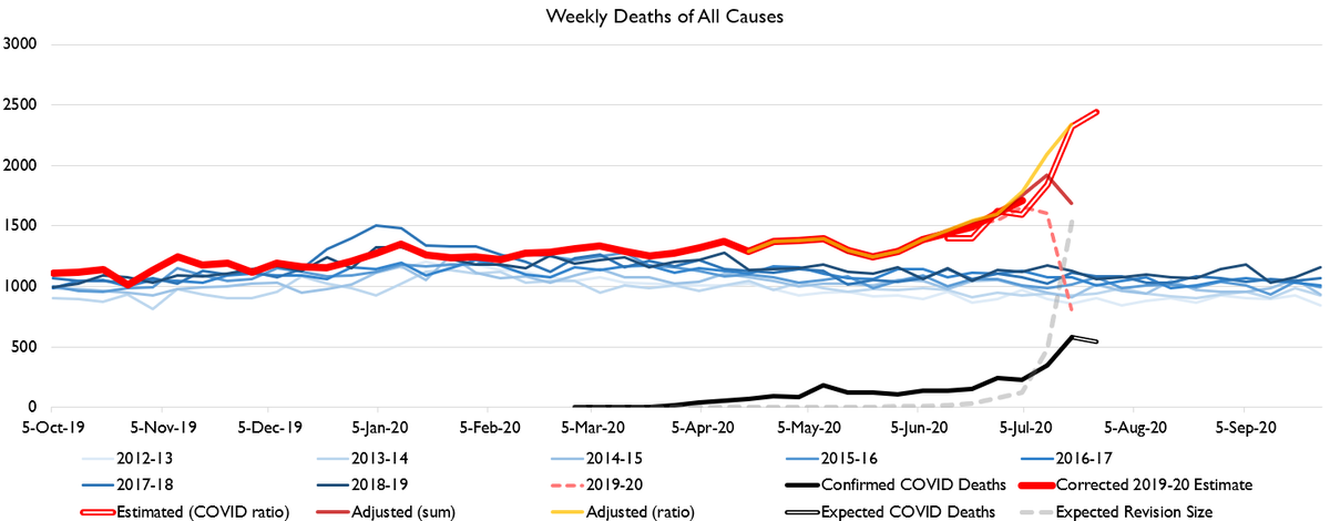
That forecast looks extremely dire and it is extremely dire and normally I& #39;m a "no silver linings" kind of guy but here I& #39;m gonna offer a small silver lining and it& #39;s that I& #39;m not totally sold on my own numbers today.
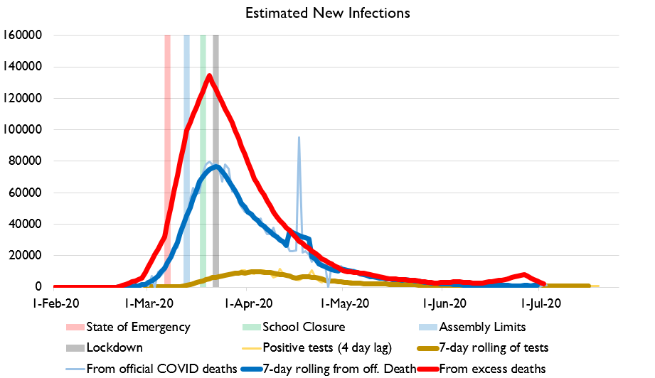
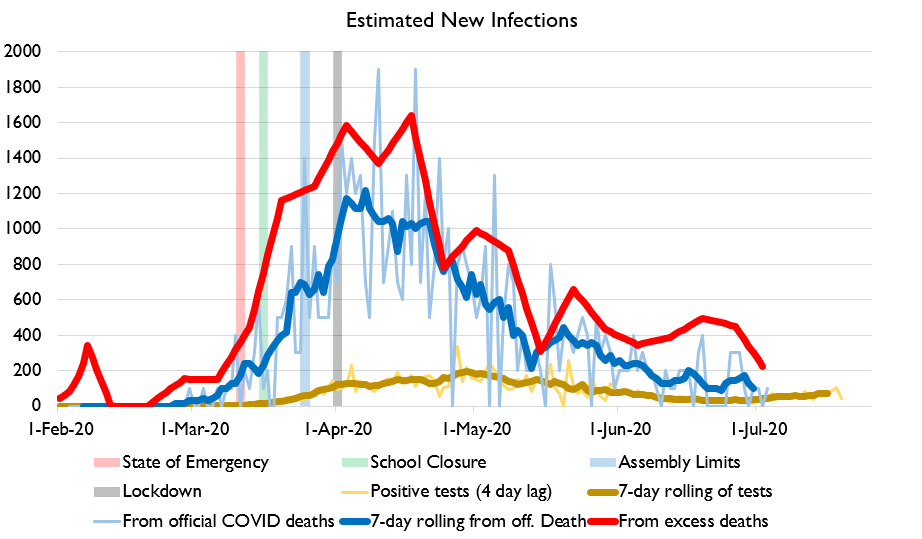
What I mean is, the spike in excess deaths implied by my method is really big despite the spike in official COVID deaths NOT being that big and despite the scale of testing being MUCH greater which spoiler alert makes absolutely zero sense.
Everyone being like "iTs StIlL tHe FiRsT wAvE" lol no there& #39;s two humps on that graph so it& #39;s a second wave cuz a wave is a hump science says so
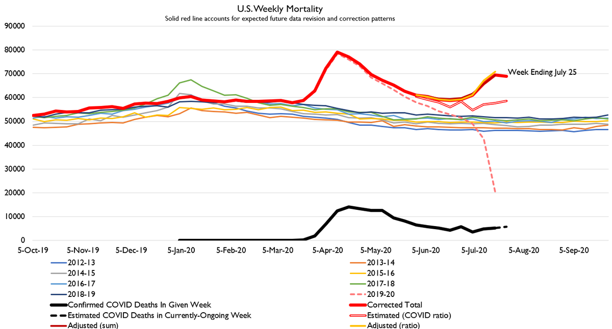
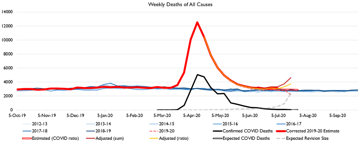
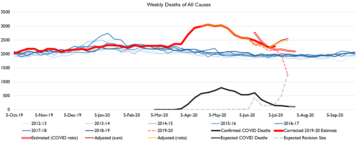
Anyways, here& #39;s the "how the sausage gets made" chart showing different forecast methods. As you can see, the revision-adjustment method is quite convinced that we are gonna see a wave of deaths but the COVID-death based method is like nah
What I suspect is going on here is my model has had so many weeks training on weeks with super huge adjustments that it is over-estimating adjustments. Death backlogs will be smaller going forward so latter-week adjustments should be smaller.
Or maybe not! There have been fancy "what the data is really telling us" explanations in the past and they turned out to be wrong. So I& #39;m using the number my model tells me even though it& #39;s pretty eyebrow raising.
Here it is by age. What& #39;s striking is as old-age deaths rose, young deaths dropped again. i.e. as old people deaths started rising again, stay-at-home behaviors intensified again and as more people stayed home fewer kids died.
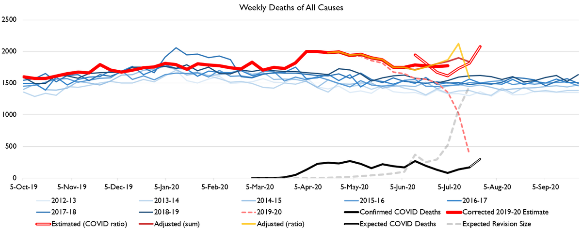
You can see the revision pattern problem pretty clearly in the case of New York. Here& #39;s what New York& #39;s charts look like.
At the tail end there: is New York& #39;s epidemic re-igniting? Or still in decline?
I think the true value is between the hollow red line and the yellow line on the death chart, i.e. the revision pattern method is overcorrecting.
I think the true value is between the hollow red line and the yellow line on the death chart, i.e. the revision pattern method is overcorrecting.
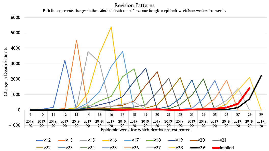
Here& #39;s NY& #39;s revision history. As you can see, revisions used to peak a lot higher. The latest revision came in smaller than the estimate I& #39;m using.
You might think the solution is to just drop those high-revision weeks from the expected revision, or only use the last X weeks or something.
But when you& #39;re trying to forecast an epidemic, dropping the weeks where the last wave occurred is building in a curious assumption.
But when you& #39;re trying to forecast an epidemic, dropping the weeks where the last wave occurred is building in a curious assumption.
It& #39;s in fact *asserting* that there *won& #39;t* be a second wave. My current method is the assumption that there *might* at any time be a second wave a-brewin& #39;.
That assumption will *often* be wrong. Given the lumpiness of the distribution of high-mortality events it will in fact *usually* be wrong.
But in my view, being right 95% of the time because you just "forecast normalcy" 100% of the time and thus miss the 5% of the distribution that represents 100% of the *interesting* distribution is worse than being right 85% of the time but getting the weird 5% correct.
That is why I continue to, with caution and adjustment and showing and noting the disagreement in different methods, think the revision-based method is helpful even when it gives weird results.
Furthermore, in some states we are getting the OPPOSITE result! States getting a bad wave right now who missed the first wave have implicitly "underestimated" revisions for the opposite reason as NY.
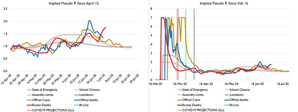
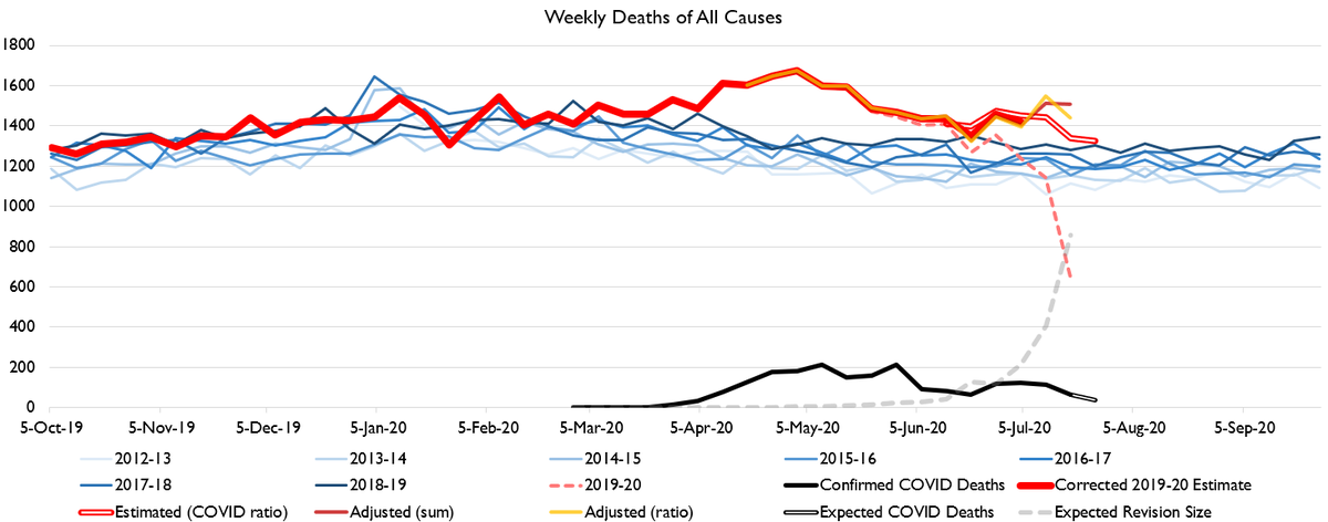
So, here& #39;s Texas, for example. You can see that the three estimate approaches agree for several weeks, but in the latest weeks diverge. Also you can see R values are coming down in TExas, btw, though deaths will keep rising for a while probably.
What& #39;s going on here?
Well, here& #39;s the revision chart. In Texas& #39; case, recent revisions have come in ABOVE past revisions.
SO the revision-based method is a nice way of guessing at future values, but is FAR from perfect!
Well, here& #39;s the revision chart. In Texas& #39; case, recent revisions have come in ABOVE past revisions.
SO the revision-based method is a nice way of guessing at future values, but is FAR from perfect!
California is also headed upwards, though less steeply.
I just want to emphasize here that "it& #39;s still the first wave" is clearly wrong in some of these cases.
California HAD a first wave! Then it started to decline! Then it came back!
I just want to emphasize here that "it& #39;s still the first wave" is clearly wrong in some of these cases.
California HAD a first wave! Then it started to decline! Then it came back!
Acting like what we& #39;re seeing is one "first wave" just spilling past the first epicenter through the rest of the country is wrong. What we& #39;re seeing is brand new epicenters forming, the virus spreading, and wave after wave of imports re-seeding it.
In other words, what we& #39;re seeing is the virus becoming endemic. Which means we& #39;re seeing a scenario where it neither mitigation nor suppression will have much hope of success in the long run: we& #39;ll have to go for elimination, which means very high rates of vaccination.
The possibility that we may be forming COVID-19 disease reservoirs (among humans or, the worst scenario, among animals in whom it evolves and then jumps back over) in the US is a really bad one.
Anyways here& #39;s Illinois.
oh sorry that& #39;s Virginia, which is for lovers.
Here& #39;s Arizona. It& #39;s a bad situation. But if the official case data is to be believed (???) then excess deaths should begin to decline in the next week or two of data.
There are also some states where the three methods are all just very confused and have no idea which way is up, like Georgia, which is identifiably having a second wave.

 Read on Twitter