Thread on color part 3! We& #39;ve gone over a lot of the science, but how do we use all of this creatively in our paintings? How do we make a black and white image look natural? The secret and key to the whole thing is in a property of color called Chroma.
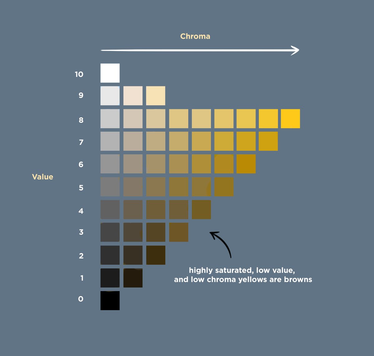
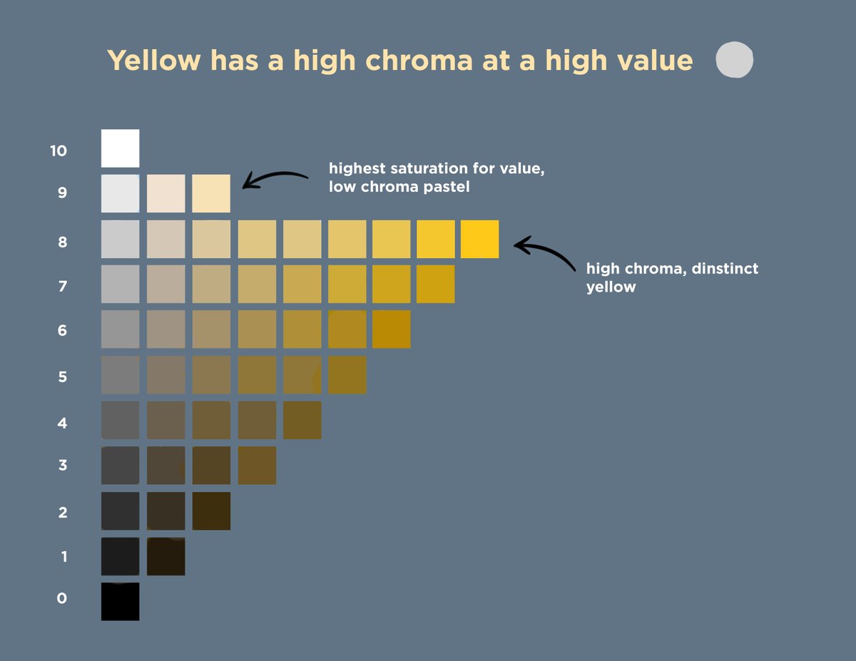
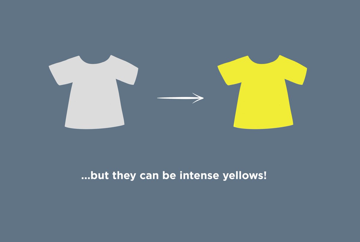
Chroma is distinct from, but related to, saturation. You can have a highly saturated yellow hue at a dark value. This would mean that it is a pure color, but at a low intensity. That color is not high chroma, because it appears brown and not what we would describe as yellow.
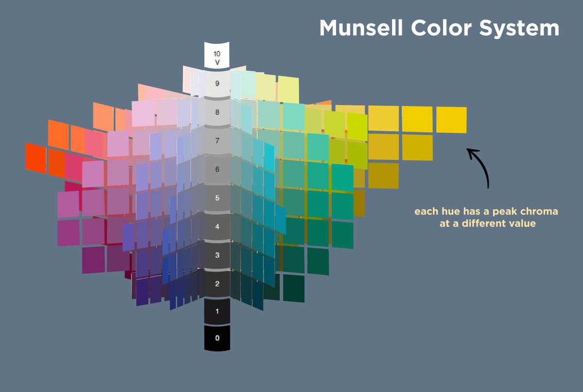
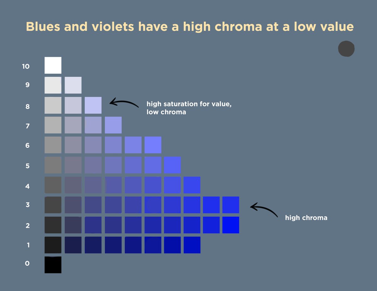
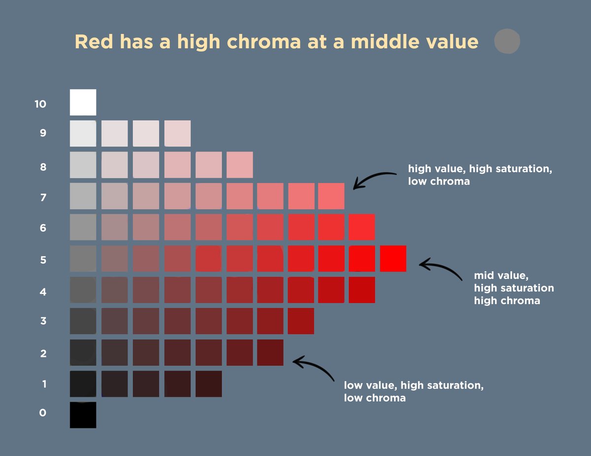
Yellows have a high chroma at bright values, reds at middle values, and blues and violets at dark values. At extreme values, it becomes harder to have a high chroma for any color. Instead of copying a scene without direction, we can control our values to show the colors we want.
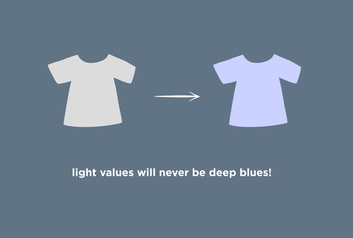
Say we have a greyscale image, and we want to make a light value T-shirt a deep blue. It will always look pale and pastel. A b/w image is suggesting possible colors. A color image already has all of the values defined. This is the way that colors and values relate to each other.
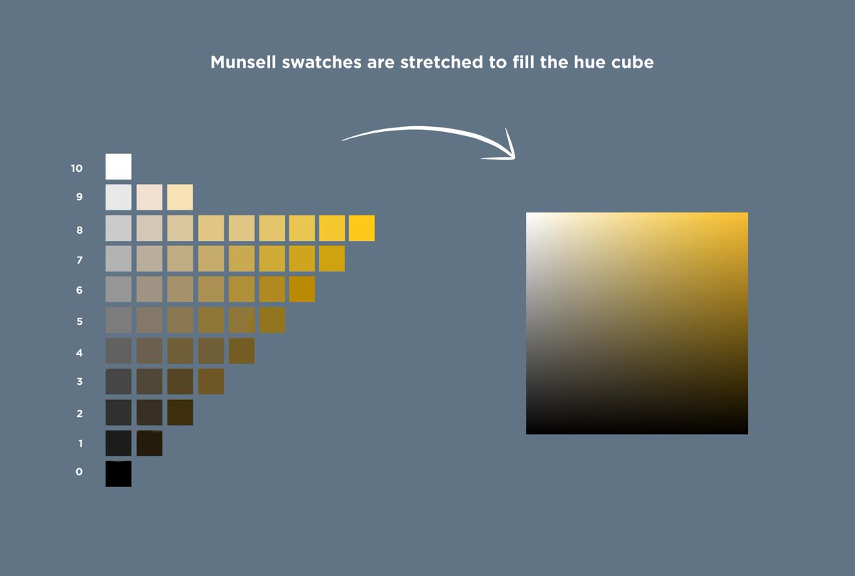
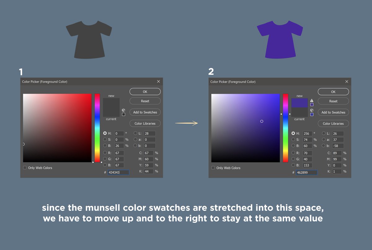
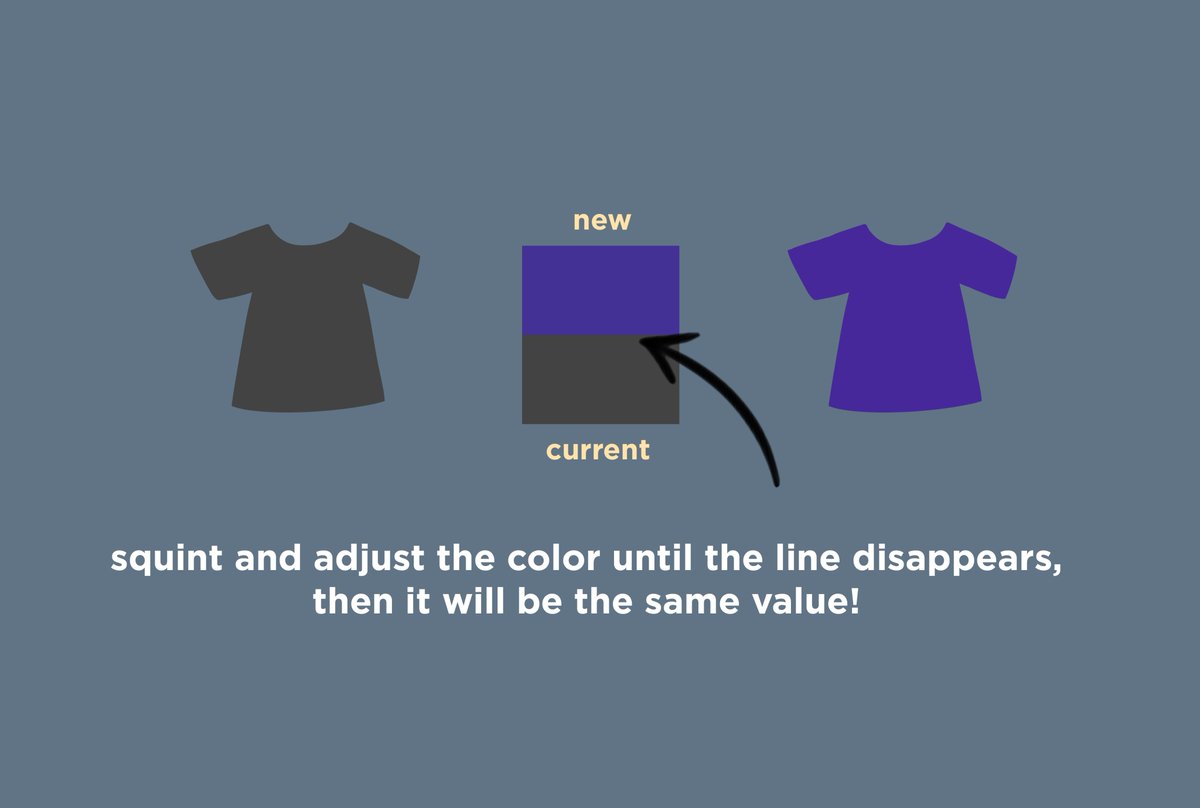
If we wanted to pick a high chroma color for this shirt, we can select the greyscale color, and then use the color picker to find a high chroma color to match. By working this way, we can get an intuitive sense of what value a color is that can be used even in oil painting.
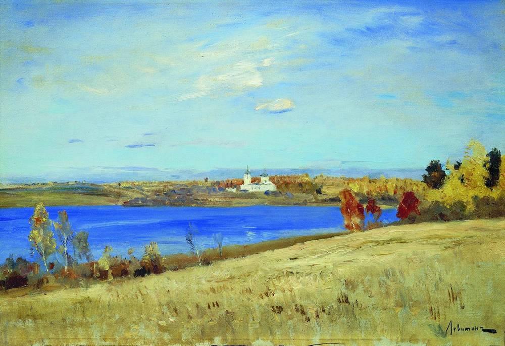
With this scene, the artist wanted to communicate the blue of the water vs. the autumn yellows of the trees. He chose the right color, therefore one value, and related everything else to that. When you “key” to something, you define that decision as accurate and compare to that.
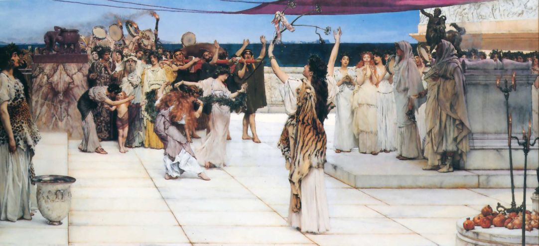
Here, the idea is no longer about the blue water, but the detail in the dresses/marble. The variety of temperature would not read against an intensely blue sea, so the value is lowered to be part of the dark value group, and chroma is lost. The painting is “keyed” for the marble.
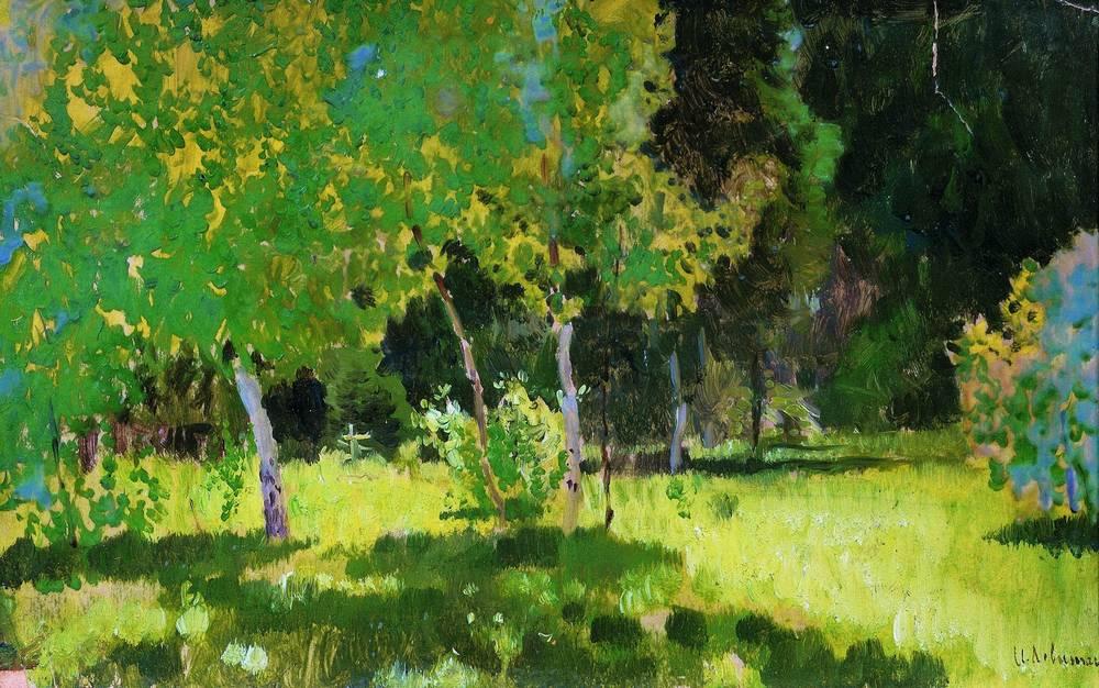
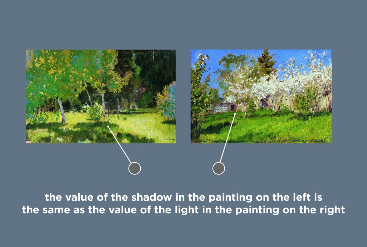
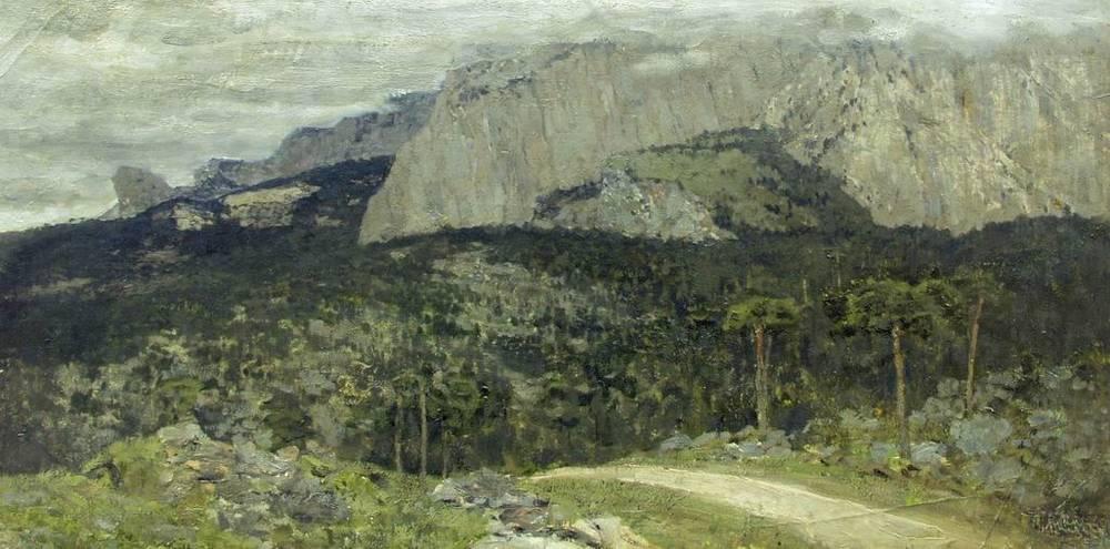
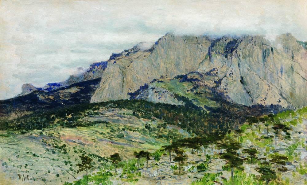
Keying is related to exposure. Here we are exposed for the shadow, the colors are keyed to the leaves. These colors wind up at a middle value where we can show intense greens. The lights, since they have to be far enough apart from the shadows, approach white and chroma is lost.
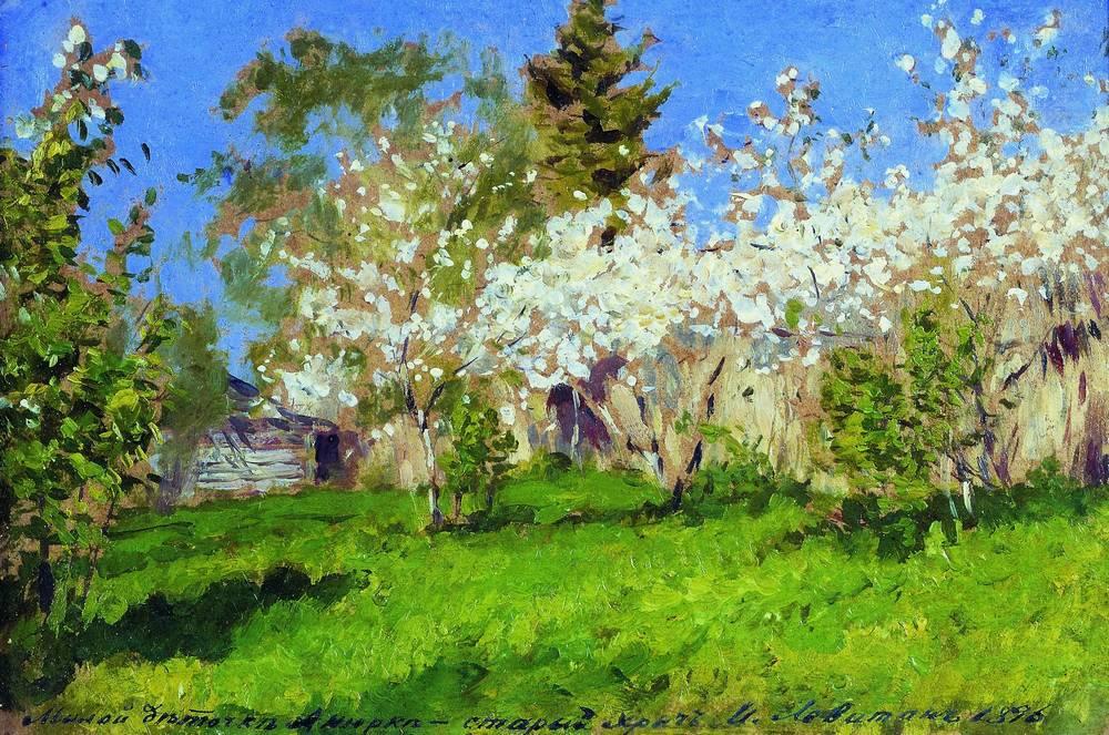
Now, the opposite is true. Exposure is set for the grass in light, the value of light in this painting is the same as the shadow in the previous one. There is a variety of temperature and color in the light, and the shadows need to be far away, so they are dark and low chroma.
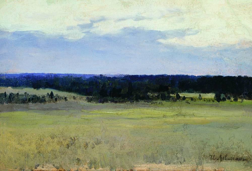
In this example, the important part of the painting is the intense color at the horizon, due to scattering in the atmosphere, as well as the difference between warms and cools in the sky. The exposure was controlled to allow for values that supported these color ideas.
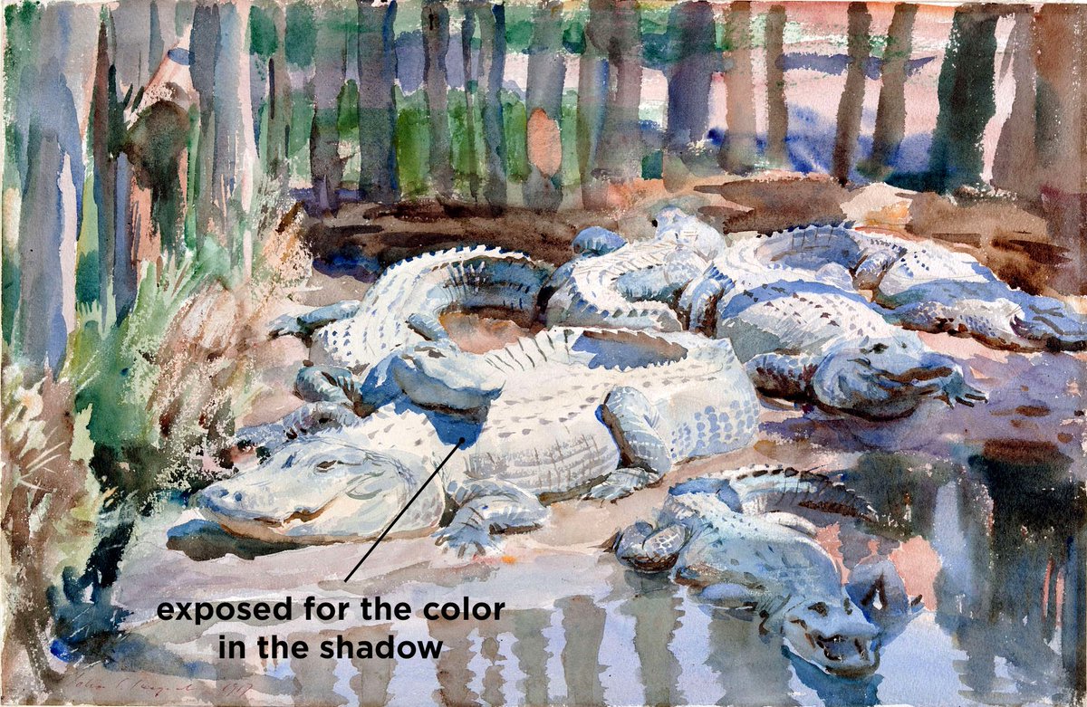
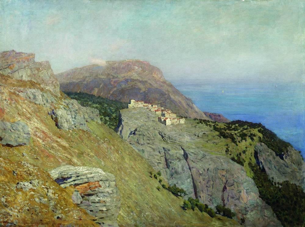
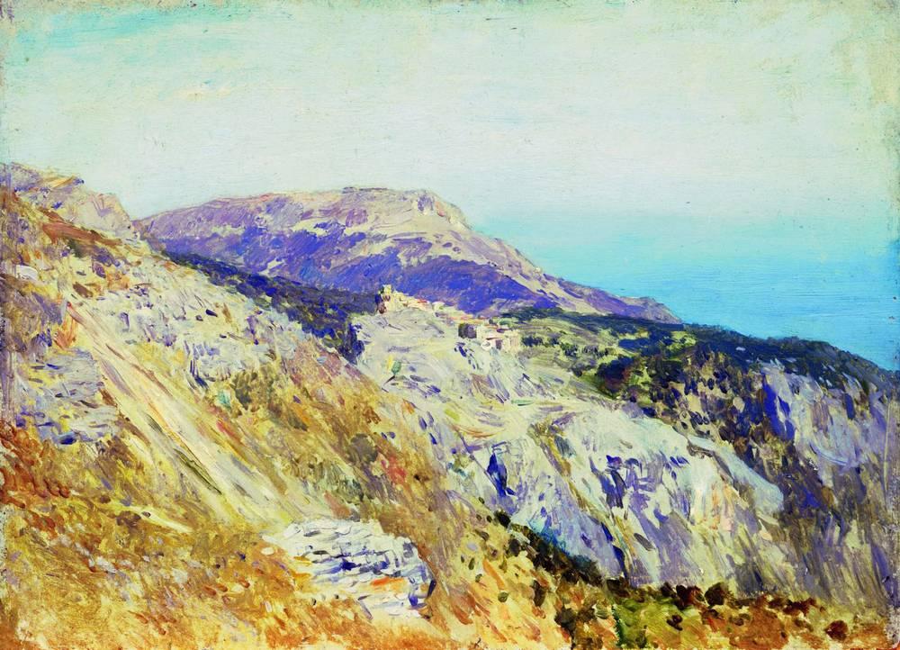
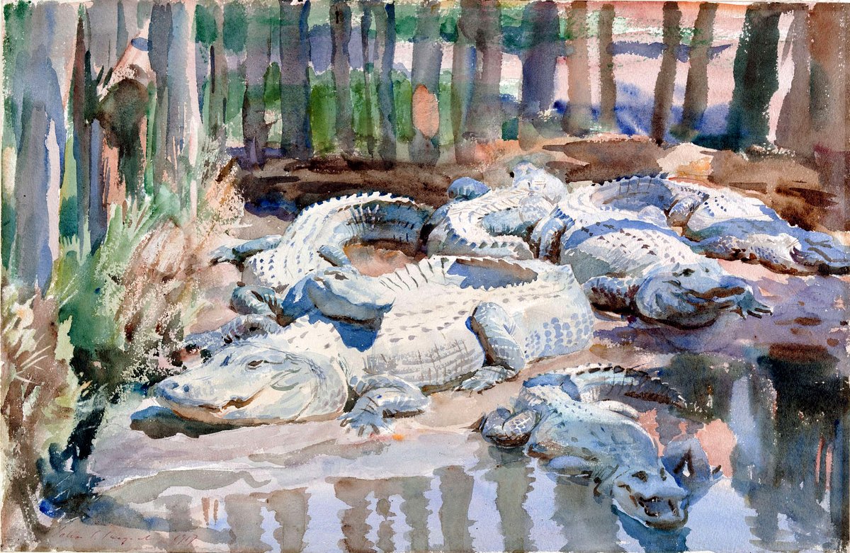
What we show can be based on what our medium can express best. Here, the finished work is exposed for the the info in light, the sketch is exposed for chroma in the shadows. As long as relationships stay consistent, there are infinite “accurate” ways to express the same scene.
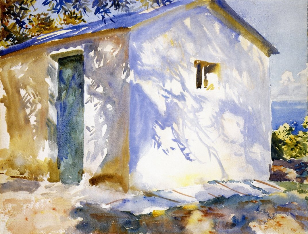
With watercolor, we can have the paper as overexposed light, and a full range of color in the shadow. By understanding the relationship between color and value, we can make creative paintings that are technically sound, play with mediums, and adapt reality to support our ideas.
That& #39;s it for the color series, thanks so much for reading! if you& #39;ve enjoyed this, check out my ebook! It& #39;s greatly expanded, and there are lots of bonuses like a glossary, recommended reading, and all the artists names right there with the examples! https://gumroad.com/l/YPtf ">https://gumroad.com/l/YPtf&qu...
Artist credit: John Singer Sargent, Isaac Levitan, Lawrence Alma-Tadema
If you missed it, here is part one! https://twitter.com/devinkorwin/status/1278049901709012995">https://twitter.com/devinkorw...
And part two: https://twitter.com/devinkorwin/status/1280212496012455938">https://twitter.com/devinkorw...

 Read on Twitter