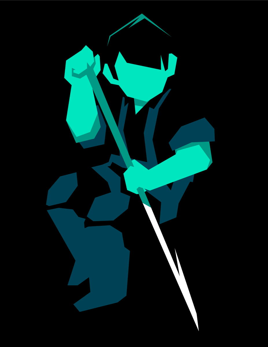
Hey! Yesterday I spent some time talking about @roswellwrites’s excellent new GIANTKILLER Beam Saber playbook, hot off the presses.
Today i’d love to spend some time talking about the visual development process that went into our art and layout! https://roswellian.itch.io/the-giantkiller-playbook">https://roswellian.itch.io/the-giant...
Today i’d love to spend some time talking about the visual development process that went into our art and layout! https://roswellian.itch.io/the-giantkiller-playbook">https://roswellian.itch.io/the-giant...
Ben and I first put our heads together for this collab a little bit more than a month ago: I was already playing a Giantkiller in my ongoing Beam Saber campaign sending him playtesting feedback. Illustrating the playbook felt like a natural extension of an ongoing conversation.
(Design tip #1: if you have friends designing cool things, offer to playtest! If they ask for feedback, share your experiences with them! It will give them a serotonin boost to know someone’s interested in their work, and your feedback might prove invaluable.)
We chatted about the scope of the project, and outlined a few core design principles we wanted the pieces to follow:
— Highlight the disparity of scale, but never overshadow the human
— Make the art feel strenuous: show the effort and motion behind it
— Keep everything cohesive
— Highlight the disparity of scale, but never overshadow the human
— Make the art feel strenuous: show the effort and motion behind it
— Keep everything cohesive
HIGHLIGHT THE DISPARITY OF SCALE: the mechs should feel massive, but they should never pull focus away from the human figure opposing them.
I took a lot of inspiration from @SifSweetman’s mech art, particularly this stunning Counter/WEIGHT fanart: https://twitter.com/SiSweetman/status/1061861576486076416">https://twitter.com/SiSweetma...
I took a lot of inspiration from @SifSweetman’s mech art, particularly this stunning Counter/WEIGHT fanart: https://twitter.com/SiSweetman/status/1061861576486076416">https://twitter.com/SiSweetma...
MAKE THE ART FEEL STRENUOUS: having firsthand experience playing as a Giantkiller meant I could really lean into the physicality that the playbook allows. Load is a crucial part of this playbook, and I knew I wanted to emphasize the specialist gear in the illustrations.
KEEP EVERYTHING COHESIVE: the Giantkiller draws on a lot of different thematic touchstones: Spiderman, David and Goliath, Shadow of the Colossus. Despite the multiplicity of source material we knew we wanted a visual style that reinforced the underlying themes.
We knew right away we wanted to keep @Notaninn’s iconic Beam Saber color scheme as a staple: black and teal is a good look, and aligning the art to the the base game’s palette reminds potential readers exactly what game this playbook is for. https://austin-ramsay.itch.io/beamsaber ">https://austin-ramsay.itch.io/beamsaber...
I aimed to keep the style simple and clean: Ben often referred to the Giantkiller as a folk hero in our chats and I wanted to emphasize the Jack and the Beanstalk tone, giving the pieces almost a storybook quality.
Taking the time to discuss about the ideological undercurrent of the text strengthened my vision for the art, but it helped that Ben has already written a lot on this subject. Here& #39;s a concurrent thread about another one of his games, Behemoth and Killer: https://twitter.com/roswellwrites/status/1283600922938089476">https://twitter.com/roswellwr...
Interlude to say: Behemoth and Killer is a GREAT game that speaks beautifully in conversation with the core themes of the Giantkiller. If you want to play a Giantkiller, I highly recommend playing B&K as an interlude between sessions. https://roswellian.itch.io/behemoth-and-killer">https://roswellian.itch.io/behemoth-...
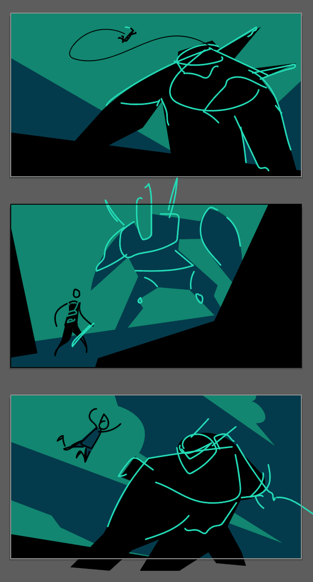
With these principles, in mind, I sketched up a couple rough thumbnails and sent them to Ben. We hadn’t yet finalized the hard specs of layout (dimensions/resolution) so I started in landscape just to get a feel for potential mood.
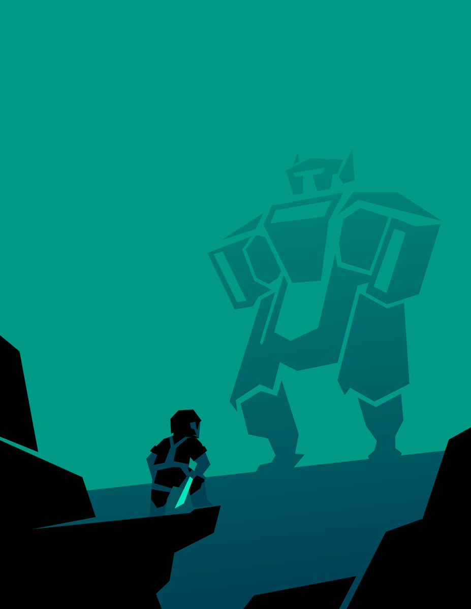
Ben felt most drawn to option 1 here, so I started moving in that direction for the piece that would eventually become the itch cover (which you can see upthread).
After I finished the first piece, Ben specified he was planning on a portrait layout, so I knew I wanted the other pieces to really play into that verticality, integrating image into the text.
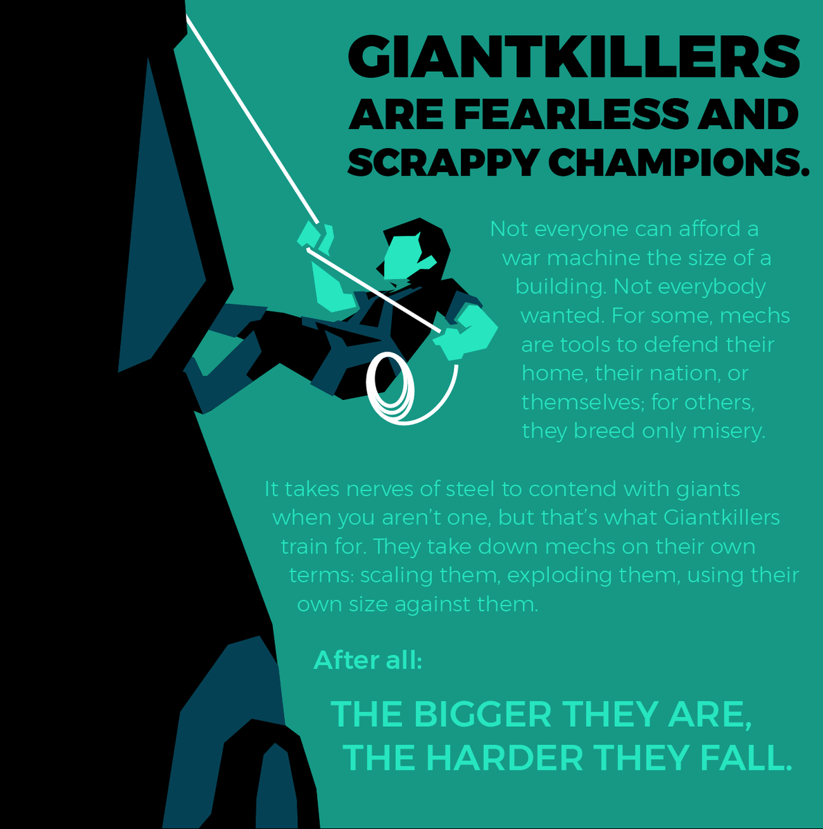
Here’s a WIP screencap of one of the pieces that made it into the final cut:
Here’s a WIP screencap of one of the pieces that made it into the final cut:
That piece, along with the third illustration, really played into the scale: I wanted one piece that showcased the Giantkiller in action, and one that showcased them in potentia.
(The third illustration also pulls in some of the energy from the other unused roughs!)
(The third illustration also pulls in some of the energy from the other unused roughs!)
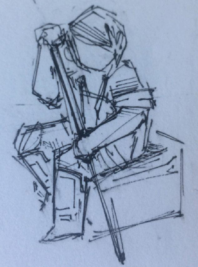
Finally, I threw together an extra piece: I had another sketch I was working on mostly for fun, and I sent along a version of it to Ben on a whim. He included it in the final pass in a really satisfying arrangement.
(I felt comfortable doing this SPECIFICALLY because Ben and I had discussed in explicit detail the terms of my payment/work expectations, and because I trust him from past professional experience. Artists, know the value of your labor and make sure you charge appropriately!!)
This was a really personal and fun project — it was intensely satisfying to work on something with a peer and friend who understood immediately the energy I was trying to capture in my art, and who was able to integrate my work into his layout in ways I hadn’t even considered.
If this thread was interesting to you, consider checking out the finished product at http://roswellian.itch.io/the-giantkiller-playbook">https://roswellian.itch.io/the-giant... and follow Ben’s other work at http://roswellian.itch.io"> http://roswellian.itch.io and on twitter @roswellwrites!
Lastly, if you found any of this process interesting, consider checking out my work, to see how I integrate my visual design philosophy into my own games!
http://seaexcursion.itch.io"> http://seaexcursion.itch.io https://abs.twimg.com/emoji/v2/... draggable="false" alt="🌊" title="Wasserwelle" aria-label="Emoji: Wasserwelle">
http://patreon.com/seaexcursion ">https://patreon.com/seaexcurs... https://abs.twimg.com/emoji/v2/... draggable="false" alt="✨" title="Funken" aria-label="Emoji: Funken">
http://seaexcursion.itch.io"> http://seaexcursion.itch.io
http://patreon.com/seaexcursion ">https://patreon.com/seaexcurs...

 Read on Twitter