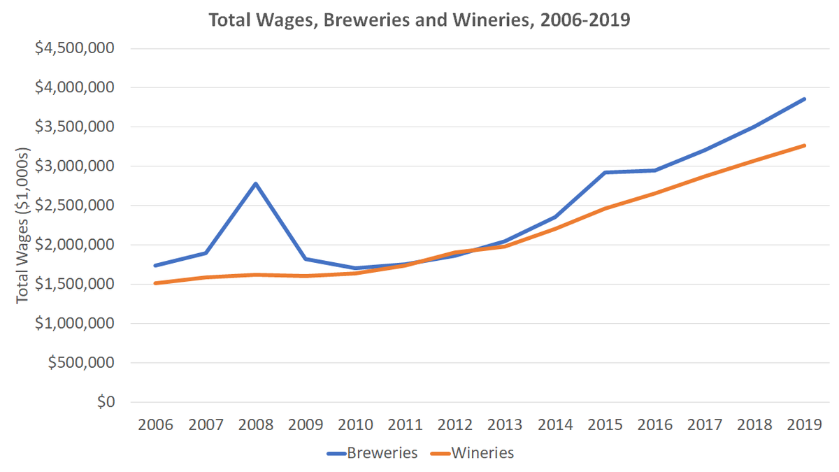
This chart is interesting, but even more interesting when put in the context of total firms/employees/wages, which show what& #39;s going on. A short thread. https://twitter.com/wineecon/status/1285181144091295749">https://twitter.com/wineecon/...
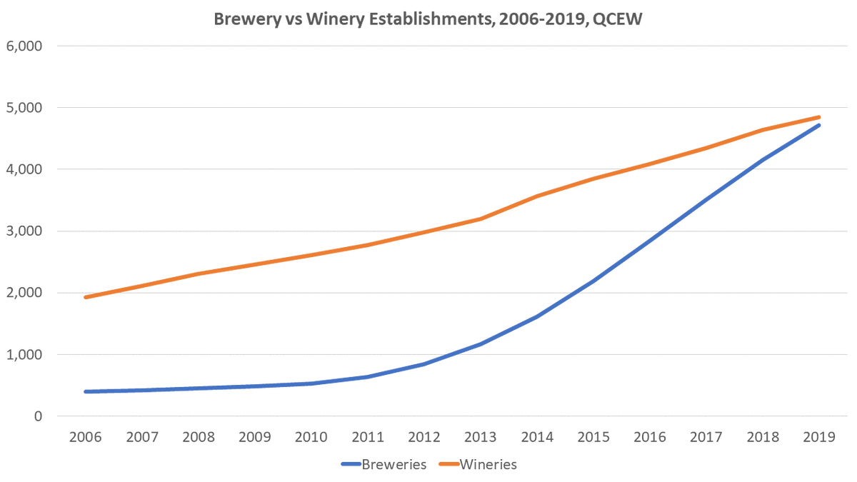
First, let& #39;s look at firms. Both have grown tremendously, but breweries have closed the gap relative to wineries over this time period.
A reminder that breweries doesn& #39;t include brewpubs, or it would have grown more (and wineries doesn& #39;t cover everyone who is selling wine).
A reminder that breweries doesn& #39;t include brewpubs, or it would have grown more (and wineries doesn& #39;t cover everyone who is selling wine).
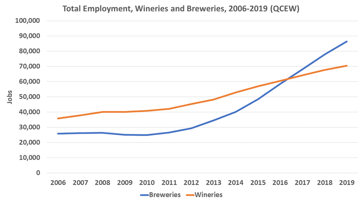
Next, we can look at total employment, which has grown strongly during this period, particularly for breweries, in line with the number of firms. Here we see breweries overtake wineries in jobs.

 Read on Twitter


