hey devs, let’s talk site accessibility!  https://abs.twimg.com/emoji/v2/... draggable="false" alt="♿️" title="Rollstuhlfahrer-Symbol" aria-label="Emoji: Rollstuhlfahrer-Symbol">
it’s a win for all of us. you’re making the web an accessible place for everyone, boosting your seo, and improving your user empathy. i’m still learning, but here are some lesser known html + css tips. do share any you find helpful! https://abs.twimg.com/emoji/v2/... draggable="false" alt="🧵" title="Thread" aria-label="Emoji: Thread">
it’s a win for all of us. you’re making the web an accessible place for everyone, boosting your seo, and improving your user empathy. i’m still learning, but here are some lesser known html + css tips. do share any you find helpful!
something that i need to work on is thinking about accessibility from the beginning. i’m working on it, but i still have a couple projects where i’m retroactively fixing my a11y blunders, including my own new site. i’m calling myself out here. it’s poor etiquette and wastes time.
instead of typing out uppercase content in all caps manually, use text-transform: uppercase on its class or id in CSS instead. this is because some screen readers read capitalised text letter by letter. can you imagine how annoying that would be?!
the alt tag is used for describing images, but have you used the aria-label attribute? this is used to describe an elements role for screen readers. e.g. on a button that says “close” the aria-label could be “back to homepage” to give better context. more: http://a11y-101.com/development/aria-label">https://a11y-101.com/developme...
be sure to use one <main> tag to specify where the main content is. this helps less abled users to ignore any fancy fluff on your site and go straight to where the main content is
when hiding absolutely positioned content using left: -9999px instead of using display: none, it’s not visible on a typical screen but this text is still technically visible for a screen reader, so it will still read whatever it is.
gosh darn it fellow devs, let’s stop using <div>s as buttons. i know they’re by default really ugly and need style stripping, but you’re losing all the button functionality such as keyboard events which screen readers look for to help with navigation.
when adding a link, you may be tempted to use text decoration: none and change the colour on hover. don’t do this! people who are colourblind struggle with seeing it as a link and won’t see that change. plus, why not be more creative than that?! here‘s a snazzier example
text sizing is a biggie for people with visual needs. don’t make your text so small! a good point of reference - body text should be minimum 16px, small text summaries minimum 12px. it’s generally better to use relative screen sizing though. more here: http://css-tricks.com/accessible-font-sizing-explained/">https://css-tricks.com/accessibl...
using outline: none (common on text inputs) is keyboard user unfriendly. they use the outline to see which element they’re focused on when they’re navigating through a page, so won’t know what they’re currently interacting with. to remove it sensibly, try http://github.com/nuclei/unfocus ">https://github.com/nuclei/un...
here are some links to help with a11y driven development which are helping me too:
a resource for further info and a checklist: http://a11yproject.com"> http://a11yproject.com
another similar site: http://a11y.me"> http://a11y.me
a repo of a11y css stylesheets for your project: http://github.com/mike-engel/a11y-css-reset">https://github.com/mike-enge...
a resource for further info and a checklist: http://a11yproject.com"> http://a11yproject.com
another similar site: http://a11y.me"> http://a11y.me
a repo of a11y css stylesheets for your project: http://github.com/mike-engel/a11y-css-reset">https://github.com/mike-enge...
@googlechrome has an open source toolkit for site accessibility auditing that you should check out. you can install this in your own project for testing. http://github.com/GoogleChrome/accessibility-developer-tools">https://github.com/GoogleChr...
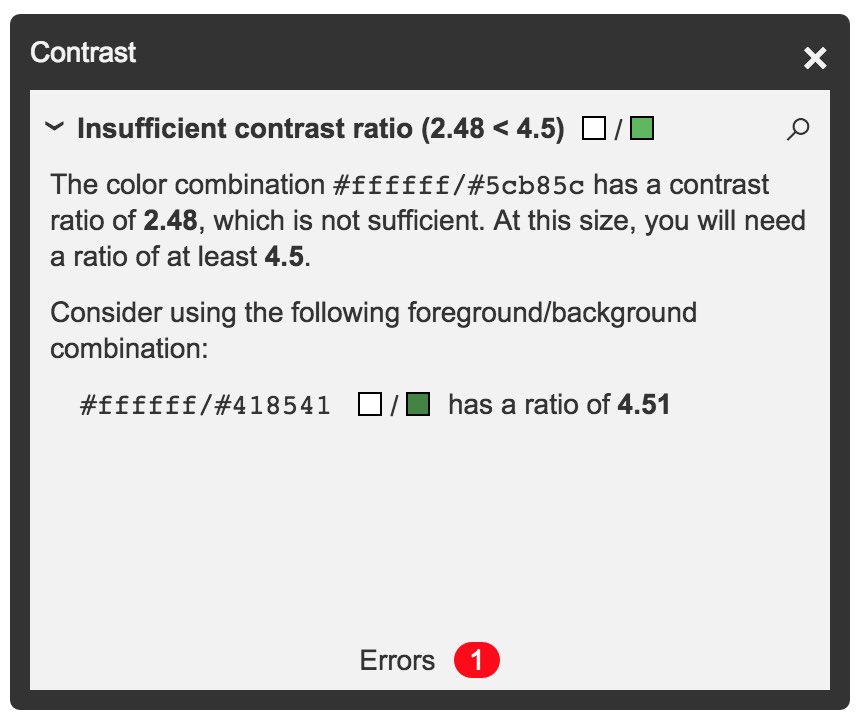
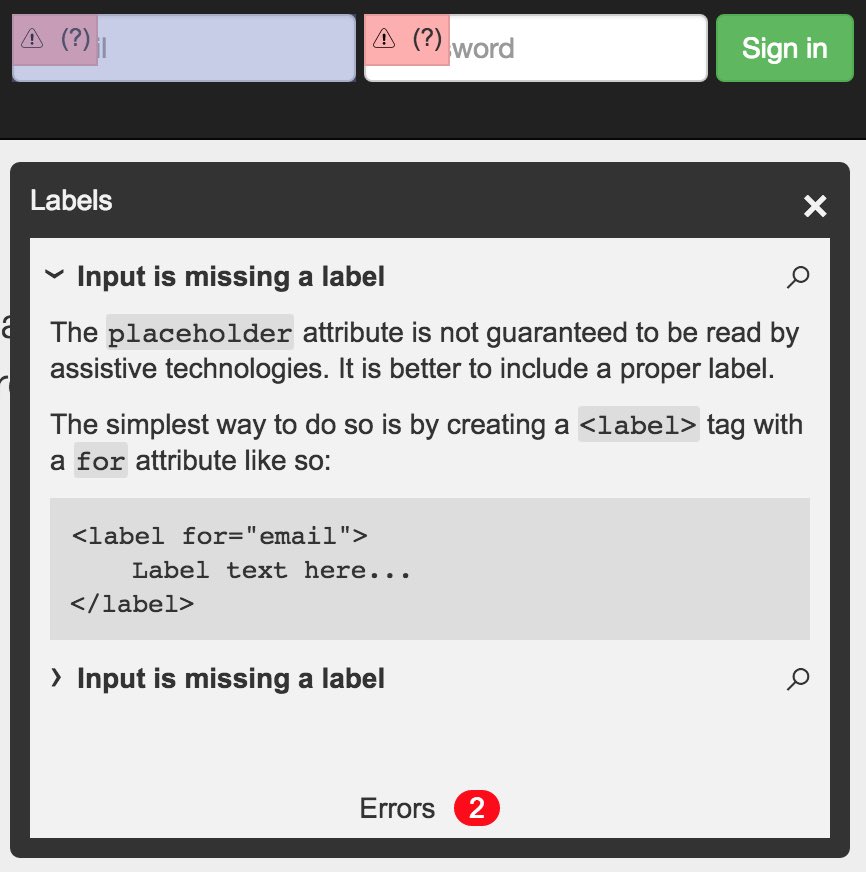
@khanacademy has an open sourced accessibility visualisation toolkit, tota11y, so you can see how your site performs with assistive tech. how awesome is that?! check it out here: http://github.com/Khan/tota11y ">https://github.com/Khan/tota...
if you have time, try using a screen reader yourself. On a Mac, turn on VoiceOver using Cmd + 5. Navigate through your site using tab and H/B/T/L to get to the next heading, button, table and list. The closed captions will read out the aria labels! credit: https://stackoverflow.com/a/56510982 ">https://stackoverflow.com/a/5651098...
there’s loads more on the internet to learn from and i’m just scratching the surface. i’m trying be a decent citizen of the internet and hope i can encourage other devs to do so too. feel free to share more valuable tips  https://abs.twimg.com/emoji/v2/... draggable="false" alt="💡" title="Elektrische Glühbirne" aria-label="Emoji: Elektrische Glühbirne">

 Read on Twitter


