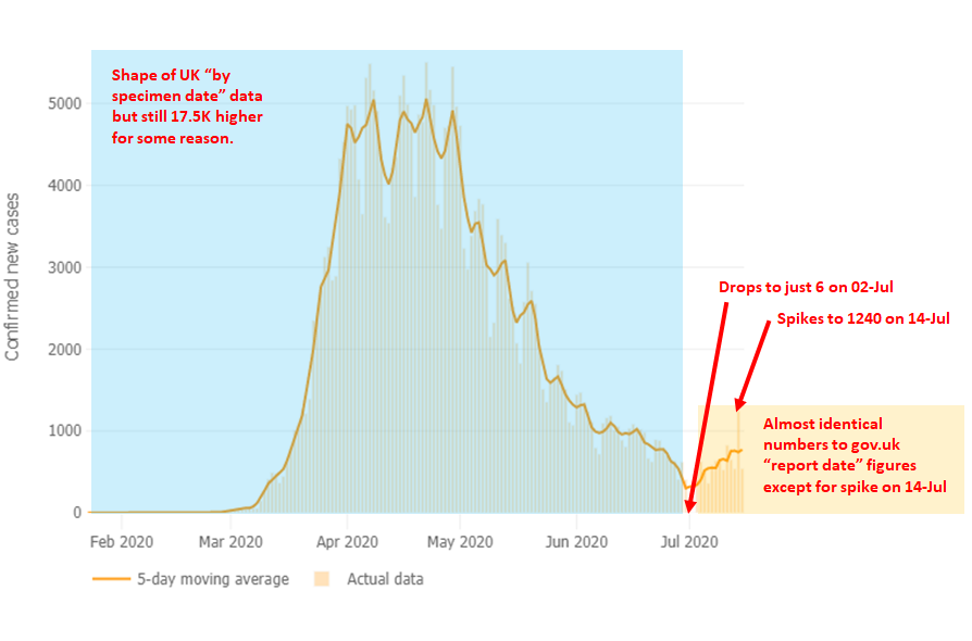
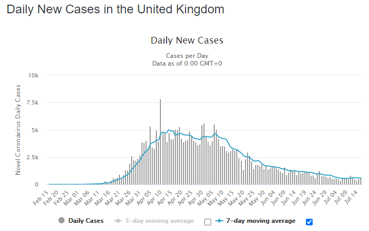
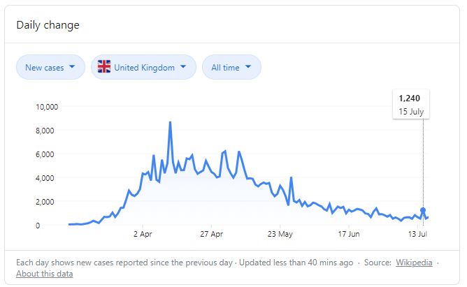
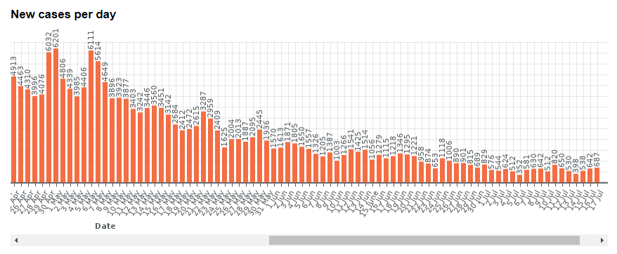
An update on the iffy @JohnsHopkins UK cases chart. I contacted them on github and their response was less than concerned for the problems in this chart. It appears they& #39;ve stitched together two types of data. Some is "specimen date" and rest is "report date".
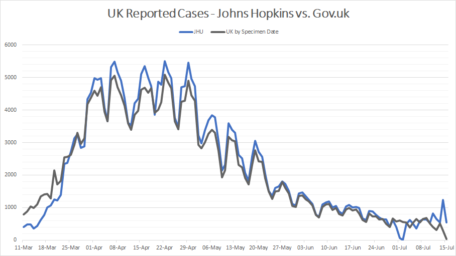
This is a comparison of JHU data against UK by-specimen-date data. You can see that April to June clearly have the same shape, but theirs is just a bit higher. The difference is about 17,500 cases.
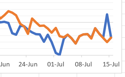
Then from about 24-Jun to 14-Jul there is a section that matches http://gov.uk"> http://gov.uk "report date" data almost exactly. Really shows how this chart is stitched together using different types of data sources.
The drops to 63 on 01-Jul and 6 on 02-Jul, as well as the spike of 1240 on 14-Jul are not easily explained. Some people have suggested that the drop could be the 30K correction being applied, but then why not drop all the way to zero? Also suggestions the 1240 is the Wales cases?
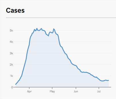
For comparison, this is what the official http://gov.uk"> http://gov.uk version of this chart looks like:
And even the worldometer one doesn& #39;t have the tick-shape:

 Read on Twitter