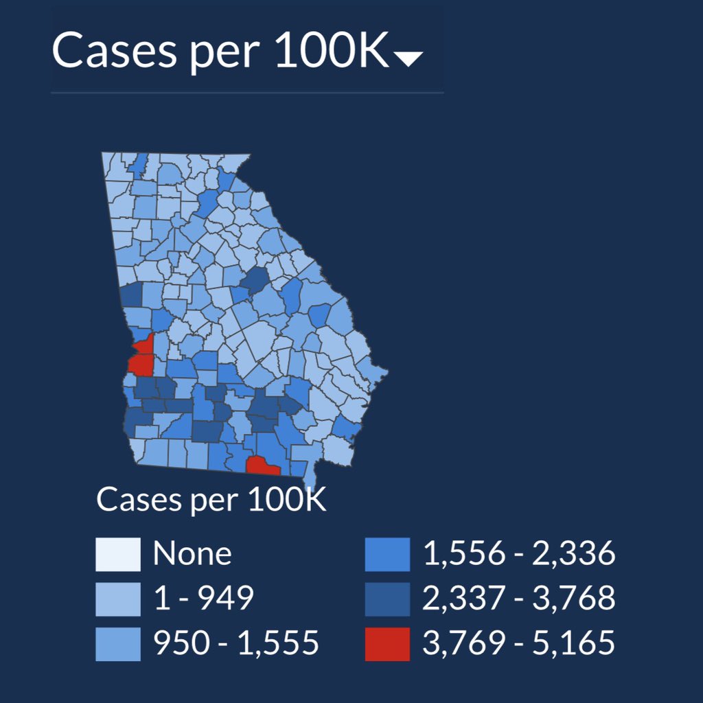
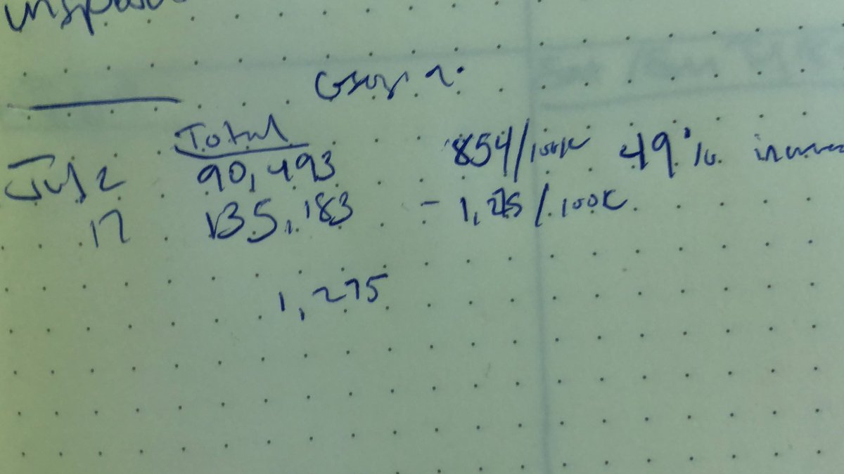
In just 15 days the total number of #COVID19 cases in Georgia is up 49%, but you wouldn’t know it from looking at the state’s data visualization map of cases. The first map is July 2. The second is today. Do you see a 50% case increase? Can you spot how they’re hiding it? 1/
Kemp’s health department keeps changing the numbers on the map’s color legend to keep counties from getting darker blue or red. 2,961 cases was Red on July 2. Now a county needs 3,769 cases to show red. The result: an infographic that hides data instead of showing it. 2/
Nearly every day this month Kemp’s health dept has altered the numbers assigned to each color without ever saying so. I take screenshots. Georgia DPH is violating data visualization best practices in a way that’s hiding severity of the outbreak. 3/
If any journalists want my screenshots, DM me. The metadata will show you the day I took them. 4:
I hope people read the critics of this post - in particular the data viz people. I think they’re making an important point and missing an important point.
the point many are making - the map isn’t designed to show change over time. it divides counties into quintiles.
Very helpful and informative reply from @callin_bull, who calls it “a truly remarkable example of misleading data visualization” and suggests it’s more likely incompetence than malice. 7/ https://twitter.com/callin_bull/status/1284269269815980033?s=21">https://twitter.com/callin_bu...
I appreciate very much the data viz pros who’ve explained how a data viz can get that bad without malice. i rt’d a few. 10/
Wow this blew up! Check out my Sondclod. It’s like Soundcloud but I sing every song in the style of Nico.
I actually do have a Soundcloud though. This is me singing Bee Gees in the style of chickens. I’m serious. https://soundcloud.com/andishehnouraee/more-than-a-chicken">https://soundcloud.com/andishehn...

 Read on Twitter


