Thread.
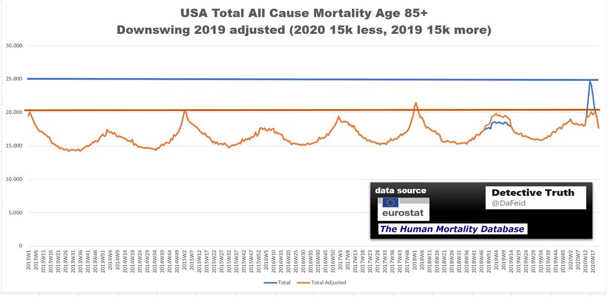
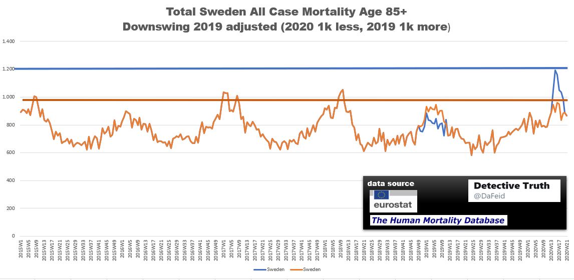
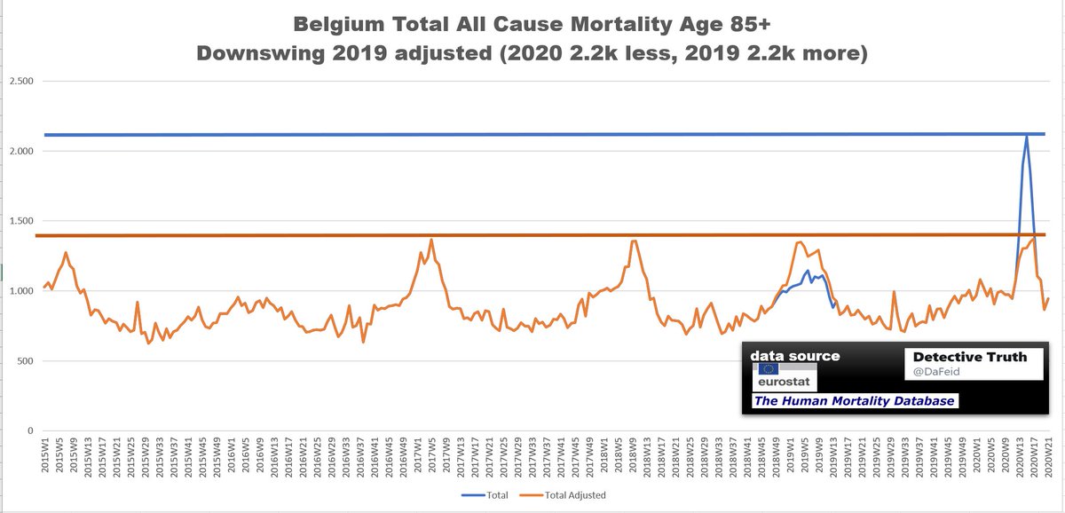
Did a downswing in 2019 had an impact to current situation and increased fatalaties in 2020.
Focus are the "hard hit countries" and age group 85+
Exercise: take numbers from peak in
2020 week 13 to week 17
and shift them back to winter
2018/2019 week 48 to week 13
Did a downswing in 2019 had an impact to current situation and increased fatalaties in 2020.
Focus are the "hard hit countries" and age group 85+
Exercise: take numbers from peak in
2020 week 13 to week 17
and shift them back to winter
2018/2019 week 48 to week 13
(5)
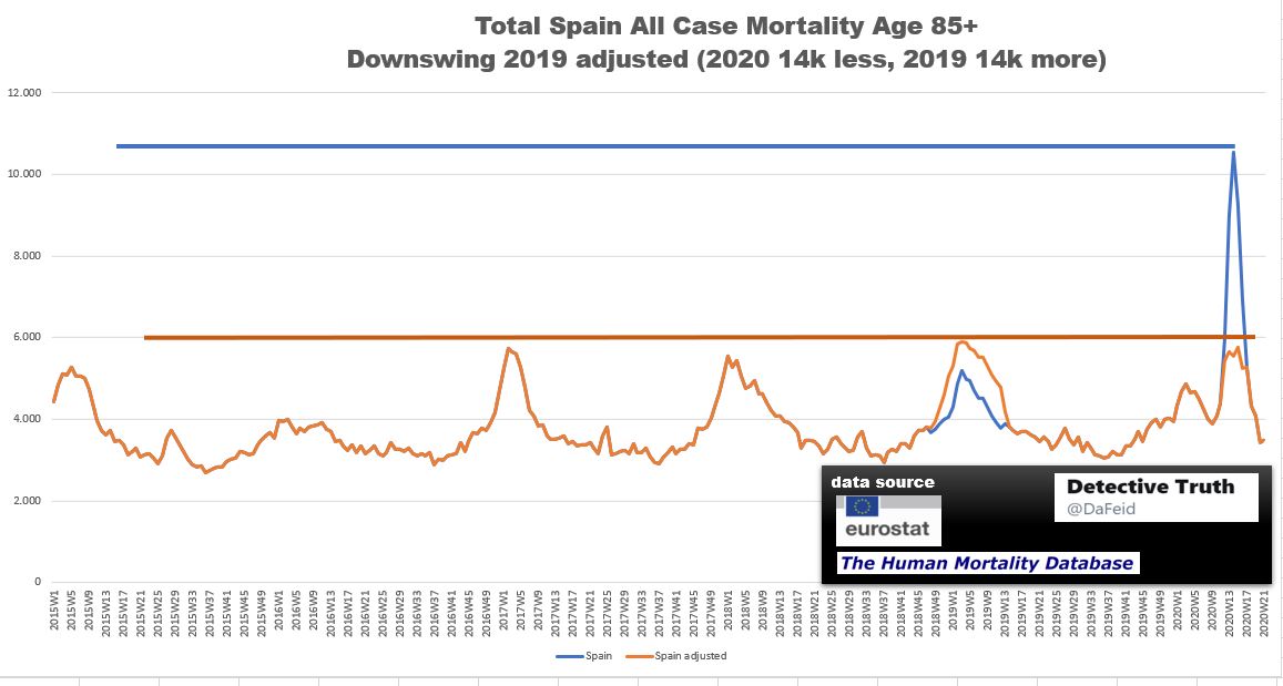
Typo again Thread (2) Spain.
Peak 2020 Week 14: 10538 total fatalaties age group 85+ .
Chart is correct.
Typo again Thread (2) Spain.
Peak 2020 Week 14: 10538 total fatalaties age group 85+ .
Chart is correct.
(6)
England and Wales
Peak 2020 week 16: 9.601 total fatalaties age group 85+ .
Shifted numbers in total: 9.5k
England and Wales
Peak 2020 week 16: 9.601 total fatalaties age group 85+ .
Shifted numbers in total: 9.5k
(8)
Germany no hard hit 2020.
But as a I highlighted here, Germany has a higher mortality rate anyway
https://twitter.com/DaFeid/status/1281131174920945664">https://twitter.com/DaFeid/st...
Germany no hard hit 2020.
But as a I highlighted here, Germany has a higher mortality rate anyway
https://twitter.com/DaFeid/status/1281131174920945664">https://twitter.com/DaFeid/st...
(9)
11 European Countries.
Hard hit: Spain, France, Netherlands, Belgium, Sweden (??)
+ Norway, Finland, Austria, Switzerland, Hungary, Portugal
Peak 2020 week 16: 29.365 total fatalaties age group 85+
Shifted numbers in total: 26k
11 European Countries.
Hard hit: Spain, France, Netherlands, Belgium, Sweden (??)
+ Norway, Finland, Austria, Switzerland, Hungary, Portugal
Peak 2020 week 16: 29.365 total fatalaties age group 85+
Shifted numbers in total: 26k
Credit to @FatEmperor who made video about this already https://twitter.com/FatEmperor/status/1280105813672148992?s=19">https://twitter.com/FatEmpero...
@threader_app please compile
(10)
I have been asked if this calc will also work for other age groups.
Europe, same countries as (9) but age group 75-84.
Peak 2020 week 16: 16.653 total fatalaties age group 75-84
Shifted numbers in total: 13k
I have been asked if this calc will also work for other age groups.
Europe, same countries as (9) but age group 75-84.
Peak 2020 week 16: 16.653 total fatalaties age group 75-84
Shifted numbers in total: 13k
(11)
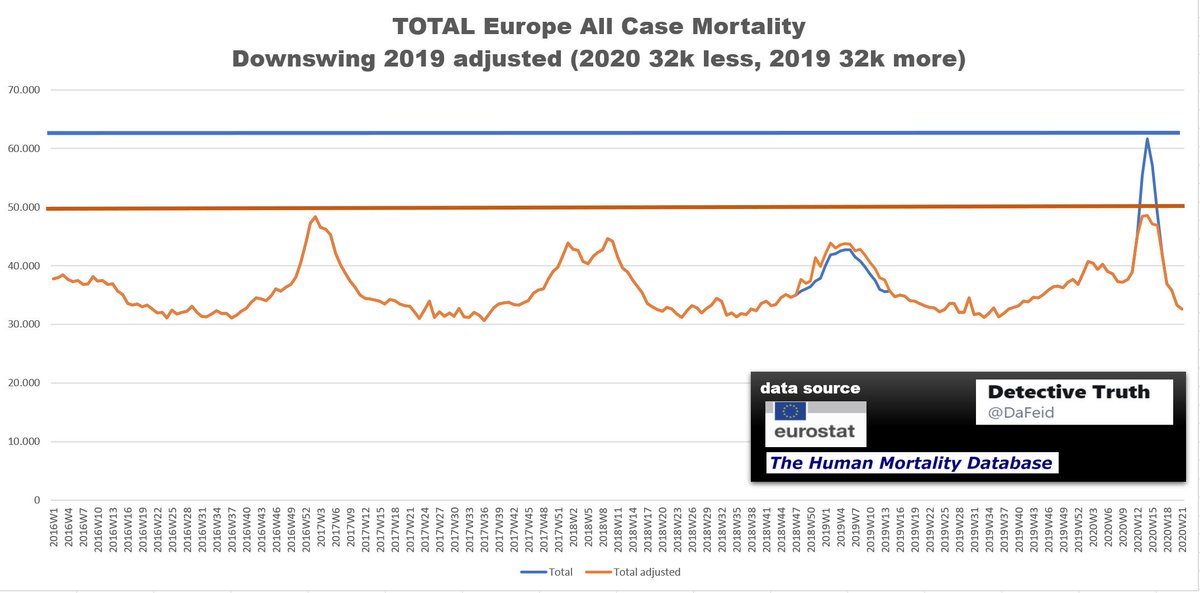
All age groups.
Total numbers.
Europe, countries see above (9).
Peak 2020 week 14: 61.591 total fatalities
Shifted numbers in total: 32k
All age groups.
Total numbers.
Europe, countries see above (9).
Peak 2020 week 14: 61.591 total fatalities
Shifted numbers in total: 32k
(12)
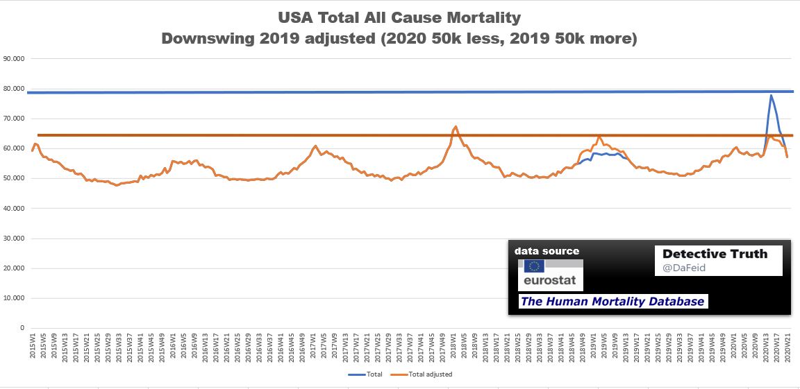
USA
All age groups.
Total numbers.
Peak 2020 week 15: 77.737 total fatalities
Shifted numbers in total: 50k
USA
All age groups.
Total numbers.
Peak 2020 week 15: 77.737 total fatalities
Shifted numbers in total: 50k
(13)
Did you know that I am actually sceptic about those blurry curves since I have seen so many COVID curves?
I will do another view and try to keep it simple.
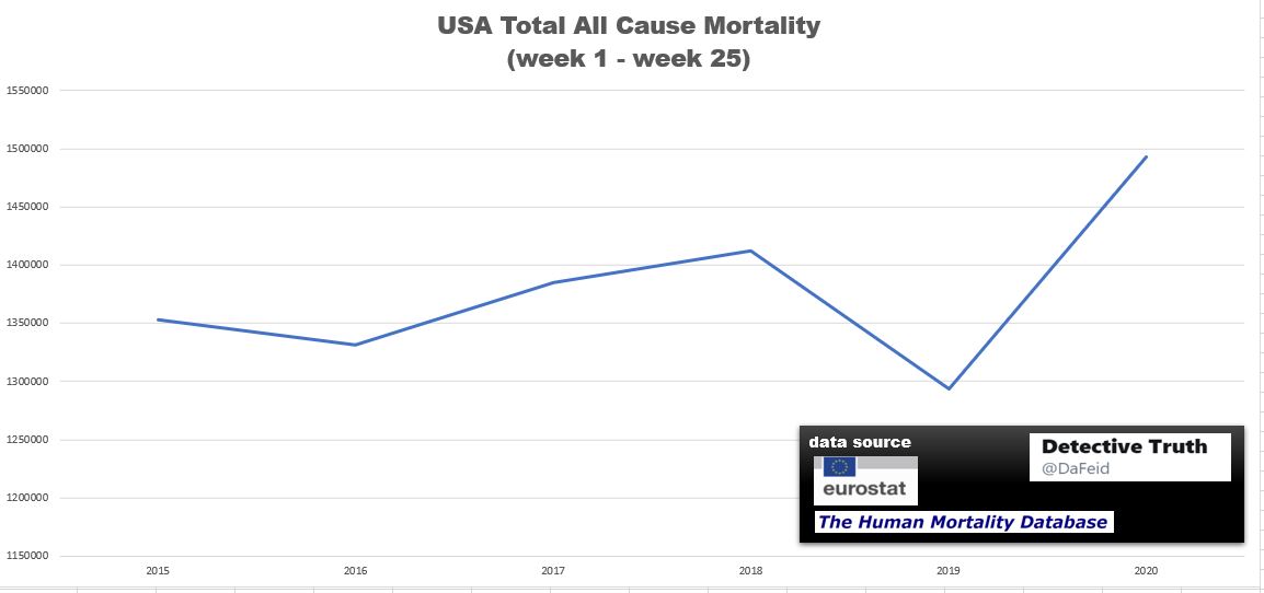
Total numbers summary from week 1 to week 25 each year.
We see the spike 2020.
Did you know that I am actually sceptic about those blurry curves since I have seen so many COVID curves?
I will do another view and try to keep it simple.
Total numbers summary from week 1 to week 25 each year.
We see the spike 2020.
(14)
To break the numbers down divide by 25 to get it
on a weekly basis to ensure a better visibilty.
To break the numbers down divide by 25 to get it
on a weekly basis to ensure a better visibilty.
(15)
Now, time range is 5 years.
Population grew.
On the left side from ~321 Mio 2015 to ~328 Mio 2019.
I took 328 Mio for 2020 as well.
Have a look at 2019 !
Now, time range is 5 years.
Population grew.
On the left side from ~321 Mio 2015 to ~328 Mio 2019.
I took 328 Mio for 2020 as well.
Have a look at 2019 !

 Read on Twitter