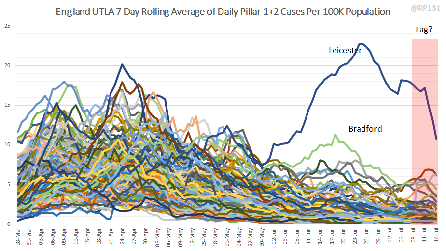
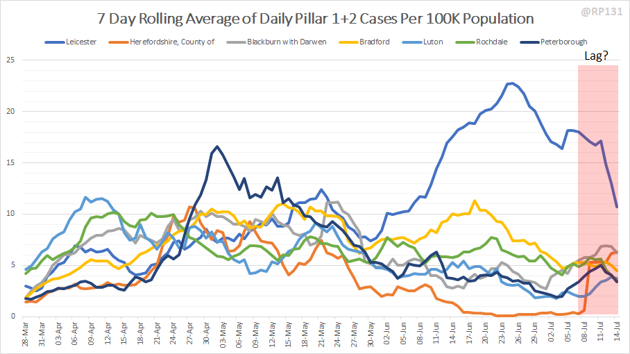
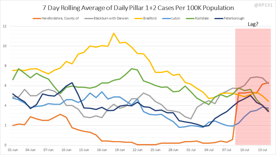
Latest "spaghetti" chart based on today& #39;s 15-July case data. This shows cases by specimen date (i.e. when person tested, not when reported) for all upper tier local authorities in England:
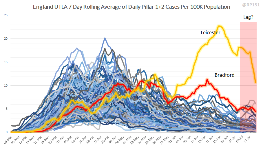
And the full range version with the Leicester/Bradford highlights. Do I need to start highlighting somewhere other than Bradford?

 Read on Twitter


