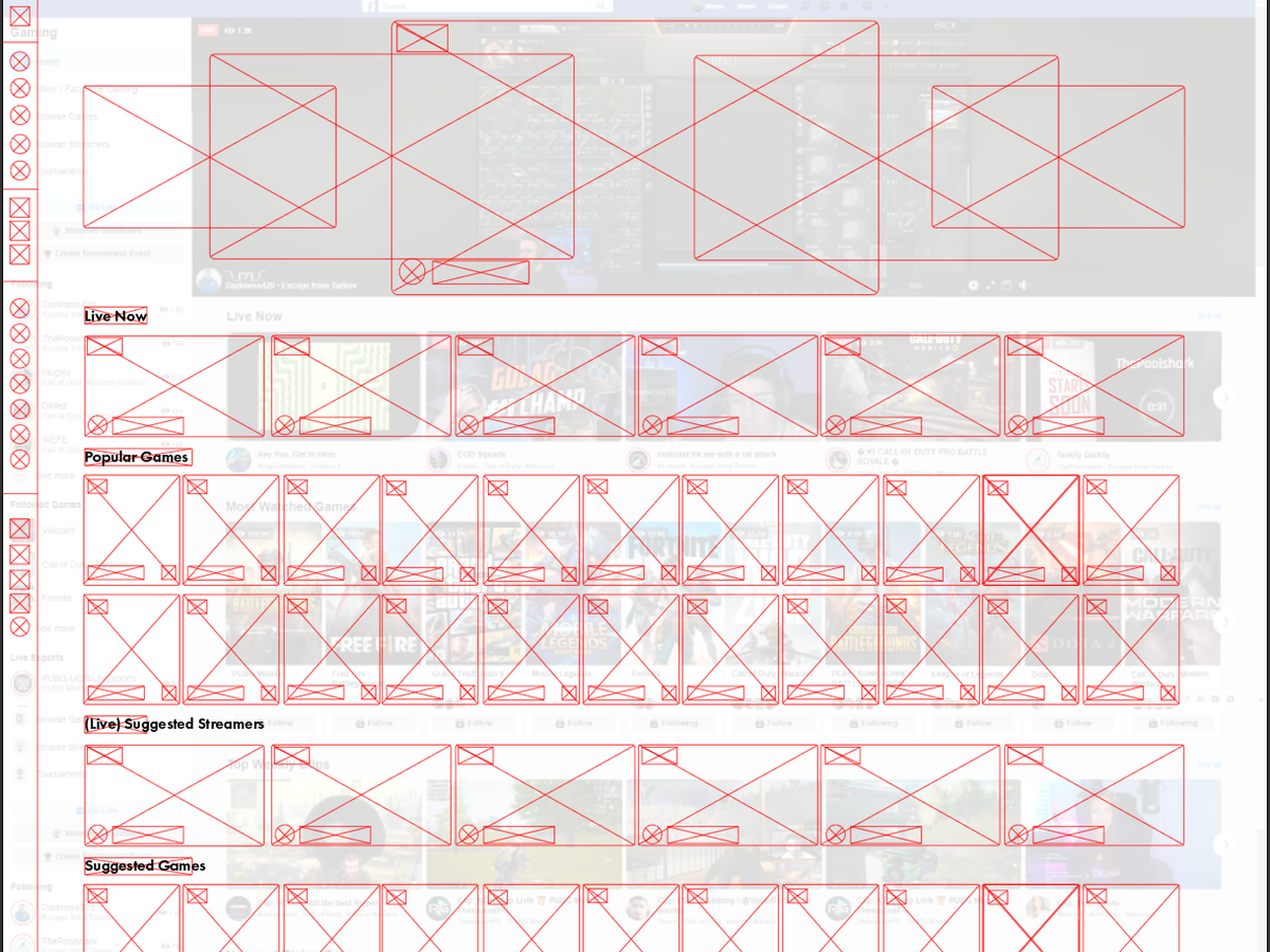
I don& #39;t know who needs to see this at @FacebookGaming but your homepage needs some incredible work done to it and maybe there already is something in progress. This is gunna be a designy thread, so heads up. This is a quick wireframe overlayed on the current fbgg layout I mocked
- Why is the side nav not collapsible. There is so much space being wasted by it.
- I love @Darkness429, but whichever streamer is featured takes up far too much space. Make it a carousel featuring a few more streamers and if that& #39;s too much like twitch, do anything else
- I love @Darkness429, but whichever streamer is featured takes up far too much space. Make it a carousel featuring a few more streamers and if that& #39;s too much like twitch, do anything else
- The amount of space each slate/tile for games and streamers is wasted. In this mock I can fit almost 2 whole games in the existing space by overlaying information on the tiles.
-The page is unscaled, I need to zoom out to 80% in browser to make the horizontal scroll disappear
-The page is unscaled, I need to zoom out to 80% in browser to make the horizontal scroll disappear
-Why do those 3 buttons for going live, the dashboard, and tournaments need to be so big? Make them similar to all the other icons on the nav and collapse it to make everything neat.
-make a clear text indicator (within the red "Live" ring) to show in the collapsed nav
-make a clear text indicator (within the red "Live" ring) to show in the collapsed nav
-I slightly changed the order of importance. Suggested streamers are almost at the bottom of the current page. Also why not suggest streamers who are live?

 Read on Twitter


