(1/12) Big thread with 16 diagrams to investigate the “dry tinder” hypothesis (mild preceding seasons affecting future mortality). We begin with a deep dive into the Nordics – in short: the data does not seem to refute the hypothesis (preview in pictures).
(2/12) I provide comments in the pictures to keep the thread manageable. The diagrams are organized by country. Although I generally advise against inter-country comparison, in this case I would suggest looking at the same diagrams for different countries side by side too.
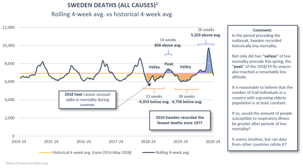
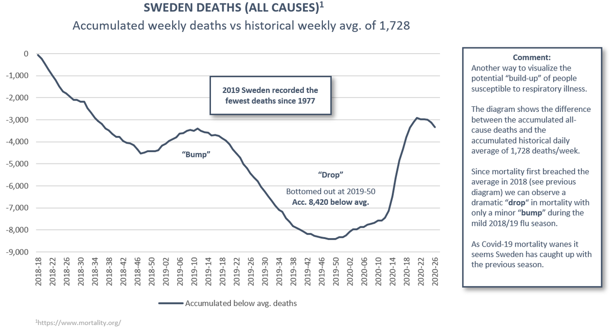
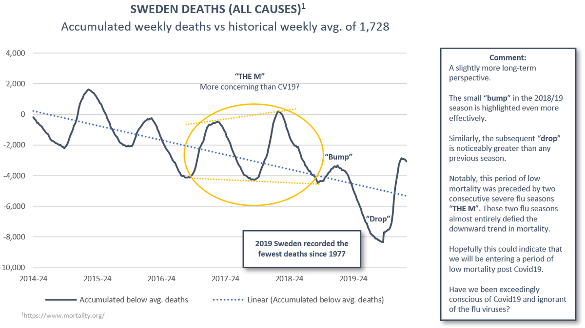
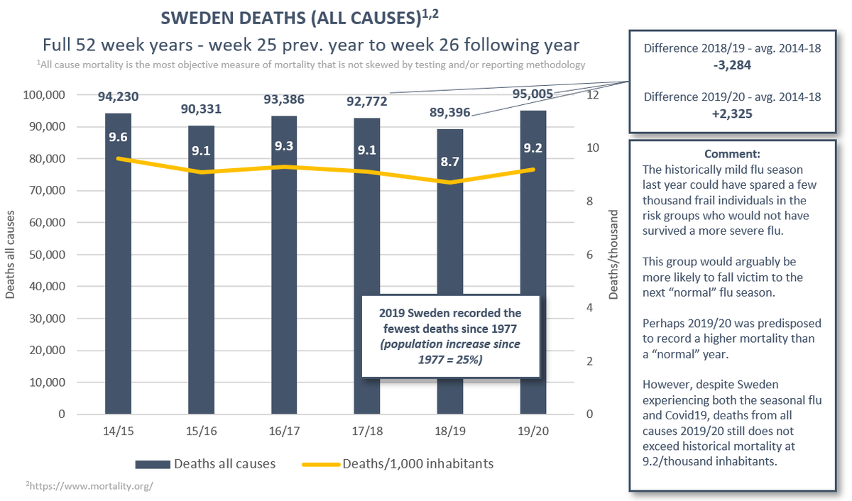
(3/12) Sweden. The outlier in the group in terms of response policy. A record-low mortality in 18/19 and 19/20 flu seasons could have spared a large population vulnerable to respiratory illness.
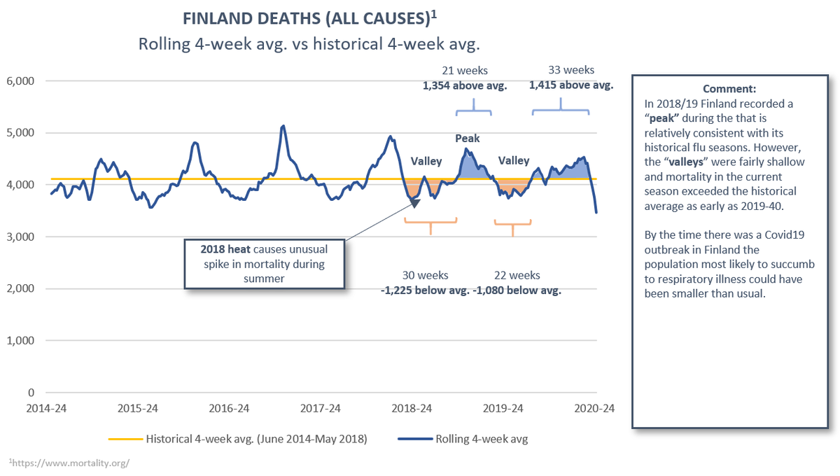
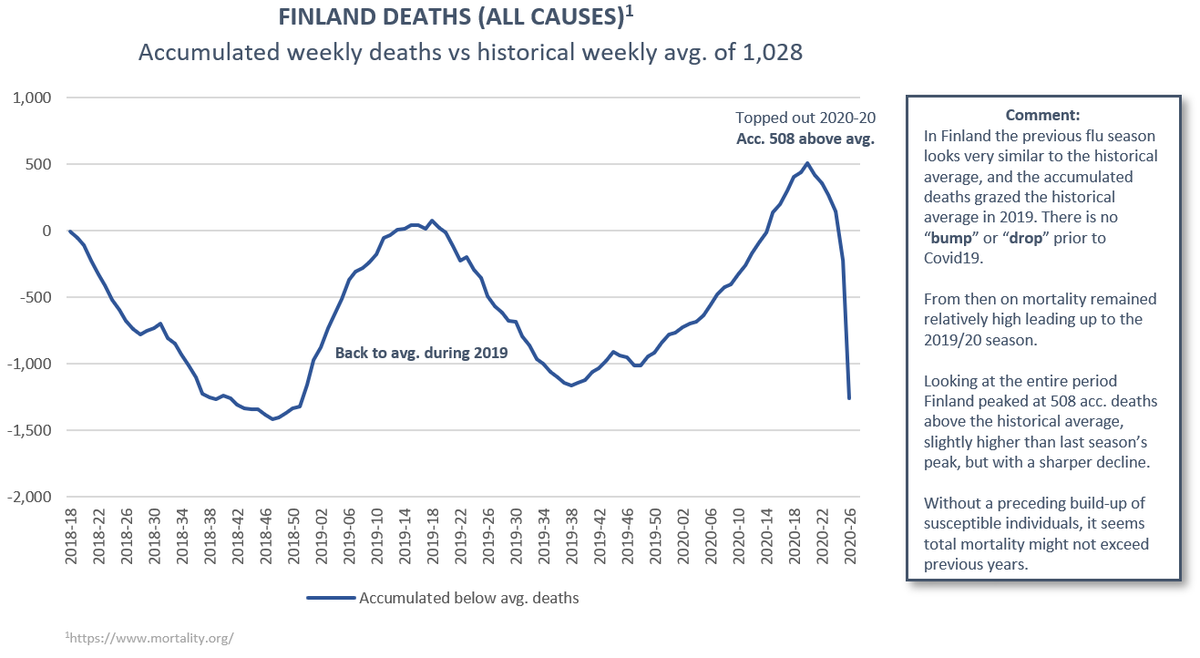
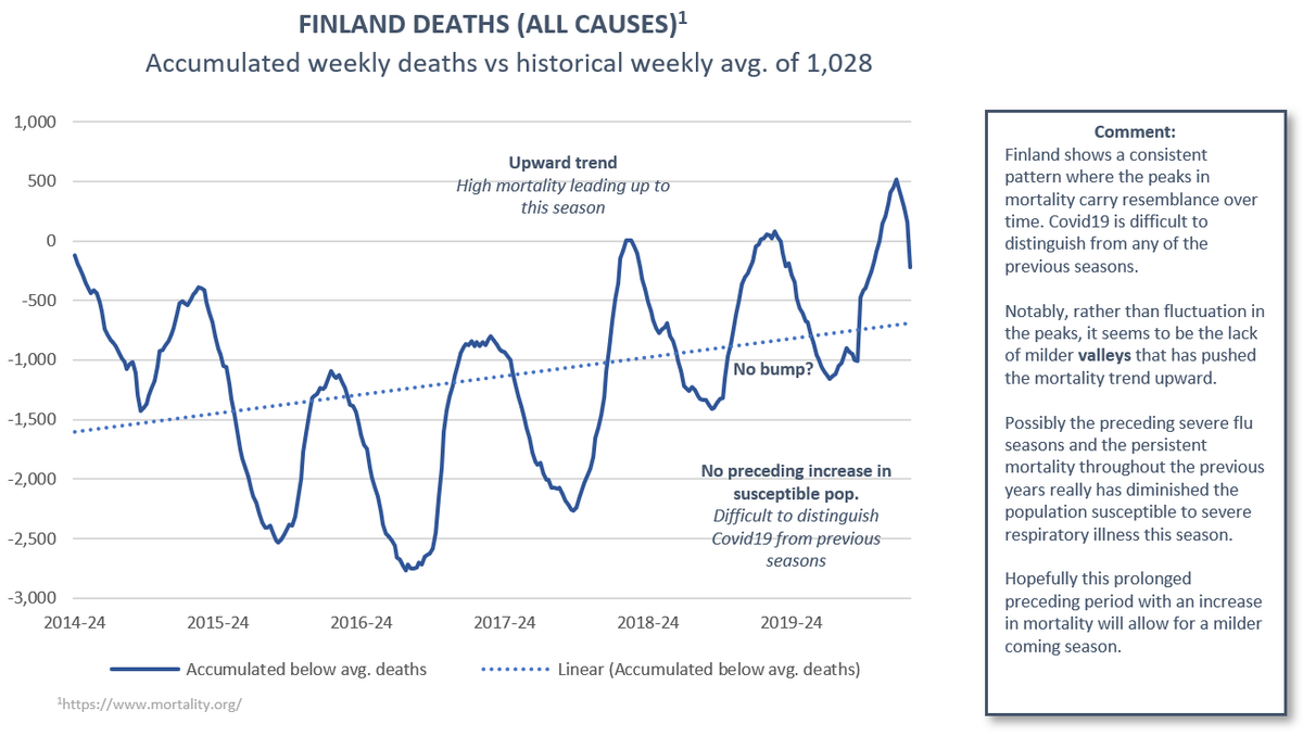
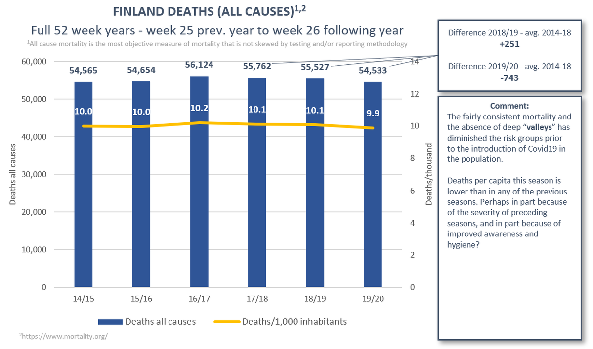
(4/12) Finland. Relatively high mortality with an upward trend over the past three seasons with a lack of deep valleys between seasons. The population vulnerable to respiratory illness have could possibly have succumbed prior to the outbreak of Covid19.
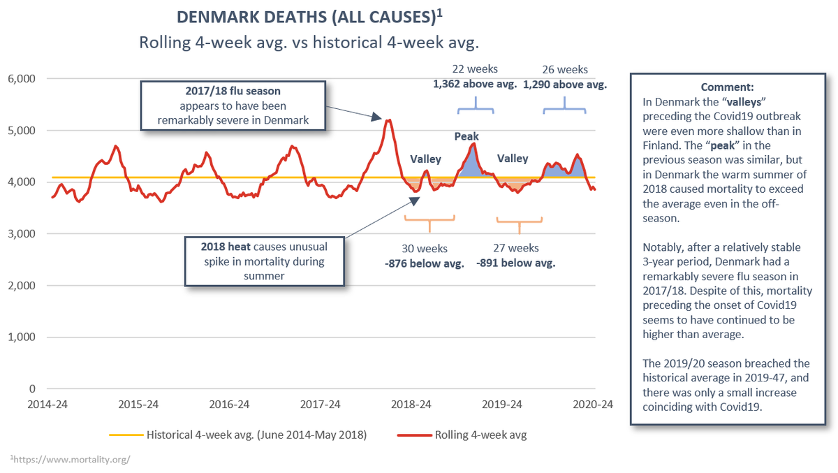
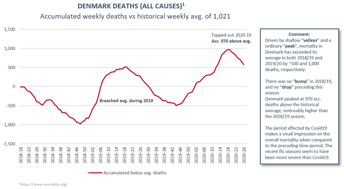
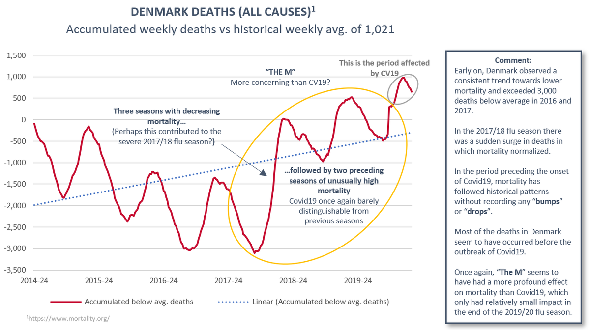
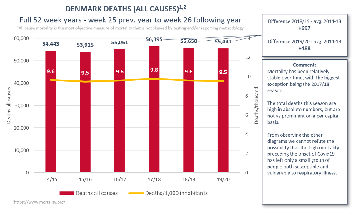
(5/12) Denmark. High mortality has been persistent between the last two flu seasons. Notably there was an outsized spike in mortality in 17/18, followed by an off-season peak due to heat and relatively high mortality 18/19. 19/20 the flu caught on early and was fairly severe.
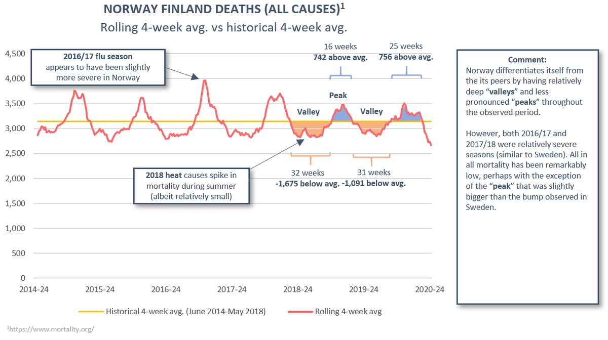
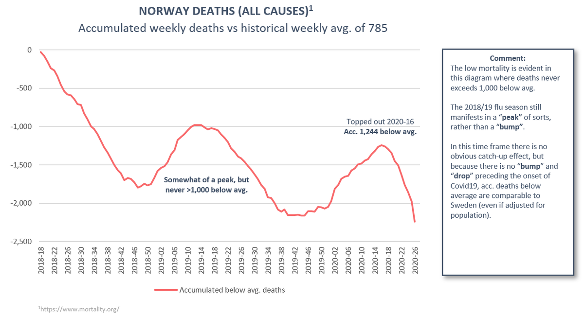
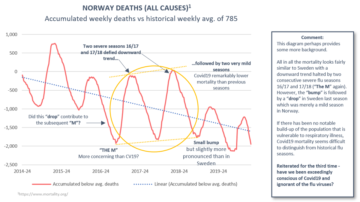
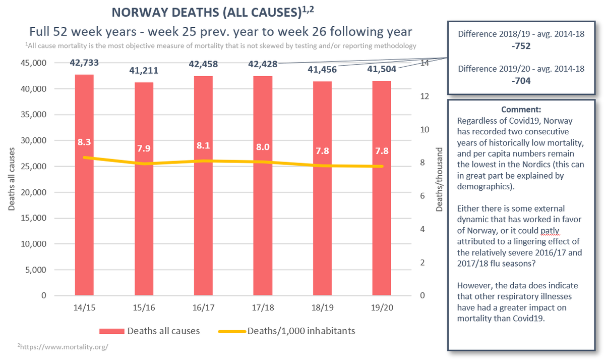
(6/12) Norway. Both 18/19 and 19/20 mild with moderate peaks and deep valleys. Did record two severe flu seasons 16/17 and 17/18 that reversed an otherwise downward trend in mortality. Notably greater impact on mortality from flu than Covid19.
(7/12) Personal take: no virus exists in a vacuum.
It is uncontroversial to assume there are frail individuals in all populations. Their proportion of the population will vary over time depending on a myriad of factors. It seems intuitive that preceding mortality would be one.
It is uncontroversial to assume there are frail individuals in all populations. Their proportion of the population will vary over time depending on a myriad of factors. It seems intuitive that preceding mortality would be one.
(8/12) Even hot summers cause spikes in mortality among these groups. It would seem reasonable to expect that many viruses can too. From the data I have observed so far, I cannot refute “dry tinder” as a possibly important factor determining how severe this spike becomes.
(9/12) I should refrain from jumping to conclusions, but after working with this data I am tempted to propose that the number of susceptible individuals at the start of the outbreak could be a greater determinant of outcome than any active response measures imposed by government.
(10/12) I imagine that this is a staple of any introductory course to epidemiology. But I have yet to see the theory being either proposed or debunked by insiders. Therefore, I truly hope to get some feedback from people in the field. Please help the diagrams to reach them.
(11/12) That said, I welcome everyone’s opinion regardless of background. A lot of the most informative reports rely on objective data that does not require a background in epidemiology. This data has piqued my interest so I will shamelessly ping en masse at the end of the thread
(12/12) Lastly, I have it set up so that I can reproduce these diagrams for any country that is tracked by the Max Planck Institute. If you would like to have a diagram on any specific country, let me know (probably won’t come with my commentary though).
It would also be very interesting if someone could do a similar analysis of countries outside the EU and of US states. Any takers?
@FatEmperor
@creon
@MLevitt_NP2013
@daniellevitt22
@HaraldofW
@TLennhamn
@Humble_Analysis
@ShakespeareanApe
@RuminatorDan
@plaforscience
@MarkChangizi
@AlistairHaimes
@EthicalSkeptic
@TTBikeFit
@DaFeid
@FrankfurtZack
@hughosmond
@pwyowell
@NahasNewman
@JustinHart
@PhilKerpen
@creon
@MLevitt_NP2013
@daniellevitt22
@HaraldofW
@TLennhamn
@Humble_Analysis
@ShakespeareanApe
@RuminatorDan
@plaforscience
@MarkChangizi
@AlistairHaimes
@EthicalSkeptic
@TTBikeFit
@DaFeid
@FrankfurtZack
@hughosmond
@pwyowell
@NahasNewman
@JustinHart
@PhilKerpen
@alexkx3
@Sven_Roman
@emanuelkarlsten
@JacobGudiol
@AgnesWold
@FallTove
@BallouxFrancois
@MarkkuPeltonen
@Sven_Roman
@emanuelkarlsten
@JacobGudiol
@AgnesWold
@FallTove
@BallouxFrancois
@MarkkuPeltonen
Apologies for the pings. I would greatly appreciate your opinion and even more so your ability to point out any potential error(s) I have made in this thread.

 Read on Twitter

