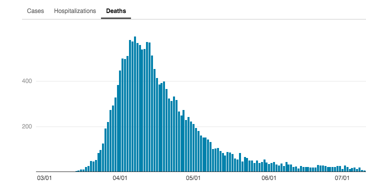
On the left is NY& #39;s COVID-19 Curve.
Does it look familiar? It should.
It& #39;s exactly the curve that every health expert said we should desperately seek to avoid.
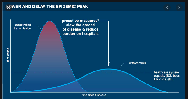
That& #39;s exactly what the image on the right was meant to convey. The states spiking now are the second curve.
Does it look familiar? It should.
It& #39;s exactly the curve that every health expert said we should desperately seek to avoid.
That& #39;s exactly what the image on the right was meant to convey. The states spiking now are the second curve.
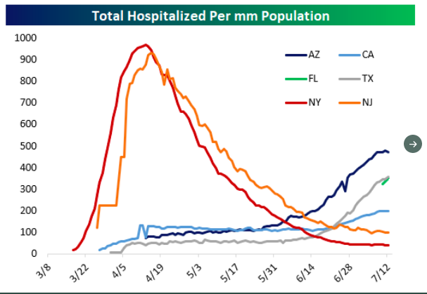
Now some people are celebrating because NY is on the other side of the curve everyone (rightly) agreed we should avoid and they are pretending that is a better outcome than states that are following the path of the second curve by peaking later and MUCH lower.

 Read on Twitter


