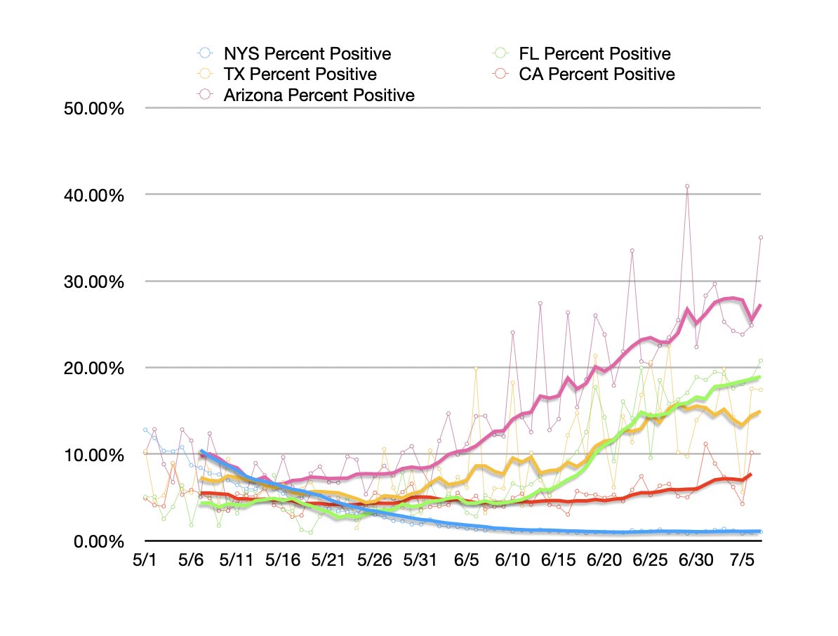
This post tries to make sense of the disjuncture between rising cases & stable/declining death toll nationwide. Bunch of different issues. But one thing I did was put together these graphs to help myself visualize whats happening in the hardest hit states. https://talkingpointsmemo.com/edblog/making-sense-of-the-happy-mystery-of-the-declining-covid-death-toll">https://talkingpointsmemo.com/edblog/ma...
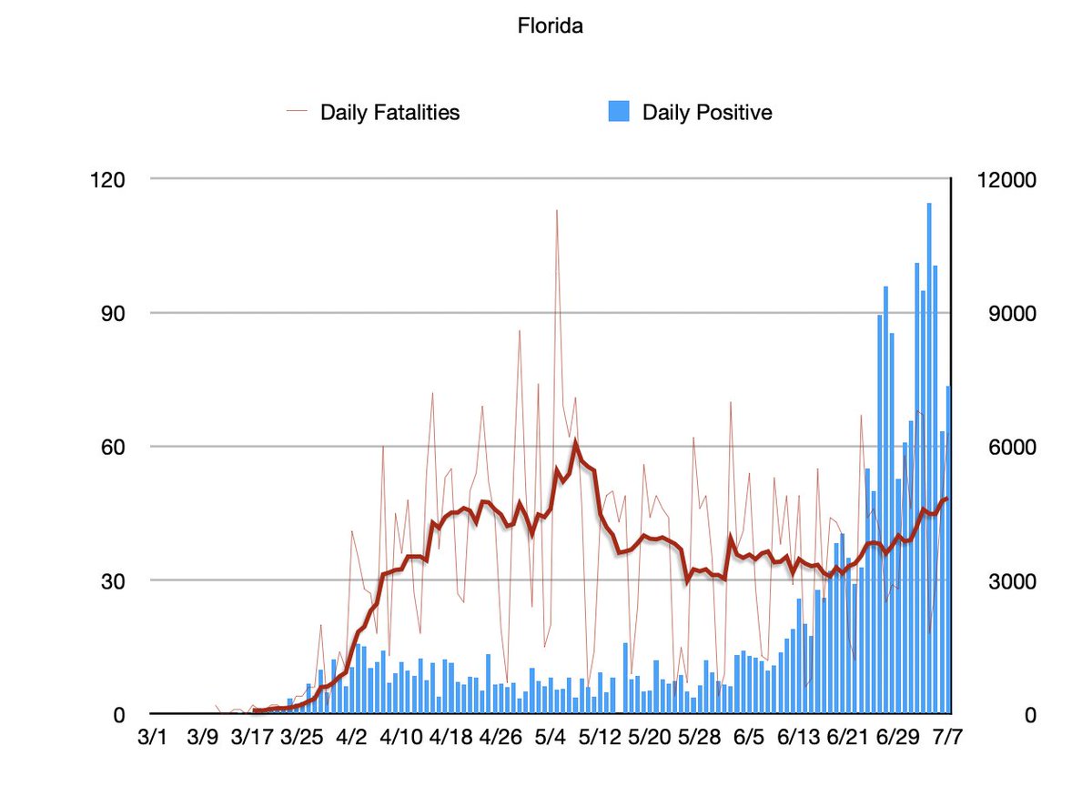
2/ Quite simply, in the hardest hit states the death toll is rising with a 2 to 3 week lag from the surge showing up in the cases about as you& #39;d expect. Here& #39;s Florida.
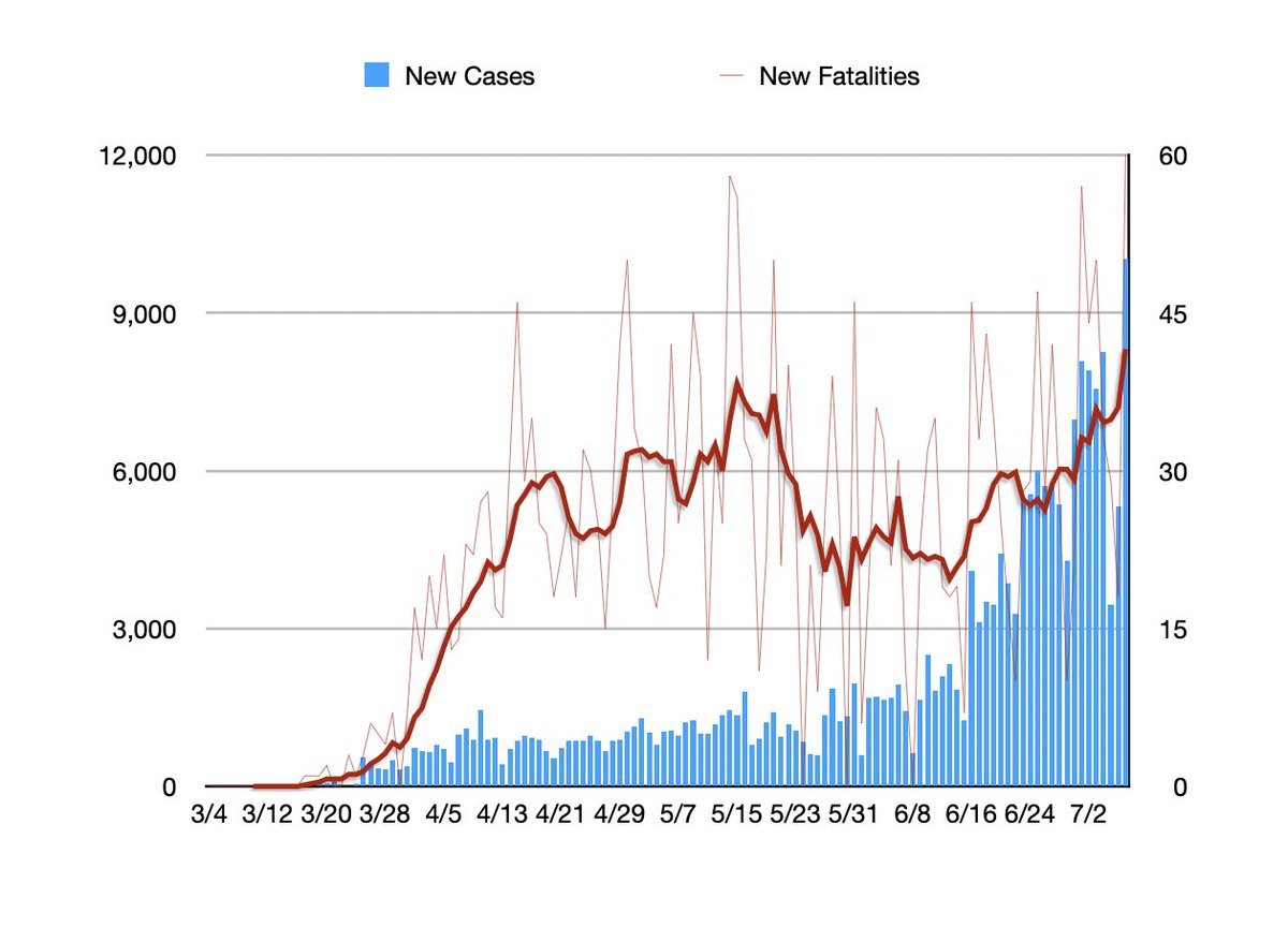
3/ Here& #39;s Texas.
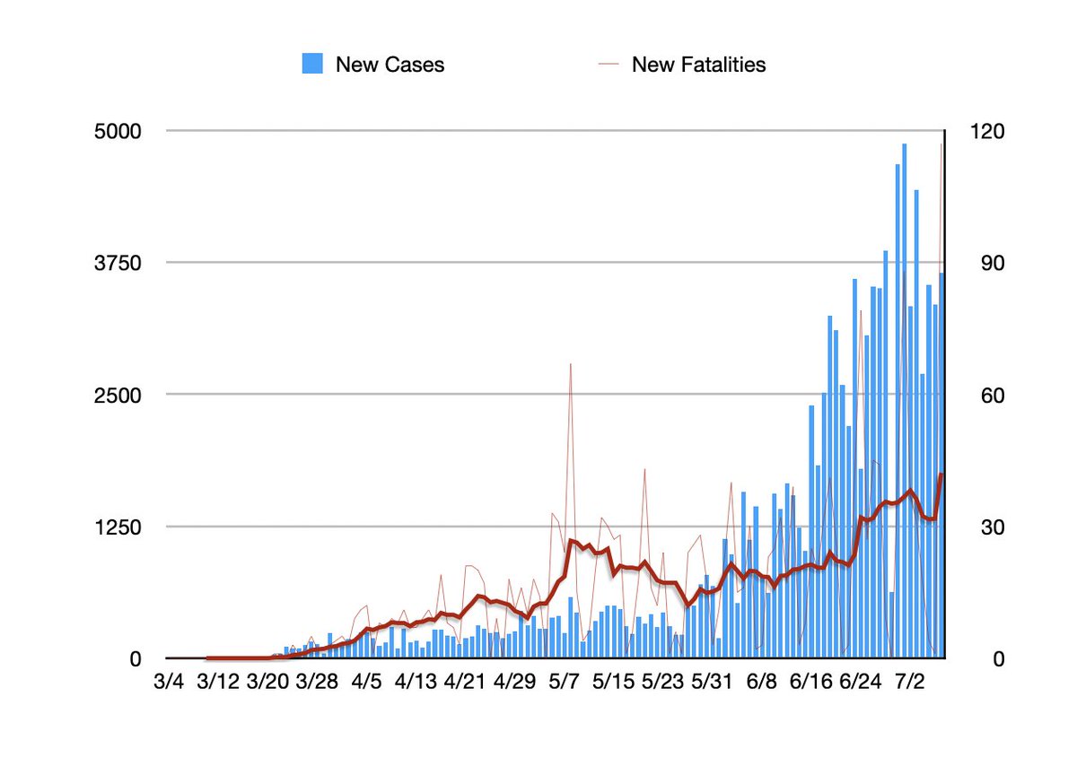
4/ Here& #39;s Arizona.
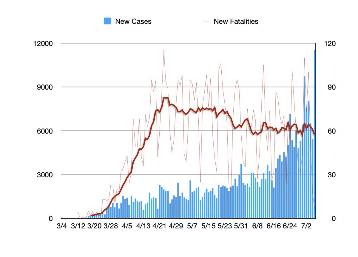
5/ The exception that proves the rule is California. As you can see, the number of fatalities has been stable and even trended slightly down.
6/ That will likely change. But the reason is there in the numbers. Unlike these other states California& #39;s positivity number has remained pretty stable. In California, unlike these other states, expanded testing probably is accounting for a significant amount of the case rise.
8/ In each graph, the trend line is a 7 day moving average with absolute daily numbers pushed to the background. Graphs by @TPM; data from @COVID19Tracking and state reporting sites.

 Read on Twitter