A few words on keying a painting, as related to this wonderful Tissot:
When painting, you can& #39;t copy directly the value range in nature: the gap between the lightest light and the darkest dark. Your paints aren& #39;t bright enough or dark enough to do that. (1/) https://twitter.com/artisttissot/status/1279126246555860993">https://twitter.com/artisttis...
When painting, you can& #39;t copy directly the value range in nature: the gap between the lightest light and the darkest dark. Your paints aren& #39;t bright enough or dark enough to do that. (1/) https://twitter.com/artisttissot/status/1279126246555860993">https://twitter.com/artisttis...
Keying a painting is selecting a scheme for arranging your lights and darks such that it allows you to convey the light-effect you want. Consider this Emil Carlsen: he& #39;s pushed his darks dark, giving him space to make his midtones dark, leaving space for the highlight to pop (2/
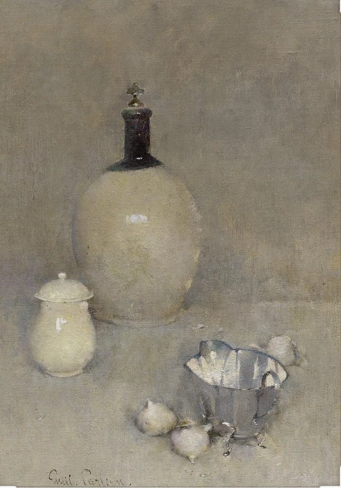
Compare this Emil Carlsen. Objectively, the highlights are brighter than in the previous, but they don& #39;t pop in the same way: he& #39;s keyed this one such that most of his range of values is consumed by modulating halftones, so there& #39;s no space for the highlight to stand out. (3/)
Going back to the Tissot! He& #39;s trying to do several things here: convey a sense of outdoor sun and shadow AND not crush anything so far it vanishes AND do it almost purely with value, not with color contrasts like Monet would (4/ https://twitter.com/artisttissot/status/1279126246555860993?s=19">https://twitter.com/artisttis...
He succeeds by carefully grouping his values, and keeping things flat and with minimal variation within value-groups. Most of the shadow-zone is almost the same, giving space down for the black dress to be black, and up for faces to show form in the reflected light. (5/)
Similarly, that light patch is kept within a very narrow range, giving anything in light as much space from the stuff in shadow as he can manage. Again, it& #39;s got to be, because he wants the sense of brilliant light more than he wants modeling of form or delicious highlights (6/)
But yeah. Keying a painting, in essence, is stretching or compressing lights and darks to convey the impression of the particular aspect of light you wish to convey. Tissot, imo, kicks ass here at a difficult task.
(7/7)
(7/7)
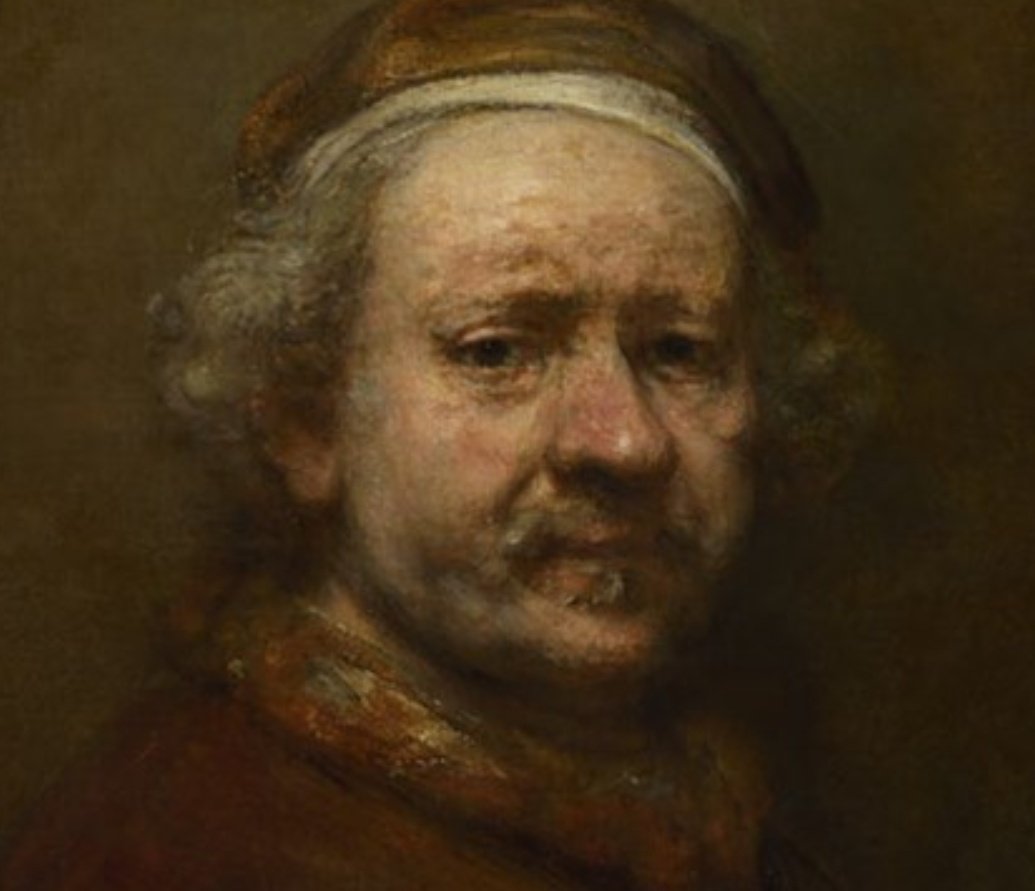
One more: I& #39;d suggest that, if such a thing exists the "standard" key is kinda like this. Shadows kept low & flat, but with space for darker accents (pupils, nostrils). Lots of space in the midtones for modelling, kept fairly light but with headroom for a subtle highlight (8/7)

 Read on Twitter


