let& #39;s say it one more time:
"discussing case counts without reference to testing levels is tantamount to lying."
let& #39;s look at just how much difference it makes.
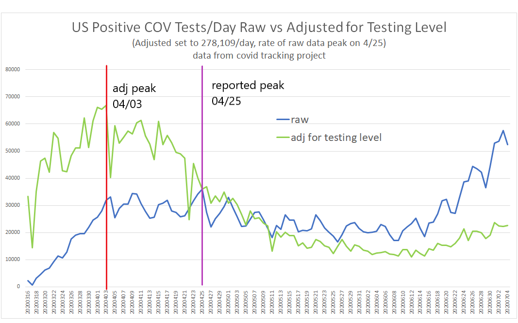
i plotted raw "new positives reported per day" vs the same data adjusted for teasing levels.
big difference, huh?
"discussing case counts without reference to testing levels is tantamount to lying."
let& #39;s look at just how much difference it makes.
i plotted raw "new positives reported per day" vs the same data adjusted for teasing levels.
big difference, huh?
testing levels are 2.3X what they were when raw cases were reporting their peak in april.
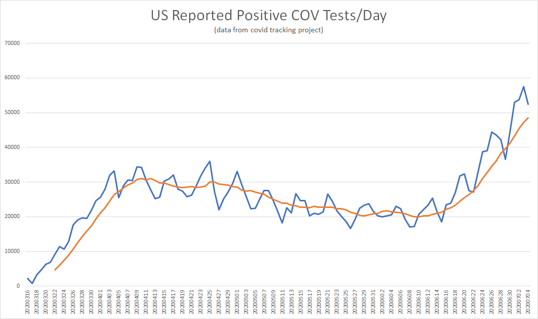
leaving that fact out of an analysis and just using this scare chart is literally the definition of "material omission."
look at the changes it makes when you adjust for testing.
leaving that fact out of an analysis and just using this scare chart is literally the definition of "material omission."
look at the changes it makes when you adjust for testing.
not only does the slope of the chart from april to now change signs dramatically, but the date of the peak infection shifts 3 weeks from 4/25 to 4/03.
this lines up FAR better with the peak in US deaths on 4/21. (18 day lag, very tight to what one would expect)
this lines up FAR better with the peak in US deaths on 4/21. (18 day lag, very tight to what one would expect)
this gives us some strong intuitions about which cases curve we should be trusting. the raw reported data sees cases peak AFTER deaths and the curve adjusted for testing sees it peak right where you& #39;d expect it to based on deaths (which are a far better data series than cases)
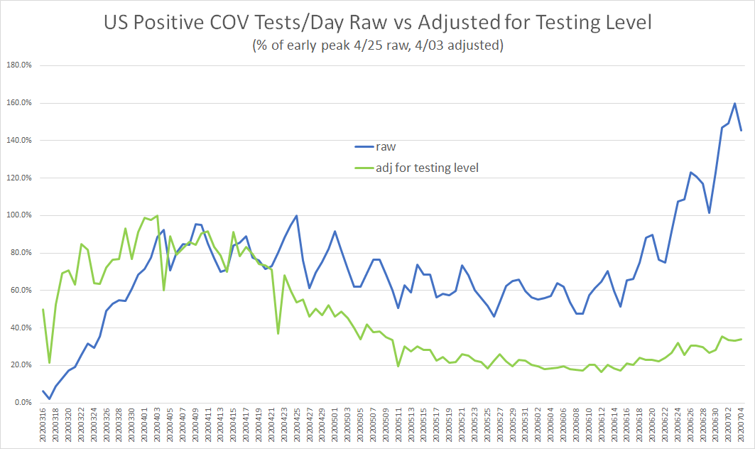
the general implications here are profound and can be more easily seen if curves are normalized to % of peak.
i set the april peak of each series to 1
the divergence is beyond stark.
07/04 vs april peak:
raw: +46%
testing adjusted: -66%
that& #39;s literally the whole ballgame
i set the april peak of each series to 1
the divergence is beyond stark.
07/04 vs april peak:
raw: +46%
testing adjusted: -66%
that& #39;s literally the whole ballgame
some have tried to use the scare chart to claim that COV is currently more prevalent in the US than in april.
this is, frankly, nonsense. every reliable metric from hospitals to deaths to adj cases shows it WAY down.
and the CDC agrees. https://justthenews.com/politics-policy/coronavirus/covid-19-close-losing-its-epidemic-status-us-according-cdc">https://justthenews.com/politics-...
this is, frankly, nonsense. every reliable metric from hospitals to deaths to adj cases shows it WAY down.
and the CDC agrees. https://justthenews.com/politics-policy/coronavirus/covid-19-close-losing-its-epidemic-status-us-according-cdc">https://justthenews.com/politics-...
this idea that the real epidemiological curve of cases are at a new high lacks a shred of confirmatory evidence and lots of data is being badly misused. even the analysis i presented above likely understates the full extend of the decline for a number of reasons.
1. it counts positive results and these are being double and triple counted in some places as tests of same patient on different day are not being adequately differentiated.
2. there is a massive issue with test reporting over electronic systems. testing away from hospitals is ONLY being reported if the results are positive.
this adds massively to "cases" while understating testing and "salts" the % positive figure to make it read very high
this adds massively to "cases" while understating testing and "salts" the % positive figure to make it read very high
this appears to be an issue in many states including GA, NC, FL, TX.
from what i have been told, it affects most states and is just the nature of what happens when you try to use billing systems to perform epidemiology. https://twitter.com/boriquagato/status/1274432160682831872?s=20">https://twitter.com/boriquaga...
from what i have been told, it affects most states and is just the nature of what happens when you try to use billing systems to perform epidemiology. https://twitter.com/boriquagato/status/1274432160682831872?s=20">https://twitter.com/boriquaga...
and the % of cases not on ELR systems may be 30% in many places and had a direct correlation to "opeing" as workplace testing has this issue.
this is a massive set of bias to add to the already unreliable case figures and makes % positive highly unreliable.
consider:
this is a massive set of bias to add to the already unreliable case figures and makes % positive highly unreliable.
consider:
you have 1000 people, 100 with covid.
you test 100. on ELR you get 10 positives form 100 tests 10% pos.
if 30% of tests are off elr, you get 10 + but only report 73 tests. % pos spikes to 13.7%.
but nothing real changed.
it& #39;s a reporting artifact.
you test 100. on ELR you get 10 positives form 100 tests 10% pos.
if 30% of tests are off elr, you get 10 + but only report 73 tests. % pos spikes to 13.7%.
but nothing real changed.
it& #39;s a reporting artifact.
all the clever math in the world cannot save you from really bad, biased source data.
so let& #39;s sum up: cases were never a great metric.
they are now much worse than they used to be and the issues are biased one way and unpredictable.
but even so, testing is way up.
so let& #39;s sum up: cases were never a great metric.
they are now much worse than they used to be and the issues are biased one way and unpredictable.
but even so, testing is way up.
so case count, even adjusted by this number that is too low and influenced by tracing and hotspot hunting, still shows us WAY down from peak, not up.
so don& #39;t buy this "the worst is yet to come" argument.
it has zero basis in fact.
so don& #39;t buy this "the worst is yet to come" argument.
it has zero basis in fact.

 Read on Twitter


