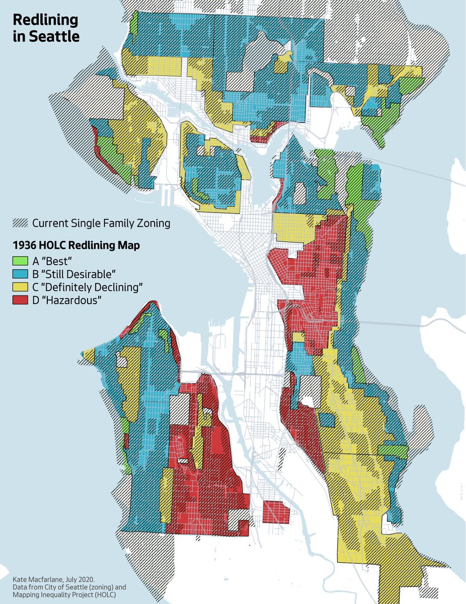
I was curious how Seattle& #39;s 1936 redlining map compares with today& #39;s zoning. So, I made a map.
As a refresher, the federal government sponsored the creation of redlining maps in the 1930s and used them to determine mortgage eligibility. Here& #39;s Seattle& #39;s map:
These maps were explicitly racist. Neighborhoods where people of color lived were considered "Hazardous." If you lived there, it was difficult or impossible to get a home loan. For people of color, this cut off a major route to building intergenerational wealth.
Back to the present: to no one& #39;s surprise, the "Best" neighborhoods from Seattle& #39;s 1936 map are all still wealthy single-family enclaves. Meanwhile, Seattle& #39;s historically Black and Asian neighborhoods have mostly been upzoned.
I strongly support upzoning, but we need to look critically at where and how we do it. In Seattle, wealthy white neighborhoods have a strong track record of getting what they want, and what they want is usually preservation of their (racist, exclusionary) status quo.
Want a more equitable Seattle? Upzone those green and blue neighborhoods. Looking at you: North Capitol Hill, Madrona, Queen Anne, Wallingford, Phinney, West Seattle...

 Read on Twitter


