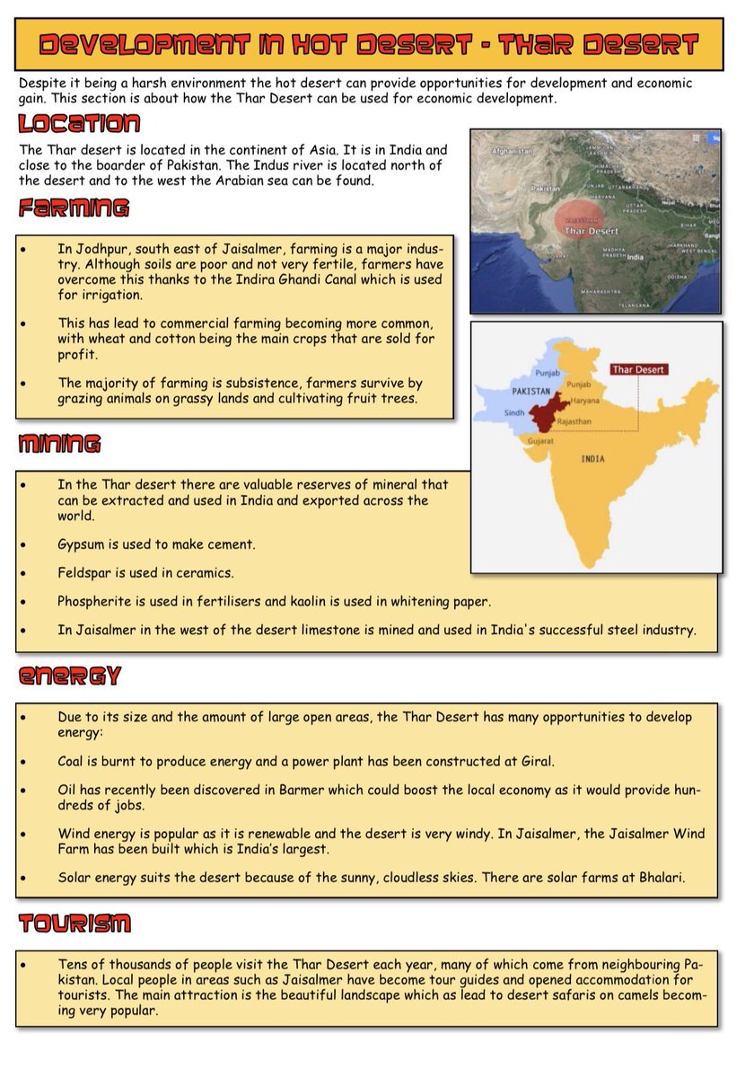
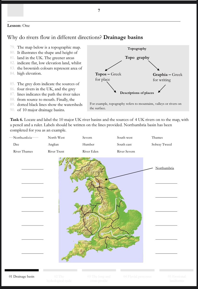
1/5 Old me versus new me https://abs.twimg.com/emoji/v2/... draggable="false" alt="👇" title="Rückhand Zeigefinger nach unten" aria-label="Emoji: Rückhand Zeigefinger nach unten"> been asked a lot recently about use of colour and is it a No No. The answer is no it isn’t a no no...restraint is the answer, don’t use it unnecessarily like in example 1. In example 2 the topographic map couldn’t be interpreted without being in colour
2/5 The golden rule is 2 colours e.g for headings/titles and text etc. In example 1 in an attempt to make things appear interesting and standout - nothing stands out. There is nothing about example 1 that makes the content anymore interesting- the typefaces are gimmicky.
3/5 granted example 2 doesn’t make the content anymore interesting but it certainly didn’t take as long to produce and it has the level of sophistication I want to see in my pupils work. I make the content interesting through my teaching and not relying on gimmicks
4/5 I don’t know this for certain and if anyone can signpost research id appreciate it - but I think example 1 places unnecessary load on pupils working memory as they work harder than needed to navigate the noisy and overcrowded page. I now look for influences from newspapers
5/5 and magazines. 2 typefaces, 2 colours (excluding photos, graphs and maps that need colour). Plenty of white space at the top of the page, writing in columns. Why? If newspapers and magazines were difficult to read they’d go out of business. Accessiblity for all learners

 Read on Twitter
 been asked a lot recently about use of colour and is it a No No. The answer is no it isn’t a no no...restraint is the answer, don’t use it unnecessarily like in example 1. In example 2 the topographic map couldn’t be interpreted without being in colour" title="1/5 Old me versus new mehttps://abs.twimg.com/emoji/v2/... draggable="false" alt="👇" title="Rückhand Zeigefinger nach unten" aria-label="Emoji: Rückhand Zeigefinger nach unten"> been asked a lot recently about use of colour and is it a No No. The answer is no it isn’t a no no...restraint is the answer, don’t use it unnecessarily like in example 1. In example 2 the topographic map couldn’t be interpreted without being in colour">
 been asked a lot recently about use of colour and is it a No No. The answer is no it isn’t a no no...restraint is the answer, don’t use it unnecessarily like in example 1. In example 2 the topographic map couldn’t be interpreted without being in colour" title="1/5 Old me versus new mehttps://abs.twimg.com/emoji/v2/... draggable="false" alt="👇" title="Rückhand Zeigefinger nach unten" aria-label="Emoji: Rückhand Zeigefinger nach unten"> been asked a lot recently about use of colour and is it a No No. The answer is no it isn’t a no no...restraint is the answer, don’t use it unnecessarily like in example 1. In example 2 the topographic map couldn’t be interpreted without being in colour">


