Visual communication will dominate the 2020’s.
Here’s 8 principles to improve your visual design from @JackButcher’s course.
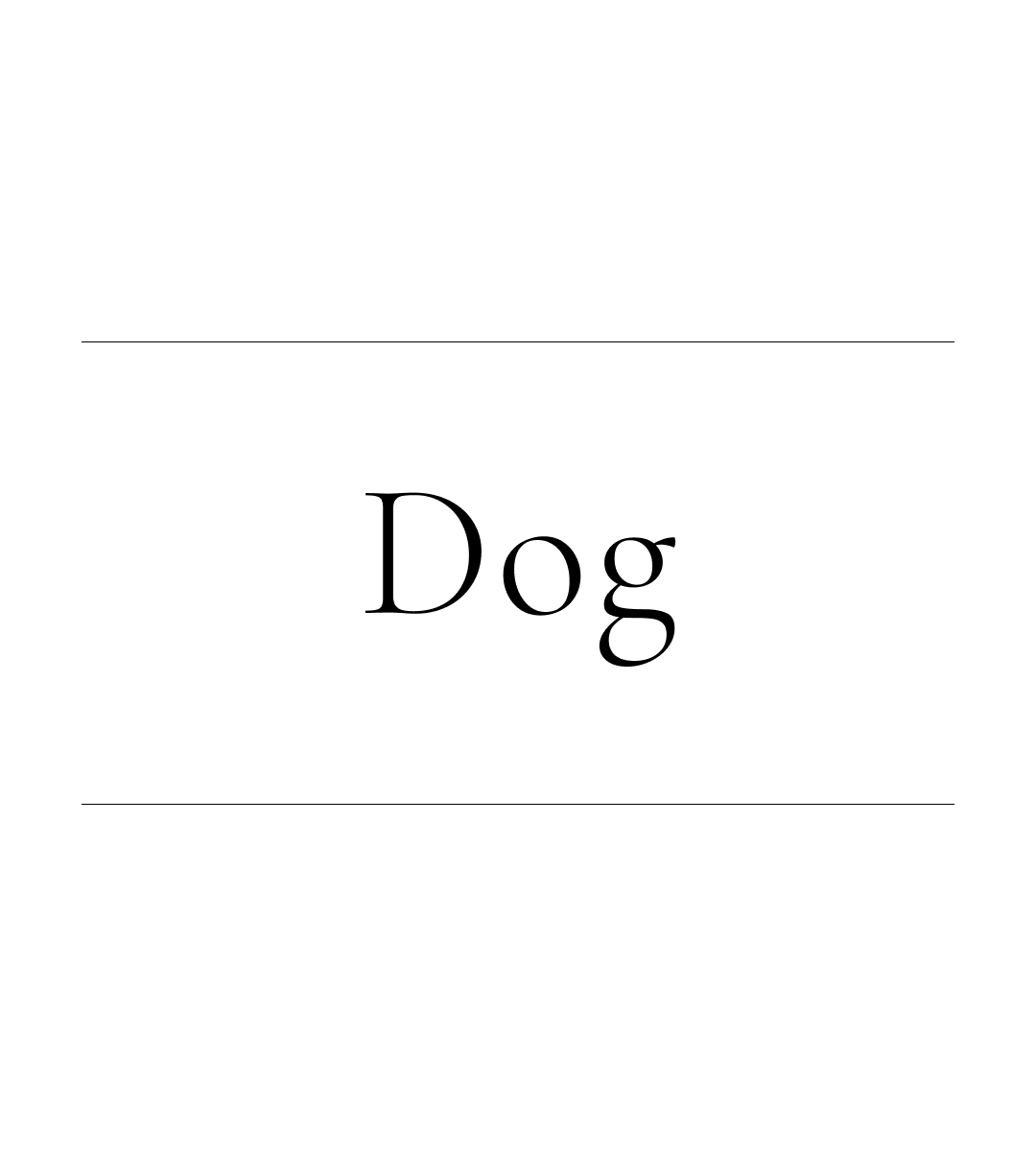
1/ Visuals prevent misunderstanding. When I say “dog" you imagine a different dog to me. When I show you a dog, we see the same idea.
Here’s 8 principles to improve your visual design from @JackButcher’s course.
1/ Visuals prevent misunderstanding. When I say “dog" you imagine a different dog to me. When I show you a dog, we see the same idea.
2/ Focus on nailing IDEAS over visuals.
Visuals effortlessly follow the right idea.
Bad ideas? Visuals struggle fitting into them.
"The world rewards the people who are best at communicating ideas, not the people with the best ideas” — @David_Perell
Visuals effortlessly follow the right idea.
Bad ideas? Visuals struggle fitting into them.
"The world rewards the people who are best at communicating ideas, not the people with the best ideas” — @David_Perell
3/ 2 step process to add visual context to an idea:
Step 1: Identify key elements.
Step 2: Find symbols for key elements.
Example idea: “Examine what is said, not who speaks”
Key elements = Speech + The Speaker
Step 1: Identify key elements.
Step 2: Find symbols for key elements.
Example idea: “Examine what is said, not who speaks”
Key elements = Speech + The Speaker
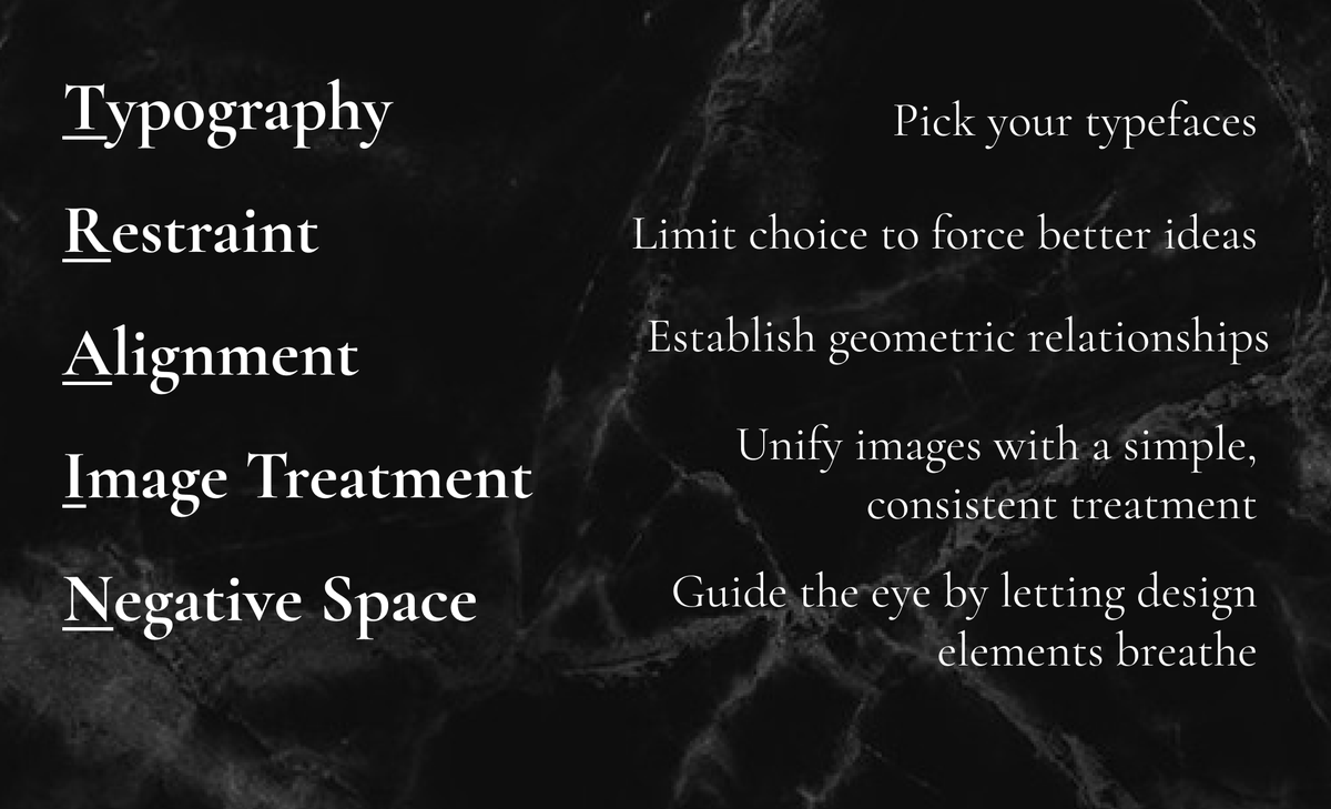
4/ A visual content system has 5 key elements: TRAIN
1. Typography - Pick your typeface
2. Restraint - Limit choice
3. Alignment - Establish element relationships
4. Image Treatment - Give images a consistent look
5. Negative Space - Let elements breathe
1. Typography - Pick your typeface
2. Restraint - Limit choice
3. Alignment - Establish element relationships
4. Image Treatment - Give images a consistent look
5. Negative Space - Let elements breathe
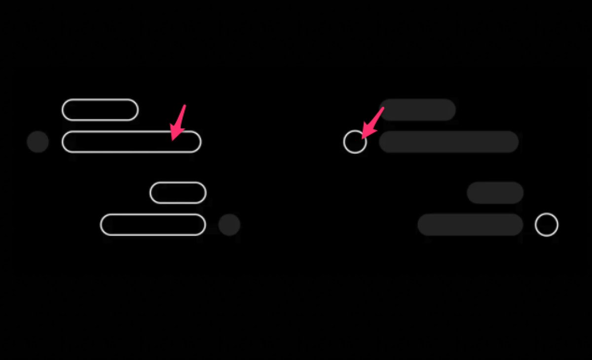
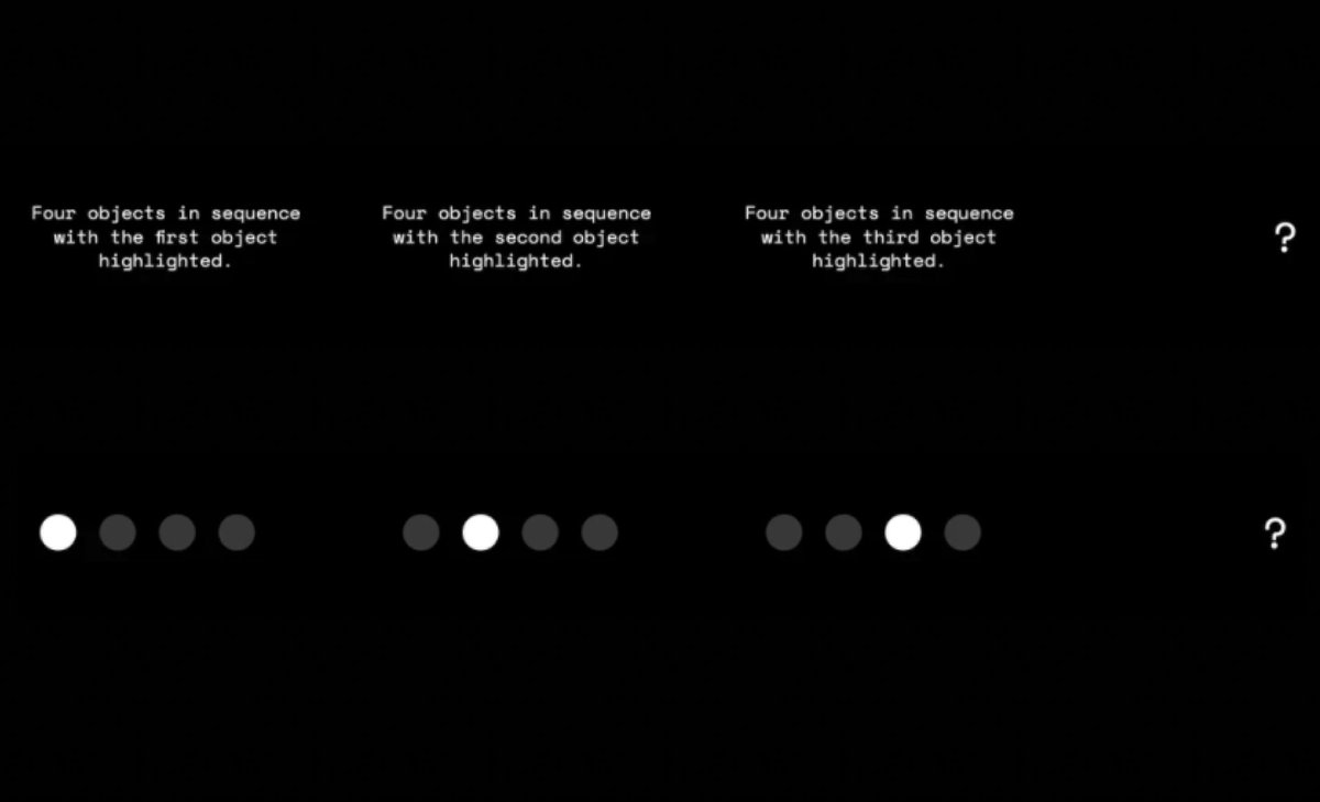
5/ We’re wired to recognise patterns. Visual design takes full advantage of this.
Which do you see quicker: The first or second pattern?
Patterns make your ideas easy to understand.
Which do you see quicker: The first or second pattern?
Patterns make your ideas easy to understand.
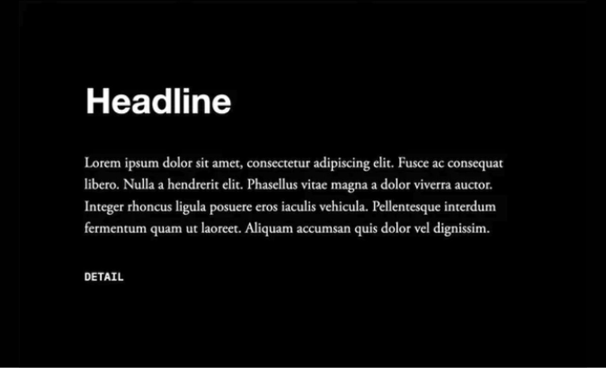
6/ Make important ideas visually prominent.
Newspapers work like this: HEADLINE https://abs.twimg.com/emoji/v2/... draggable="false" alt="➡️" title="Pfeil nach rechts" aria-label="Emoji: Pfeil nach rechts"> Subtitle
  https://abs.twimg.com/emoji/v2/... draggable="false" alt="➡️" title="Pfeil nach rechts" aria-label="Emoji: Pfeil nach rechts"> *Details*
—LARGE— ideas carry more weight, physically and mentally.
Newspapers work like this: HEADLINE
—LARGE— ideas carry more weight, physically and mentally.
7/ Use the golden ratio grid to make images aesthetically pleasing.
Align elements along their lines. It creates space for them to breathe.
Space is there to frame, not fill.
Align elements along their lines. It creates space for them to breathe.
Space is there to frame, not fill.
8/ Finally, never delete. Always keep previous versions of your designs.
This lets you come back later and cherry-pick the best bits.
This lets you come back later and cherry-pick the best bits.

 Read on Twitter

 Subtitle https://abs.twimg.com/emoji/v2/... draggable="false" alt="➡️" title="Pfeil nach rechts" aria-label="Emoji: Pfeil nach rechts"> *Details*—LARGE— ideas carry more weight, physically and mentally." title="6/ Make important ideas visually prominent.Newspapers work like this: HEADLINE https://abs.twimg.com/emoji/v2/... draggable="false" alt="➡️" title="Pfeil nach rechts" aria-label="Emoji: Pfeil nach rechts"> Subtitle https://abs.twimg.com/emoji/v2/... draggable="false" alt="➡️" title="Pfeil nach rechts" aria-label="Emoji: Pfeil nach rechts"> *Details*—LARGE— ideas carry more weight, physically and mentally." class="img-responsive" style="max-width:100%;"/>


