Hop!
6/10, any logo that conveys the idea that air travel is even remotely fun, easy, or exciting deserves some recognition
6/10, any logo that conveys the idea that air travel is even remotely fun, easy, or exciting deserves some recognition
ok i have to get back to work, I& #39;ll pick this up later this evening
ok im back
Iceland Air
5/10 this one has always bothered me. i thought the scandinavians were supposed to be good at doing minimalism
5/10 this one has always bothered me. i thought the scandinavians were supposed to be good at doing minimalism
also they had the common sense to realize that you can& #39;t improve on perfection hence they did a reverse american airlines and went back to their dope midcentury imagery
i do have a soft spot for the 80s logo because it was trapped squarely in the middle of the pomo-to-neomodern interzone
Jetstar
8/10, I& #39;ve said it once and I& #39;ll say it again: you can never go wrong with neo-grotesk sans serifs
8/10, I& #39;ve said it once and I& #39;ll say it again: you can never go wrong with neo-grotesk sans serifs
JinAir
8/10, embracing the y2k aesthetic is a bold choice, also lime green never fails to look cool on planes
8/10, embracing the y2k aesthetic is a bold choice, also lime green never fails to look cool on planes
Joon
9/10, this looks sick af - clearly embracing the midcentury verve, capturing futurism and momentum and cool all at the same time
9/10, this looks sick af - clearly embracing the midcentury verve, capturing futurism and momentum and cool all at the same time
ah, well, nevertheless, https://aviationvoice.com/why-has-air-frances-joon-airline-for-millennials-failed-201901211846/">https://aviationvoice.com/why-has-a...
cool livery tho, but again, i am the target audience
Korean Air
9/10 - a total classic, one of the few serif logos left it seems like, gives it cool vintage vibes
9/10 - a total classic, one of the few serif logos left it seems like, gives it cool vintage vibes
as you can tell this thread is deeply serious, using official design terms like "vibes"
Kish Air
2/10 logo looks like an orange floating on a sea of red toothpaste. also i feel like they definitely don& #39;t care about me
2/10 logo looks like an orange floating on a sea of red toothpaste. also i feel like they definitely don& #39;t care about me
Kulula Airlines
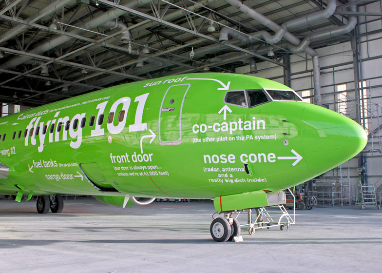
6/10, the logo is ok but what really rules is that they did a McMansion Hell on their planes& #39; livery
6/10, the logo is ok but what really rules is that they did a McMansion Hell on their planes& #39; livery
we stan the shitpost plane
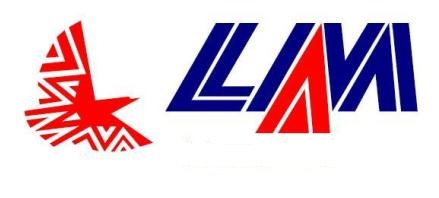
LAM
8/10, the African airlines continue to kill it with these bold, in your face logos that feature birds
8/10, the African airlines continue to kill it with these bold, in your face logos that feature birds
Level
5/10, this one definitely gives off "pandering to millennials" vibes but ends up looking like a hip new look for H&R Block
5/10, this one definitely gives off "pandering to millennials" vibes but ends up looking like a hip new look for H&R Block
I& #39;ll wrap up the thread with golden oldies eg Continental, Braniff, Northwest, Southeast, old school Frontier, etc
But for now onward through the list
Liat Airlines
8/10 this is the logo equivalent to a Michelle Branch song. i feel like cameron diaz could be in the commercials. la croix vibes.
8/10 this is the logo equivalent to a Michelle Branch song. i feel like cameron diaz could be in the commercials. la croix vibes.
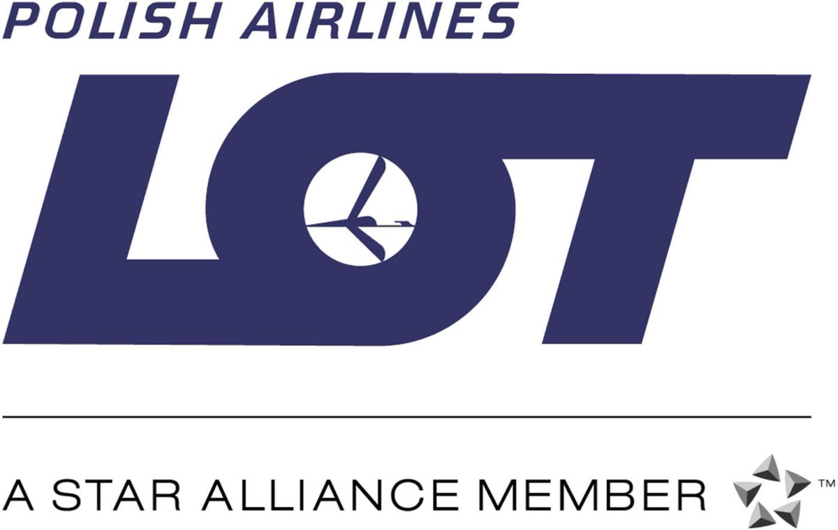
LOT
8/10, love that they& #39;ve kept the old logo which feels weirdly fresh and corporate at the same time
8/10, love that they& #39;ve kept the old logo which feels weirdly fresh and corporate at the same time
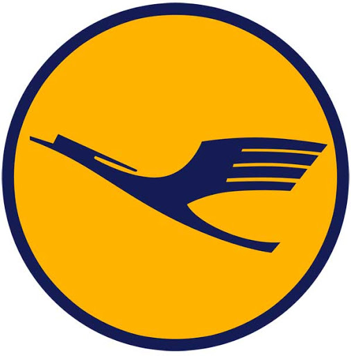
Lufthansa
10/10, proof that if it ain& #39;t broke don& #39;t fix it, you can& #39;t mess with perfection, etc
10/10, proof that if it ain& #39;t broke don& #39;t fix it, you can& #39;t mess with perfection, etc
Mango Airlines
7/10 because *I* like it but also it irrefutably looks like a soda brand not an airline
7/10 because *I* like it but also it irrefutably looks like a soda brand not an airline
Middle East Airlines
3/10, You know those faux-streetwear t-shirts they sell at Forever 21 that look intentionally lo-fi and say shit like "ketchup"? this fits right in.
3/10, You know those faux-streetwear t-shirts they sell at Forever 21 that look intentionally lo-fi and say shit like "ketchup"? this fits right in.
Nok Air
6/10, definitely one of the more fun logos but also the branding says breakfast sandwich place
6/10, definitely one of the more fun logos but also the branding says breakfast sandwich place
3 star android game vibes
Norwegian
7/10, I love how it& #39;s weirdly stuck in the dot-com bubble age with the type kerning and the little swooshy plane
7/10, I love how it& #39;s weirdly stuck in the dot-com bubble age with the type kerning and the little swooshy plane
Peach Air
4/10, the difference between this and Joon Air is that Joon Air& #39;s color scheme and branding more accurately captures that jetsetting 70s corporate aesthetic whereas Peach looks like it& #39;s asking me to refinance my student loans
4/10, the difference between this and Joon Air is that Joon Air& #39;s color scheme and branding more accurately captures that jetsetting 70s corporate aesthetic whereas Peach looks like it& #39;s asking me to refinance my student loans
what if arial rounded light on navy rectangle. im a graphic designer now
designer guy: bro what if i did this left-handed lmao
other designer guy: bro that looks like shit
corporate guy passing buy: hey now that& #39;s something!
other designer guy: bro that looks like shit
corporate guy passing buy: hey now that& #39;s something!
update: i& #39;ve had to re-evaluate Porter because I& #39;ve been informed that the mascot is a raccoon and he& #39;s friends with a seagull. the cute ads are 8/10, the logo still sucks shit though. https://twitter.com/davidcapizzano/status/1279227166018768898?s=20">https://twitter.com/davidcapi...
ok i will continue this tomorrow im gonna watch startrek

 Read on Twitter