A Story of 2 Americas: Daily deaths in 2 groups
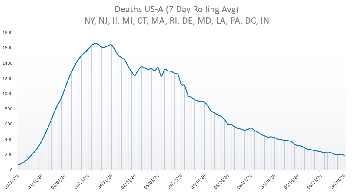
US-A: These were hit hard early on - NY, NJ, Il, MI, CT, MA, RI, DE, MD, LA, PA, DC, IN
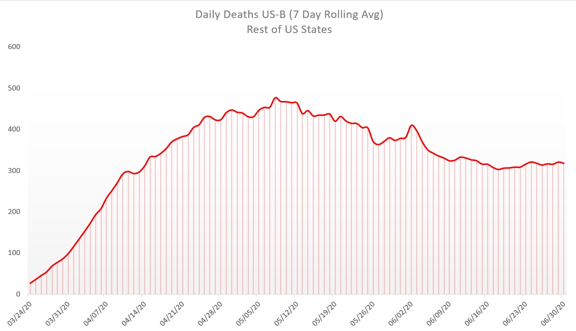
US-B: The rest of the country which wasn& #39;t hit very badly early on but with increasing cases
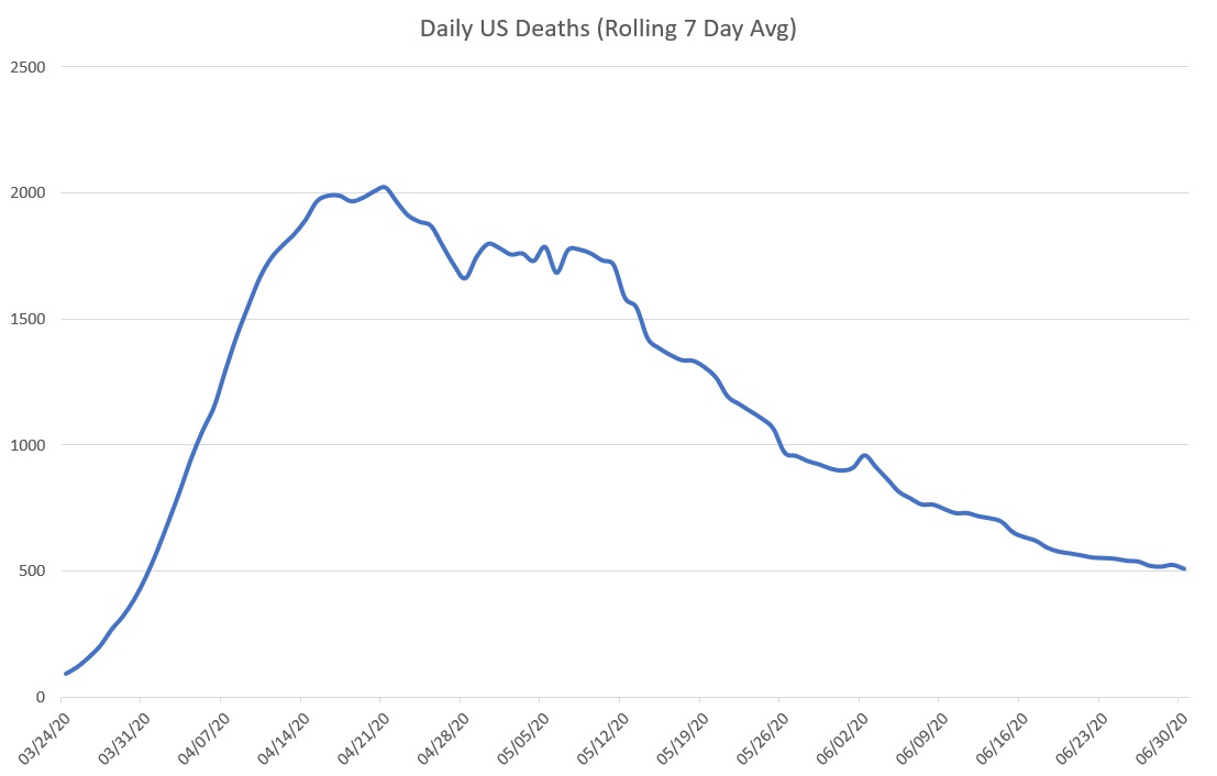
Overall, the US looks like this:
1/5
US-A: These were hit hard early on - NY, NJ, Il, MI, CT, MA, RI, DE, MD, LA, PA, DC, IN
US-B: The rest of the country which wasn& #39;t hit very badly early on but with increasing cases
Overall, the US looks like this:
1/5
First up - US-A
Represents 29% of US Population
Looks like a typical Gompertz curve
Huge growth early followed by long decrease
Looks alot like the overall curve...hmmm....
2/5
Represents 29% of US Population
Looks like a typical Gompertz curve
Huge growth early followed by long decrease
Looks alot like the overall curve...hmmm....
2/5
Second - US-B
Represents 71% of population
A more gradual rise in deaths followed by a slow decline and then a plateau
These are the states that the MSM is freaking out about the rise in cases, but no significant increases in death
3/5
Represents 71% of population
A more gradual rise in deaths followed by a slow decline and then a plateau
These are the states that the MSM is freaking out about the rise in cases, but no significant increases in death
3/5
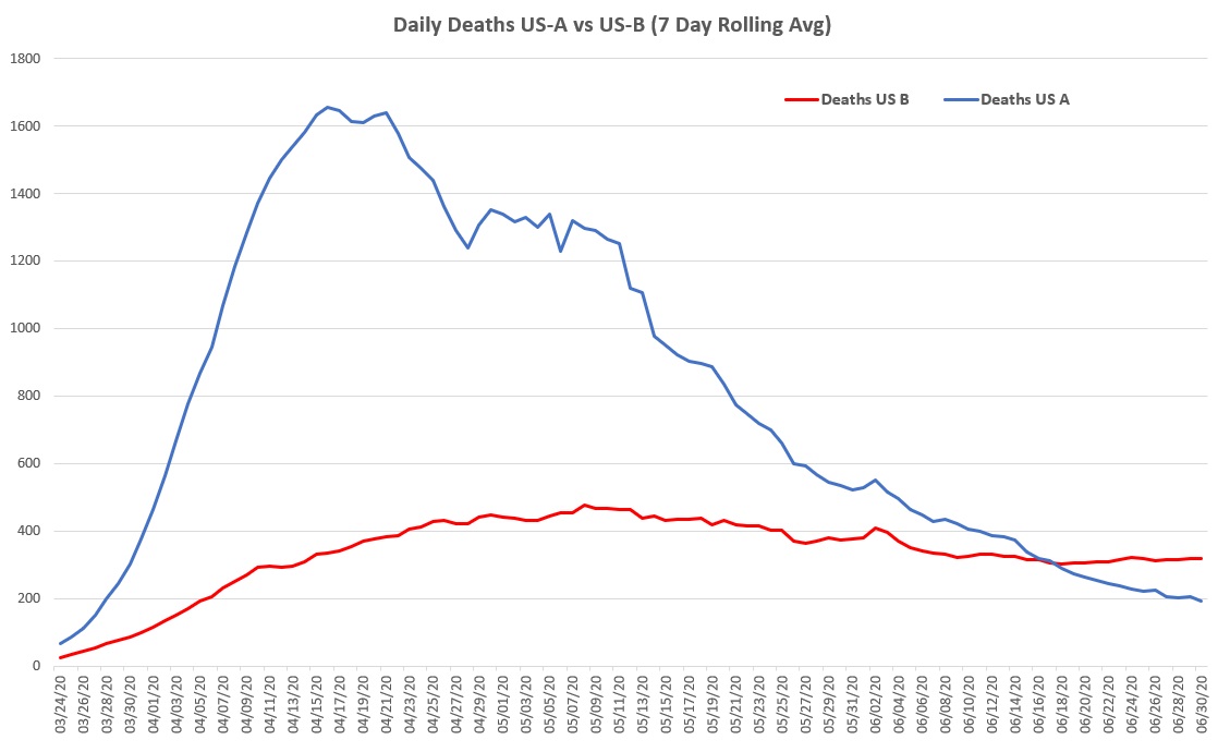
But if we look at them side by side, another picture emerges
US-A- despite representing only 29% of the US population, it represents 70% of all deaths. Good news is that Covid almost burned out here
US-B- This curve is already flat! How much more do u want to flatten it?
4/5
US-A- despite representing only 29% of the US population, it represents 70% of all deaths. Good news is that Covid almost burned out here
US-B- This curve is already flat! How much more do u want to flatten it?
4/5

 Read on Twitter


