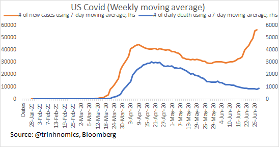
Here is the updated of US data using the latest. Chart below shows new deaths & new confirmed in a 10:1 ratio (cases to the left scale & deaths to the right).
Will look at the states w/ highest new confirmed cases recently (California, Texas, Florida). https://twitter.com/Trinhnomics/status/1277819144449089536">https://twitter.com/Trinhnomi...
Will look at the states w/ highest new confirmed cases recently (California, Texas, Florida). https://twitter.com/Trinhnomics/status/1277819144449089536">https://twitter.com/Trinhnomi...
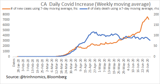
Latest date is 30 June (It& #39;s 1 July in HK but still 30 June in the USA). Anyway, here is California. The absolute increase yesterday was:
+37 deaths
+4,293 cases (yesterday+15,861)
That said, data tends to be volatile on the day, so better to smooth using a 7-day moving average
+37 deaths
+4,293 cases (yesterday+15,861)
That said, data tends to be volatile on the day, so better to smooth using a 7-day moving average
Absolute deaths are down in California (right scale blue line) & cases wise seem to be trending down recently (left scale orange line) although cases & deaths diverge in trends & so we should look at ratios of fatality to see trends!
2 ratios:
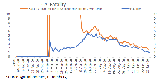
The blue line shows fatality of new daily deaths (7-day moving average)/ new cases (7-day moving average) = 1.1% & same as previous day.
Here& #39;s the good news:
Current fatality/ cases of TWO WEEKS AGO to take care of lag issue = 1.7% for 30 June& down from 1.9 yesterd
The blue line shows fatality of new daily deaths (7-day moving average)/ new cases (7-day moving average) = 1.1% & same as previous day.
Here& #39;s the good news:
Current fatality/ cases of TWO WEEKS AGO to take care of lag issue = 1.7% for 30 June& down from 1.9 yesterd
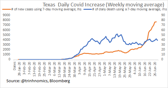
Texas, also a state w/ high surge of Covid, shows this:
New deaths = +15
New Cases = 5303
But new deaths using 7-day moving average = 39 & cases =4170. I do this to smooth out vol & u see that deaths are down in the blue line while orange surges!
New deaths = +15
New Cases = 5303
But new deaths using 7-day moving average = 39 & cases =4170. I do this to smooth out vol & u see that deaths are down in the blue line while orange surges!
Texas fatality shows that fatality is falling if u use Covid deaths now/ Covid cases two weeks ago = 1.7%, down from 1.9% previously & the trends are showing below.
Blue is current deaths/current cases (7-day moving average of course).
Blue is current deaths/current cases (7-day moving average of course).
Florida, another state w/ high surge of Covid-19 cases:
New deaths = +58 (yesterday 81)
New cases = +6,093 (yesterday was 23,381)
So clearly volatile so u do a 7-day moving average to show trends & it shows deaths are flat.
CA, Florida & Texas fatality all lower than national.
New deaths = +58 (yesterday 81)
New cases = +6,093 (yesterday was 23,381)
So clearly volatile so u do a 7-day moving average to show trends & it shows deaths are flat.
CA, Florida & Texas fatality all lower than national.
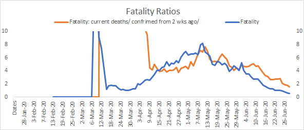
Florida daily change fatality:
Current fatality is very low at 0.5%
If you lag using current deaths/current fatality of two weeks ago then 1.6% from 1.8% yesterday & trend is downward even if we lag.
So it means fatality is falling!
Current fatality is very low at 0.5%
If you lag using current deaths/current fatality of two weeks ago then 1.6% from 1.8% yesterday & trend is downward even if we lag.
So it means fatality is falling!
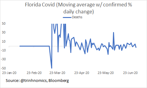
This is a chart of deaths & percentage change per day (using 7-day moving average new daily) & you can see that we still haven& #39;t seen a massive spike.
And u can see that already in the absolute numbers I showed earlier but this is the math of the rate of daily change . https://abs.twimg.com/emoji/v2/... draggable="false" alt="👇🏻" title="Rückhand Zeigefinger nach unten (heller Hautton)" aria-label="Emoji: Rückhand Zeigefinger nach unten (heller Hautton)">
And u can see that already in the absolute numbers I showed earlier but this is the math of the rate of daily change .
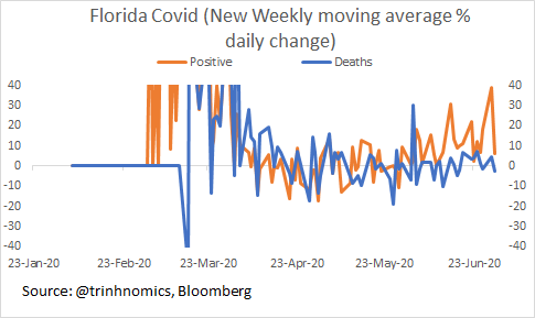
Deaths & cases: We compare deaths rate of change daily & also rate of change of new cases.
You can see that the orange line & blue line diverge in rate of growth & that& #39;s already in the level chart earlier & also the fatality ratios declining. Just another way to analyze. https://abs.twimg.com/emoji/v2/... draggable="false" alt="👇🏻" title="Rückhand Zeigefinger nach unten (heller Hautton)" aria-label="Emoji: Rückhand Zeigefinger nach unten (heller Hautton)">
 https://abs.twimg.com/emoji/v2/... draggable="false" alt="👇🏻" title="Rückhand Zeigefinger nach unten (heller Hautton)" aria-label="Emoji: Rückhand Zeigefinger nach unten (heller Hautton)">
 https://abs.twimg.com/emoji/v2/... draggable="false" alt="👇🏻" title="Rückhand Zeigefinger nach unten (heller Hautton)" aria-label="Emoji: Rückhand Zeigefinger nach unten (heller Hautton)">
You can see that the orange line & blue line diverge in rate of growth & that& #39;s already in the level chart earlier & also the fatality ratios declining. Just another way to analyze.
In California, Texas & Florida:
*Deaths are down even if cases are up
*Relative deaths are down (fatality ratios), and even if we us lag of 2 weeks, deaths are down.
Okay, someone asked me to do Arizona (a fellow finance person over IB https://abs.twimg.com/emoji/v2/... draggable="false" alt="👋🏻" title="Waving hand (heller Hautton)" aria-label="Emoji: Waving hand (heller Hautton)">) so here it is:
Deaths +47
Cases+4683
*Deaths are down even if cases are up
*Relative deaths are down (fatality ratios), and even if we us lag of 2 weeks, deaths are down.
Okay, someone asked me to do Arizona (a fellow finance person over IB
Deaths +47
Cases+4683
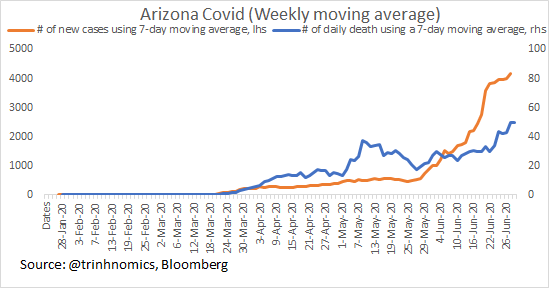
As previously stated, because daily changes can be so volatile, we do 7-day moving average daily change & you can see that:
a) Cases rising rapidly
b) Deaths also rising but slower.
Let& #39;s look at ratios & rate of change!
a) Cases rising rapidly
b) Deaths also rising but slower.
Let& #39;s look at ratios & rate of change!
Arizona is different in that absolute deaths are rising, although let& #39;s not forget that its fatality ratios are still lower than the USA average.
Fatality of current deaths/current cases = 1.2%, same as yesterday
Current deaths/confirmed 2 wks =2.2% down from 2.3%
Fatality of current deaths/current cases = 1.2%, same as yesterday
Current deaths/confirmed 2 wks =2.2% down from 2.3%
Arizona Covid deaths % daily change. Chart to the left is daily % change using the 7-day moving average & chart to the right is smoothing further by taking the 4-day moving average. Still shows the same:
Increase & some trending down but no spike (well hopefully ever & not yet)
Increase & some trending down but no spike (well hopefully ever & not yet)
Let& #39;s look at some other factors for Arizona (CA testing ratio is about 10% of population & the hit ratio is about 5%).
Here is Arizona. It has tested in total 302k w/ a cumulative hit ratio of 6.7% positive & so it has tested less as a share of population than CA (pop = 7.5m)
Here is Arizona. It has tested in total 302k w/ a cumulative hit ratio of 6.7% positive & so it has tested less as a share of population than CA (pop = 7.5m)
Basically it has tested 4% of total population (the US has tested about 10% total) so it is behind the USA by a long shot and so when it does test people, it is finding out more hit ratios as well.
The latest positive is 8.4% so higher. Let& #39;s look at hospitalization ratios.
The latest positive is 8.4% so higher. Let& #39;s look at hospitalization ratios.
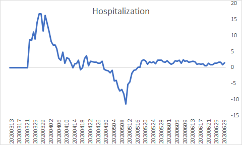
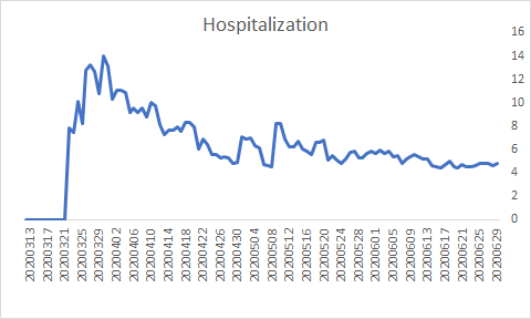
There are 2 ways that I do it:
a) Total # of people now in hospital = 300/(total cases - total recovered =) = 6191 so 300/6191 = 4.8%
or
b) Change of cases/ change in hospital = 1.5%
Either way, u get a trend that is downward!
So new cases = less hospitalization!
a) Total # of people now in hospital = 300/(total cases - total recovered =) = 6191 so 300/6191 = 4.8%
or
b) Change of cases/ change in hospital = 1.5%
Either way, u get a trend that is downward!
So new cases = less hospitalization!
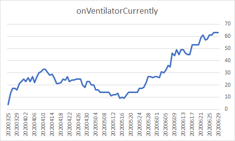
Next, let& #39;s look at ventilators usage. Arizona doesn& #39;t have ICU data so let& #39;s use vents. So far we know that:
a) Deaths rising but rate is not spiking & gently upward from a low base
b) Fatality is falling
c) Hospitalization falling
d) Vents use is up to 63.
Let& #39;s look at ratios
a) Deaths rising but rate is not spiking & gently upward from a low base
b) Fatality is falling
c) Hospitalization falling
d) Vents use is up to 63.
Let& #39;s look at ratios
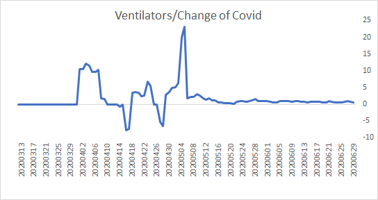
So there are two ways to take the ventilator ratios:
Either cumulative vents use change / cumulative case change = 0.6%
or taking the change of current vents/ daily new cases = 0.05%
What we care about is trends & so:
New Covid = less hospitalization & less vents use https://abs.twimg.com/emoji/v2/... draggable="false" alt="👇🏻" title="Rückhand Zeigefinger nach unten (heller Hautton)" aria-label="Emoji: Rückhand Zeigefinger nach unten (heller Hautton)">
Either cumulative vents use change / cumulative case change = 0.6%
or taking the change of current vents/ daily new cases = 0.05%
What we care about is trends & so:
New Covid = less hospitalization & less vents use
Meaning, we may get an increase of deaths but that increase isn& #39;t going to be proportion to an increase of cases for a wide range of reasons, including:
*Better treatment (hospitalization ratio falling & vents/ICU falling)
*Earlier detection of virus & likely many asymptomatic https://abs.twimg.com/emoji/v2/... draggable="false" alt="👈🏻" title="Rückhand Zeigefinger nach links (heller Hautton)" aria-label="Emoji: Rückhand Zeigefinger nach links (heller Hautton)">
*Better treatment (hospitalization ratio falling & vents/ICU falling)
*Earlier detection of virus & likely many asymptomatic
For those interested:
Covid Data is free & widely available. And you can get it here & download & make all the charts you like all day everyday https://abs.twimg.com/emoji/v2/... draggable="false" alt="🤗" title="Umarmendes Gesicht" aria-label="Emoji: Umarmendes Gesicht">
 https://abs.twimg.com/emoji/v2/... draggable="false" alt="🤓" title="Nerd-Gesicht" aria-label="Emoji: Nerd-Gesicht">
 https://abs.twimg.com/emoji/v2/... draggable="false" alt="💃🏻" title="Woman dancing (heller Hautton)" aria-label="Emoji: Woman dancing (heller Hautton)">!!
https://covidtracking.com/
Sincerely,
https://covidtracking.com/">... href="https://twitter.com/Trinhnomics">@Trinhnomics
Going for a hike now! Free & healthy & wholesome & what a clear day in HK!
Covid Data is free & widely available. And you can get it here & download & make all the charts you like all day everyday
https://covidtracking.com/
Sincerely,
Going for a hike now! Free & healthy & wholesome & what a clear day in HK!

 Read on Twitter



 " title="This is a chart of deaths & percentage change per day (using 7-day moving average new daily) & you can see that we still haven& #39;t seen a massive spike. And u can see that already in the absolute numbers I showed earlier but this is the math of the rate of daily change . https://abs.twimg.com/emoji/v2/... draggable="false" alt="👇🏻" title="Rückhand Zeigefinger nach unten (heller Hautton)" aria-label="Emoji: Rückhand Zeigefinger nach unten (heller Hautton)">" class="img-responsive" style="max-width:100%;"/>
 https://abs.twimg.com/emoji/v2/... draggable="false" alt="👇🏻" title="Rückhand Zeigefinger nach unten (heller Hautton)" aria-label="Emoji: Rückhand Zeigefinger nach unten (heller Hautton)">https://abs.twimg.com/emoji/v2/... draggable="false" alt="👇🏻" title="Rückhand Zeigefinger nach unten (heller Hautton)" aria-label="Emoji: Rückhand Zeigefinger nach unten (heller Hautton)">" title="Deaths & cases: We compare deaths rate of change daily & also rate of change of new cases.You can see that the orange line & blue line diverge in rate of growth & that& #39;s already in the level chart earlier & also the fatality ratios declining. Just another way to analyze.https://abs.twimg.com/emoji/v2/... draggable="false" alt="👇🏻" title="Rückhand Zeigefinger nach unten (heller Hautton)" aria-label="Emoji: Rückhand Zeigefinger nach unten (heller Hautton)">https://abs.twimg.com/emoji/v2/... draggable="false" alt="👇🏻" title="Rückhand Zeigefinger nach unten (heller Hautton)" aria-label="Emoji: Rückhand Zeigefinger nach unten (heller Hautton)">https://abs.twimg.com/emoji/v2/... draggable="false" alt="👇🏻" title="Rückhand Zeigefinger nach unten (heller Hautton)" aria-label="Emoji: Rückhand Zeigefinger nach unten (heller Hautton)">" class="img-responsive" style="max-width:100%;"/>
 ) so here it is:Deaths +47Cases+4683" title="In California, Texas & Florida:*Deaths are down even if cases are up*Relative deaths are down (fatality ratios), and even if we us lag of 2 weeks, deaths are down.Okay, someone asked me to do Arizona (a fellow finance person over IB https://abs.twimg.com/emoji/v2/... draggable="false" alt="👋🏻" title="Waving hand (heller Hautton)" aria-label="Emoji: Waving hand (heller Hautton)">) so here it is:Deaths +47Cases+4683" class="img-responsive" style="max-width:100%;"/>


 " title="So there are two ways to take the ventilator ratios:Either cumulative vents use change / cumulative case change = 0.6%or taking the change of current vents/ daily new cases = 0.05%What we care about is trends & so:New Covid = less hospitalization & less vents use https://abs.twimg.com/emoji/v2/... draggable="false" alt="👇🏻" title="Rückhand Zeigefinger nach unten (heller Hautton)" aria-label="Emoji: Rückhand Zeigefinger nach unten (heller Hautton)">" class="img-responsive" style="max-width:100%;"/>


