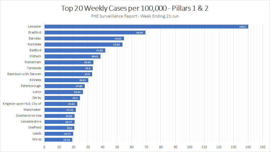
Thanks to @danielhowdon for spotting that they& #39;ve published the underlying data for the weekly case (pillar 1 & 2) regional graphic in the surveillance report. That means we can look at the data in a more simple / comparative way. E.g.
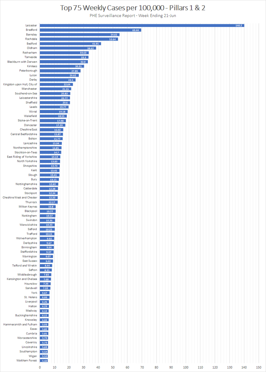
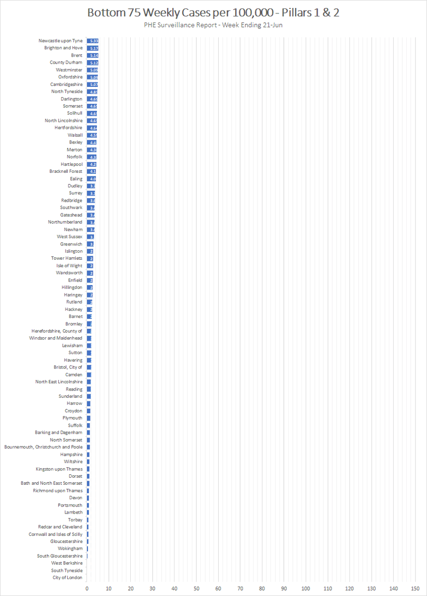
Not saying these numbers are correct (usual potential problems around different levels of testing per region, duplicate tests etc.) but you can definitely see why they& #39;re focusing on Leicester. Here the full list of 150 split into 2 sections:
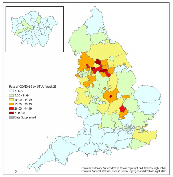
For reference, this is how the data is presented in the surveillance report. I prefer the simpler list view though.
As Daniel also says, this data can be used to extrapolate actual pillar 2 numbers by using known p1 values and population sizes. I quite like it in 100K form though as it& #39;s better for comparison. https://twitter.com/danielhowdon/status/1278060940953559043?s=20">https://twitter.com/danielhow...

 Read on Twitter


