What up its ya level design boi.
Back at it again with another design lesson on #TheLastofUsPartII https://abs.twimg.com/hashflags... draggable="false" alt="">
This time. Colours and framing.
#leveldesign #gamedev
Back at it again with another design lesson on #TheLastofUsPartII
This time. Colours and framing.
#leveldesign #gamedev
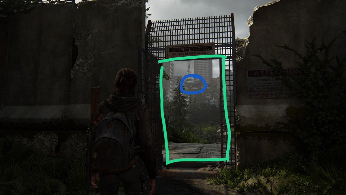
Great framing here with the BLUE tower acting as a focal point. Keeping the player& #39;s goal in mind. Framed by the gate to focus attention.
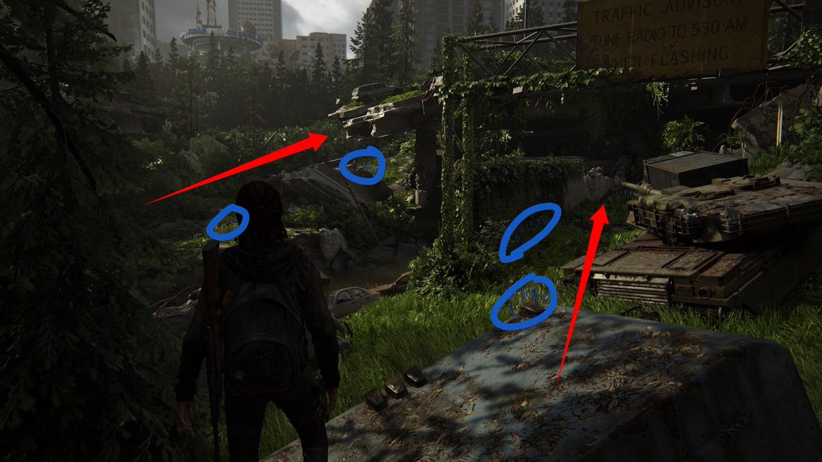
Use of BLUE flowers indicate possible paths for the player to take towards the BLUE building.
Seeing a pattern here?
Seeing a pattern here?
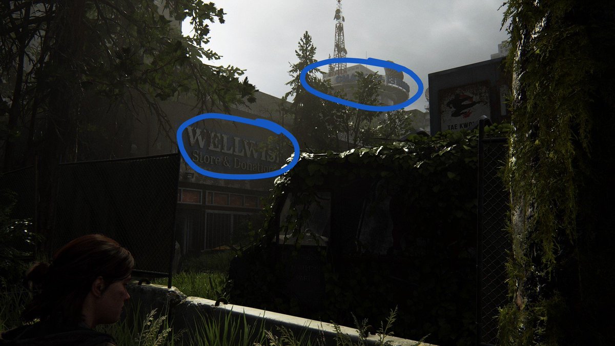
The BLUE sign indicates the player is on the correct path towards their destination. Which is always kept in sight to show their progression.
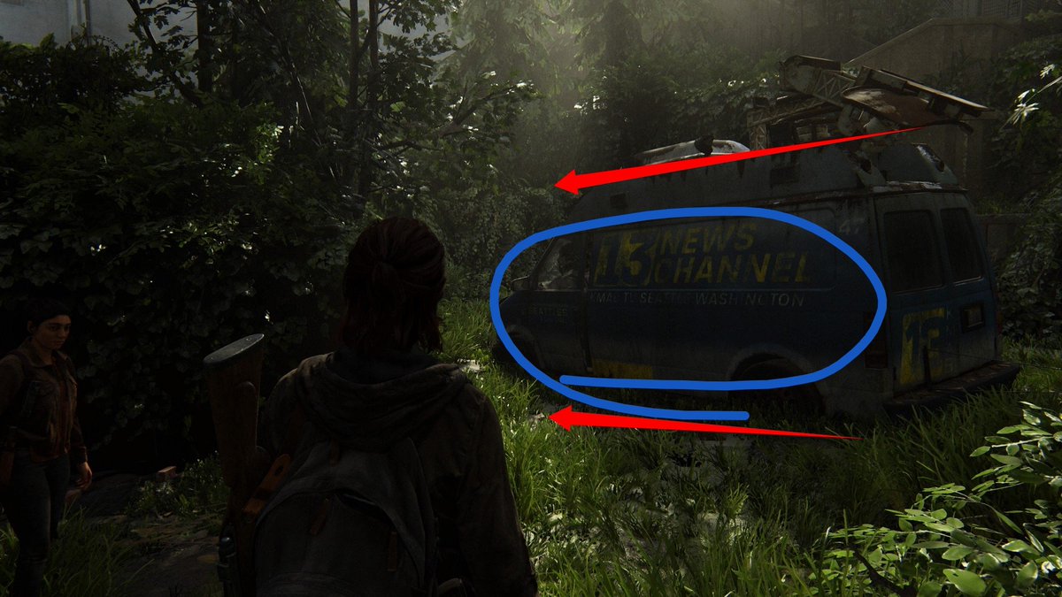
Oh look. A BLUE van. Looks like I& #39;m going the right way.
This coupled with the direction of the van leading the player left towards their goal.
This coupled with the direction of the van leading the player left towards their goal.
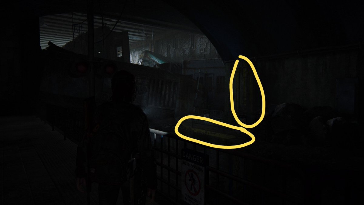
Time for some classic NaughtyDog YELLOW.
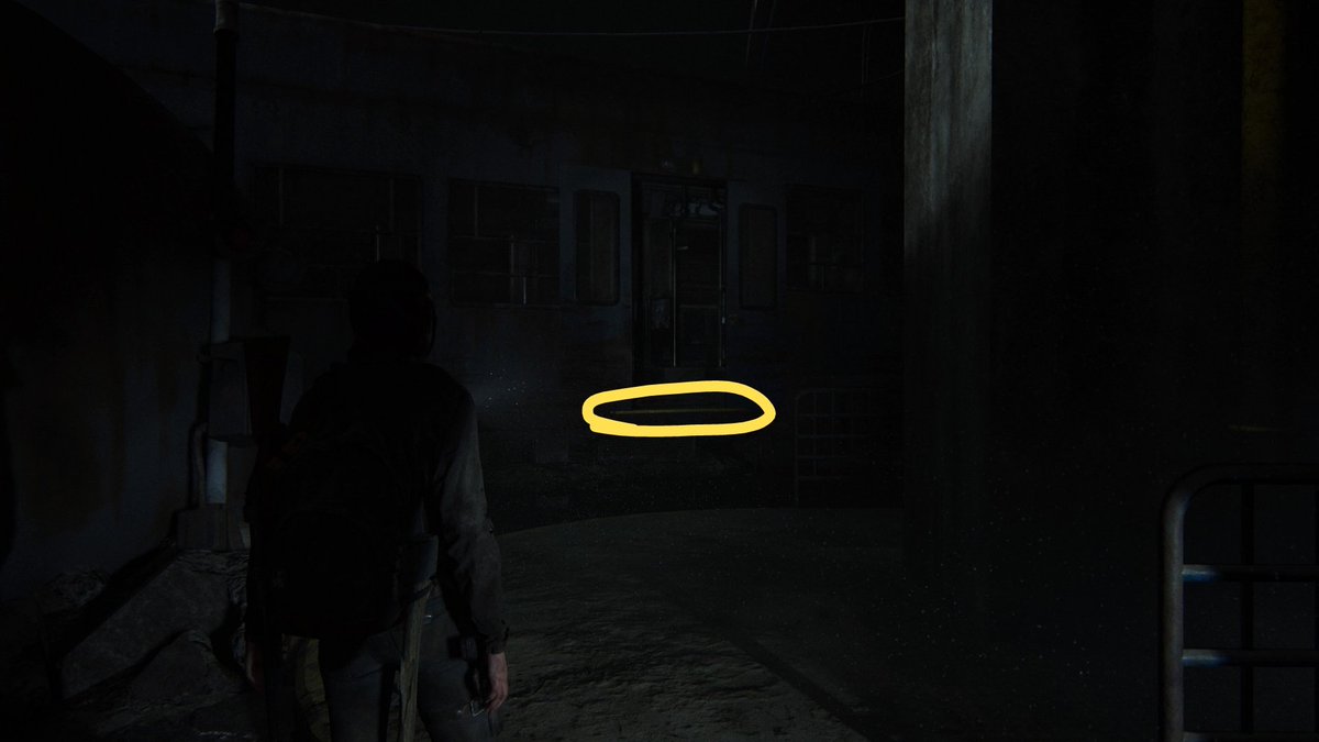
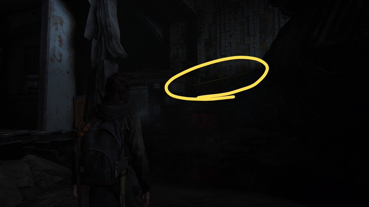
The bright YELLOW cuts through the darkness to provide the player grounding and hinting at the location.
The bright YELLOW cuts through the darkness to provide the player grounding and hinting at the location.
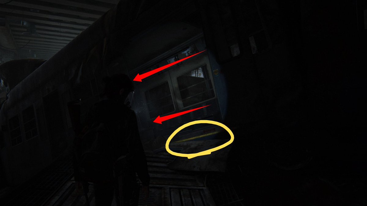
The YELLOW rim of the train showing the player not only direction. But also the fact they can climb up this. (As taught earlier in the game)
Final piece of NaughtyDog YELLOW reassures the player that they are on the correct path along with subtle guiding lines to indicate the player should turn left.

 Read on Twitter