Striped clubs are, in my opinion, the hardest to design. Keep it traditional and it& #39;s boring, play around too much and its blasphemous.
Here& #39;s my take on the @Inter home kit in recent years.
A Thread
Here& #39;s my take on the @Inter home kit in recent years.
A Thread
2015/16
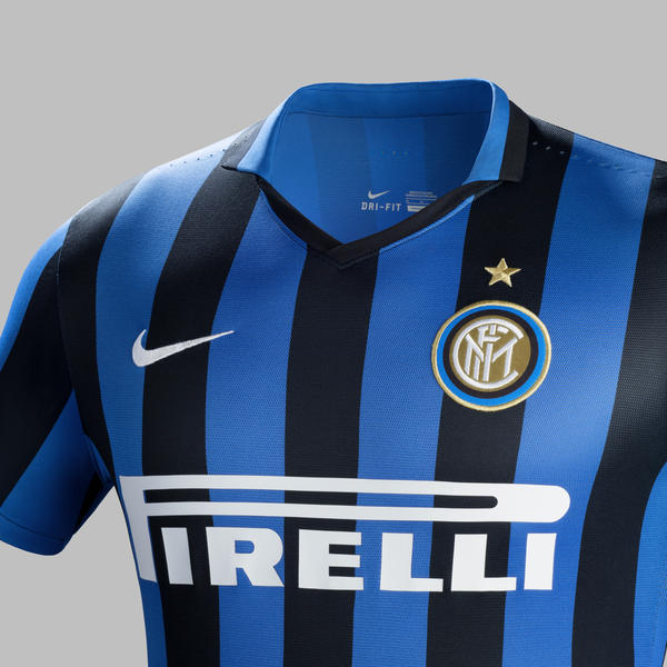
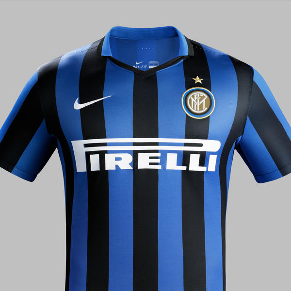
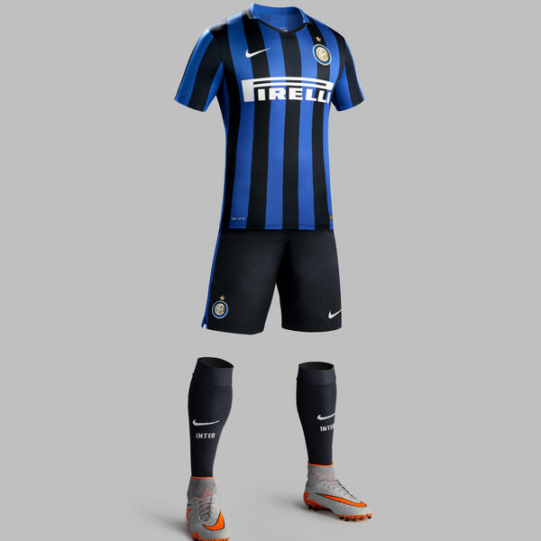
The last of the real "classic" kits: polo colour - same stripe width - stripes on front, back and sleeves - white branding and sponsor.
The last of the real "classic" kits: polo colour - same stripe width - stripes on front, back and sleeves - white branding and sponsor.
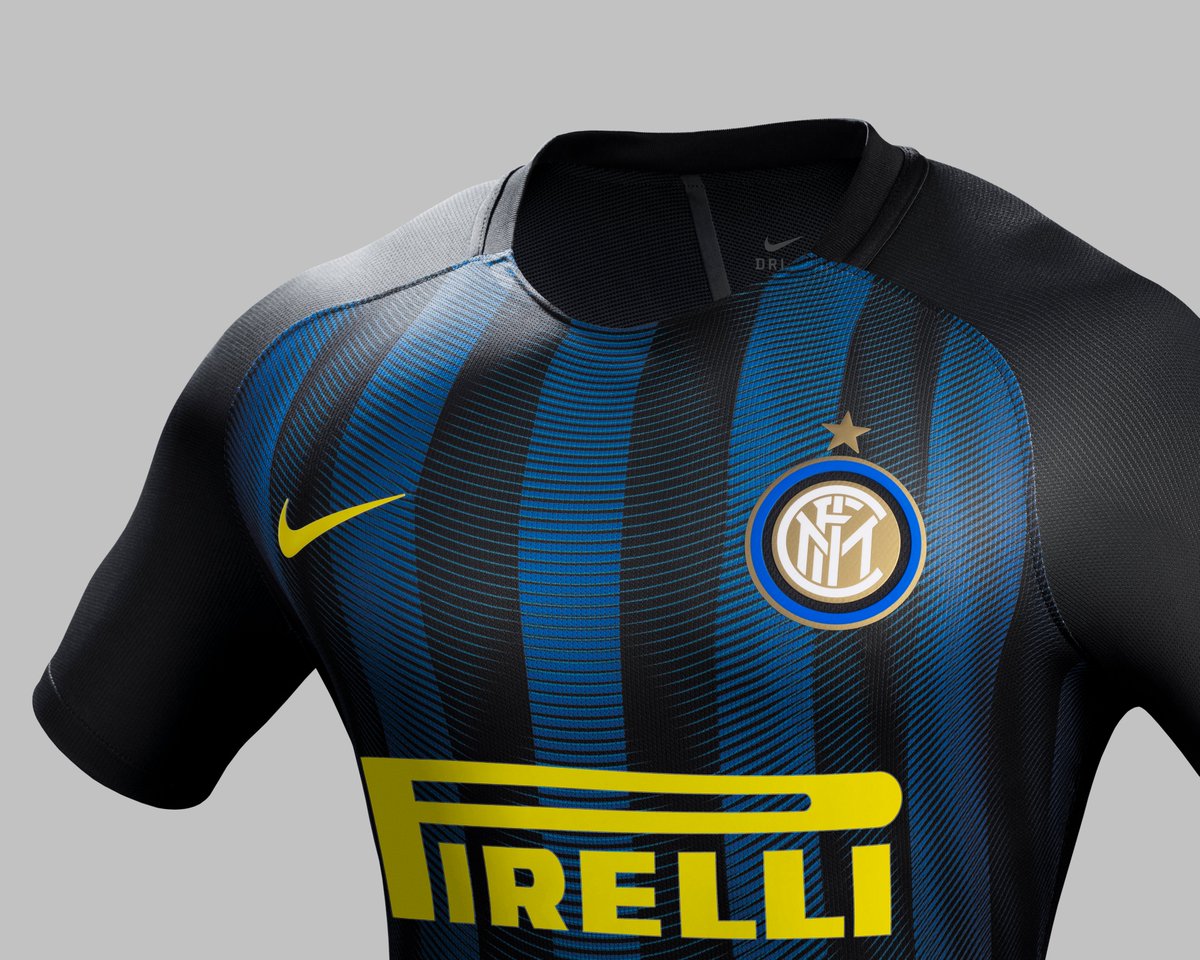
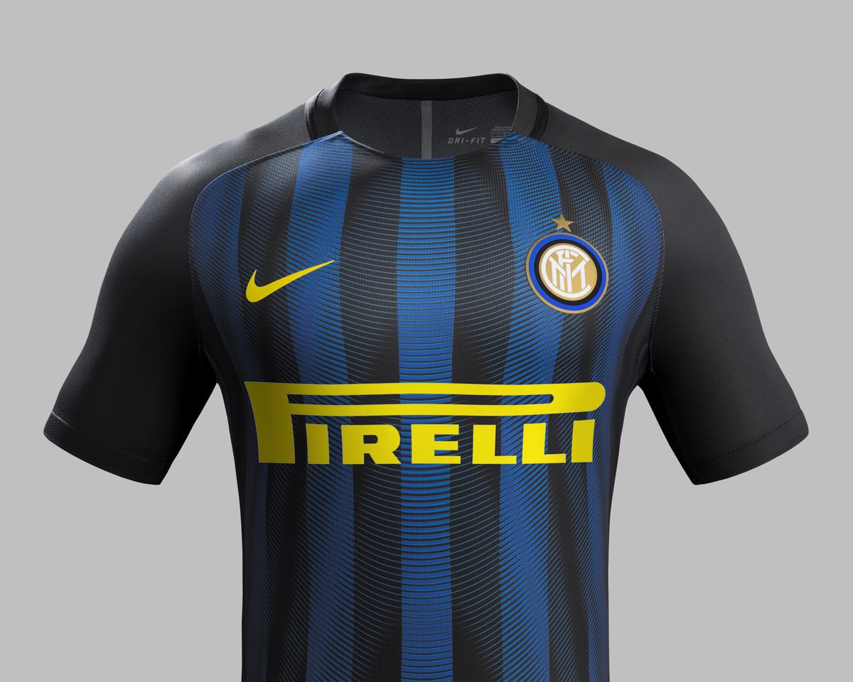
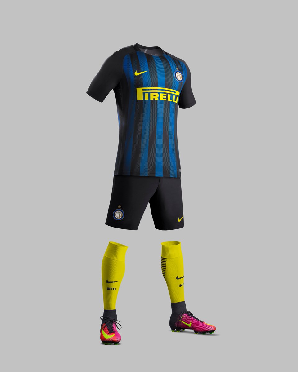
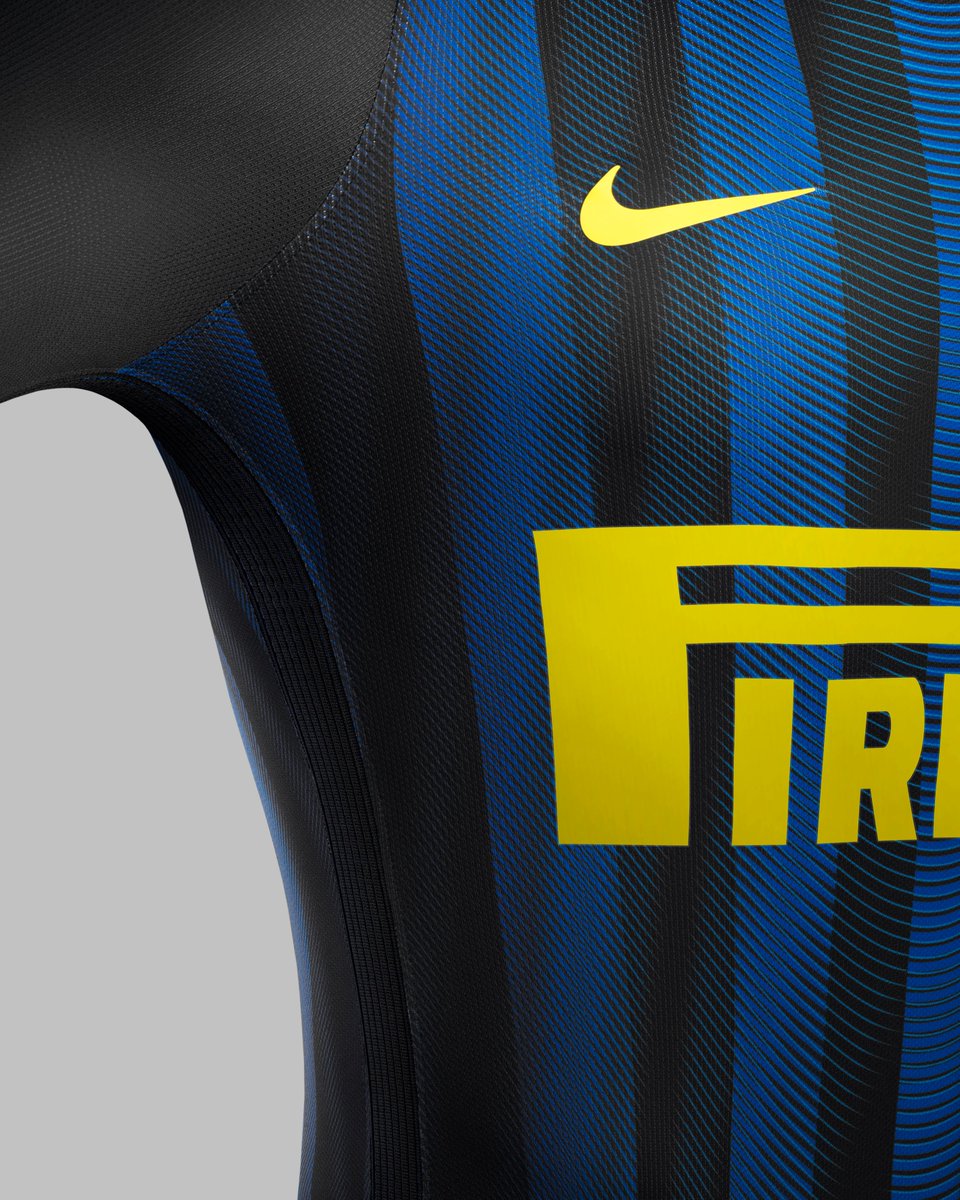
2016/17
Sponsor and branding colour falls in line with Nike& #39;s contrast socks horizontal direction. Stripes only on the front and back with a graphic inside gives the perception of big change. A great job of bringing newness but whilst not having to change the stripes too much.
Sponsor and branding colour falls in line with Nike& #39;s contrast socks horizontal direction. Stripes only on the front and back with a graphic inside gives the perception of big change. A great job of bringing newness but whilst not having to change the stripes too much.
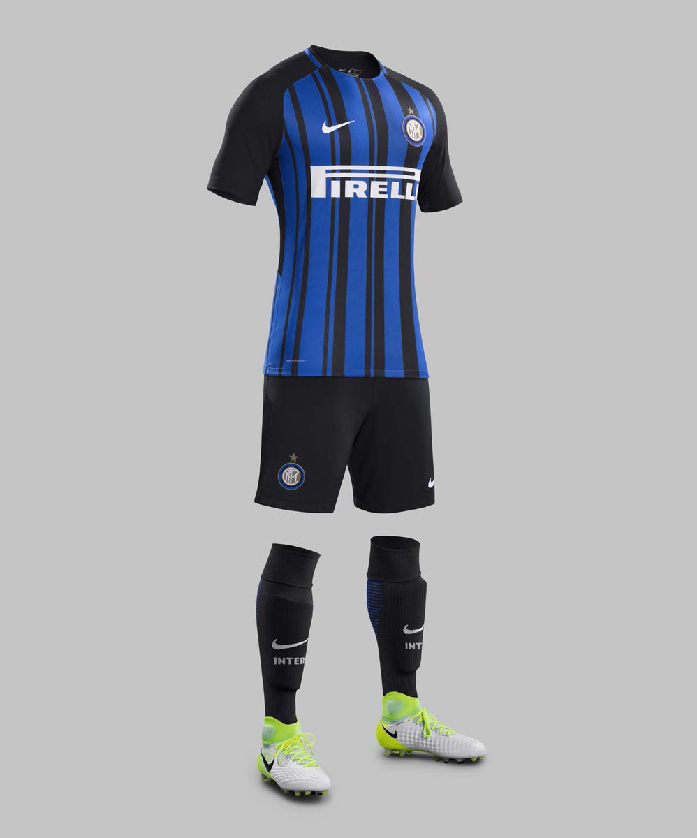
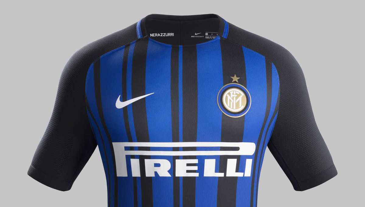
2017/18
Sponsor back to white and different widths of stripe. With a solid stripe returning, the blue is changed back to its vivid best. Here, the designer has done a great job of still creating a difference whilst having to use the black sleeves dictated by the base style.
Sponsor back to white and different widths of stripe. With a solid stripe returning, the blue is changed back to its vivid best. Here, the designer has done a great job of still creating a difference whilst having to use the black sleeves dictated by the base style.
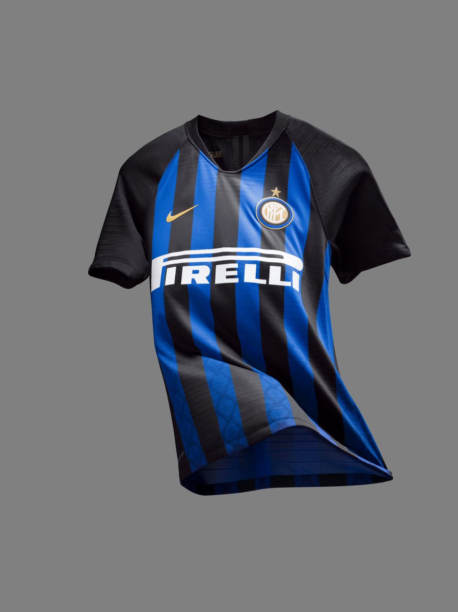
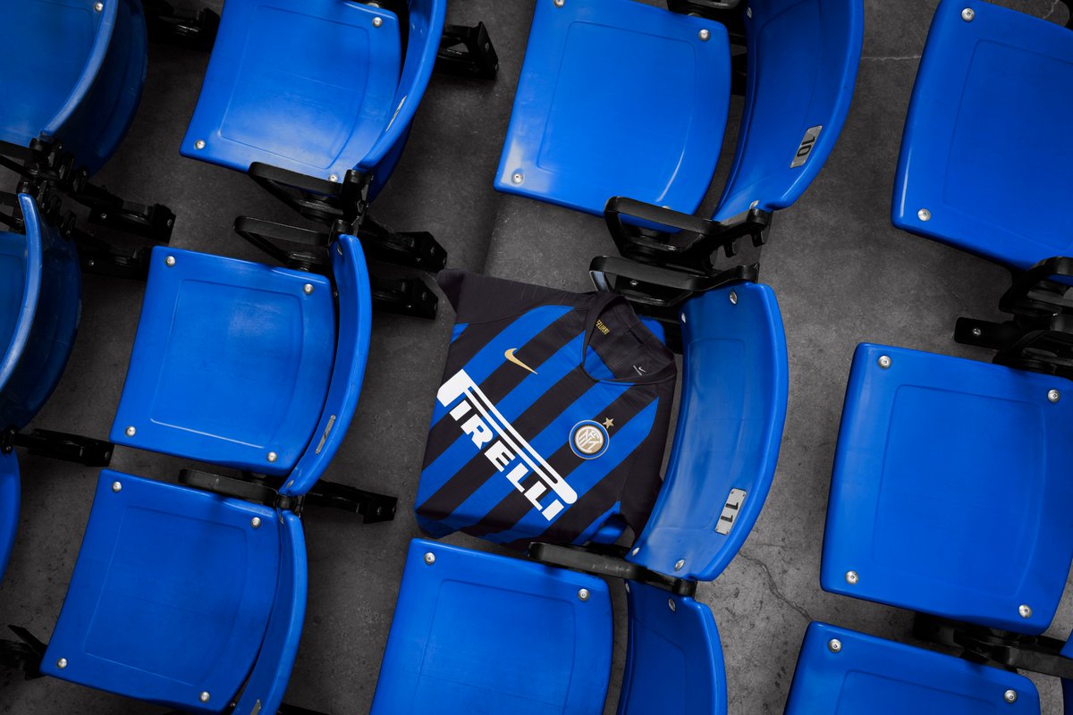
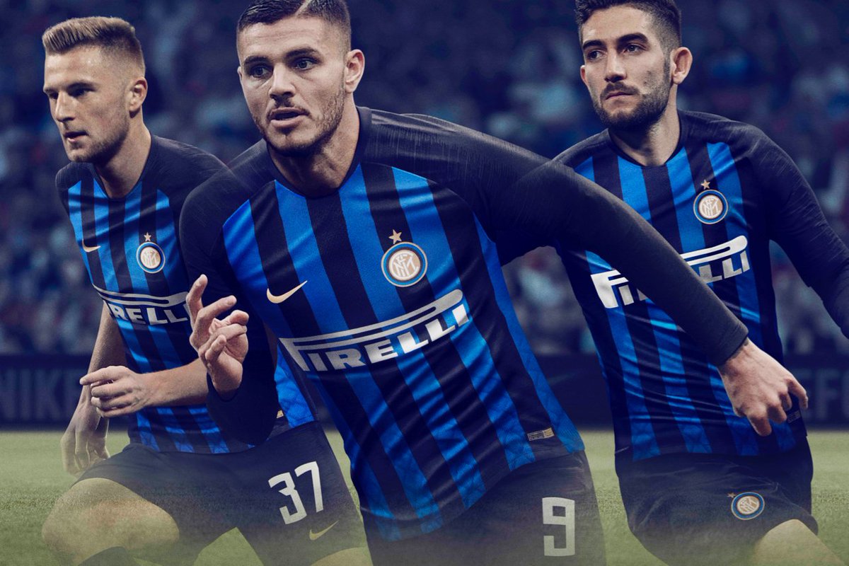
2018/19
Again, the base style means no stripes on the sleeves so it back to regular stripe width with a graphic in side the stripes. A good job of creating difference from 17/18 (stripes) and 16/17 (shade of blue and branding/sponsor colour)
Again, the base style means no stripes on the sleeves so it back to regular stripe width with a graphic in side the stripes. A good job of creating difference from 17/18 (stripes) and 16/17 (shade of blue and branding/sponsor colour)
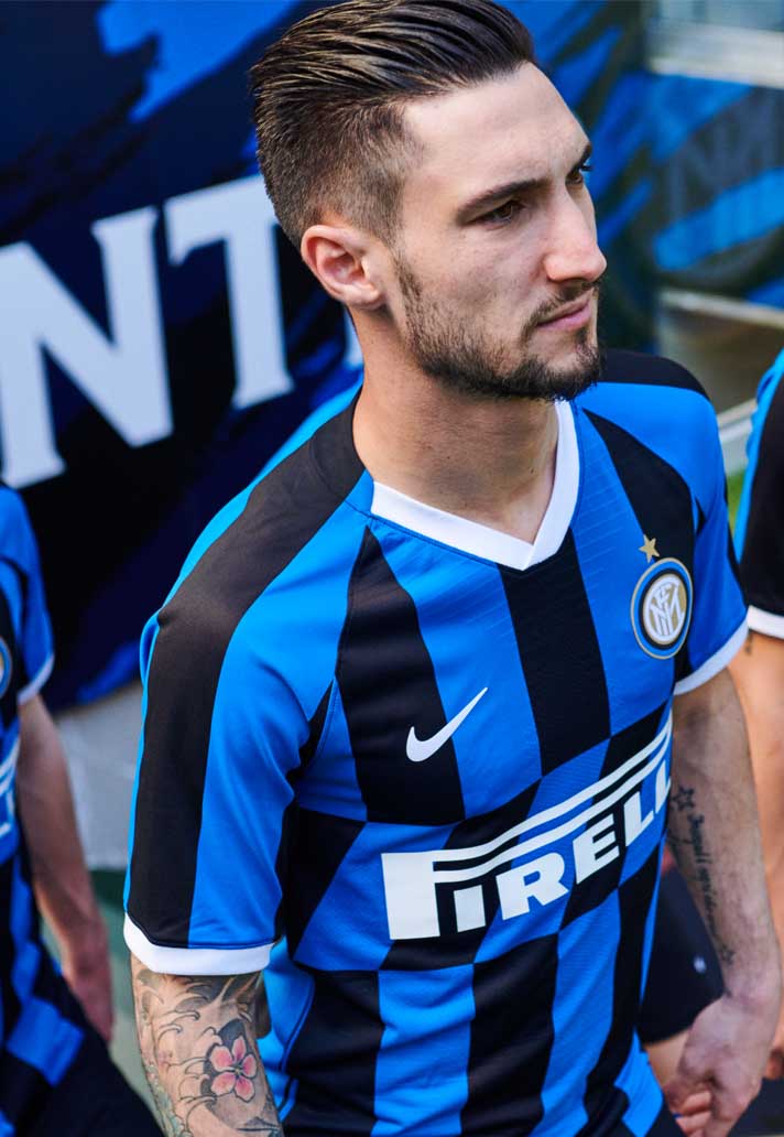
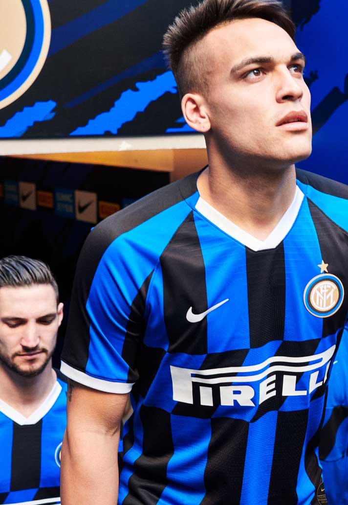
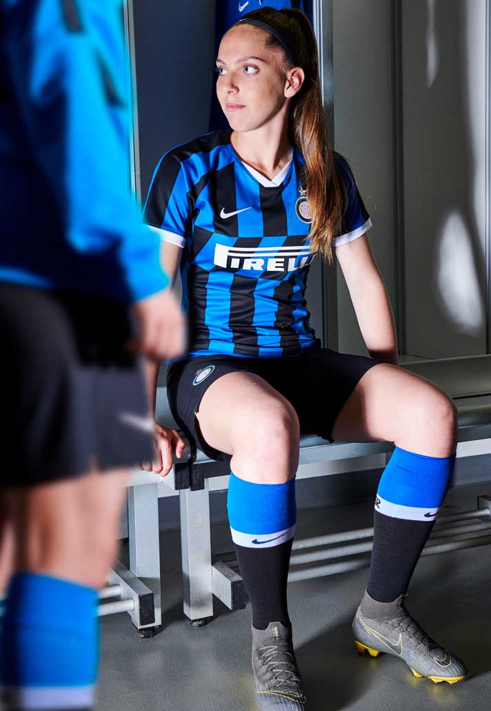
2019/20
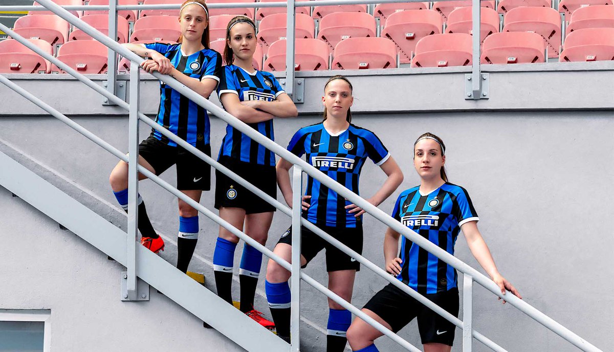
My favourite of the bunch. Regular stripe returns with no graphic, on front back and sleeves. Amazing use of the sponsor box with the diagonal stripes and the use of white as an accent on the collar/cuffs and not just the trims, is a great change of pace.
My favourite of the bunch. Regular stripe returns with no graphic, on front back and sleeves. Amazing use of the sponsor box with the diagonal stripes and the use of white as an accent on the collar/cuffs and not just the trims, is a great change of pace.
2020/21
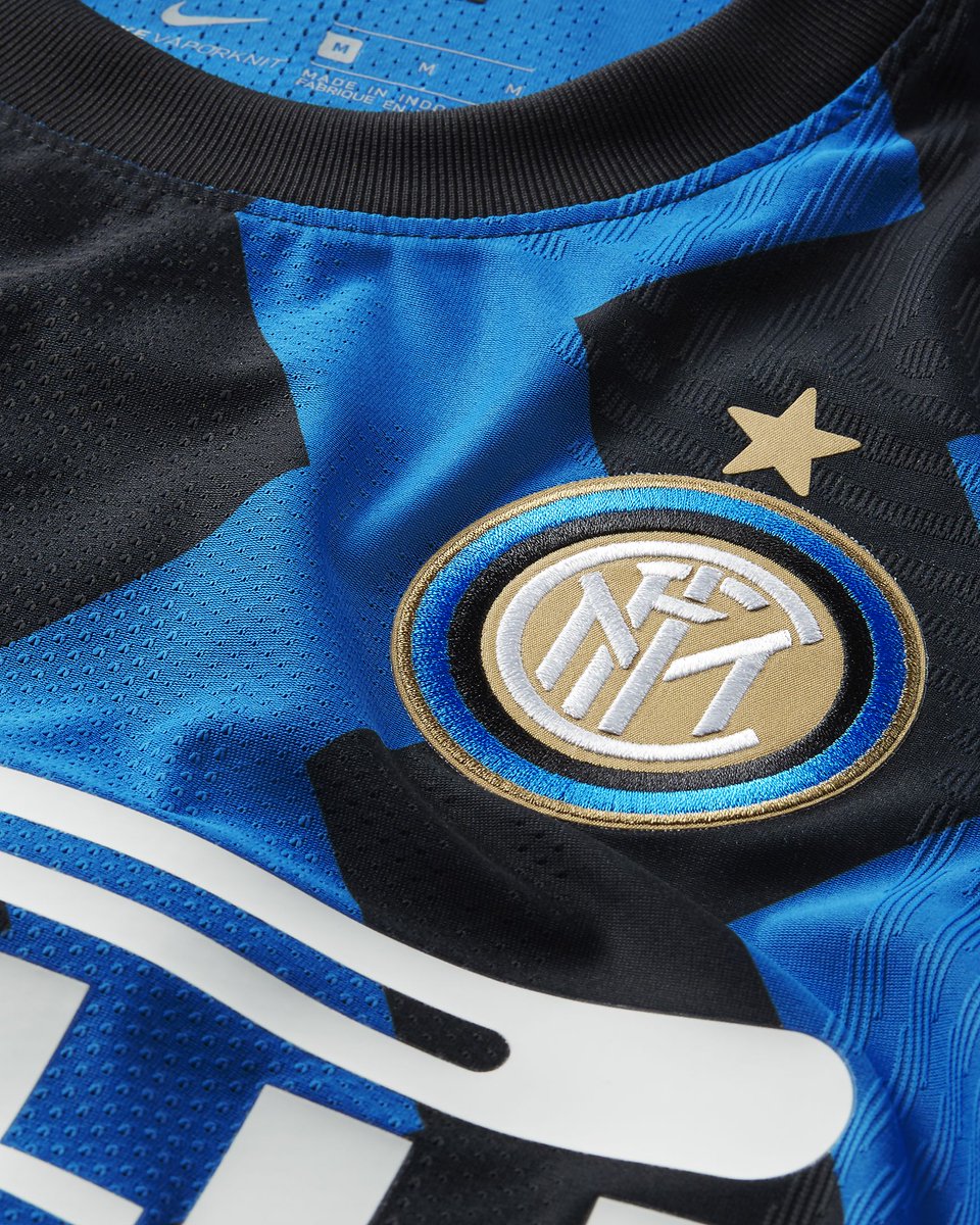
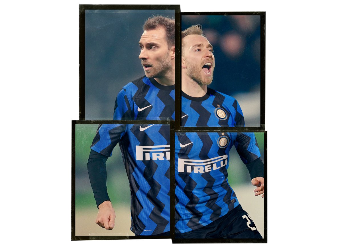
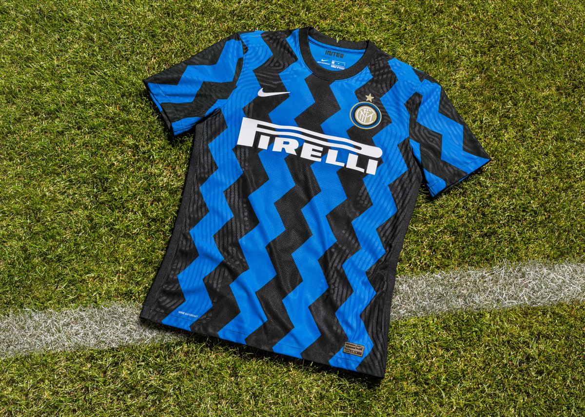
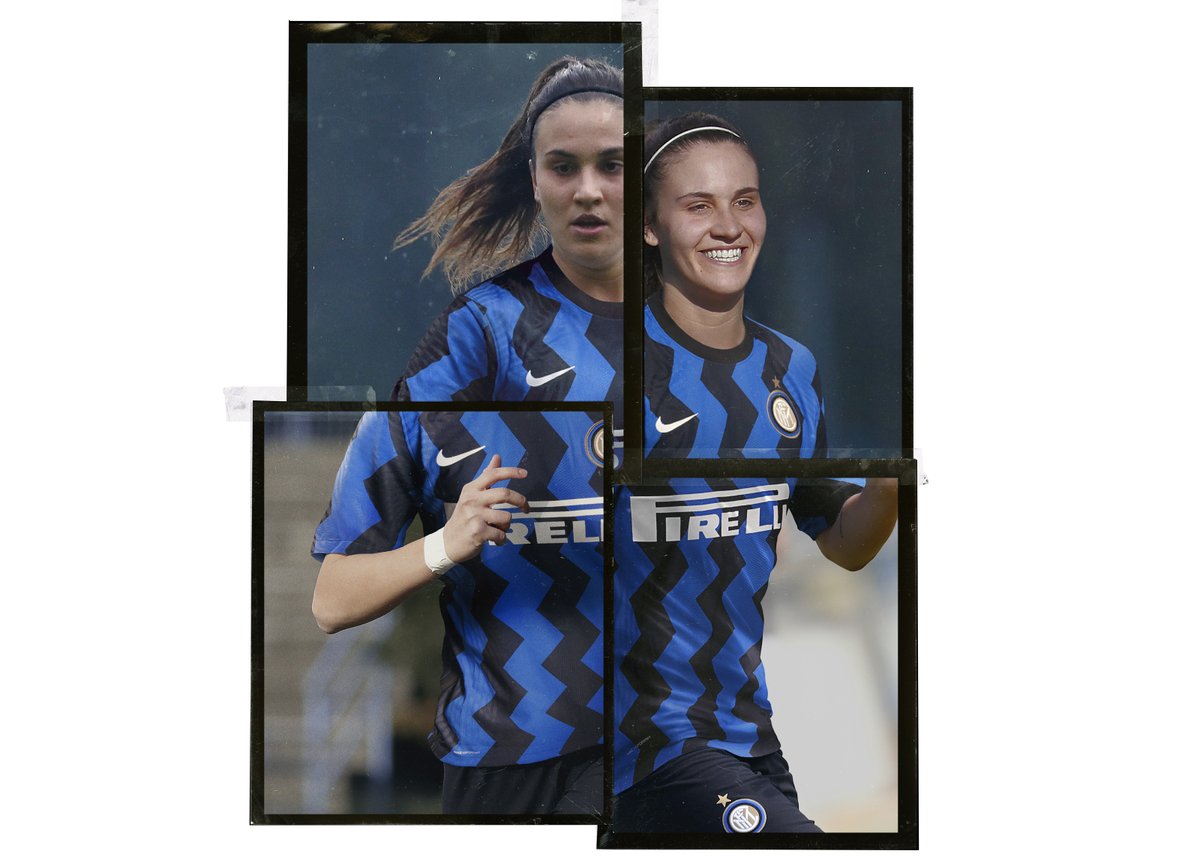
Today& #39;s launch marks a departure from the straight vertical stripe and looks to play more with shape. Yes, this will be polarising, but for me this is still stripes and not a departure to the extent of Juve or Barcelona.
Today& #39;s launch marks a departure from the straight vertical stripe and looks to play more with shape. Yes, this will be polarising, but for me this is still stripes and not a departure to the extent of Juve or Barcelona.
The key will always be, at first glance does it still look like @inter? For me it’s a definite yes.

 Read on Twitter