Now that we& #39;ve gone through China soft data (don& #39;t forget that this is month over month so we& #39;re still behind pre Covid esp employment), let& #39;s look at USA Covid data.
Bloomberg hasn& #39;t refreshed new stuff so I will look at Covid Tracking data (testing, hospitalization etc). https://twitter.com/Trinhnomics/status/1277769701876133889">https://twitter.com/Trinhnomi...
Bloomberg hasn& #39;t refreshed new stuff so I will look at Covid Tracking data (testing, hospitalization etc). https://twitter.com/Trinhnomics/status/1277769701876133889">https://twitter.com/Trinhnomi...
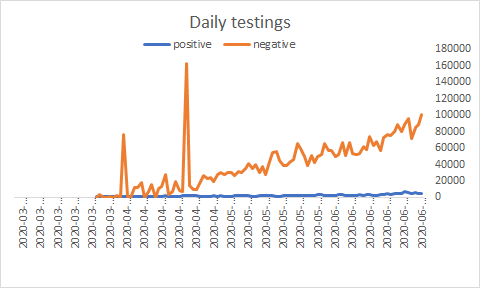
The USA has tested roughly about 10% of its population. JHU has a tracker on tests & positive/test portal u can access. I will do some analysis similar to what they do.
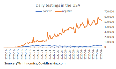
Daily testing in the USA = ~600k level. What we care about also is the hit ratio (as in ratio that is positive
Daily testing in the USA = ~600k level. What we care about also is the hit ratio (as in ratio that is positive
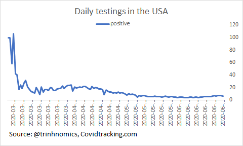
So I took positive/(positive + negative) = ratio of positive over testing daily. Latest hit ratio is 6.4% and that has climbed from the bottom of 3.9% on 12 June 2020.
Meaning, they are testing asymptomatic people to have single-digit hit ratio!
Meaning, they are testing asymptomatic people to have single-digit hit ratio!
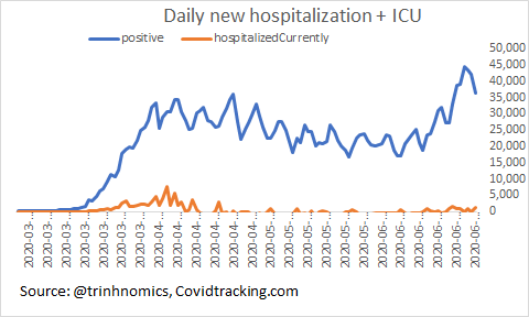
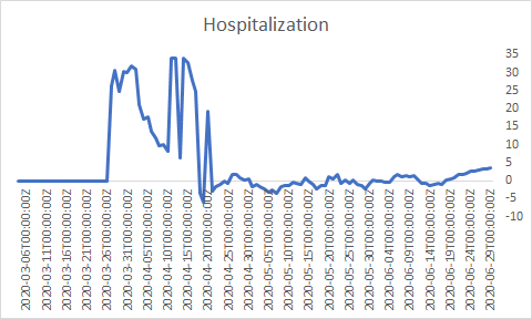
Daily change of Covid-19 cases & daily new hospitalization in the USA.
Notice that you don& #39;t see a correlation of a spike of hospitalization despite massively higher positive cases because of testing: earliest tests only SYMPTOMATIC & later more widespread.
Notice that you don& #39;t see a correlation of a spike of hospitalization despite massively higher positive cases because of testing: earliest tests only SYMPTOMATIC & later more widespread.
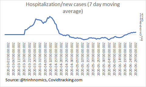
Obviously because of the scale issue, u can& #39;t see the ratios so what I will do is take a ratio of daily new hospitalization/new Covid & I do a 7-day moving average because it& #39;s too messy.
Seems like we& #39;re rising in recent week but still very low at <2% vs 12.5% at peak.
Seems like we& #39;re rising in recent week but still very low at <2% vs 12.5% at peak.
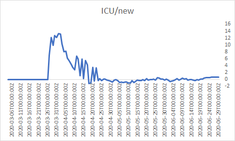
Next, let& #39;s take a look at ICU (intensive care so cases got serious) vs new Covid.
The ratios are below. You can see the following:
Hospitalization is no where near peak & ratio of new ICU/ new Covid = 0.018%
Meaning, cases more mild & treatment at hospitals better!
The ratios are below. You can see the following:
Hospitalization is no where near peak & ratio of new ICU/ new Covid = 0.018%
Meaning, cases more mild & treatment at hospitals better!
Note:
Hospitalization & ICU data incomplete so we& #39;re not getting the whole picture.
That said, we can see trends over time. Ventilators/new cases ratio are below & also low. I also caution against using this as data not complete. Have state data & perhaps good to do! CA is next
Hospitalization & ICU data incomplete so we& #39;re not getting the whole picture.
That said, we can see trends over time. Ventilators/new cases ratio are below & also low. I also caution against using this as data not complete. Have state data & perhaps good to do! CA is next
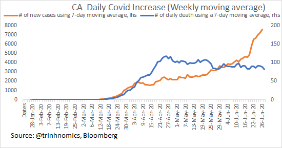
Okay, let& #39;s look at California, my home state. Below is the daily change of California deaths & cases.
Newest deaths = +44
Newest cases = +5976
The ratio of two has been falling.
Newest deaths = +44
Newest cases = +5976
The ratio of two has been falling.
This is California new daily testings & results. It has tested around 10% of its total population & daily ratio of positive/total tests = 5% so testing all sorts & not just people w/ symptoms.
This is what positive testing/total tests daily looks like & it& #39;s falling to about 5%, which is a level the WHO says is good (below good above not so good).
Positive/hospitalization ratio edging up to 3.6% (7-day moving average) but no where near earlier spikes which means that the newly diagnosed people either fight it off or they are detected much earlier & not requiring hospitalization as much.
new ICU/new cases rising but at 0.71% at the latest 7-day moving average so not good news but no where near where it was in March & April.
Treatment in hospital must be getting better as ICU not spiking sharply & we& #39;ll see whether deaths will spike as they remain flat.
Treatment in hospital must be getting better as ICU not spiking sharply & we& #39;ll see whether deaths will spike as they remain flat.
Here is the chart of daily new deaths & daily new cases:
Deaths are falling on an absolute basis https://abs.twimg.com/emoji/v2/... draggable="false" alt="👈🏻" title="Rückhand Zeigefinger nach links (heller Hautton)" aria-label="Emoji: Rückhand Zeigefinger nach links (heller Hautton)">
 https://abs.twimg.com/emoji/v2/... draggable="false" alt="👈🏻" title="Rückhand Zeigefinger nach links (heller Hautton)" aria-label="Emoji: Rückhand Zeigefinger nach links (heller Hautton)">
 https://abs.twimg.com/emoji/v2/... draggable="false" alt="👈🏻" title="Rückhand Zeigefinger nach links (heller Hautton)" aria-label="Emoji: Rückhand Zeigefinger nach links (heller Hautton)">
Deaths are falling on an absolute basis
This is a chart that takes fatality concurrently & one that is current deaths/confirmed of 2 weeks ago & shows the same trends.
The US isn& #39;t the only place where fatality is falling. Covid death rate in hospitals (% of total hospitalised coronavirus patient population dying per day) falling sharply in the UK too. Meaning, it must mean that there is better treatment + other factors
https://www.bbc.com/news/health-53192532">https://www.bbc.com/news/heal...
https://www.bbc.com/news/health-53192532">https://www.bbc.com/news/heal...

 Read on Twitter





 https://abs.twimg.com/emoji/v2/... draggable="false" alt="👈🏻" title="Rückhand Zeigefinger nach links (heller Hautton)" aria-label="Emoji: Rückhand Zeigefinger nach links (heller Hautton)">https://abs.twimg.com/emoji/v2/... draggable="false" alt="👈🏻" title="Rückhand Zeigefinger nach links (heller Hautton)" aria-label="Emoji: Rückhand Zeigefinger nach links (heller Hautton)">" title="Here is the chart of daily new deaths & daily new cases:Deaths are falling on an absolute basis https://abs.twimg.com/emoji/v2/... draggable="false" alt="👈🏻" title="Rückhand Zeigefinger nach links (heller Hautton)" aria-label="Emoji: Rückhand Zeigefinger nach links (heller Hautton)">https://abs.twimg.com/emoji/v2/... draggable="false" alt="👈🏻" title="Rückhand Zeigefinger nach links (heller Hautton)" aria-label="Emoji: Rückhand Zeigefinger nach links (heller Hautton)">https://abs.twimg.com/emoji/v2/... draggable="false" alt="👈🏻" title="Rückhand Zeigefinger nach links (heller Hautton)" aria-label="Emoji: Rückhand Zeigefinger nach links (heller Hautton)">" class="img-responsive" style="max-width:100%;"/>


