NEW:
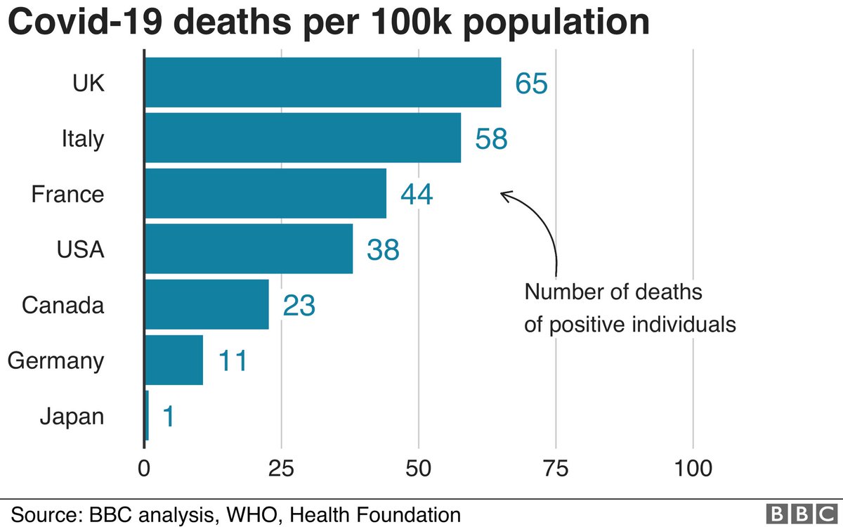
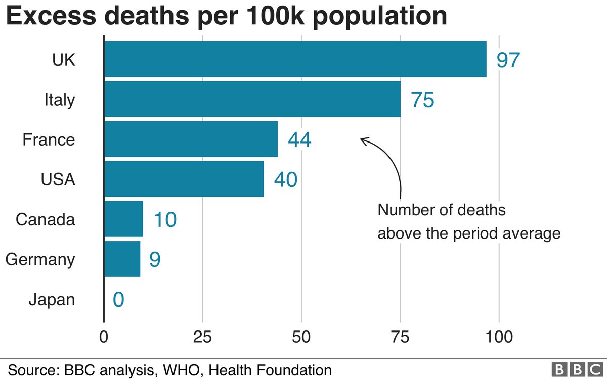
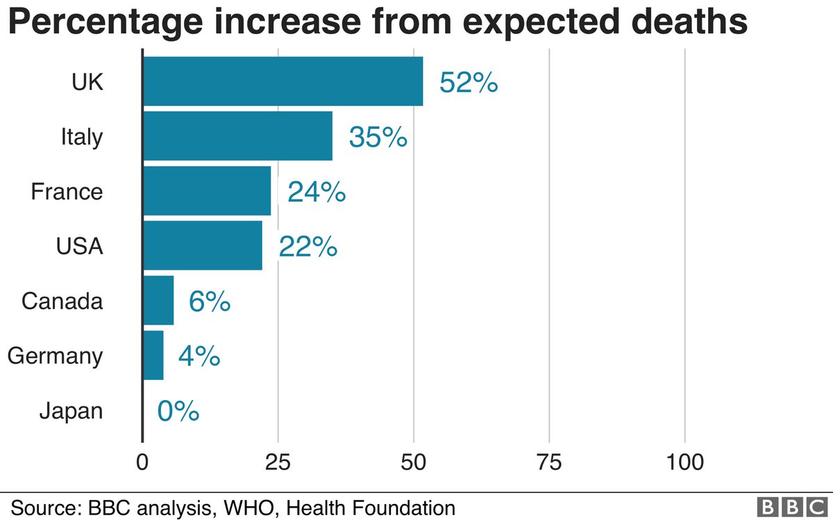
UK hardest hit in G7 by pandemic deaths
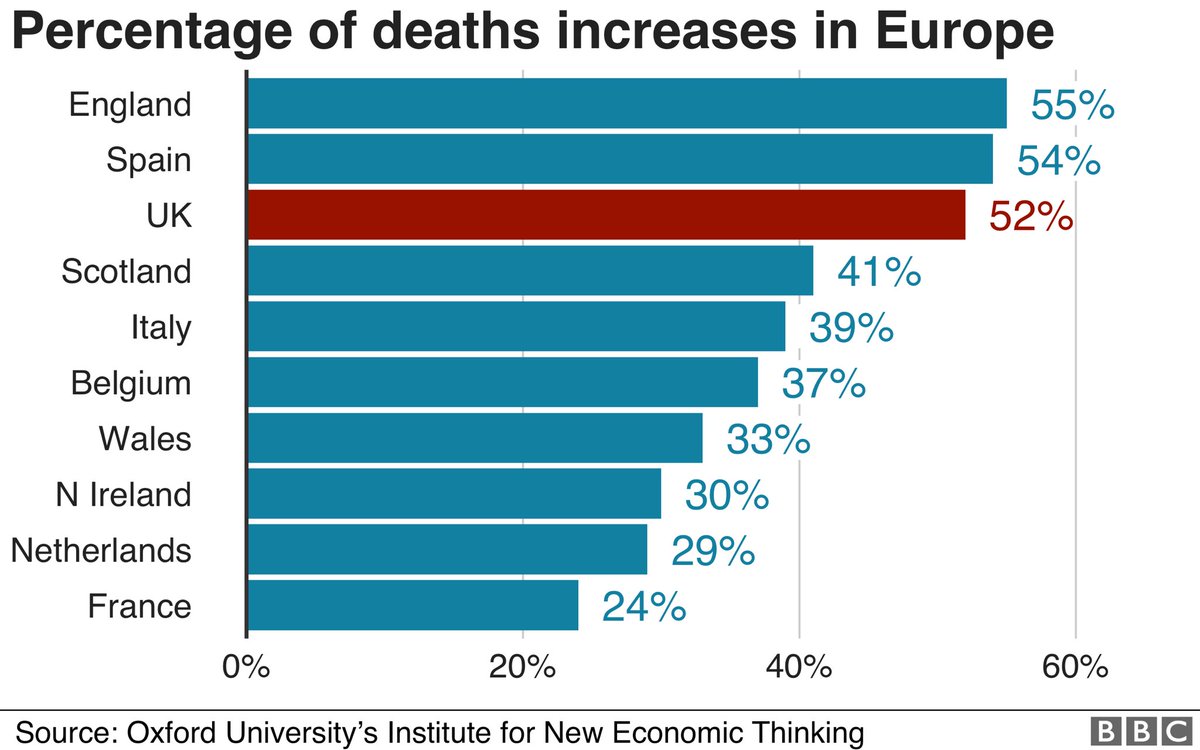
England & Spain hardest hit in Europe
Acc to analysis with @HealthFdn of G7 Covid/excess deaths & separate new Oxford Uni @INETOxford Europe analysis as impact of first wave pandemic becomes clear in many countries:
More #BBCNewsSix
UK hardest hit in G7 by pandemic deaths
England & Spain hardest hit in Europe
Acc to analysis with @HealthFdn of G7 Covid/excess deaths & separate new Oxford Uni @INETOxford Europe analysis as impact of first wave pandemic becomes clear in many countries:
More #BBCNewsSix
... FULL STORY:
This is the result of waiting for the the first wave to come back to normal and analysing the G7 by three different methods that take into some account existing age structure, levels of deaths - results same by all three methods... https://www.bbc.co.uk/news/business-53222182">https://www.bbc.co.uk/news/busi...
This is the result of waiting for the the first wave to come back to normal and analysing the G7 by three different methods that take into some account existing age structure, levels of deaths - results same by all three methods... https://www.bbc.co.uk/news/business-53222182">https://www.bbc.co.uk/news/busi...
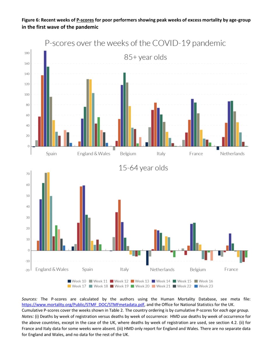
NEW Separately @INETOxford ‘s Profs John Muellbauer and Janine Aron about to release new paper comparing Europe’s hardest hit nations, based on percentage excess deaths over expected deaths... England tiny bit worse than Spain - basically same, we calc that Spain worse than UK:
Oxford @INET study also finds that England & Wales had a considerably higher proportion of working age (15-64 yo) excess mortality over pandemic period... in France for example this measure showed fewer deaths than usual during lockdown...
DHSC response: look to evidence from other countries but “comparing figures directly can be misleading as different countries compile their stats in different ways”.
Privately Govt acknowledge not too early to start analysing but say certainly too early to reach firm conclusions
Privately Govt acknowledge not too early to start analysing but say certainly too early to reach firm conclusions
So Covid deaths/ 100k population is a crude measure and is susceptible to different methods of death measurement, but is a useful comparator. So excess deaths - deaths above the normal level in previous years - is a helpful measure of general impact of pandemic & response to it..
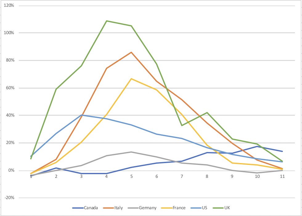
two measures used above are excess deaths per 100k population, which makes G7 comparison worse for UK...& then excess deaths as %age of usual deaths over a common timeframe, that includes the entire peak - in this case 11 weeks - this takes some account of demographic differences
That last method - the cumulative p-score over constant time period - both recognised as best current method for comparison between countries by @INETOxford and @HealthFdn ....
The @HealthFdn did this chart to compare the shape of the pandemics in the G7 using % excess deaths...
The @HealthFdn did this chart to compare the shape of the pandemics in the G7 using % excess deaths...
That % measure takes some general account of underlying demographics, deaths, age, obesity for example - there are other methods such as age standardised mortality rates. As UK & England are generally younger than say Italy & Spain, that wouldn’t appear to help UK in comparison.
Two caveats on G7 - clear possibility US spike turns into new wave and is arguably continuation of first wave rather than second one - will update if that happens - but this is analysis of the first wave to mid June. No Canada excess data for 3 territories incl Ontario yet...
Here’s the full paper from @inetoxford on Our World in Data about comparing excess deaths in Europe - lots of interesting details on the stats, breakdowns by age, and a comparison of the four Home Nations: https://ourworldindata.org/covid-excess-mortality">https://ourworldindata.org/covid-exc...

 Read on Twitter